Every year Sherwin-Williams names one color, and every year we get the same question a few weeks later: "Is it actually a good color, or just the one they're pushing?" For 2027 the pick is Celery, SW 6421. The honest answer is that it's a better real-world wall color than most Color of the Year picks. It's also easy to get wrong in a Colorado house. Here's what it is, where it works, and how to test it before you commit.
What Celery actually is
Sherwin-Williams describes Celery as "an airy, herbal green" with "subtle yellow undertones," sitting between an airy pastel and a grounded, herbal hue. The theme they hung on it is "Refresh & Restore," and it comes out of their Colormix 2027 trend forecast.
Strip the marketing off and here's the paint: Celery is a very light, warm green that leans yellow. Its Light Reflectance Value is about 71, which puts it in off-white territory for brightness. For comparison, the mid-tone sages everyone has been painting for the last few years sit in the 30s. So this is not that sage kitchen. It's much lighter, much softer, and in a lot of light it reads closer to a tinted white than a green.
That is the single most important thing to understand about it. People fall in love with the chip expecting green and end up with a wall that looks pale yellow at two in the afternoon. Or they expect a subtle off-white and get a distinctly green room on a cloudy morning. Celery does both, depending on the light. Our Celery page has the hex, the LRV, the closest matches in other brands and the rooms it suits, if you want the numbers.
Why it's a smart pick, and how it differs from the sages
Trend colors have been drifting for years: gray, then greige, then warm white, then the deep sages and olives. Celery is the next step. It keeps the green but drops the weight. Instead of a moody, saturated color that has to be the star of the room, it's a background color. It flatters wood, it flatters white trim, and it doesn't fight with your furniture.
That's why it's more livable than most Color of the Year picks. A deep navy or a dusty plum is a color you use in one room, once. Celery is one you can run through a whole floor. Kitchens, dining rooms, hallways, a nursery, an entry: it works in all of them, and the way it shifts from room to room is part of the appeal rather than a problem.
How it behaves in Colorado light
The Front Range gets a lot of very direct sun under a very blue sky, and light greens with yellow in them are the colors most affected by that.
South- and west-facing rooms. Full afternoon sun pulls the yellow forward. On a sunny wall Celery can go from herbal green to pale butter in the space of an hour. If you already have warm floors, oak cabinets or a lot of warm wood, this can tip the room warmer than you wanted. If you like a sunny, cottage feel, it's ideal.
North-facing rooms. Cooler, flatter light pushes the green forward and takes some of the warmth out. In a north room Celery reads more clearly as green, and a touch grayer. Most people find this is the version they were picturing from the chip.
Evening and lamplight. Warm bulbs (2700K) turn it soft and yellow-green, close to what Sherwin-Williams shows in its photography. Cooler bulbs (4000K and up) keep it greener.
The practical translation: Celery is at its best in rooms with plenty of indirect daylight, or in rooms where you want the sunny version. It is not the color for a dim room you're hoping to brighten. There, the green undertone can go a little murky.
Where we'd use it, and where we wouldn't
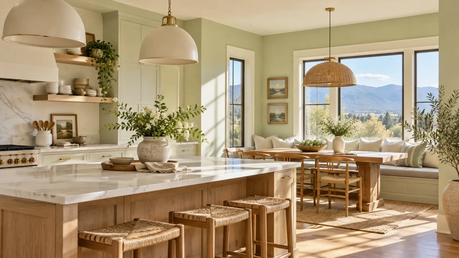
Kitchens. The obvious one, and clearly the room Sherwin-Williams is picturing. Two ways to do it. Walls in Celery with white cabinets and warm wood accents is a soft, safe, very current kitchen. The bolder move is Celery on the cabinets themselves. Because it's so light, it doesn't feel like a "colored cabinet" the way a navy or a forest green does; it feels like a warm white with some personality. Our cabinet doors are sprayed flat in our shop in a custom-tinted cabinet finish, so a Celery kitchen doesn't mean wall paint brushed onto cabinet doors.
Dining rooms and entries. Rooms you pass through or use at night are where the warmer, lamplit version of Celery shines. Welcoming without being loud.
Bedrooms and nurseries. Calm, light, and it sits well with white bedding and natural textures. If the room faces south, sample first; the afternoon yellow can be more than you want in a room meant for sleep.
Living rooms. Works well as a whole-room color when the furniture is neutral: warm whites, linen, wood, leather. It struggles in a room already full of cool grays, which make it look yellow by contrast.
Where we'd skip it. Small windowless bathrooms and basements. Without daylight the color loses what makes it interesting. We'd also skip it beside a lot of cool gray tile or stone. The two don't argue, but they don't help each other either.
What to pair it with
Sherwin-Williams' own pairing palette for Celery is worth a look because it's more adventurous than you'd expect: Potentially Purple (SW 6821), Artichoke (SW 6179), Cocoon (SW 6173), Kirsch Red (SW 6313), Cosmos (SW 6528), Georgian Bay (SW 6509), Plum Brown (SW 6272), White Flour (SW 7102) and Woven Wicker (SW 9104). Treat that as a whole-house palette, not a list of colors for the same room.
For the trim and cabinet decisions people actually make, here's what we reach for:
- Trim: a warm white, not a stark one. Shoji White (SW 7042) or Alabaster (SW 7008) keep the softness. Pure White (SW 7005) works if you want crisper contrast. Avoid the cool blue-whites; they make Celery look dingy.
- An island or lower cabinets for contrast: Urbane Bronze (SW 7048) or Black Fox (SW 7020) ground it without going cold. Artichoke on the lowers with Celery uppers is a genuinely good two-tone kitchen.
- Adjoining rooms: Repose Gray (SW 7015) or a warm greige keeps the flow if you don't want green everywhere. Liveable Green (SW 6176) is the closest "same family, one step deeper" option.
If you're matching across brands, Benjamin Moore's Pistachio (CSP-815) is the nearest we've found, and Behr's Caraway Seeds (S330-2) is close. Neither is exact. Sample both if you're set on another brand's product.
Sheen
Walls: matte or satin. Matte lets a light color like Celery look soft and chalky, which suits it, and hides more of the wall. Satin holds up better in kitchens and hallways. Skip anything glossier on walls; reflections turn a subtle color into a shiny one. Cabinets and doors get a sprayed finish in our shop, so the color reads the same and the surface gets the durability it needs.
How to test it before you commit
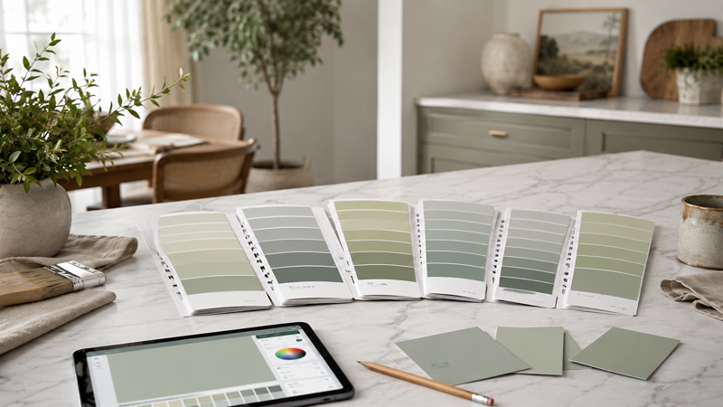
Don't judge Celery from a chip. Of the colors we've painted in the last few years, it's one of the most light-dependent.
- Paint two large samples, at least two feet square, on the actual wall: one near the window and one on the far wall. Peel-and-stick samples work if you'd rather not paint.
- Look at them at three times of day: morning, mid-afternoon, and after dark with your normal lamps on.
- Put your trim color next to it. Celery changes character depending on how warm the white beside it is.
- Use our Celery page to narrow the shortlist and check the closest matches, then confirm with the physical sample.
If the afternoon version looks too yellow, look at Rice Paddy (SW 6414) or Honeydew (SW 6428); they're neighbors that lean a touch less warm. If you wanted more green, Liveable Green (SW 6176) is the step up.
Our take
Celery is a good Color of the Year: livable, flexible, and less of a fad than the last several picks. Its weakness is the same as its strength. It moves. Sample it in your light, pair it with a warm white, and it's a color you'll still like in five years. Skip the sampling and there's a fair chance you end up with a yellow room you didn't order.
If you want a second opinion on your rooms, or you'd like to see it on cabinets, get in touch. We're happy to talk through the whole palette, not just the wall.