Most whole-home color problems aren't about picking bad colors. They're about picking good colors that don't talk to each other. One room reads warm gray, the next reads cool blue-gray, the hallway between them looks like a mistake, and nobody can say why.
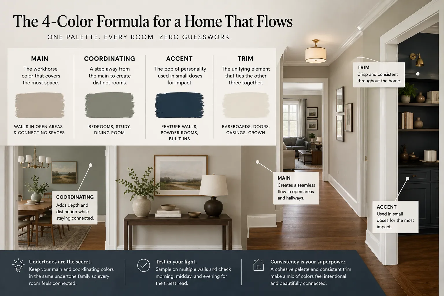
The fix is to stop choosing colors room by room and start choosing roles. A palette that flows usually runs on four of them: a main color, a coordinating color, an accent, and a trim. Get those four working together and every room borrows from the same family — even when the shades change.
The four roles, and what each one does
Main. This is your workhorse — the color that covers the most square footage across open areas, hallways, and the rooms that connect everything. It should be quiet. A main color you'd describe as "interesting" is usually a main color you'll get tired of. Lean toward soft neutrals with a slight undertone.
Coordinating. A step away from the main — often the same undertone, one or two values darker or lighter. This is what you put in bedrooms, a study, or a dining room so those spaces feel distinct without breaking from the whole. Because it shares DNA with the main, the transition between rooms stays smooth.
Accent. The color with some personality, used in small doses: a feature wall, a powder room, the inside of built-ins. Accents are where you can be bold, precisely because you're not committing a whole floor to them.
Trim. Baseboards, casings, doors, and crown. Trim ties the other three together. A consistent trim color running through the house is one of the strongest tools you have for making a mixed palette feel intentional. Many homes do well with a clean off-white carried everywhere.
Undertones are where flow lives or dies
Two grays can look identical on a chip and fight on the wall — one leans green, the other leans purple. Undertone is the hidden variable. When your main and coordinating colors share an undertone, they read as relatives. When they don't, the eye catches it even if the person can't name it.
This is exactly the part that's hard to eyeball, which is why we built the palette builder. It snaps the four roles — main, coordinating, accent, trim — to real catalog colors across four brands, so the combination you're looking at is one you can actually buy and put on a wall. You're not guessing whether two swatches coordinate; the tool keeps them in a working relationship.
How to build yours, step by step
- Start with the room you can't change. Big-ticket items set the rules: floors, stone, cabinets, a sofa you're keeping. Pull an undertone from those and let your main color agree with it.
- Pick the main first, in the biggest connected space. Look at it in that room's real light — Colorado sun is bright and cool, and north-facing rooms will pull a color grayer than the chip suggests.
- Set the coordinating color one or two steps off the main. Same undertone. Test it in the room where it'll actually live.
- Choose one accent, not four. Save it for the spots that earn attention.
- Lock the trim last and run it everywhere. Consistency here does the heavy lifting.
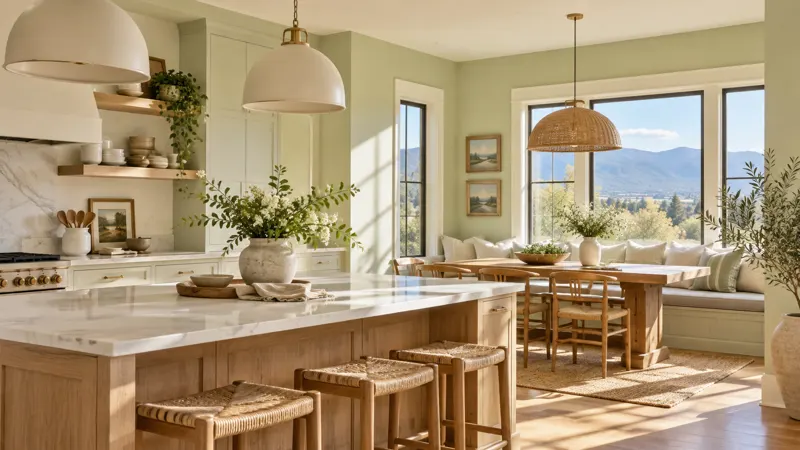
If you're staring at a blank slate, browse Explore Colors to see shades in real rooms before you commit to anything. Seeing a color in context beats a chip under store lighting every time.
Test in your own light — always
A palette that looks perfect on screen or in a showroom can shift once it's on your walls. Sample your main and coordinating colors on more than one wall, look at them at morning, midday, and evening, and check the transition where two rooms meet. If the connection between them looks slightly off in person, trust it — that's the undertone talking.
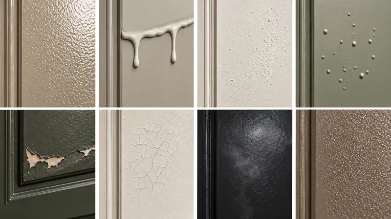
Sheen matters too. Flatter finishes hide wall texture and read softer; we keep interior sheens topping out at semi-gloss, which is plenty of durability for trim and doors without turning them into a mirror that shows every roller mark.
When you want a second set of eyes
One of the reasons homeowners over-think palettes is that they're doing it in isolation. During a free estimate walk-through we'll look at your fixed elements, your light, and how your rooms connect, and help you narrow the four roles to something that holds together — no pressure, no upsell.
Start with the palette builder, sample what you like, and when you're ready to see it go up on the walls, get your free estimate and we'll take it from there.