Valspar Crabapple Wine (1005-7A): A Rich and Sophisticated Hue
Valspar Crabapple Wine (1005-7A) is a luxurious and deeply pigmented paint color that exudes warmth and elegance. This shade is a rich, velvety blend of burgundy and red, with subtle brown undertones that add depth and sophistication. Its name evokes the image of ripe crabapples and mulled wine, making it a perfect choice for creating spaces that feel cozy, refined, and inviting.
Undertones of Crabapple Wine
Crabapple Wine is a warm red with earthy undertones. While the dominant hue is a deep burgundy, its brown and muted maroon undertones give it an organic, grounded feel. These undertones make the color less vibrant than a traditional red, but more versatile and adaptable for various design styles. The brown base ensures the shade doesn’t feel overpowering, while the rich wine tones add a touch of drama and opulence.
Coordinating Colors
This versatile shade pairs beautifully with neutral tones, soft pastels, and complementary deep hues. Here are some coordinating colors to consider:
- Neutral Pairings: Pair Crabapple Wine with warm neutrals like Valspar's Soft Sheepskin (3002-10B) or Ivory Dust (3006-10B) to balance its richness while maintaining a cozy and cohesive look.
- Cool Contrasts: Add contrast with cooler tones like Cool Grey (4005-1B) or Filtered Shade (4005-1C). These grays will temper the warmth of Crabapple Wine and create a modern, sophisticated palette.
- Earthy Complements: Enhance its organic feel with earthy greens such as La Fonda Olive (6004-4C) or Spring Green (6003-8A). These greens will highlight the subtle brown undertones and create a harmonious connection to nature.
- Bold Accents: For a dramatic pairing, consider rich tones like Black Garnet (4011-2) or Deep Indigo (4008-4C). These shades will amplify Crabapple Wine’s opulence and create a stunning contrast.
Ideal Uses for Crabapple Wine
Crabapple Wine is a versatile shade that can transform a variety of spaces with its bold yet inviting character. Consider these applications:
Living Rooms
Use Crabapple Wine for an accent wall in a living room to create a cozy and intimate ambiance. Pair it with plush furniture in neutral tones and metallic accents for a sophisticated design.
Dining Rooms
This shade is perfect for dining spaces where you want to foster warmth and conviviality. A Crabapple Wine dining room wall can set the tone for elegant dinner parties or relaxed gatherings.
Bedrooms
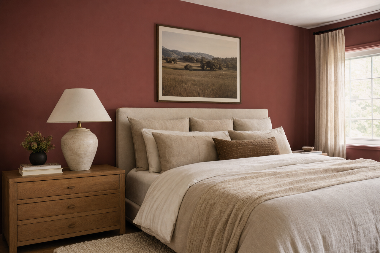
For a bold yet calming retreat, incorporate Crabapple Wine in a bedroom. Use it on the walls or as a backdrop for a statement headboard, pairing it with soft linens in beige, cream, or blush tones.
Offices or Libraries
Crabapple Wine’s rich hue works beautifully in home offices or libraries, creating a space that feels grounded and inspiring. Pair it with dark wood furniture and brass fixtures for a timeless, classic look.
Bathrooms
Add a touch of drama to a powder room or bathroom with Crabapple Wine. Pair it with white or marble accents for a luxurious, spa-like feel.
Accents and Furniture
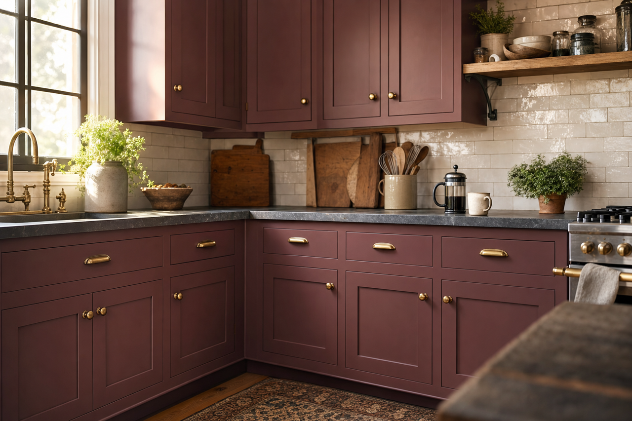
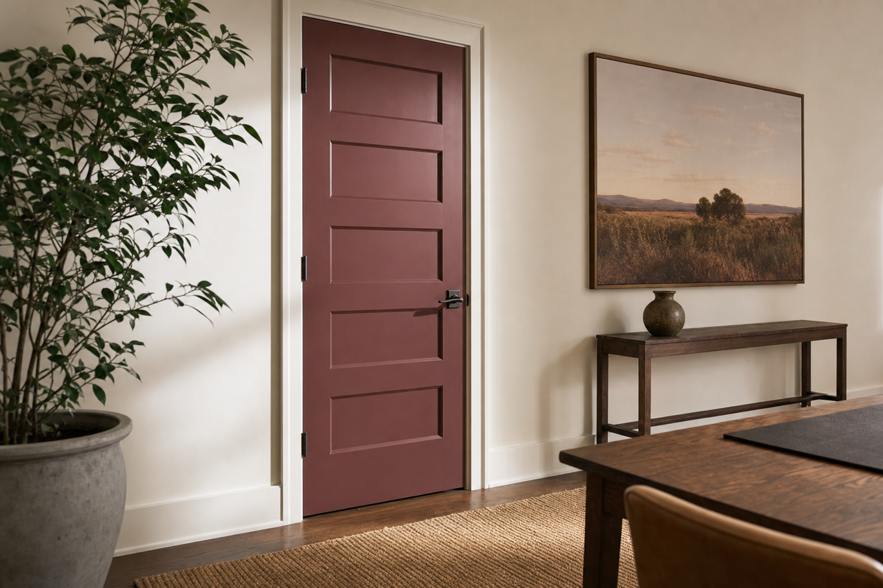
If you prefer subtle incorporation, use Crabapple Wine on furniture pieces, cabinets, or trim. It can also be applied to built-in bookshelves or decorative elements to introduce depth and visual interest.
Design Style Compatibility
Crabapple Wine is incredibly versatile and complements a range of interior design styles:
- Traditional: Enhance the classic elegance of traditional interiors by pairing Crabapple Wine with ornate woodwork and antique furniture.
- Modern: Use it as a bold accent in minimalistic spaces, paired with clean lines and monochromatic palettes.
- Rustic: Highlight its earthy undertones with reclaimed wood and natural textures for a cozy, cabin-inspired aesthetic.
- Eclectic: Mix and match Crabapple Wine with bold patterns and vibrant colors to create a dynamic, personalized space.
Whether you’re looking to create a statement wall, add sophistication to your furniture, or design an entire room with this sumptuous hue, Valspar Crabapple Wine (1005-7A) is a timeless choice that brings depth, richness, and warmth to any interior space.