Benjamin Moore Ballet Slippers (1331): A Serene and Sophisticated Neutral
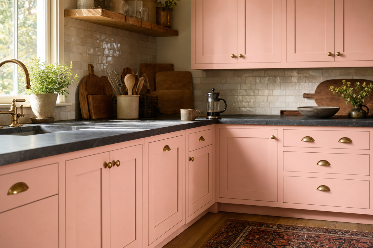
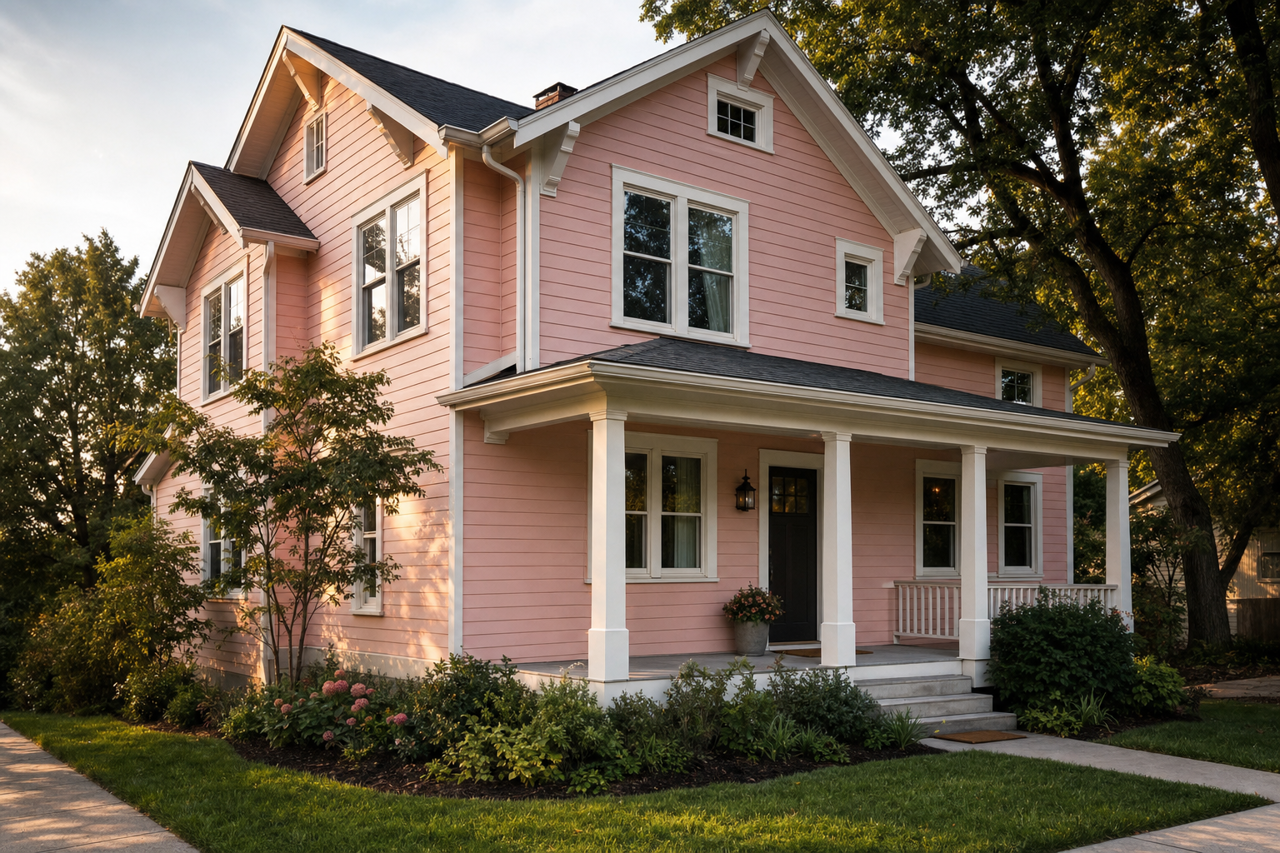
Benjamin Moore Ballet Slippers (1331) is a gorgeously soft and understated neutral that exudes elegance and versatility. Its subtlety and warmth make it a timeless choice for creating tranquil and inviting spaces. Whether you’re designing a serene bedroom retreat, a calming living room, or a sophisticated dining area, Ballet offers a refined backdrop that complements a variety of aesthetics.
Color Characteristics and Undertones
Ballet (1331) is a delicate blend of beige and taupe, creating a balanced neutral that works beautifully in both traditional and modern interiors. The color has warm undertones, leaning slightly towards creamy beige rather than cool gray. These warm undertones make Ballet feel cozy and approachable without being overpowering, ensuring it remains light and airy.
The refined nature of Ballet makes it especially suited for spaces where you want a soft and natural look. Its undertones pair well with both bright whites and darker accents, giving you ample flexibility to experiment with your design.
Coordinating Colors
Benjamin Moore Ballet Slippers (1331) is incredibly versatile and pairs harmoniously with a wide range of shades. Here are some coordinating colors to consider:
- Bright Whites: For crisp contrasts, pair Ballet with Benjamin Moore Chantilly Lace (OC-65) or Simply White (OC-117). These whites amplify the brightness of Ballet while maintaining a clean and sophisticated vibe.
- Deep Charcoals: For dramatic depth, try coordinating Ballet with Benjamin Moore Kendall Charcoal (HC-166) or Chelsea Gray (HC-168). These darker shades add richness and balance to the soft neutral tones of Ballet.
- Moody Blues: Introduce a serene yet bold contrast with Benjamin Moore Hale Navy (HC-154) or Van Deusen Blue (HC-156). These blues infuse the space with personality while beautifully complementing the warm undertones of Ballet.
- Earthy Greens: Pair Ballet with Benjamin Moore Saybrook Sage (HC-114) or October Mist (1495) for a grounded, nature-inspired palette that feels fresh and calming.
Room Applications and Uses
Ballet’s soft and versatile nature makes it a perfect choice for nearly any room in the home. Below are some ideas for using this timeless neutral:
- Living Rooms: Create a welcoming and comfortable atmosphere by using Ballet as the primary wall color. Pair it with plush beige or taupe furniture, crisp white trim, and wood accents for a cozy yet sophisticated look.
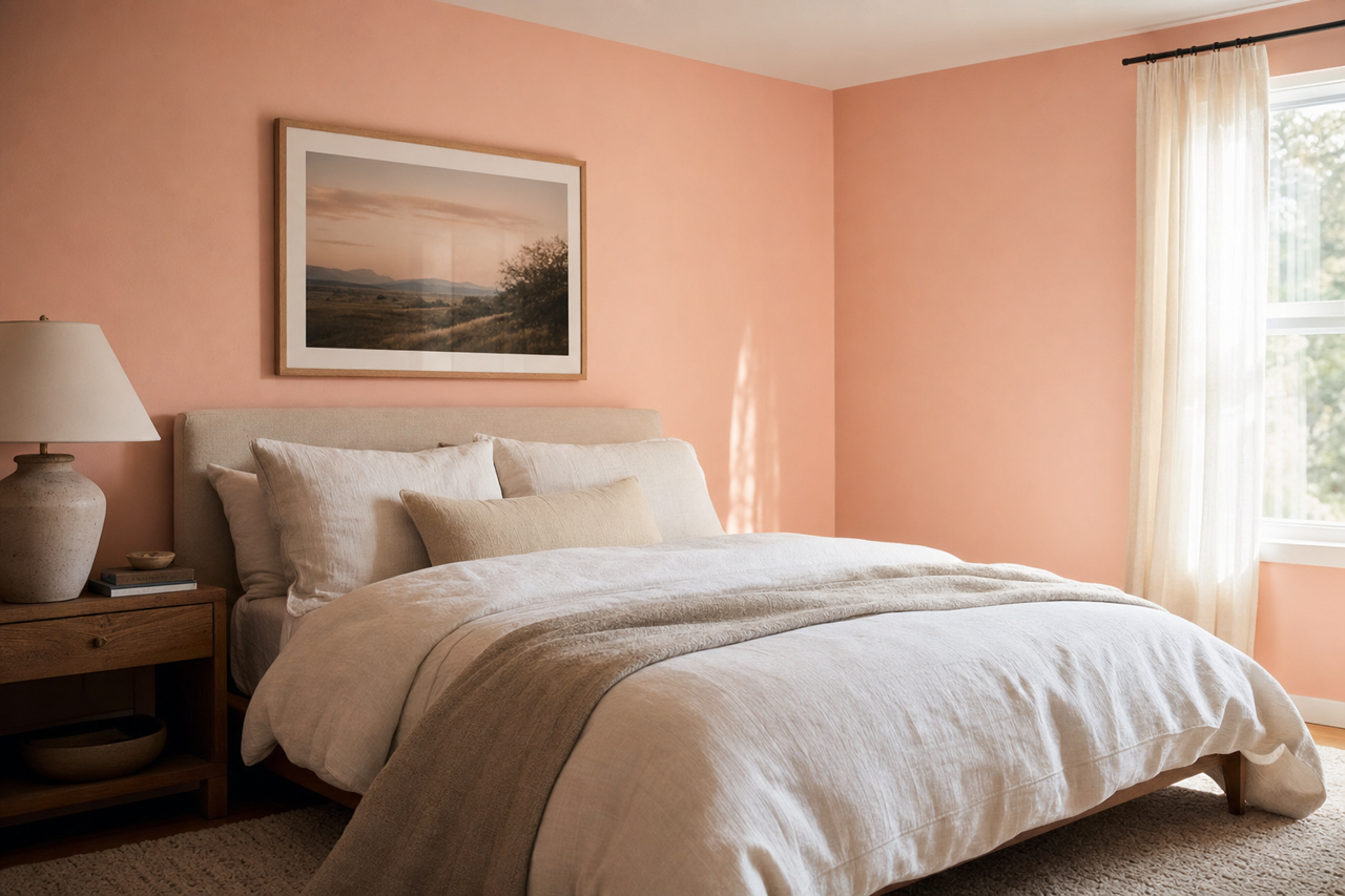
- Bedrooms: Ballet is ideal for bedrooms, where its soothing tones promote relaxation and rest. Layer it with soft linens in cream or blush tones for a dreamy retreat. Add touches of metallics, such as gold or bronze, for a hint of glamour.
- Dining Rooms: Elevate your dining room with Ballet’s understated elegance. Pair it with dark wood furniture, rich navy accents, and warm lighting for a refined and intimate dining experience.
- Home Offices: Ballet fosters focus and calm in workspaces, making it a great choice for home offices. Pair it with darker accents like charcoal or deep green to create a professional yet inviting vibe.
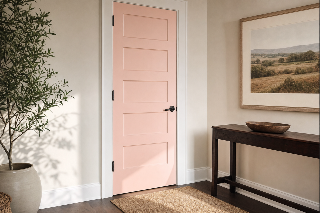
- Hallways and Entryways: Use Ballet to brighten narrow or dim spaces such as hallways or entryways. Its neutral warmth makes these transitional areas feel more open and welcoming.
Lighting Considerations
As with any paint color, the appearance of Benjamin Moore Ballet Slippers (1331) will vary depending on the lighting in your space. In rooms with ample natural light, Ballet will appear slightly lighter and airier, while in spaces with limited light, its warm beige undertones will become more pronounced. To ensure the perfect look, test Ballet in your space with swatches and observe how it interacts with the light throughout the day.
Benjamin Moore Ballet Slippers (1331) is a true gem for those seeking a refined neutral that adapts effortlessly to a variety of design styles. Its warm undertones, coordinating color options, and versatile applications make it a go-to choice for creating spaces that feel effortlessly elegant and timeless.