Benjamin Moore Vivid (138): A Bold and Lively Hue for Dynamic Spaces
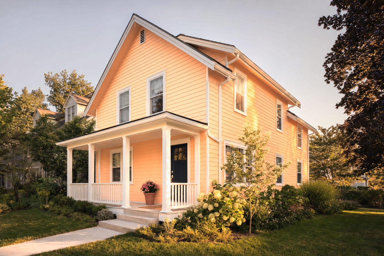
Benjamin Moore Vivid (138) is a striking and energetic deep coral hue that instantly infuses a space with vibrancy and personality. This daring color is perfect for those looking to make a statement, as it commands attention with its rich saturation and bold presence. Vivid (138) is a versatile choice, suitable for modern interiors, eclectic spaces, or anywhere you want to create a sense of excitement and warmth.
Undertones of Benjamin Moore Vivid (138)
Vivid (138) leans toward a warm, reddish-orange base, with subtle pink undertones that soften its intensity and give it a refined, sophisticated edge. The pink undertones add a playful yet elegant dimension to the color, making it more approachable and versatile than a pure red or orange. These undertones also help the color adapt beautifully to different lighting conditions, appearing more coral-like and vibrant in natural light and richer and cozier in artificial lighting.
Coordinating Colors for Benjamin Moore Vivid (138)
Vivid (138) pairs beautifully with a range of complementary and neutral tones, allowing for endless design possibilities. Here are some ideas to help you craft a harmonious palette:
- Soft Neutrals: Pair Vivid (138) with warm, creamy whites like Benjamin Moore Simply White (OC-117) or a soft beige like Edgecomb Gray (HC-173) to create balance and allow the coral shade to be the star of the room.
- Cool Contrasts: For a striking contrast, consider pairing it with deep navy hues like Hale Navy (HC-154) or a rich charcoal gray like Kendall Charcoal (HC-166). This combination brings a modern edge to the space.
- Earthy Complements: To create a more grounded and natural look, coordinate it with muted greens like Saybrook Sage (HC-114) or a terracotta tone like Arizona Tan (2162-50). These earthy shades enhance the warmth of Vivid (138).
- Playful Brights: For a fun and youthful vibe, pair Vivid (138) with sunny yellows like Hawthorne Yellow (HC-4) or turquoise accents like Tropical Turquoise (2058-50).
Ideal Uses for Benjamin Moore Vivid (138)
Vivid (138) is an excellent choice for spaces that need an injection of energy and boldness. Here are some creative ways to incorporate this color into your home or workspace:
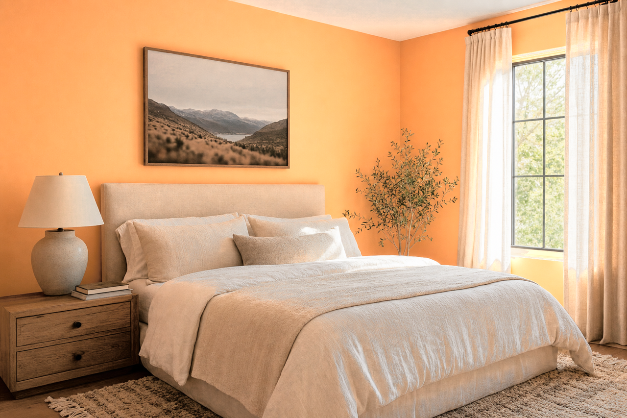
- Accent Walls: Use Vivid (138) on a feature wall to create a focal point in living rooms, dining areas, or bedrooms. Its bold nature adds depth and drama without overwhelming the space.
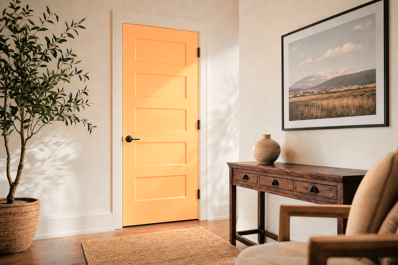
- Front Doors: Make a memorable first impression by painting your front door in Vivid (138). This welcoming and cheerful hue will stand out beautifully against neutral or muted exteriors.
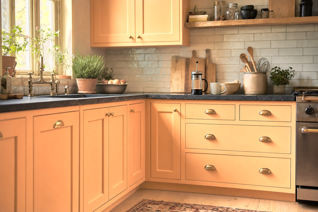
- Kitchen and Dining Areas: Incorporate Vivid (138) in spaces where people gather, like kitchens or dining rooms. Its warm undertones stimulate conversation and create a lively, inviting atmosphere.
- Furniture and Décor Accents: If painting an entire wall feels too bold, consider using Vivid (138) on smaller elements like a side table, shelving, or decorative accessories to introduce pops of color.
- Creative Workspaces: This invigorating hue is perfect for home offices or art studios, as it sparks creativity and energy.
Design Tips for Success
To make the most of Benjamin Moore Vivid (138), balance its boldness with strategic design choices:
- Opt for minimalistic or neutral furnishings to let the color shine without overwhelming the room.
- Incorporate textures like natural wood, woven fabrics, or brushed metals to add depth and soften the intensity of the color.
- Use ample lighting—whether natural or artificial—to highlight its dynamic undertones and prevent it from feeling too heavy in smaller spaces.
Benjamin Moore Vivid (138) is a courageous choice for those who want to step outside their comfort zone and create a space that feels alive, warm, and unforgettable. Whether used as an accent or a primary wall color, this deep coral hue brings undeniable energy and sophistication to any room.