Benjamin Moore Fruit Punch (140): A Vibrant and Timeless Hue for Any Space
Benjamin Moore Fruit Punch (140) is a bold and invigorating shade that captures the essence of ripe, juicy fruit. This vibrant pinkish-red hue offers a dynamic energy that can enliven a space and make it feel welcoming, cheerful, and warm. Whether used as an accent or a primary wall color, Fruit (140) is a versatile choice that adds personality and charm to interiors.
Undertones of Benjamin Moore Fruit Punch (140)
Fruit (140) carries subtle undertones of warm red and coral, giving it a balanced yet lively appearance. These undertones create a harmonious blend of warmth and vibrancy, steering the color away from being overly saturated or harsh. The coral-like undertones soften the intensity of the pinkish-red base, making it suitable for both modern and traditional design styles.
Coordinating Colors
Pairing Benjamin Moore Fruit Punch (140) with complementary hues can help create a cohesive and stylish look. Some coordinating colors to consider include:
- Benjamin Moore White Dove (OC-17): A soft, creamy white that provides a clean and neutral backdrop for Fruit (140) to stand out.
- Benjamin Moore Kendall Charcoal (HC-166): A rich, deep gray that adds sophistication and contrast to the vibrant Fruit (140).
- Benjamin Moore Coral Gables (2010-40): A lighter coral shade that harmonizes beautifully with Fruit (140) for a monochromatic palette.
- Benjamin Moore Oxford Gray (2128-40): A muted blue-gray that balances the warmth of Fruit (140) with a cool, calming effect.
- Benjamin Moore Simply White (OC-117): A bright, crisp white that highlights Fruit (140)’s boldness while maintaining a fresh and airy feel.
Uses for Benjamin Moore Fruit Punch (140)
Fruit (140) can be tailored to various design styles and applications, making it an excellent choice for spaces that need a pop of color or a bold statement.
Accent Walls
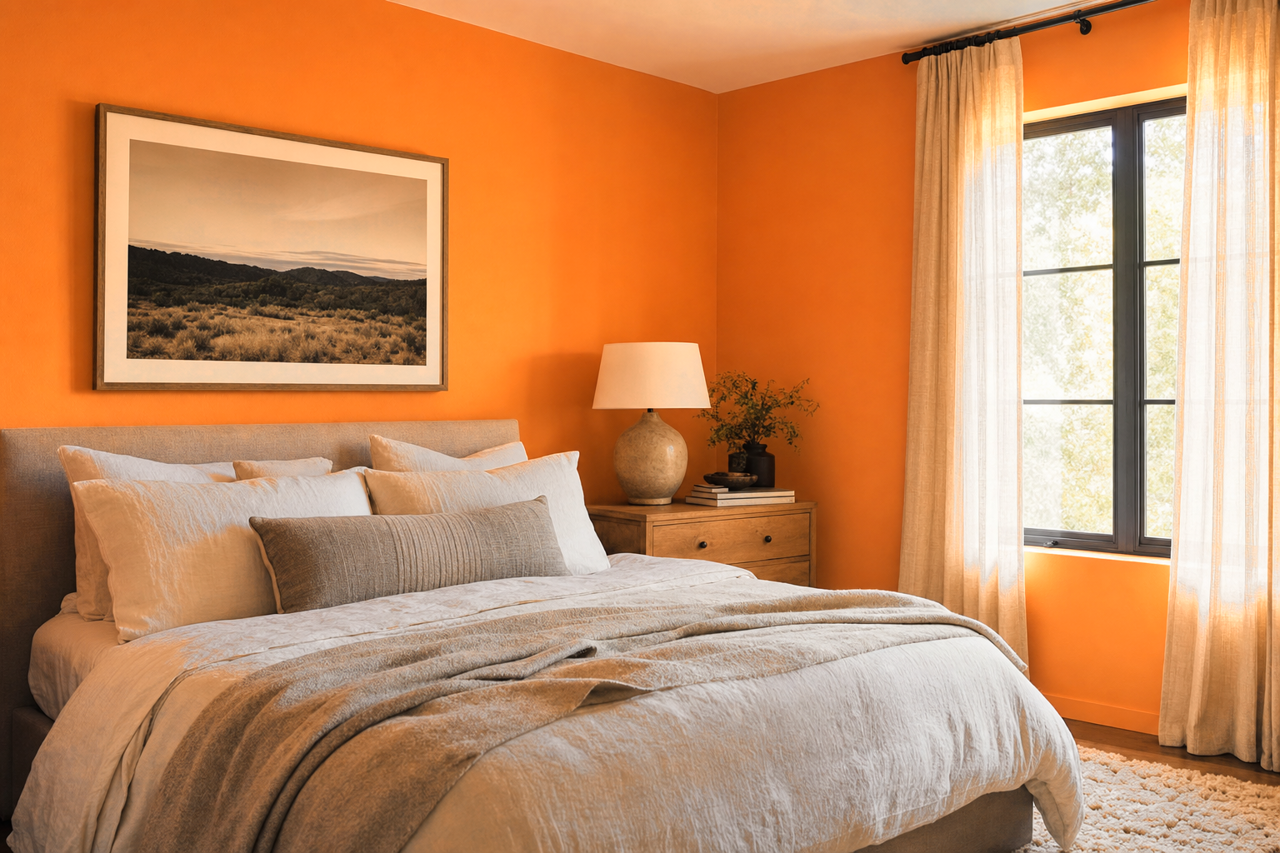
Create a feature wall with Benjamin Moore Fruit Punch (140) in living rooms, bedrooms, or dining areas. The vibrant hue draws attention and acts as a focal point, perfect for spaces that need energy and personality. Pair it with softer neutrals on surrounding walls to maintain balance.
Furniture and Decor
Fruit (140) isn’t just for walls; it can be used on furniture, cabinetry, or decor accents. A painted dresser or side table in this bold color can become a statement piece in a room, while smaller accents like picture frames or vases can subtly tie the color into your design.
Children’s Spaces
This lively pinkish-red shade is ideal for kids’ rooms or playrooms. Its cheerful and energizing quality fosters creativity and playfulness, making it a fun option for younger occupants. Pair it with whimsical patterns or pastel accents for a youthful look.
Kitchen and Dining Areas
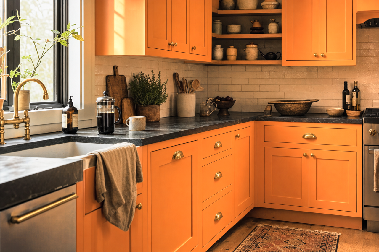
Benjamin Moore Fruit Punch (140) is a fantastic choice for kitchens or dining spaces, where its warm undertones can enhance a sense of vitality and appetite. Consider using it on cabinets or as a backdrop for open shelving to draw attention to your kitchen’s design features.
Outdoor Spaces
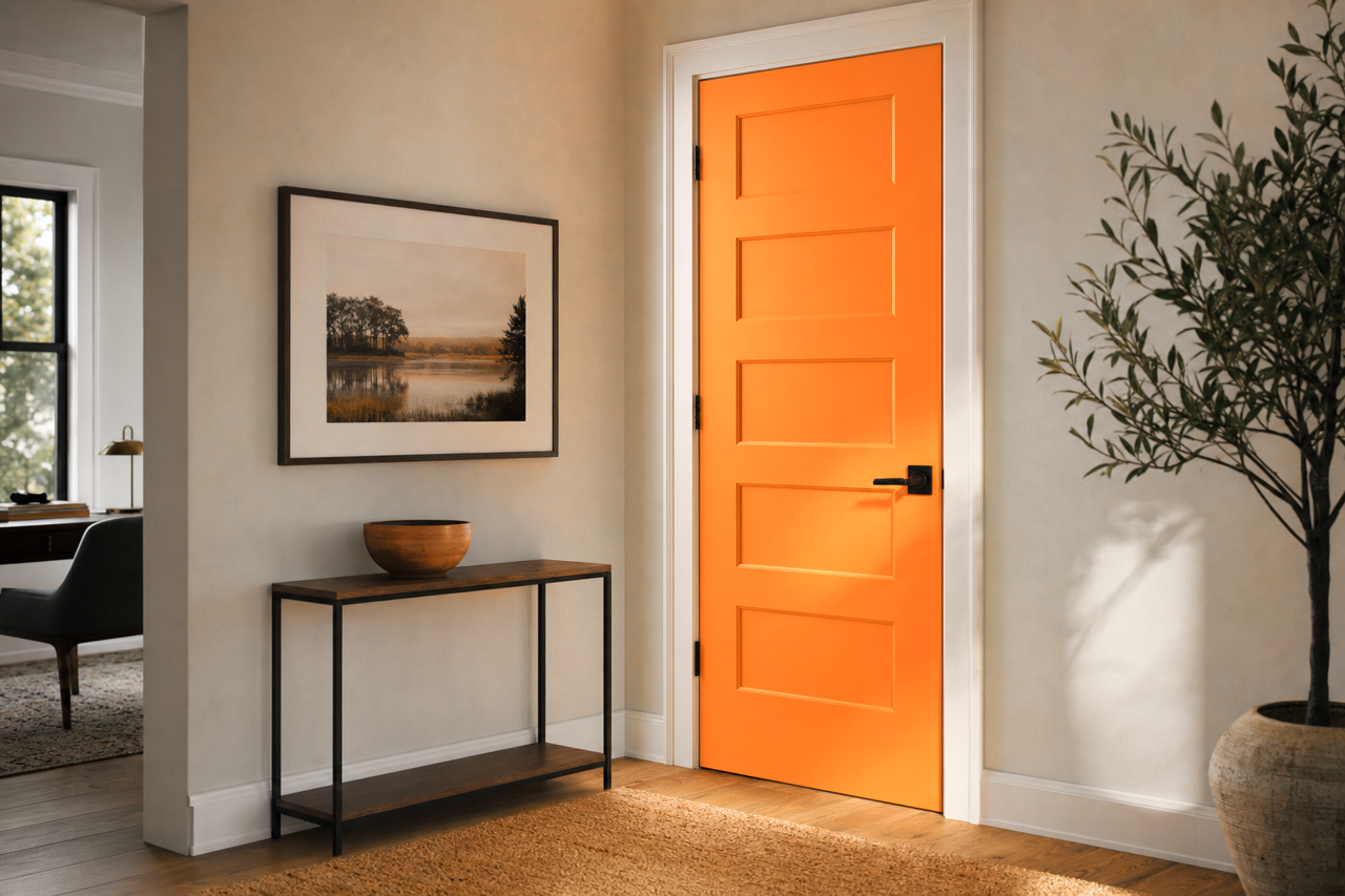
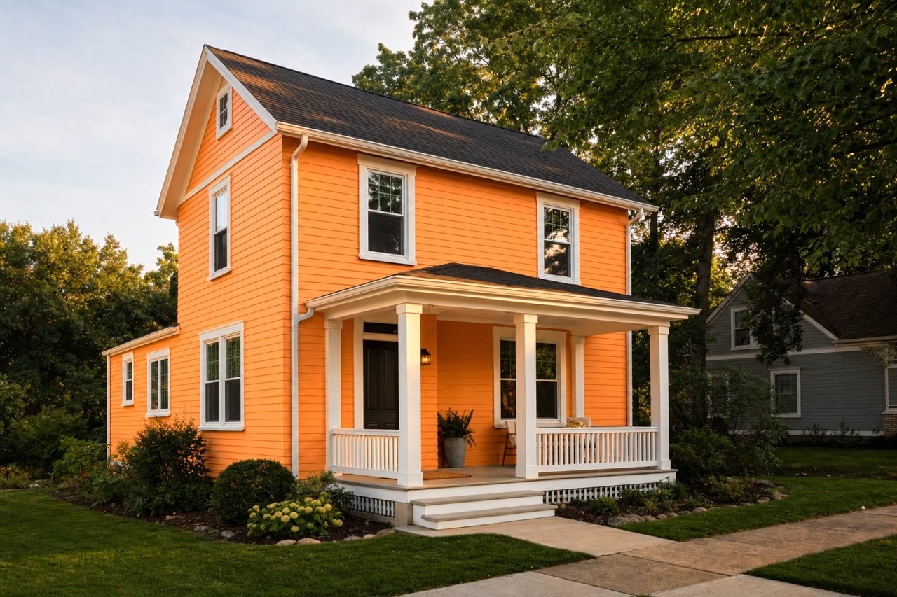
Fruit (140) can even be incorporated into exterior design, such as a front door or outdoor furniture. Its bold and welcoming appearance can brighten up the facade of your home or add a playful touch to an outdoor patio.
Design Tips and Tricks
- To prevent Fruit (140) from overwhelming your space, balance it with neutral tones such as whites, grays, or taupes.
- Use metallic accents like gold or brass to elevate the look and add a touch of sophistication.
- Consider pairing it with natural wood tones to ground the vibrancy and add warmth to the overall design.
- Incorporate textures, such as woven rugs or plush throws, to soften its boldness and create a cozy atmosphere.
Benjamin Moore Fruit Punch (140) is an energetic and versatile color that can transform any space into a lively and inviting environment. Its warm undertones, ability to coordinate with a variety of hues, and adaptability across different design styles make it a timeless choice for homeowners and designers alike.