Benjamin Moore Central Mauve 1412: A Sophisticated Neutral for Timeless Interiors
Benjamin Moore Central Mauve 1412 is a versatile and understated neutral that radiates sophistication and balance. With its warm undertones and soft, muted appearance, Central 1412 is an ideal choice for those seeking a classic yet contemporary look that seamlessly complements a variety of design styles. Whether you’re updating a modern loft, a cozy suburban home, or a professional office space, this color offers a refined backdrop for creating harmonious interiors.
Undertones: The Subtle Warmth of Central 1412
Central 1412 leans into its warm gray-beige undertone, often referred to as “greige.” This balanced undertone ensures the color feels neither too cool nor too warm, making it adaptable to a wide range of lighting conditions. In spaces with ample natural light, Central 1412 reveals a soft taupe-like warmth that feels inviting and serene. Under artificial or dim light, its depth becomes more pronounced, giving the space a cozy and grounded atmosphere.
This neutrality is what sets Central 1412 apart—it provides a calming foundation without overwhelming other design elements, allowing furniture, artwork, and textiles to shine.
Coordinating Colors: Perfect Pairings for Central 1412
To create a cohesive and polished color palette, consider pairing Central 1412 with complementary tones that enhance its warmth and depth. Here are some expert recommendations for coordinating colors:
Accent Colors:
- Benjamin Moore Hale Navy (HC-154) – A deep, rich navy that adds a sophisticated contrast.
- Benjamin Moore Caliente (AF-290) – A bold, warm red that energizes and complements the neutral tones.
- Benjamin Moore Tranquility (AF-490) – A muted blue-green that introduces a serene, spa-like vibe.
Trim and Ceiling Colors:
- Benjamin Moore White Dove (OC-17) – A soft, creamy white perfect for trim and ceilings, creating a crisp, clean contrast.
- Benjamin Moore Chantilly Lace (OC-65) – A cooler, purer white that pairs beautifully with Central 1412 for a modern aesthetic.
Neighboring Wall Colors:
- Benjamin Moore Revere Pewter (HC-172) – A coordinating greige that transitions seamlessly, ideal for adjacent rooms.
- Benjamin Moore Balboa Mist (OC-27) – A lighter warm gray that works well in open-concept spaces.
These combinations allow you to design spaces that feel cohesive and curated while giving you room to experiment with bold or subdued accents.
Uses: Where Central 1412 Shines
The beauty of Benjamin Moore Central Mauve 1412 lies in its adaptability. This color is equally at home in traditional, transitional, and modern interiors, making it a go-to choice for a variety of applications:
- Living Rooms: Central 1412 provides a calming yet sophisticated backdrop for living spaces. Pair it with plush furniture, layered textiles, and metallic accents for a cozy, upscale look.
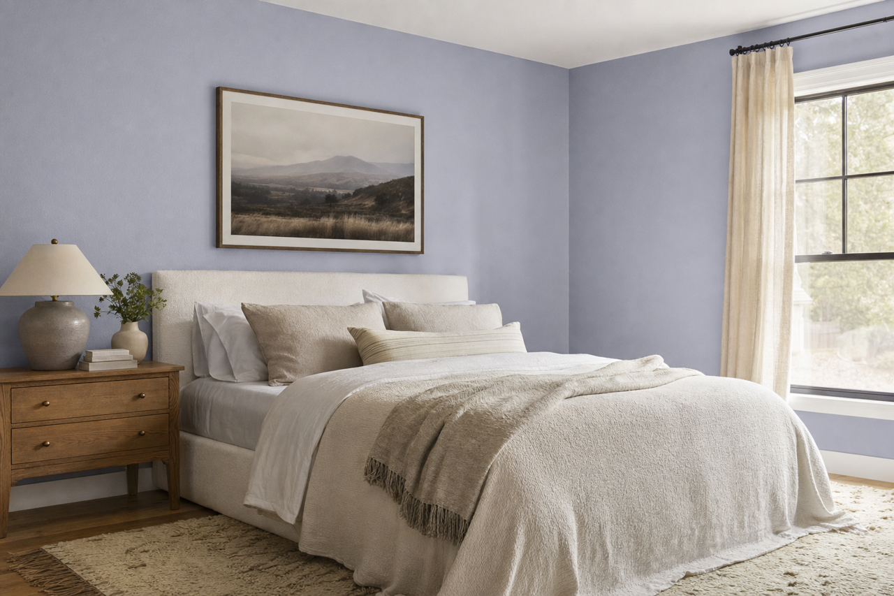
- Bedrooms: Create a serene retreat by using Central 1412 on the walls, paired with soft linens in muted blues or blush tones. Add warm wood furniture for a cohesive and inviting feel.
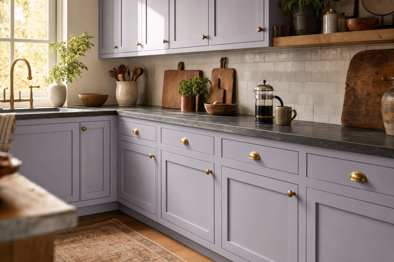
- Kitchens and Dining Areas: This neutral works beautifully with white cabinetry, natural stone counters, and brass or black hardware. Add depth with dark wood floors or patterned rugs.
- Home Offices: Central 1412 fosters focus and calm, making it an excellent choice for a work-from-home space. Pair it with deep blues or greens for a professional, grounded aesthetic.
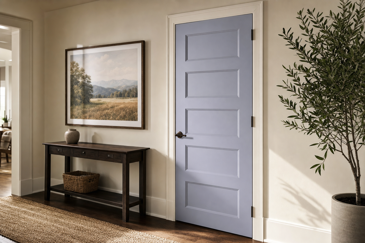
- Hallways and Entryways: As a neutral that bridges other colors effortlessly, Central 1412 is perfect for transitional spaces like hallways and entryways,