
Benjamin Moore In the Twilight (1434): A Sophisticated Neutral with Depth
Benjamin Moore In (1434) is a timeless and versatile paint color that exudes sophistication and balance. This soft, warm gray is a part of Benjamin Moore’s Classic Color Collection, a curated palette of enduring hues that complement both traditional and modern interiors. With its subtle undertones and adaptable nature, In (1434) is an excellent choice for creating serene and harmonious spaces.
Undertones of Benjamin Moore In the Twilight (1434)
One of the defining characteristics of In (1434) is its nuanced undertones. While the dominant hue is a gentle gray, it leans slightly warm with faint beige or greige undertones. These warm undertones make it feel inviting and cozy, as opposed to cool or stark. Depending on the lighting, you may also notice hints of a soft taupe or mushroom-like quality, giving the color depth and complexity.
In north-facing rooms or spaces with cooler light, the gray tones may appear more pronounced, while in south-facing rooms or under warm artificial lighting, the beige undertones will shine through, adding a comforting warmth.
Coordinating Colors for Benjamin Moore In the Twilight (1434)
The versatility of In (1434) makes it easy to pair with a variety of other hues. Whether you’re aiming for a monochromatic palette or a bold contrast, here are some coordinating color suggestions:
Neutral Pairings
- White Dove (OC-17): A crisp, soft white that works beautifully as a trim color or on ceilings to complement the warmth of In (1434).
- Edgecomb Gray (HC-173): A lighter greige that can be used to create a layered, tonal look.
- Revere Pewter (HC-172): A slightly darker greige that works well for adjacent spaces or accent walls.
Bold Contrasts
- Hale Navy (HC-154): A rich navy blue that adds drama and elegance when paired with the understated nature of In (1434).
- Hunter Green (2041-10): A deep, moody green that provides a striking contrast for a more traditional yet modern aesthetic.
- Kendall Charcoal (HC-166): A dark gray that pairs seamlessly for a high-contrast, sophisticated palette.
Soft Accents
- Pale Oak (OC-20): A light, creamy neutral that adds softness and pairs effortlessly with In (1434).
- Wedgewood Gray (HC-146): A muted blue-gray that introduces a hint of color without overwhelming the space.
- Sea Salt (CSP-95): A gentle green-gray that evokes a calming, natural feel.
Best Uses for Benjamin Moore In the Twilight (1434)
Living Rooms
In (1434) is an ideal choice for living rooms, where its warm undertones create a welcoming and comfortable atmosphere. It serves as a sophisticated backdrop for a variety of furniture styles, from modern to traditional, and pairs beautifully with wood tones, metallics, and soft textiles.
Bedrooms
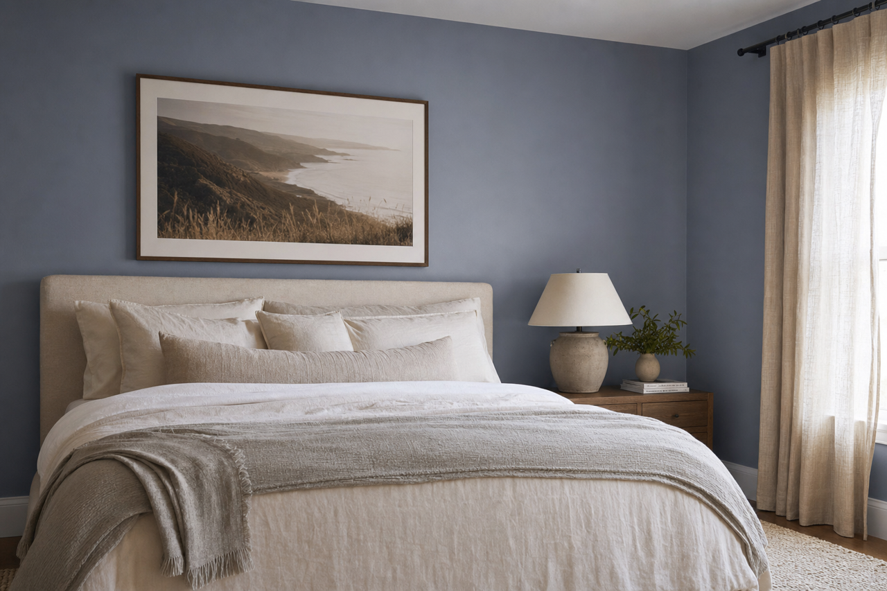
For bedrooms, In (1434) offers a soothing and tranquil vibe, perfect for creating a restful retreat. Pair it with plush bedding, warm lighting, and soft accents for an inviting, cozy space.
Kitchens and Dining Areas
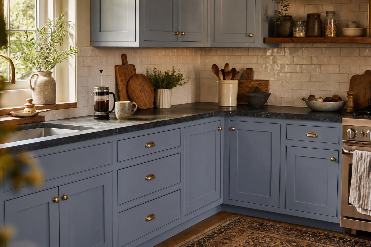
In kitchens and dining areas, this warm gray works wonderfully on walls or even cabinetry. It pairs well with marble countertops, brushed nickel hardware, and natural wood finishes, giving the space a timeless yet contemporary feel.
Hallways and Entryways
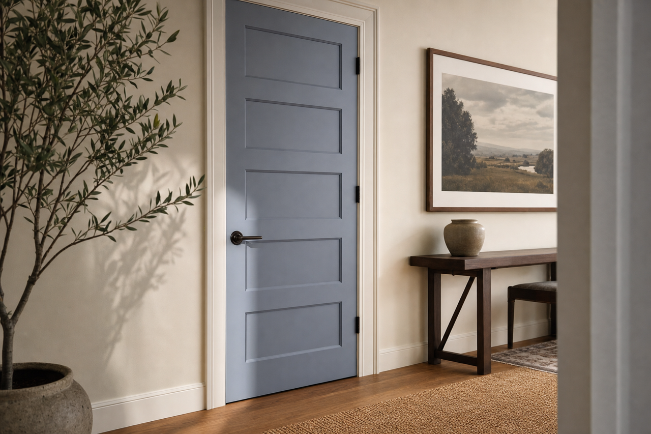
Hallways and entryways painted in In (1434) feel balanced and cohesive, setting the tone for the rest of the home. Its neutral undertones ensure it flows seamlessly with adjoining rooms and color schemes.
Offices
For home offices, In (1434) strikes the perfect balance between calm and focus. Its neutral warmth helps create a professional yet inviting environment conducive to productivity.
Lighting Considerations
The appearance of In (1434) can shift depending on the lighting in your space:
- Natural Light: In ample natural light, the color appears lighter and its greige undertones become more pronounced.
- Artificial Light: Under warm lighting, it takes on a cozier, beige hue, while cooler lighting will emphasize its gray tones.
- Accent Lighting: Pairing it with accent lighting can amplify its depth and create a stunning interplay of light and shadow.
Why Choose Benjamin Moore In the Twilight (1434)?
Benjamin Moore In the Twilight (1434) is more than just a neutral—it’s a versatile classic that adapts beautifully to a wide range of styles and settings. Its warm undertones bring a sense of comfort, while its gray base ensures a chic, modern aesthetic. Perfect for walls, cabinetry, and even trim, this color strikes a harmonious balance that will elevate the design of any room. Whether you’re creating a serene retreat or a polished professional space, In (1434) is a reliable and stylish choice.