Benjamin Moore Quiet Moments 1563: A Versatile and Sophisticated Neutral
Benjamin Moore Quiet Moments 1563 is a serene and understated medium gray that effortlessly elevates any space with its timeless appeal. This versatile paint color strikes the perfect balance between warm and cool, making it a popular choice for homeowners and designers alike. Its ability to complement a wide range of design styles, from modern minimalism to traditional elegance, makes it a standout in Benjamin Moore’s extensive collection.
Undertones: A Subtle Blend of Warmth and Coolness
One of the defining features of Quiet 1563 is its nuanced undertones. While it reads as a true gray in most lighting conditions, it carries faint blue and green undertones, giving it a soft, calming quality. These undertones ensure that Quiet 1563 never feels too stark or cold, making it an excellent choice for spaces where you want to create a sense of tranquility and balance. Depending on the light source and time of day, it can lean slightly cooler or take on a warmer, more welcoming feel.
Lighting Effects on Undertones
- Natural Light: In spaces with abundant natural light, Quiet 1563 reveals its cool blue undertones, making it feel crisp and modern.
- Artificial Light: Under warm artificial lighting, its green undertones may subtly emerge, adding depth and warmth to the color.
- Low Light: In dimly lit areas, it maintains its neutrality, appearing as a soft and muted gray.
Coordinating Colors for a Harmonious Palette
Quiet 1563 pairs beautifully with a range of complementary colors, allowing you to create cohesive and visually pleasing interiors. Whether you’re designing a monochromatic scheme or adding pops of color, this versatile gray works seamlessly with a wide variety of hues.
Neutral Pairings:
- Benjamin Moore White Dove OC-17: A soft, warm white that enhances Quiet 1563's subtle undertones.
- Benjamin Moore Thunder AF-685: A deeper, greige-toned neutral that complements Quiet 1563 for a layered look.
Accent Colors:
- Benjamin Moore Hale Navy HC-154: A rich navy blue that adds depth and sophistication to any room.
- Benjamin Moore Sea Salt CSP-95: A soft, muted green that highlights Quiet 1563's tranquil undertones.
Bold Contrasts:
- Benjamin Moore Caliente AF-290: A vibrant red for a dramatic and energetic contrast.
- Benjamin Moore Black Panther 2125-10: A deep black that creates striking, modern accents.
Ideal Uses of Benjamin Moore Quiet Moments 1563
Quiet 1563’s adaptability makes it an excellent choice for a variety of applications, from walls to cabinetry. Its understated elegance ensures it remains timeless while adding depth and character to your home.
Living Spaces
In living rooms, Quiet 1563 creates a soothing and sophisticated backdrop for both neutral and colorful furnishings. Pair it with plush textures and natural materials like wood and stone for a cozy yet refined atmosphere.
Bedrooms
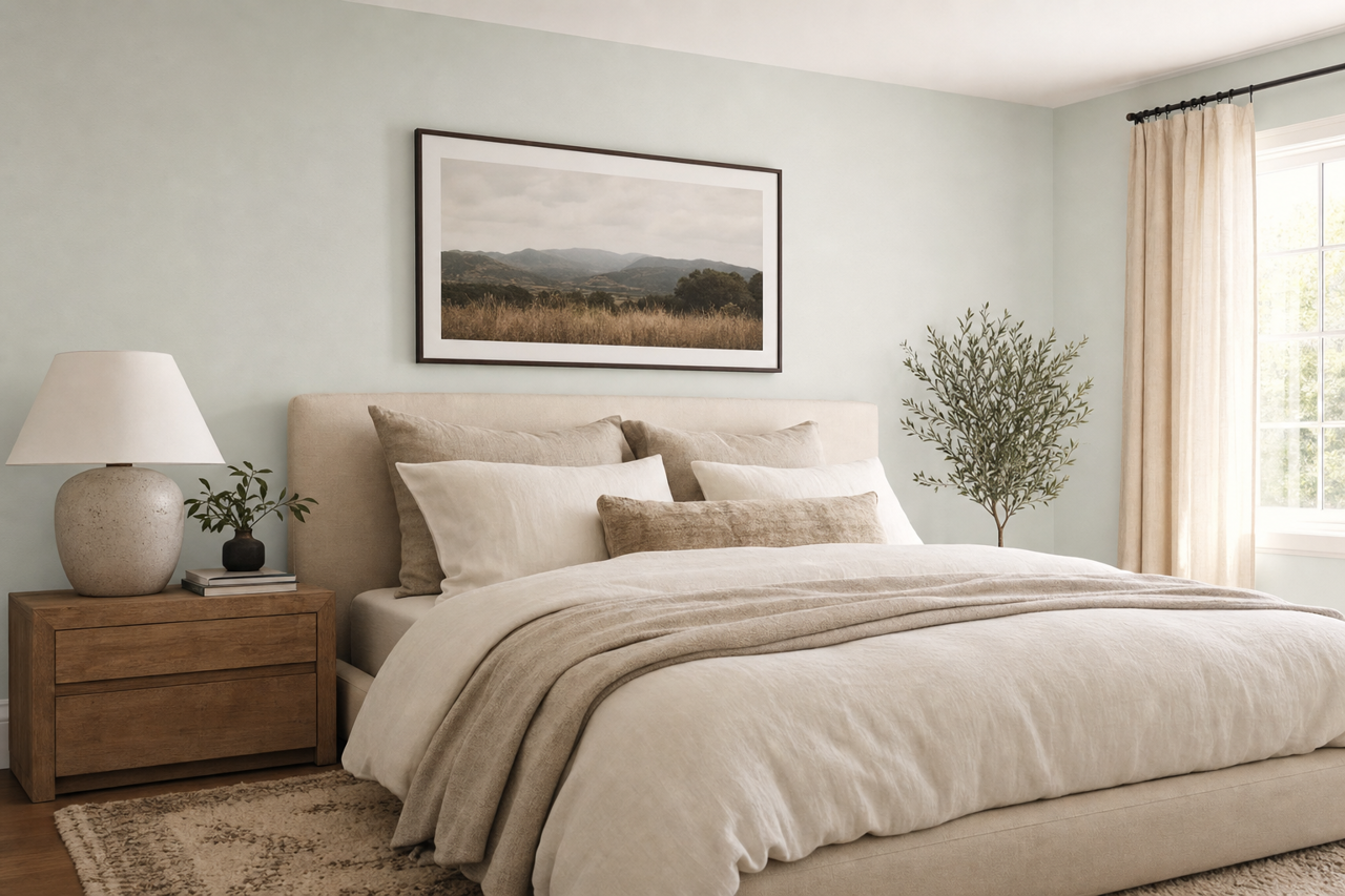
The calming undertones of Quiet 1563 make it a perfect choice for bedrooms. It promotes relaxation and pairs beautifully with soft linens in whites, creams, or pastels for a tranquil retreat.
Kitchens
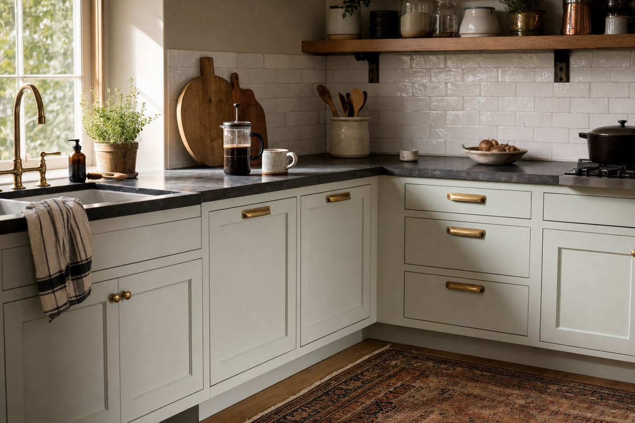
For kitchens, Quiet 1563 works wonderfully on cabinetry or walls. Pair it with crisp white countertops and backsplashes for a clean and modern look, or combine it with brass or matte black hardware for a touch of industrial elegance.
Bathrooms
Quiet 1563 transforms bathrooms into serene, spa-like spaces. Its neutral tones pair beautifully with marble finishes and chrome fixtures, creating a timeless and luxurious feel.
Offices
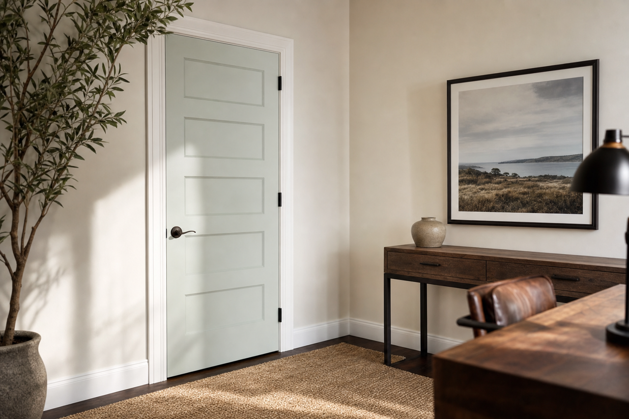
In home offices, Quiet 1563 fosters focus and productivity. Its muted, neutral quality is ideal for creating a calm and distraction-free environment.