
Benjamin Moore Sterling (1591): A Timeless, Versatile Gray
Benjamin Moore Sterling (1591) is a soft, mid-tone gray that exudes sophistication and versatility. This hue strikes a perfect balance between warm and cool, making it an ideal choice for a wide range of interior design styles. Whether you're aiming for a modern minimalist look or a cozy, traditional aesthetic, Sterling offers a neutral backdrop that enhances any space.
Undertones of Benjamin Moore Sterling
The beauty of Sterling lies in its subtle complexity. This gray has cool undertones, primarily leaning toward blue, yet it’s not overly stark or icy. The faint blue influence softens the color, giving it a calm and serene quality that works well in spaces where relaxation is key. The undertones ensure that Sterling maintains its neutrality while adding depth and character, avoiding the flatness that some grays can have.
Because of its cool undertones, Sterling complements other cool shades beautifully, but it also pairs surprisingly well with warm accents, making it a versatile choice for layering colors and textures.
Coordinating Colors
Benjamin Moore Sterling (1591) is incredibly adaptable and pairs harmoniously with a wide range of colors. Here are some coordinating hues to consider:
1. Crisp Whites
For a clean and classic look, pair Sterling with crisp whites such as Benjamin Moore Chantilly Lace (OC-65) or Simply White (OC-117). These whites amplify the softness of Sterling while maintaining a bright and airy feel.
2. Deep Blues
Bring out Sterling’s cool undertones by coordinating it with deep, rich blues like Hale Navy (HC-154) or Newburyport Blue (HC-155). This combination adds a touch of drama while maintaining a sophisticated palette.
3. Soft Beiges
For a warm contrast, pair Sterling with soft beige tones like Edgecomb Gray (HC-173) or Revere Pewter (HC-172). These hues create a subtle warmth that complements Sterling's cooler nature, resulting in a balanced and inviting space.
4. Muted Greens
Sterling works beautifully alongside muted greens like Sherwood Green (HC-118) or Soft Fern (2144-40). These earthy tones add an organic feel, perfect for spaces that aim to blend modernity with natural elements.
Ideal Uses for Benjamin Moore Sterling
Sterling is one of those rare colors that feels right at home in almost any room. Its understated elegance and adaptability make it a go-to choice for homeowners and designers alike. Here are some specific applications:
1. Living Rooms
Sterling’s airy quality makes it perfect for living rooms, especially when paired with plush textures and layered textiles. Use it as the main wall color to create a neutral foundation, then accent with pops of color in your furniture and décor.
2. Bedrooms
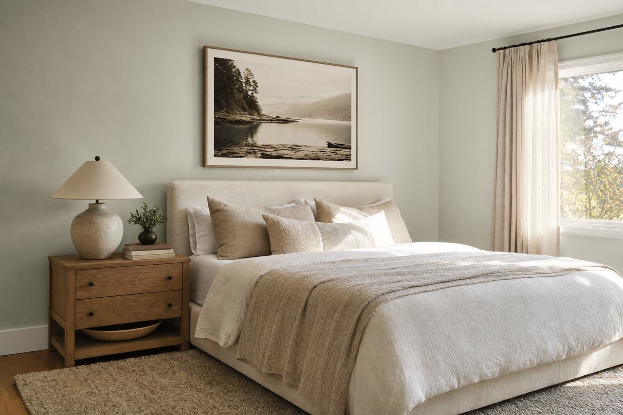
With its soothing undertones, Sterling is ideal for bedrooms. The soft gray promotes relaxation and pairs well with serene blues, whites, and muted pastels for a restful retreat.
3. Kitchens
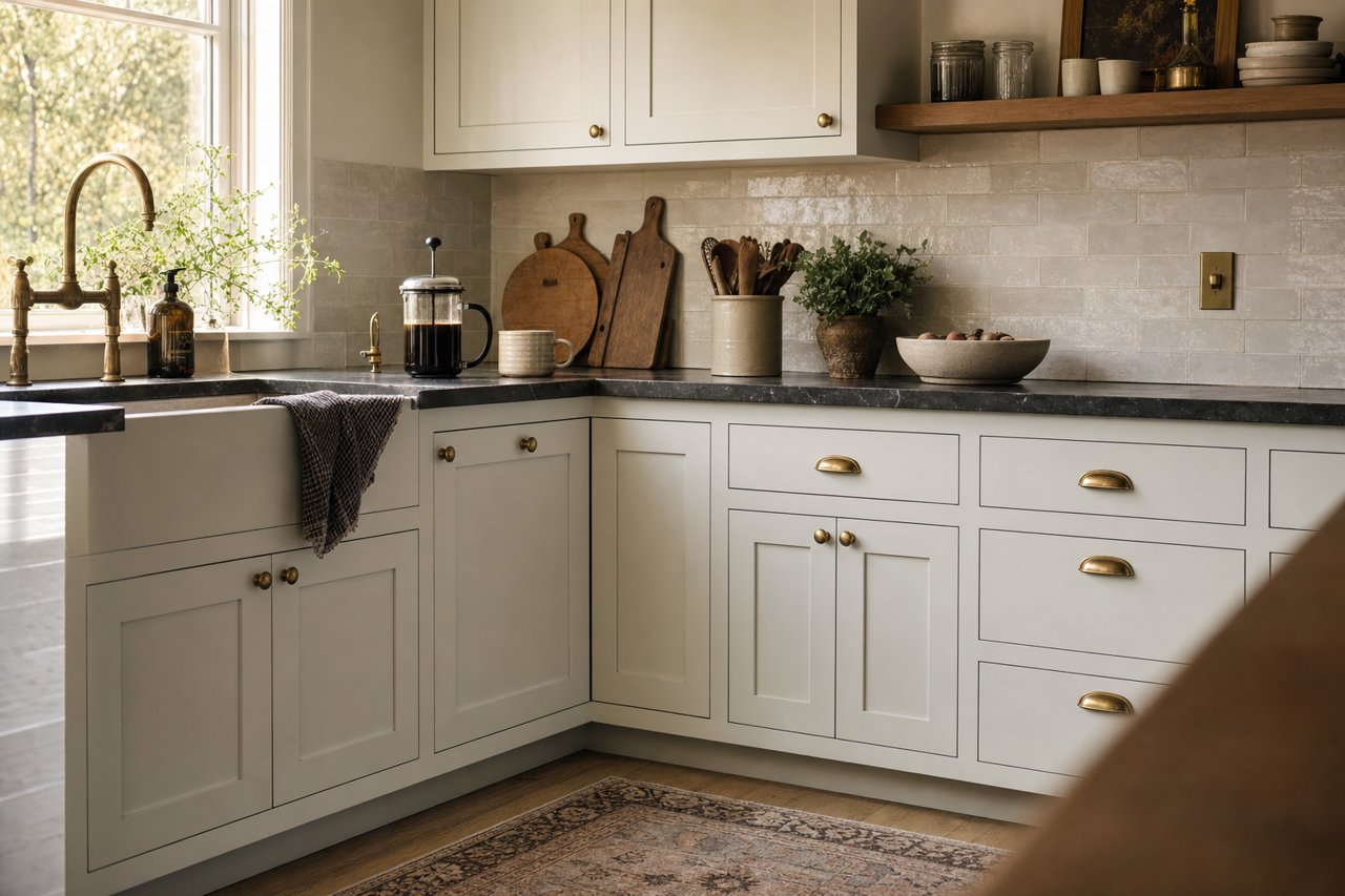
Sterling creates a clean and contemporary look in kitchens, particularly when paired with white cabinetry, stainless steel appliances, or marble countertops. Add wooden accents for warmth and contrast.
4. Bathrooms
The cool, calming nature of Sterling makes it an excellent choice for bathrooms. Pair it with crisp white tiles or brushed nickel fixtures for a spa-like atmosphere.
5. Offices
Sterling can help foster focus and creativity in home offices. Its neutral tone provides a clean canvas for productivity, while its cool undertones keep the space feeling fresh and modern.
Lighting Considerations
The appearance of Benjamin Moore Sterling can vary based on lighting conditions. In natural light, Sterling appears soft and serene, with its blue undertones creating a cool, understated effect. In artificial light, Sterling may lean slightly warmer depending on the bulb type, highlighting its versatility. Always test the color in different lighting scenarios to ensure it complements your space perfectly.
Why Choose Benjamin Moore Sterling?
Benjamin Moore Sterling (1591) is a timeless gray that adapts to both traditional and contemporary interiors. Its cool undertones, subtle elegance, and ability to coordinate with a wide range of hues make it a designer favorite. Whether you're refreshing a single room or reinventing your entire home, Sterling offers the perfect balance of neutrality and personality to elevate your space.