Benjamin Moore Graytint (1611): A Sophisticated and Versatile Neutral
Benjamin Moore Graytint (1611) is a timeless, modern gray that adds understated elegance to any space. Its soft, cool demeanor makes it an ideal choice for homeowners and designers seeking a neutral that works harmoniously across various design styles. Graytint’s subtle personality allows it to act as a backdrop or a design feature, depending on how it’s paired and applied.
Undertones: The Quiet Complexity of Graytint
Graytint is a light gray with cool undertones, leaning slightly toward blue. These undertones give it a crisp and refreshing quality, making it an excellent choice for spaces that benefit from a clean and airy atmosphere. The blue undertones ensure Graytint doesn’t feel heavy or overly neutral, striking a perfect balance between warmth and coolness. This makes it particularly suited for rooms with natural light, as the paint can shift beautifully throughout the day, from soft and serene to fresh and bright.
Coordinating Colors: Pairing Graytint for a Cohesive Palette
Graytint is incredibly versatile and pairs beautifully with other colors. Here are some coordinating options to consider:
1. Whites and Off-Whites
Graytint shines when paired with crisp whites like Benjamin Moore Chantilly Lace (OC-65) or softer off-whites such as Benjamin Moore White Dove (OC-17). These combinations create a clean and sophisticated look, perfect for minimalist or modern design styles.
2. Deep Charcoals and Blacks
For a bold and dramatic pairing, consider using Benjamin Moore Iron Mountain (2134-30) or Benjamin Moore Wrought Iron (2124-10). These darker hues provide striking contrast, making Graytint pop while maintaining a cohesive, contemporary vibe.
3. Blues and Greens
Graytint’s cool undertones complement soft blues like Benjamin Moore Boothbay Gray (HC-165) or muted greens such as Benjamin Moore Soft Fern (2144-40). These pairings evoke a sense of tranquility and work beautifully in coastal or nature-inspired interiors.
4. Warm Neutrals
To create balance and add depth to the space, pair Graytint with warm neutrals like Benjamin Moore Revere Pewter (HC-172) or Benjamin Moore Pale Oak (OC-20). These combinations bring subtle warmth to the cool tones of Graytint, resulting in a harmonious palette.
Best Uses for Graytint in Interior Design
Graytint is a versatile color that works well in a variety of applications. Below are some creative ways to incorporate it into your design:
1. Living Rooms
Graytint is an excellent choice for living rooms, where its cool undertones create a calming environment. Pair it with plush textiles in whites, blues, or muted yellows for a layered and inviting look.
2. Bedrooms
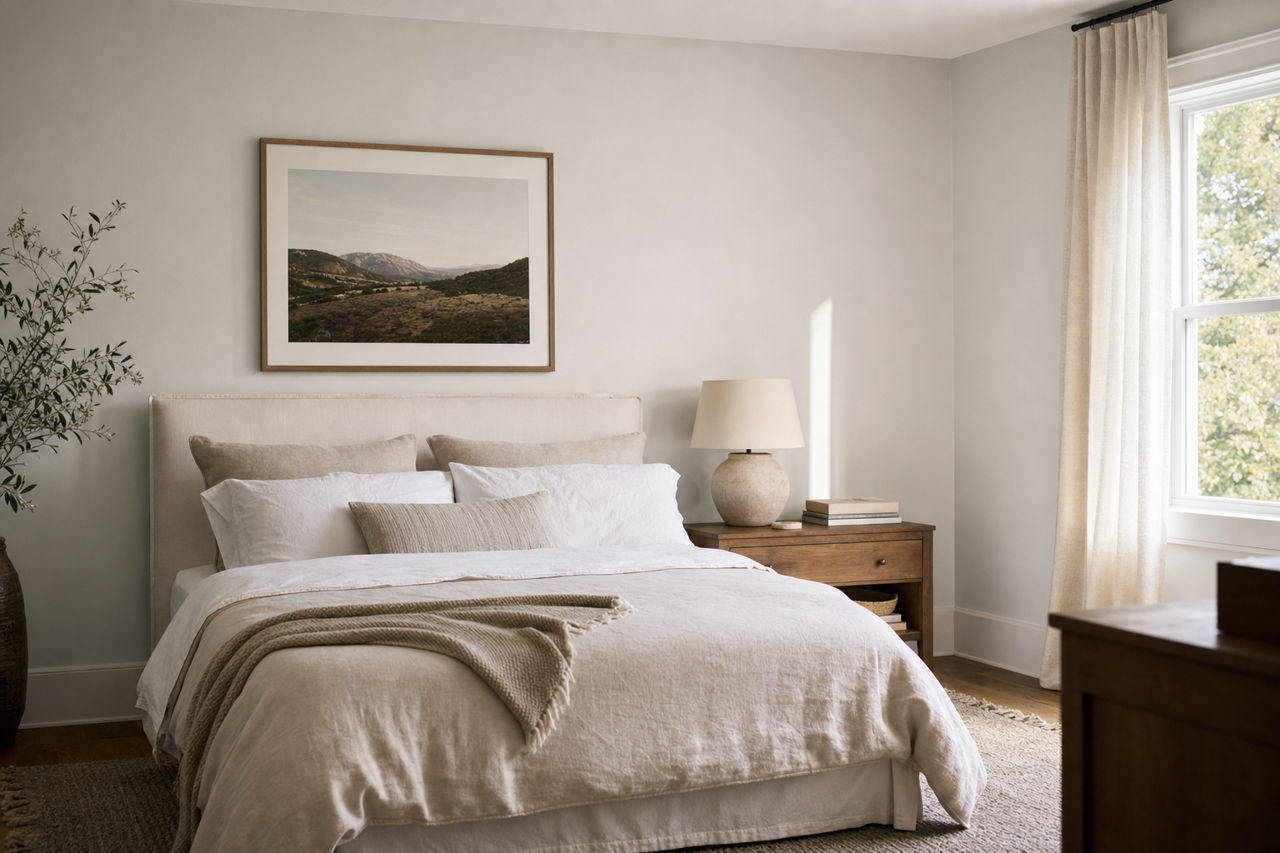
For a serene retreat, Graytint can be used on bedroom walls to create a soothing atmosphere. Complement it with crisp white bedding and soft accents in pastel colors to enhance the tranquil vibe.
3. Kitchens
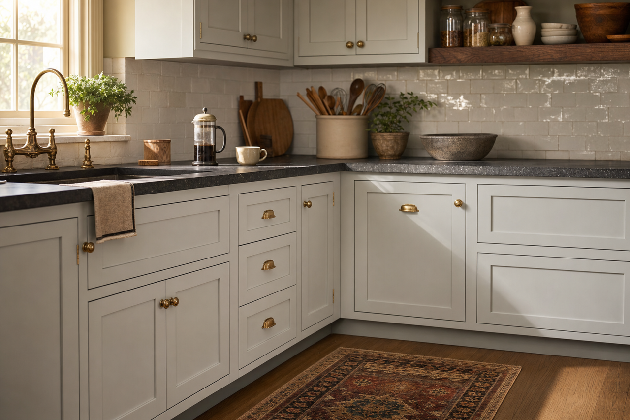
Graytint’s fresh and clean qualities make it ideal for kitchens. Pair it with white cabinetry, stainless steel appliances, and marble countertops for a modern and polished aesthetic. It’s also a great choice for a backsplash area or as a feature wall.
4. Bathrooms
In bathrooms, Graytint contributes to a spa-like ambiance. Pair it with polished chrome fixtures, white tiles, and soft gray or blue accents for a rejuvenating space.
5. Hallways and Entryways
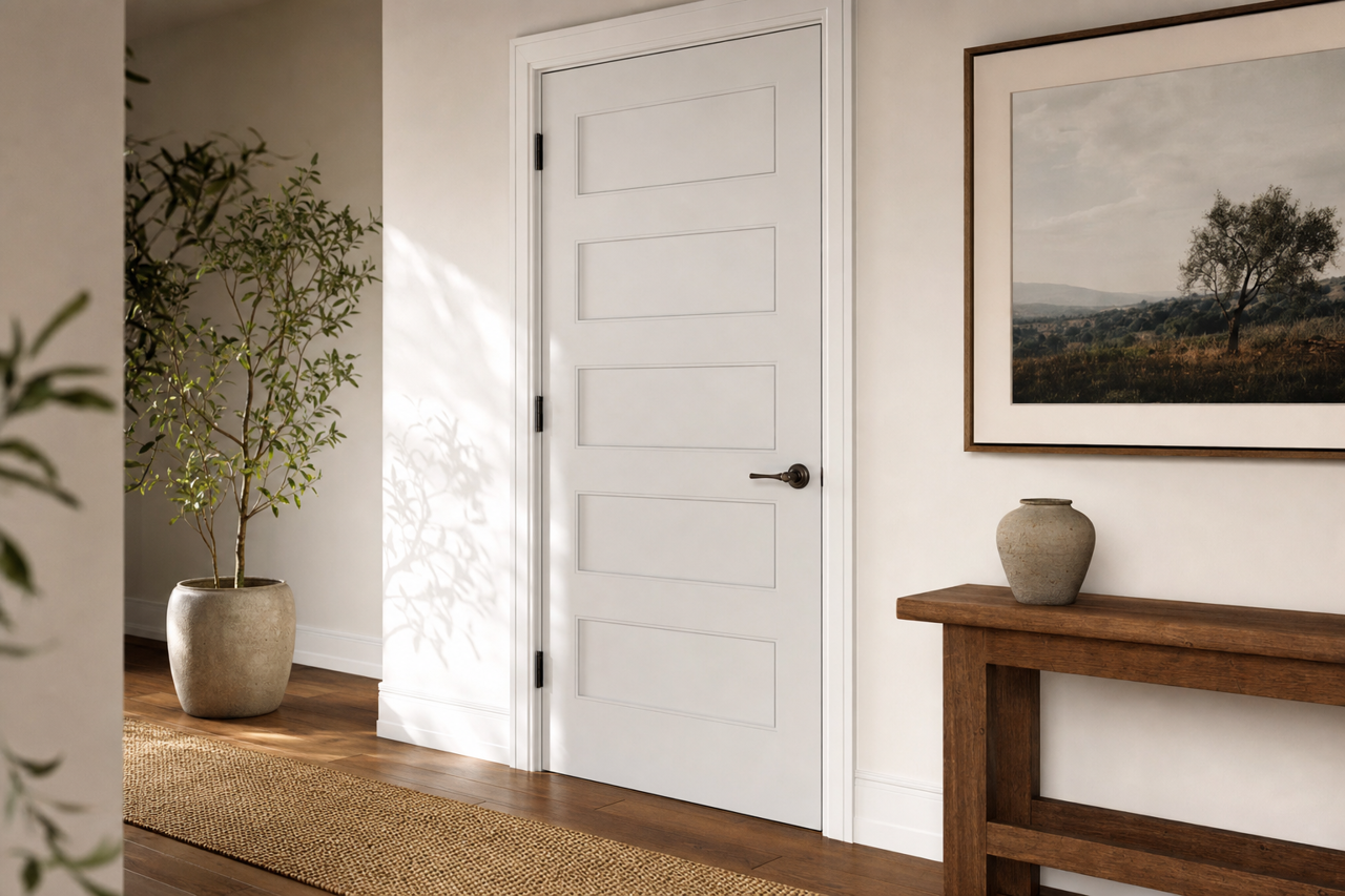
Graytint is a fantastic option for hallways and entryways, where its neutral tones create a welcoming and cohesive flow between rooms. Add visual interest with bold artwork or colorful rugs.
Why Designers Love Graytint
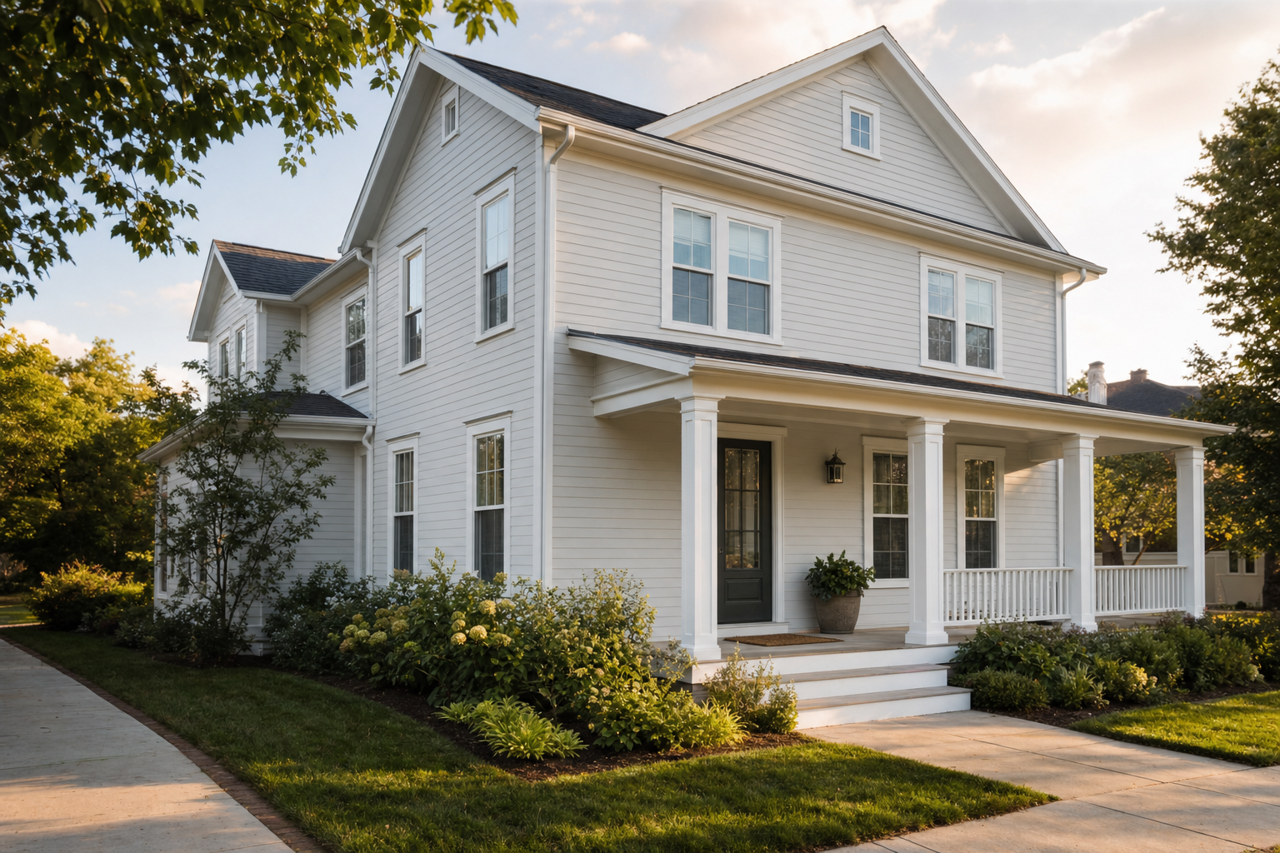
Benjamin Moore Graytint (1611) is a favorite among interior designers because of its ability to adapt to different spaces and styles. Whether used in a contemporary apartment, a coastal retreat, or a traditional family home, Graytint delivers sophistication and versatility. Its cool undertones create a fresh and modern feel that elevates any room, while its neutrality ensures it doesn’t overpower other design elements.
Graytint is the epitome of understated elegance, offering a refined gray that enhances any interior. Whether paired with crisp whites, bold charcoals, or soft pastels, it serves as the perfect canvas for creating a harmonious and beautiful space.