Valspar Créme Brûlée (2008-6C): A Warm, Golden Beige for Timeless Elegance
Valspar Créme Brûlée (2008-6C) is a sophisticated and versatile paint color that blends the warmth of golden beige with subtle creamy undertones. Its inviting shade evokes the richness and comfort of the classic dessert it’s named after, making it an excellent choice for creating spaces that feel cozy yet refined. With its ability to adapt to various design styles, Créme Brûlée is a go-to color for homeowners and designers looking to achieve a timeless aesthetic.
Undertones of Valspar Créme Brûlée
Créme Brûlée features soft yellow and warm beige undertones, giving it a golden glow that feels earthy yet luxurious. These undertones allow the color to shift subtly depending on the lighting in your space. In natural light, it leans toward a sunlit golden hue, while in artificial lighting, the creamy beige aspects become more pronounced, creating a sense of warmth and intimacy.
Its undertones work beautifully in spaces where you want a touch of sophistication without overwhelming boldness. This color is ideal for creating a welcoming atmosphere that feels grounded yet polished.
Coordinating Colors
The versatility of Valspar Créme Brûlée allows it to pair seamlessly with a wide range of coordinating colors, whether you’re designing a monochromatic palette or adding contrasting accents.
- Neutral Pairings: Pair Créme Brûlée with soft whites like Valspar Swiss Coffee or Valspar Dove White for a clean, classic look. These neutrals emphasize the creamy undertones of Créme Brûlée and create a sense of spaciousness.
- Earthy Complements: Combine Créme Brûlée with deeper taupes, such as Valspar Coastal Villa or Valspar Smoky Quartz, for a layered, earthy palette. These shades bring out the beige warmth and add depth to your design.
- Bold Accents: For a dramatic contrast, consider pairing it with rich jewel tones like emerald green or deep navy. Colors such as Valspar Sea Sapphire or Valspar Forest Canopy will add a striking touch without overpowering the softness of Créme Brûlée.
- Metallic Highlights: Accent your space with gold or brass fixtures to complement the golden undertones of this shade. These metallic finishes enhance its luxurious appeal and create a cohesive, polished look.
Uses and Applications
Valspar Créme Brûlée is a versatile paint color suitable for a variety of interior spaces, from traditional to modern designs. Its adaptable nature allows it to shine in both large and small areas, making it a favorite among homeowners and interior designers alike.
- Living Rooms: The warm and inviting nature of Créme Brûlée makes it an ideal choice for living rooms. Pair it with plush neutral furniture and textured throws for a cozy yet elegant space. Add pops of color with accent pillows or artwork for a personal touch.
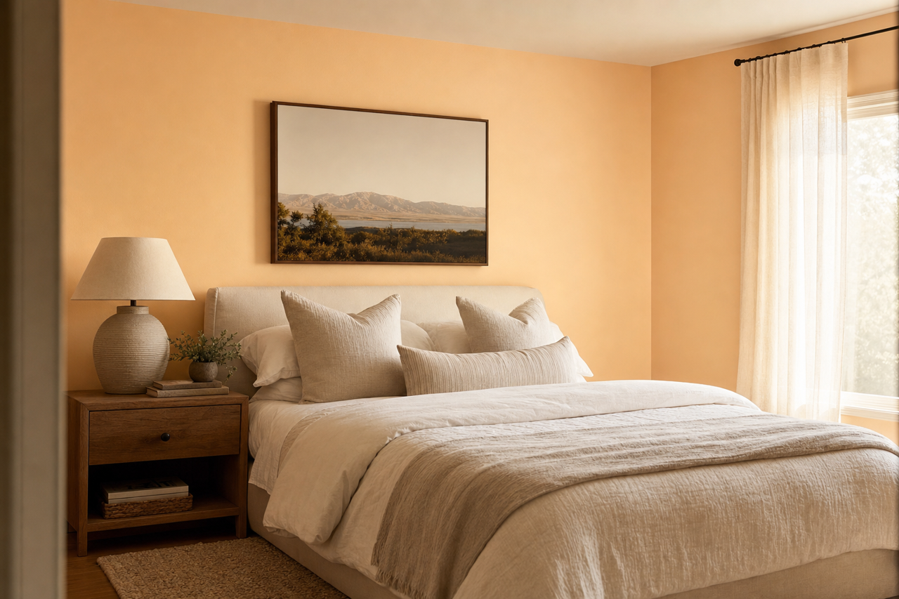
- Bedrooms: Create a relaxing retreat by using Créme Brûlée in bedrooms. Its creamy undertones promote tranquility, especially when paired with soft linens and natural wood furniture. Add bedside lamps with warm lighting to enhance the golden glow.
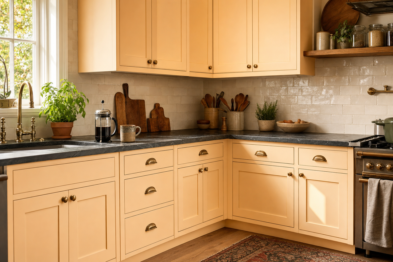
- Kitchens and Dining Areas: This shade works beautifully in kitchens and dining rooms, where it can complement cabinetry in both light and dark finishes. Pair it with marble countertops or wood accents for a balanced, inviting environment.
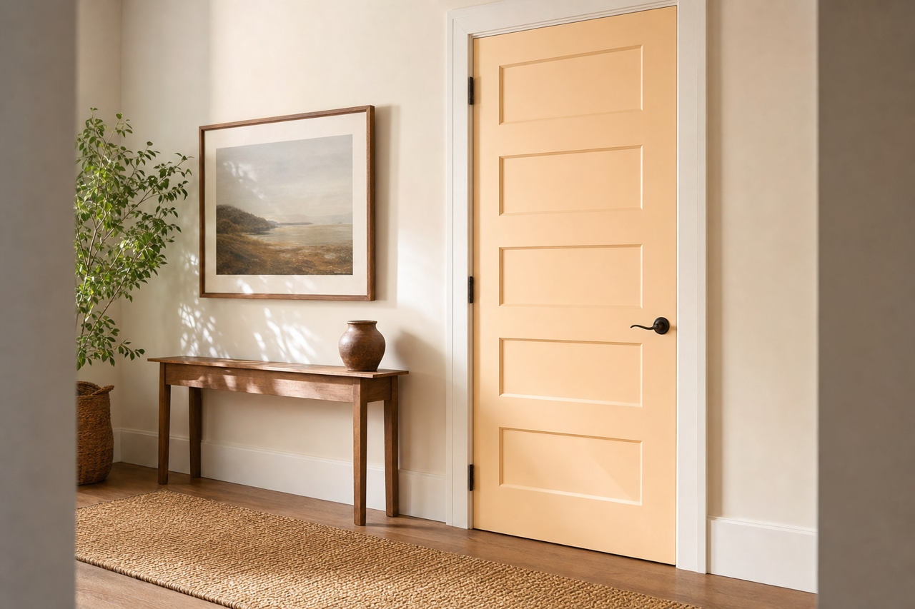
- Hallways and Entryways: Use Créme Brûlée in high-traffic areas like hallways and entryways to create a welcoming ambiance. Its timeless appeal ensures it will look fresh for years to come, especially when paired with clean white trim.
- Offices and Reading Nooks: For spaces dedicated to focus and relaxation, Créme Brûlée’s warm undertones provide a calming backdrop. Pair it with soft lighting, natural wood finishes, and greenery for a serene environment.
Lighting Considerations
Lighting plays a significant role in showcasing the beauty of Valspar Créme Brûlée. In spaces with ample natural light, its golden beige tones take center stage, creating a bright and uplifting atmosphere. In dimmer settings, the creamy undertones become more prominent, offering a cozy and grounded feel. For best results, test the color in your space under various lighting conditions before committing to ensure it aligns with your vision.
Valspar Créme Brûlée (2008-6C) is more than just a paint color—it's a statement of warmth, elegance, and versatility. Whether you're revamping a single room or designing an entire home, this timeless shade offers endless possibilities to elevate your interior spaces.