Valspar Orange Maple (2010-5): A Warm, Inviting Hue for Every Space
Valspar Orange Maple (2010-5) is a rich, earthy shade that exudes warmth and character. This color brings to mind the natural beauty of autumn leaves and the cozy ambiance of a crackling fire. Its captivating orange tone, balanced with subtle brown undertones, creates a grounded and welcoming atmosphere, making it an excellent choice for both classic and contemporary interiors.
Undertones: Warm and Balanced
The defining feature of Orange Maple is its understated brown undertones, which soften the intensity of the orange and give it a sophisticated, muted quality. This balance prevents the color from feeling overpowering, offering a more approachable and versatile hue. The warm undertones also enhance its ability to pair harmoniously with an array of coordinating shades, making it a flexible choice for various design schemes.
Coordinating Colors: Creating Harmony
To bring out the best in Valspar Orange Maple, consider pairing it with complementary or contrasting colors that highlight its richness. Some excellent coordinating options include:
- Creamy Whites: Shades like Valspar Honeymilk or Swiss Coffee provide a clean, neutral backdrop that allows Orange Maple to take center stage. This pairing is perfect for creating a bright, inviting aesthetic.
- Earthy Greens: Olive-toned greens, such as Valspar Green Tea Leaves or Laurel Ridge, create a harmonious blend that evokes the natural beauty of a forest in fall. This combination works exceptionally well in living rooms or dining areas.
- Deep Charcoals or Browns: Darker shades like Valspar Fired Earth or Noir can add drama and sophistication, making Orange Maple stand out as an accent color in spaces like bedrooms or libraries.
- Muted Blues: Soft, dusty blues like Valspar Blue Twilight offer a subtle contrast that feels balanced and serene, great for creating a calming yet stylish vibe.
Suggested Uses: Versatility in Every Room
Orange Maple is a dynamic shade that can be used in various ways to transform your space:
- Living Rooms: Create a cozy, inviting living area by using Orange Maple on an accent wall. Pair it with natural wood furniture and cream-colored textiles for a warm, rustic aesthetic.
- Dining Areas: The warm, earthy tones of Orange Maple make it an ideal choice for dining rooms. It encourages a sense of comfort and togetherness, enhancing the overall dining experience.
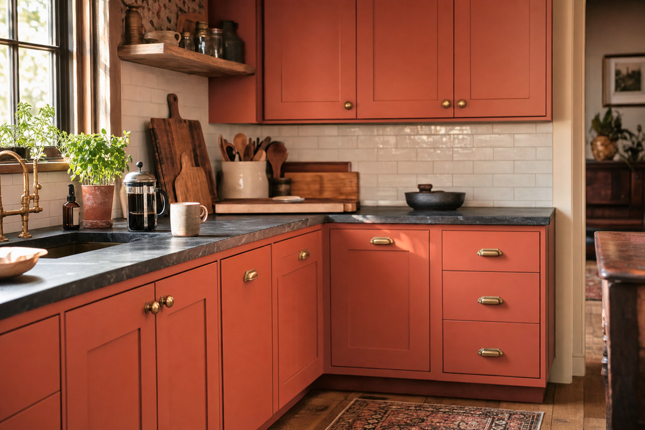
- Kitchens: Use Orange Maple for cabinetry or an accent wall to add a pop of color that feels fresh yet grounded. Pair it with matte black hardware and white countertops for a modern farmhouse vibe.
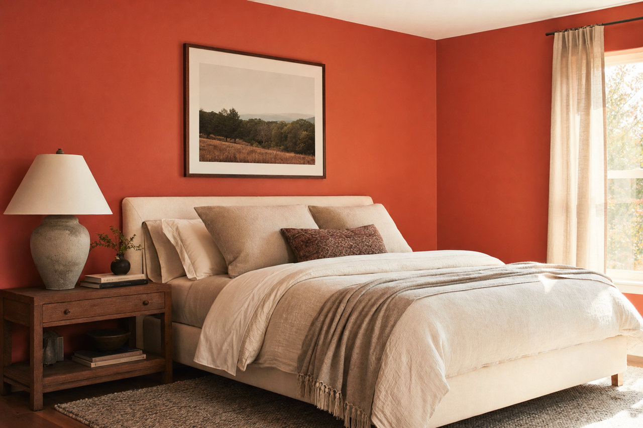
- Bedrooms: Create a serene, cocoon-like environment by painting your bedroom walls in Orange Maple. Balance it with soft beige bedding and touches of greenery for a peaceful retreat.
- Home Offices: Orange Maple’s warm undertones can boost creativity and focus. Use it as a feature wall color and pair it with crisp whites and metallic accents for a productive yet stylish workspace.
Lighting Considerations
Orange Maple’s appearance can shift subtly depending on the lighting in your space. In natural light, the orange tones become more pronounced, creating a bright and cheerful ambiance. Under warm artificial lighting, the brown undertones emerge, lending a cozier, more intimate feel. It’s a versatile color that adapts beautifully to different lighting scenarios, making it a reliable choice for any room.
Why Choose Valspar Orange Maple?
Valspar Orange Maple (2010-5) is more than just a paint color—it’s a statement. Its warm undertones, versatility, and ability to harmonize with a wide range of coordinating colors make it a standout choice for homeowners and designers alike. Whether you're creating a rustic retreat, a modern oasis, or a timeless traditional space, Orange Maple adds depth, character, and warmth that elevate the overall design of your home.