Benjamin Moore Galápagos (2057-20): A Bold, Exquisite Blue
Benjamin Moore Galápagos (2057-20) is a striking and deeply saturated shade of blue that evokes the mystery and beauty of tropical waters. This rich, jewel-toned color makes a bold statement, offering an air of sophistication and drama to any space. Whether you're looking to create a focal point or build a cohesive design theme, Galápagos provides versatility and timeless allure.
Undertones of Galápagos (2057-20)
Galápagos is not a simple blue—it boasts subtle green undertones that lend it its unique depth and complexity. These green hints give the shade a slightly aquatic quality, reminiscent of serene ocean depths or lush island lagoons. The undertone balance ensures that this color feels dynamic and dimensional, making it a fantastic choice for spaces that thrive on energy and personality. Depending on lighting, it can appear more vibrant during the day and moodier in the evening, offering a chameleon-like adaptability.
Coordinating Colors for Galápagos
When working with such a bold statement color, choosing complementary hues can make or break your design. Fortunately, Galápagos pairs beautifully with a variety of tones, allowing you to create a harmonious palette.
Neutral Pairings
- Cloud White (OC-130): This warm white creates a crisp, clean contrast that allows Galápagos to shine without feeling overwhelming.
- Shaker Beige (HC-45): A soft, sandy beige tone that complements Galápagos’ aquatic vibe, grounding the space with warmth.
Cool Accents
- Wickham Gray (HC-171): A light, cool gray that enhances the green undertones in Galápagos, adding sophistication to the overall look.
- Tranquil Blue (2051-50): A softer, muted blue that creates a monochromatic scheme, perfect for a calming and cohesive design.
Bold Contrasts
- Golden Straw (2152-50): A warm, golden yellow that provides a striking contrast, adding vibrancy and energy to the space.
- Dark Olive (2140-30): A deep, earthy green that plays up the natural undertones of Galápagos for a lush, dramatic effect.
Recommended Uses for Galápagos
Galápagos is a color that demands attention, making it ideal for spaces where you want to make a memorable impression. Here are some inspired ways to use this gorgeous hue:
1. Statement Walls
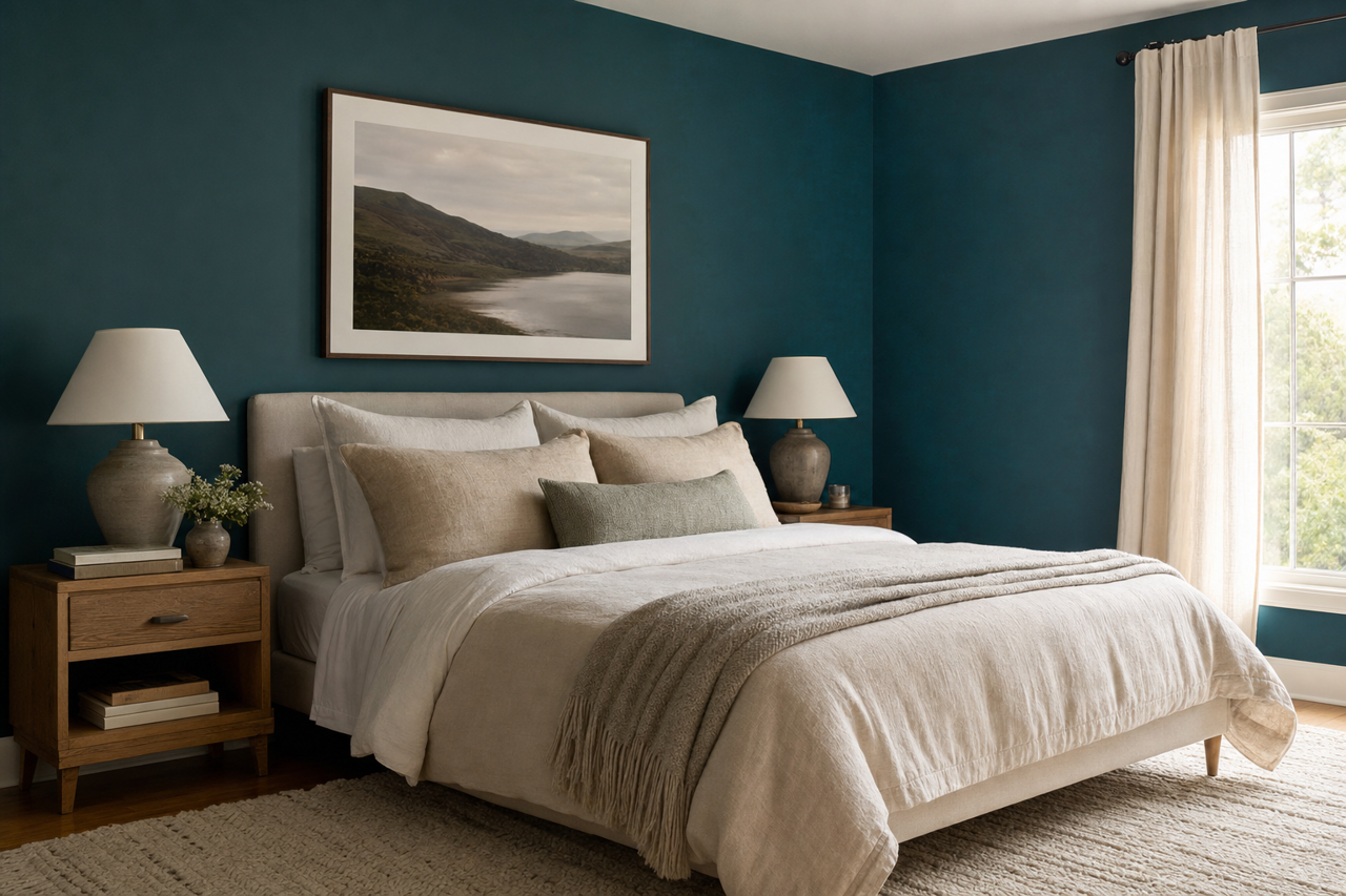
Use Galápagos as an accent wall in living rooms, bedrooms, or dining areas to draw the eye and create a focal point. Pair it with neutral walls and light furniture for balance.
2. Cabinets and Built-Ins
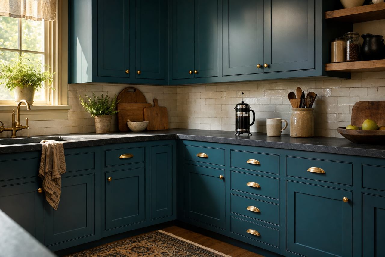
This bold blue is perfect for kitchen cabinetry or built-ins in an office or library. Its deep, dramatic tone adds depth while maintaining a modern, luxurious feel. For a nautical-inspired kitchen, pair Galápagos cabinets with brass hardware and marble countertops.
3. Front Doors and Exteriors
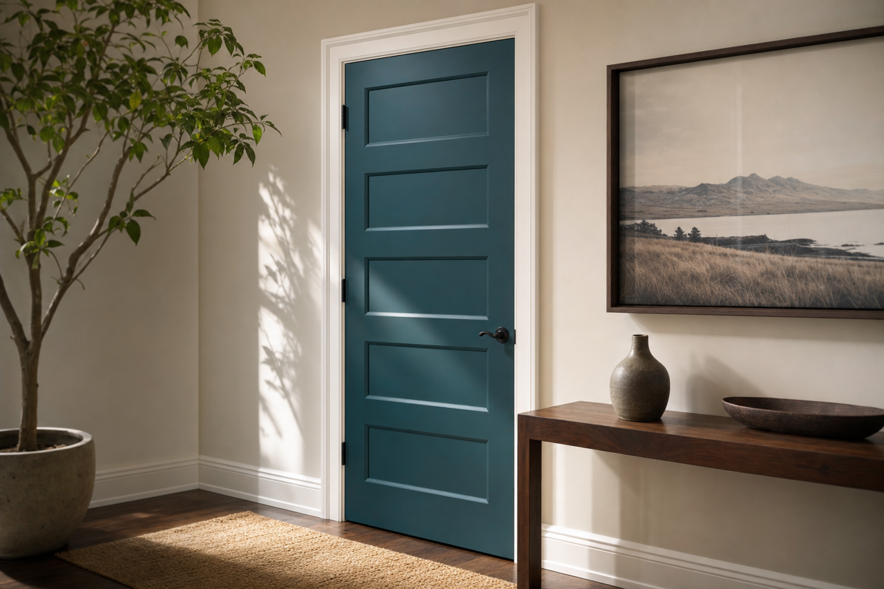
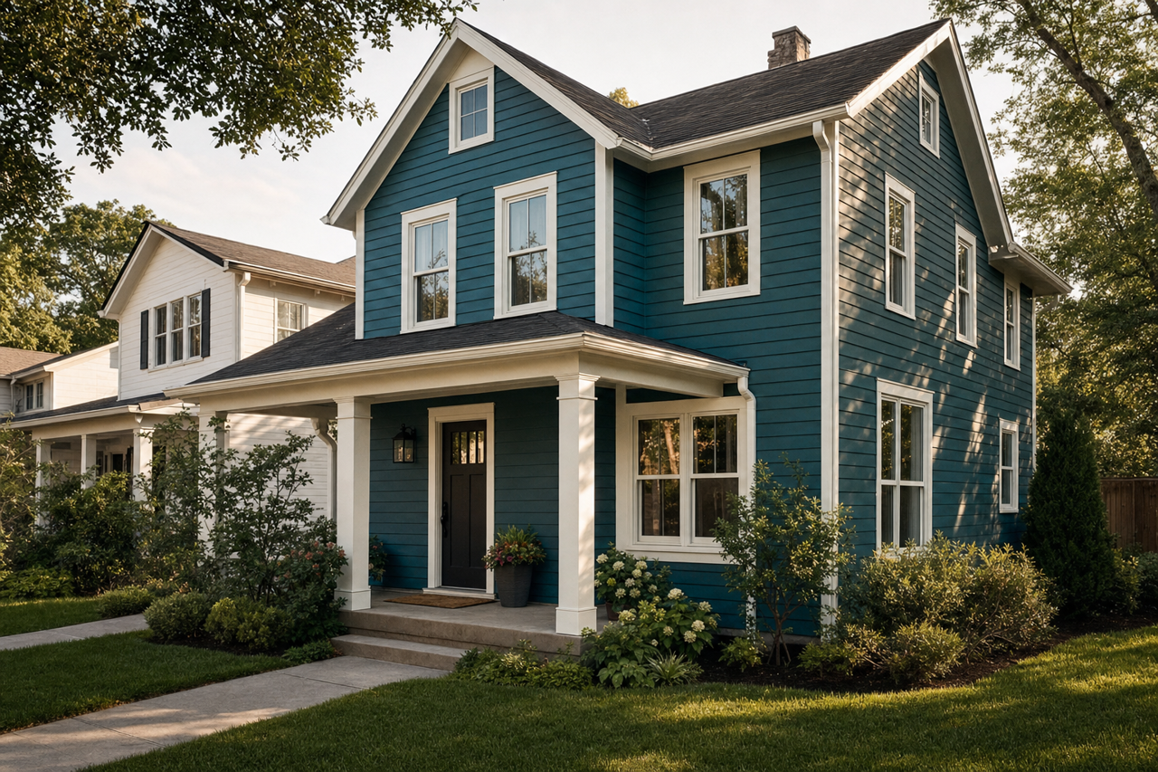
Make a lasting first impression by painting your front door or shutters in Galápagos. This color's vibrancy stands out beautifully against traditional white or gray exteriors, adding curb appeal with a pop of personality.
4. Powder Rooms
Galápagos is an excellent choice for powder rooms, where bold colors can shine without overwhelming. Pair it with polished chrome fixtures and white accents for a chic, contemporary look.
5. Creative Spaces
For home offices, art studios, or reading nooks, Galápagos fosters creativity and focus. Its rich tone inspires thought and imagination, making it the perfect backdrop for spaces where ideas flow.
Lighting Considerations
As with any deep, saturated color, lighting plays a crucial role in how Galápagos is perceived. In spaces with ample natural light, the green undertones may become more prominent, creating a vibrant and tropical vibe. In dimmer settings, the color takes on a more subdued, moody quality, adding depth and intrigue. Consider testing it in your space with both daylight and artificial lighting to determine the effect you prefer.
Why Choose Benjamin Moore Galápagos?
If you’re seeking a color that embodies luxury, drama, and a touch of the exotic, Benjamin Moore Galápagos (2057-20) is an impeccable choice. Its multifaceted undertones, adaptability to varying light conditions, and ability to pair with a wide range of colors make it a designer favorite. From coastal-inspired interiors to contemporary urban spaces, this shade delivers unparalleled elegance and personality. Make your home unforgettable with the vibrant beauty of Galápagos.