Benjamin Moore Blue (2062-50): A Timeless and Versatile Hue
Benjamin Moore Blue (2062-50) is a striking color that balances boldness and sophistication, making it a go-to choice for modern and transitional interiors. This rich, saturated shade of blue evokes a sense of depth and tranquility, while its vibrant energy keeps it from feeling overly subdued. Perfectly positioned between a true blue and a slightly cool cobalt, Benjamin Moore Blue is adaptable to a variety of design styles, from coastal-inspired spaces to sleek urban homes.
Undertones That Define the Shade
Benjamin Moore Blue (2062-50) carries cool undertones that lean toward violet, giving the color a subtle complexity. These undertones make the shade feel crisp and clean, while allowing it to pair beautifully with cooler hues like grays and whites. However, its depth ensures it doesn't skew icy or sterile, maintaining a sense of warmth and approachability despite its cooler base.
The violet undertones also give this blue a luxurious quality, making it ideal for creating bold statements in a room without feeling overpowering. Whether used as an accent or a dominant wall color, Benjamin Moore Blue adds layers of sophistication and intrigue to your space.
Coordinating Colors for a Harmonious Palette
Benjamin Moore Blue (2062-50) is a versatile color that pairs effortlessly with a variety of other hues, allowing for dynamic and visually appealing combinations.
Neutral Pairings:
- Chantilly Lace (OC-65): A crisp, bright white that contrasts beautifully with Benjamin Moore Blue, creating a clean, fresh look.
- Gray Owl (2137-60): A soft gray with green undertones that adds a subtle warmth to balance the coolness of the blue.
Bold Accents:
- Yellow Highlighter (2021-40): A vibrant yellow that pops against the deep blue, perfect for adding energy and playfulness to a space.
- Caliente (AF-290): A rich, fiery red that creates a dramatic and modern contrast with Benjamin Moore Blue.
Earthy Complements:
- Kendall Charcoal (HC-166): A deep, moody gray that creates a sophisticated pairing for a monochromatic palette.
- White Dove (OC-17): A creamy off-white that softens Benjamin Moore Blue, lending a warmer and more traditional feel.
Design Uses for Benjamin Moore Blue
Benjamin Moore Blue (2062-50) is versatile enough to be used in a variety of spaces and applications, from single accent walls to entire rooms. Here's how you can incorporate this timeless hue into your home:
Accent Walls and Statement Pieces
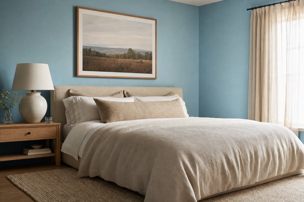
This bold blue is an excellent choice for creating accent walls that anchor a room. Use it behind a headboard in a bedroom, or as a backdrop for a gallery wall in a living room to draw attention to key features of your space. Pair it with metallics like gold or brass for added glamour and sophistication.
Cabinetry and Built-Ins
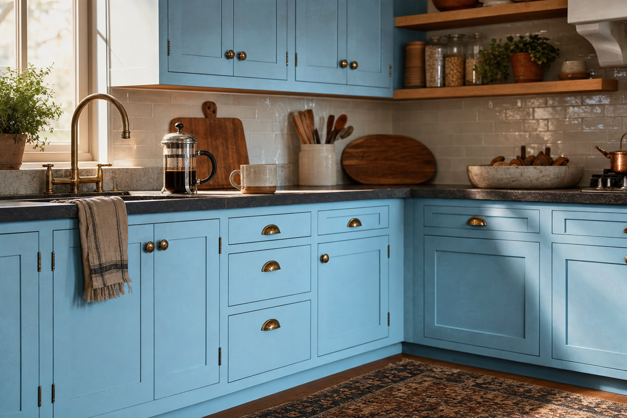
Transform your kitchen or office with Benjamin Moore Blue on cabinets or built-in shelves. Its rich tone adds depth and drama, bringing new life to otherwise utilitarian spaces. When paired with white countertops and backsplash tiles, it creates a crisp, timeless look that feels both contemporary and classic.
Living Spaces and Bedrooms
Benjamin Moore Blue’s calming yet energizing qualities make it a perfect choice for living rooms and bedrooms. It encourages relaxation while adding personality to your space. Pair it with plush textures like velvet or linen for a luxurious feel, or incorporate natural wood tones to create balance.
Bathrooms and Powder Rooms
For smaller spaces, Benjamin Moore Blue can make a bold statement without overwhelming the room. Use it on walls or vanity cabinets to create a spa-like atmosphere. Pair it with marble or white subway tiles for a clean, polished look that feels fresh and modern.
Exterior Applications
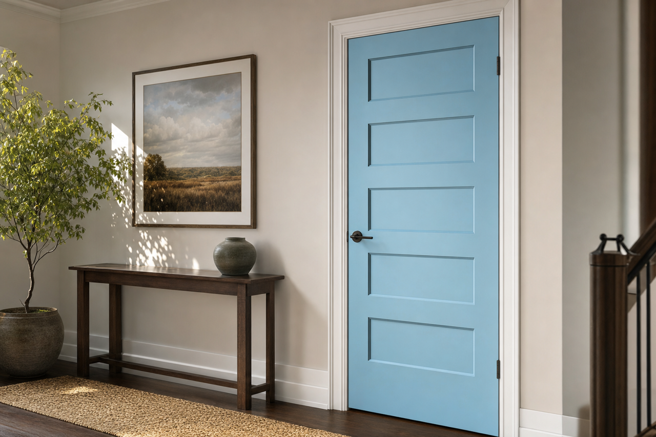
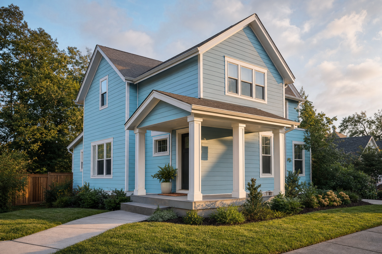
Benjamin Moore Blue isn't just for interiors—it’s a stunning choice for exterior doors, shutters, or even siding. Its deep hue adds curb appeal while maintaining a timeless elegance. Pair it with white trim for a classic look or with darker grays for a more contemporary feel.
Why Choose Benjamin Moore Blue (2062-50)?
Benjamin Moore Blue (2062-50) offers a unique blend of vibrancy and versatility. Its cool undertones, depth of color, and ability to coordinate with a wide range of shades make it an excellent option for adding personality and sophistication to any space. Whether you're looking to refresh a single room or transform the entire aesthetic of your home, this timeless blue delivers impact and elegance in equal measure.