Benjamin Moore Spring (2077-40): A Vibrant Burst of Optimism
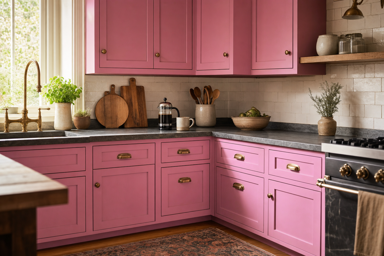
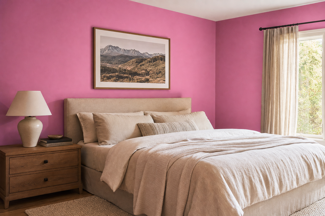
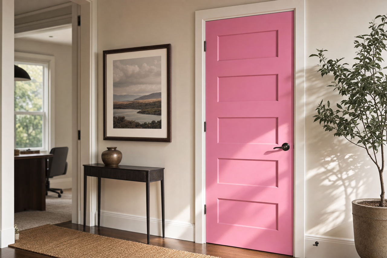
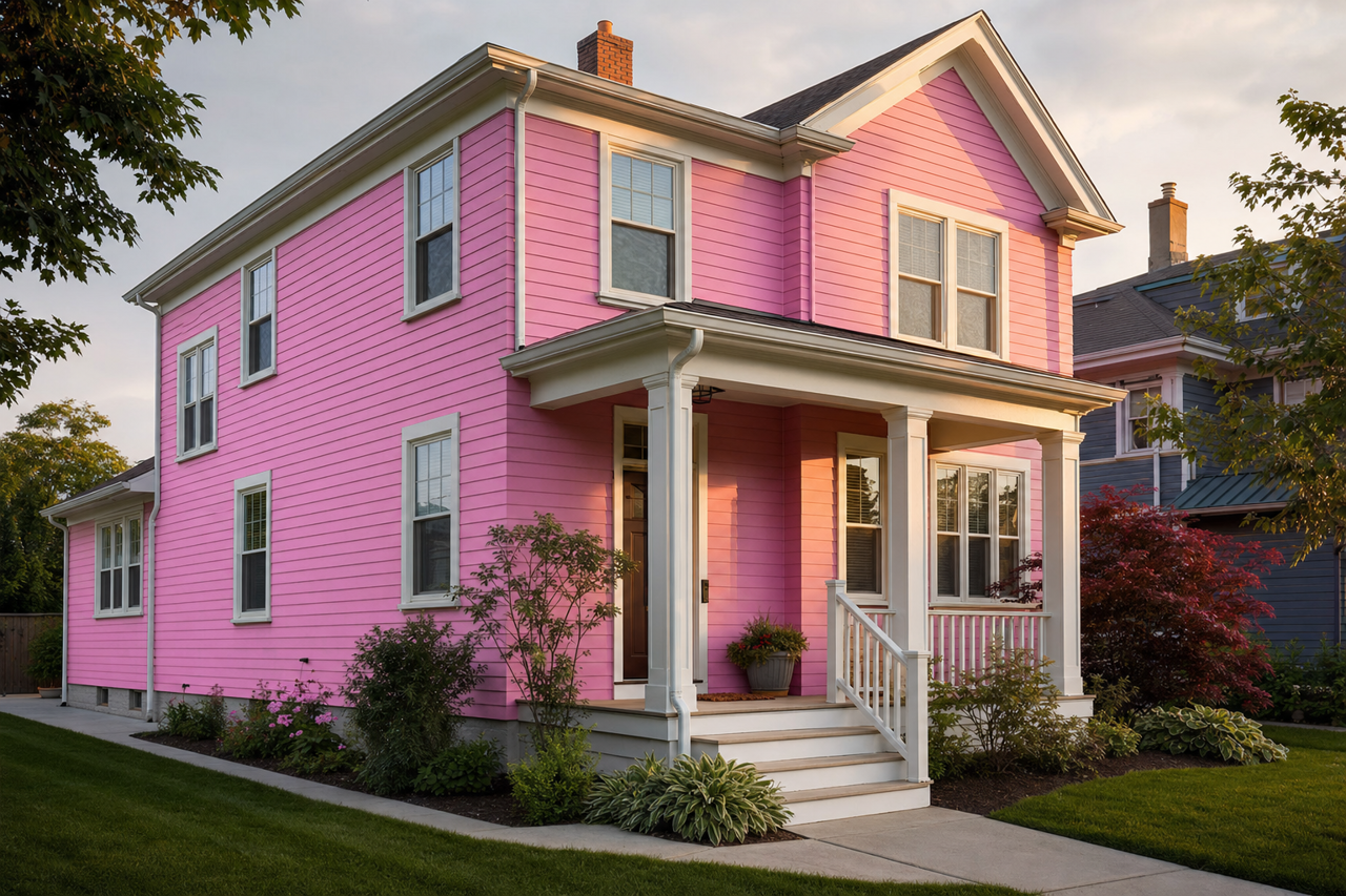
Benjamin Moore Spring (2077-40) is a lively and bold magenta hue that embodies energy, creativity, and a sense of playful sophistication. Perfect for spaces that need a statement-making color, this striking pink-purple shade brings a modern edge to any interior while maintaining a sense of warmth and approachability. Whether incorporated as an accent or used as the primary color in a room, Spring (2077-40) creates an unforgettable impact that inspires joy and individuality.
Undertones of Benjamin Moore Spring (2077-40)
Spring (2077-40) is a captivating shade with subtle undertones of both purple and red. These undertones give the color its rich magenta character, balancing vibrancy with depth. The purple undertones lend a regal quality, while the red base adds warmth and energy, making this color feel dynamic yet grounded. It’s a shade that adapts beautifully to different lighting conditions, appearing brighter in direct sunlight and richer in dimmer settings.
Coordinating Colors for Benjamin Moore Spring (2077-40)
Benjamin Moore Spring (2077-40) pairs wonderfully with an array of complementary and contrasting hues to create stunning palettes:
Neutral Pairings:
- White Dove (OC-17): A soft white that balances the boldness of Spring, creating a clean and sophisticated contrast.
- Edgecomb Gray (HC-173): A warm greige that grounds Spring's vibrancy while maintaining a modern aesthetic.
- Chantilly Lace (OC-65): A crisp, bright white that enhances the vividness of Spring without overpowering it.
Contrasting Bold Colors:
- Black Satin (2131-10): A deep black that adds drama and depth when paired with Spring, perfect for a high-impact design.
- Golden Honey (297): A rich golden-yellow that brings out the playful side of Spring, creating a joyful and dynamic pairing.
- Cool Aqua (2058-40): A refreshing teal that juxtaposes beautifully with Spring, adding a touch of vibrancy and balance.
Earthy Complements:
- Pale Oak (OC-20): A soft taupe that tones down Spring without diminishing its energy.
- Kendall Charcoal (HC-166): A deep gray that adds sophistication and contrasts perfectly with Spring's brightness.
These pairings allow for versatility in design, whether you're aiming for a bold statement or a more balanced, harmonious look.
Best Uses for Benjamin Moore Spring (2077-40)
Benjamin Moore Spring (2077-40) is an incredibly versatile color that can be used in both residential and commercial spaces. Here are some creative ways to incorporate this vibrant shade into your interior design:
Accent Walls:
Spring makes for an eye-catching accent wall in living rooms, bedrooms, or dining areas. Pair it with neutral tones like White Dove (OC-17) or Pale Oak (OC-20) on the surrounding walls to let the color shine without overwhelming the space.
Furniture and Décor:
Use Spring to bring life to furniture pieces such as a painted dresser, side table, or bookshelf. It also works beautifully in textiles like throw pillows, curtains, and area rugs, adding pops of color to a room’s design.
Kids’ Rooms and Play Areas:
The playful and energetic nature of Spring makes it an excellent choice for children’s rooms or play spaces. Pair it with Cool Aqua (2058-40) and Golden Honey (297) for a fun, cheerful vibe.
Creative Studios and Offices:
Spring is a color that sparks creativity and energy, making it ideal for studios or home offices. Use it as an accent wall behind a desk or in a shelving unit to invigorate the space and foster inspiration.
Commercial Spaces:
In retail stores, boutique shops, or cafes, Spring adds a bold and modern touch that helps create a memorable environment. Pair it with Black Satin (2131-10) or Kendall Charcoal (HC-166) for a sleek, contemporary aesthetic.
Benjamin Moore Spring (2077-40) is more than just a paint color—it’s a mood, a feeling, and a design statement. Whether you’re aiming to energize a space, create a focal point, or inspire creativity, Spring’s vibrant magenta tones deliver a powerful and unforgettable visual impact.