Benjamin Moore Pink (2081-40): A Vibrant and Expressive Hue
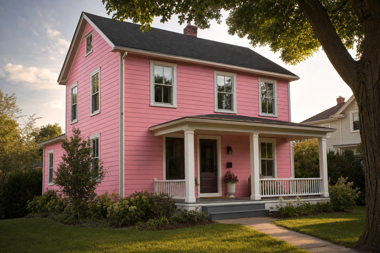
Benjamin Moore Pink (2081-40) is a bold and lively color that exudes energy, charm, and personality. This rich, medium-intensity pink is a standout choice for those looking to make a statement with their interiors. Its vibrant character is balanced by a softness that makes it versatile for a variety of design styles, from eclectic and playful to elegant and sophisticated.
Undertones: A Subtle Warmth
Pink (2081-40) leans toward the warmer spectrum of pinks, with subtle red undertones that give it a dynamic and vivacious quality. These undertones add depth to the hue, ensuring it feels warm and inviting without being overly saturated or glaring. The balance of warmth and brightness makes it a fantastic choice for spaces that need a touch of color without becoming overwhelming.
Coordinating Colors: Creating Cohesive Palettes
Benjamin Moore Pink (2081-40) pairs beautifully with a range of colors, allowing for endless design possibilities. Here are some suggestions for coordinating hues:
Neutrals: Pair this pink with warm neutrals like White Dove (OC-17) or Pale Oak (OC-20) to create a soft, balanced look. These neutrals help temper the vibrancy of the pink while maintaining a sense of elegance.
Greens: Green is a natural complementary color to pink. Try pairing it with October Mist (1495), a muted sage green, or the deeper, grounding tones of Hunter Green (2041-10) for a striking contrast.
Grays: Cool grays like Stonington Gray (HC-170) or Silver Chain (1472) create a sophisticated and modern palette that balances the warmth of the pink.
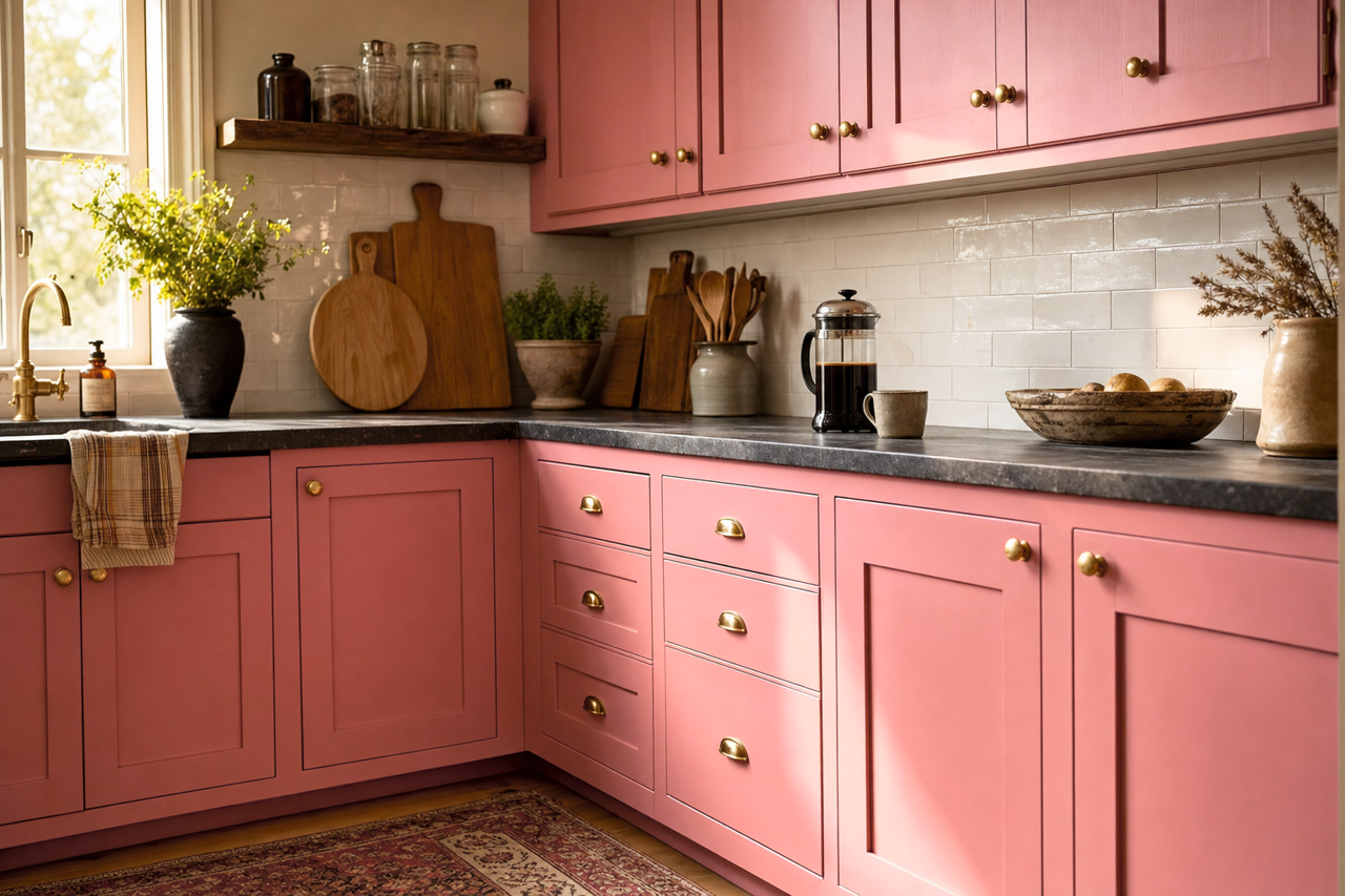
Metallics: Incorporate metallic accents, such as gold or brass, for a touch of glamour that enhances the luxurious undertones of this hue.
Where to Use Benjamin Moore Pink (2081-40)
The versatility of this color makes it suitable for a variety of spaces and applications. Here are some creative ways to incorporate it into your home:
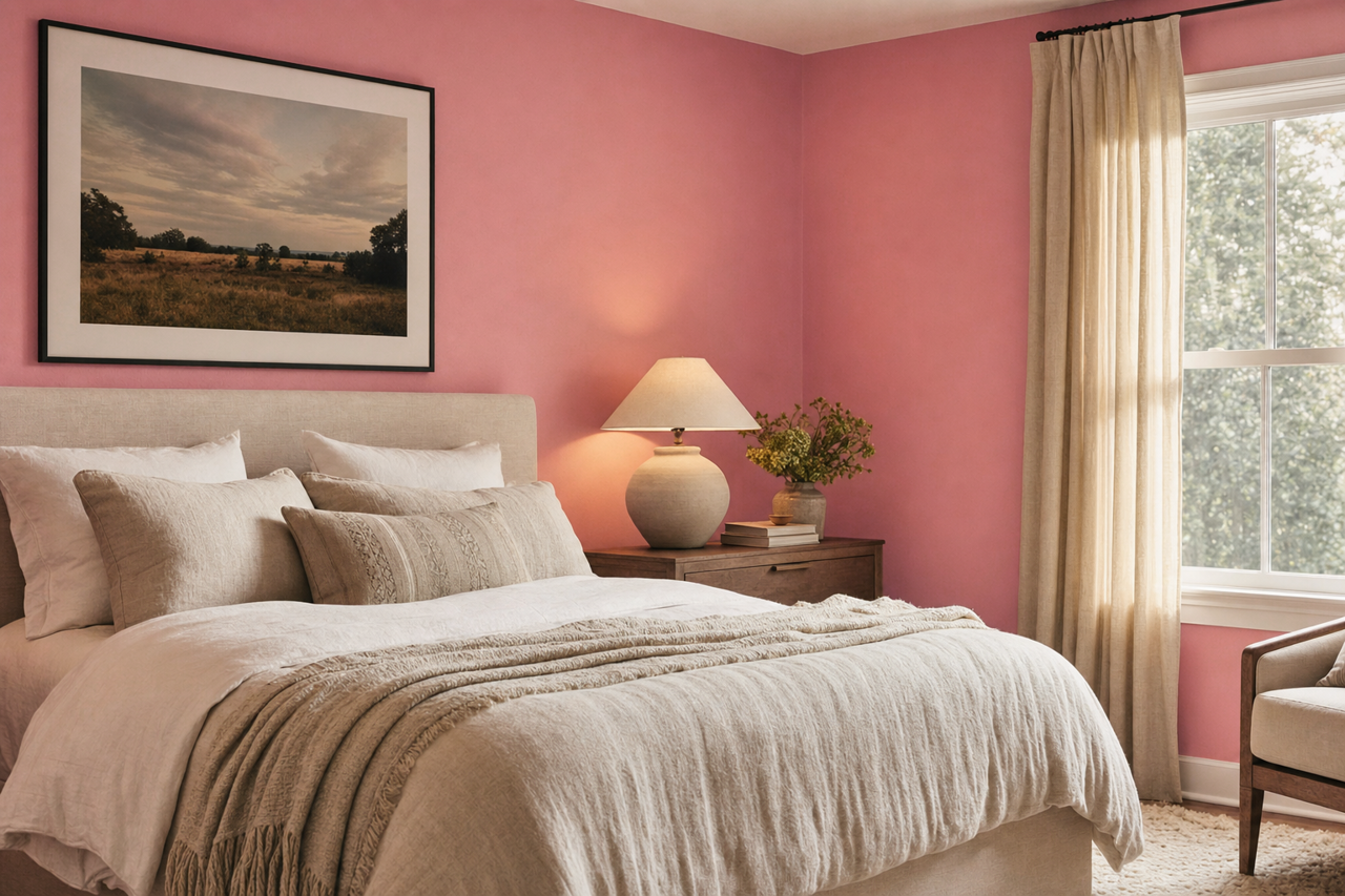
Accent Walls: Use Pink (2081-40) as an accent wall in a bedroom, living room, or dining area to add a bold pop of color. It instantly draws the eye and creates a focal point within the space.
Children’s Rooms: This playful and cheerful pink makes it a fantastic option for a child’s bedroom or playroom. Pair it with whimsical patterns and bright complementary hues for a fun, youthful vibe.
Powder Rooms: Make a bold design statement by using this color in a small powder room. Pair it with crisp white trim and metallic finishes for a chic, boutique-like feel.
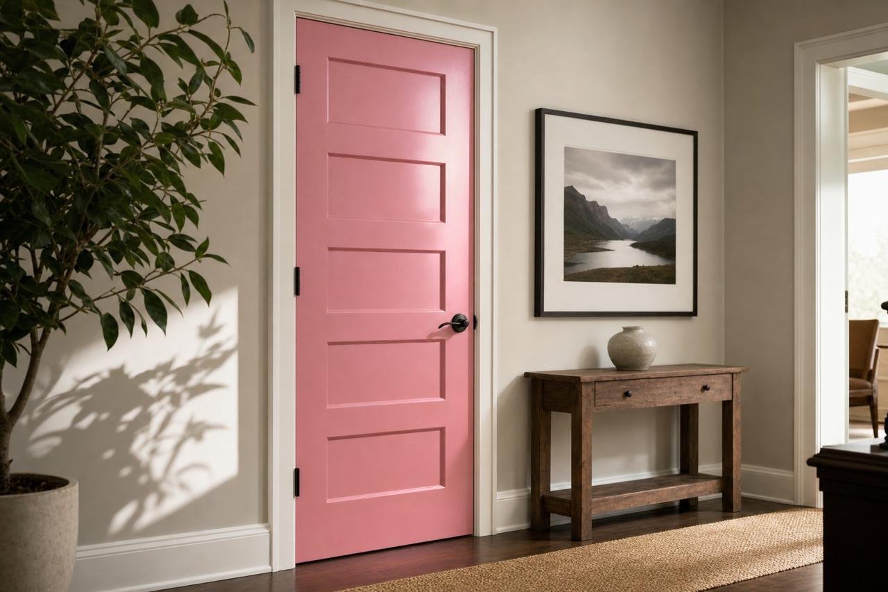
Furniture and Décor: If you’re not ready to commit to painting a wall, consider using Benjamin Moore Pink (2081-40) on furniture, cabinetry, or even smaller décor items like picture frames or shelving. It adds a pop of personality without overwhelming the space.
Creative Spaces: This pink has an energizing quality that makes it ideal for art studios, home offices, or craft rooms. Surrounding yourself with this vibrant hue can inspire creativity and productivity.
Design Tips for Using Benjamin Moore Pink (2081-40)
Balance with Textures: When using a bold color like Pink (2081-40), play with different textures to create visual interest. Velvet, linen, and natural wood tones work particularly well with this hue.
Lighting Considerations: The vibrancy of this pink can change depending on the room’s lighting. In natural light, it appears brighter and more dynamic, while in dimmer artificial light, its warmer undertones become more pronounced.
Layer with Patterns: Incorporate patterned fabrics, rugs, or wallpaper that feature complementary colors like greens, whites, or metallics to create a cohesive yet dynamic design.
Benjamin Moore Pink (2081-40) is a bold and beautiful color that brings energy and warmth wherever it’s used. Its rich undertones and versatility make it a fantastic choice for anyone seeking to infuse their space with personality and charm. Whether you’re creating a statement wall, designing a playful space, or adding a vibrant accent, this pink is sure to leave a lasting impression.