Benjamin Moore Precious (2084-40): A Vibrant Jewel-Toned Pink for Bold Interiors
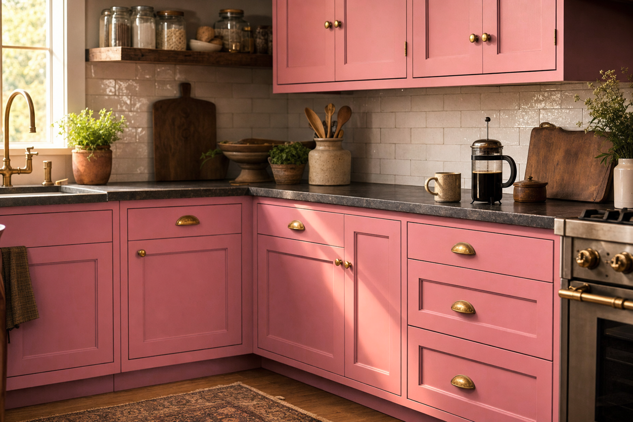
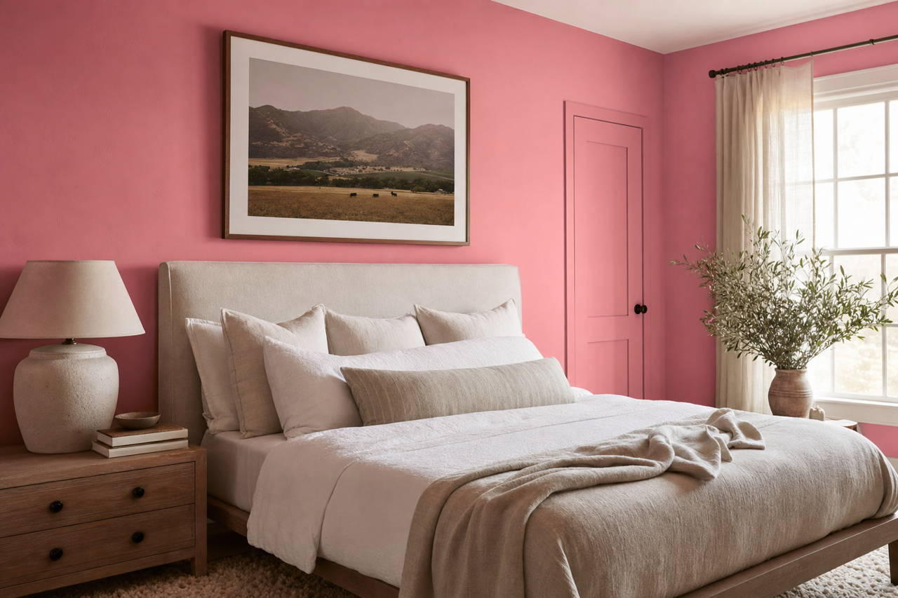
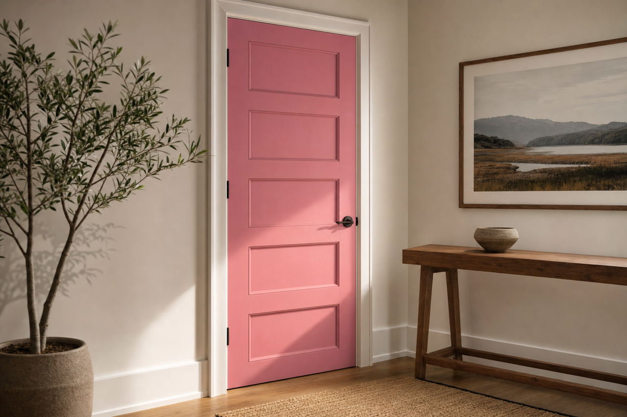
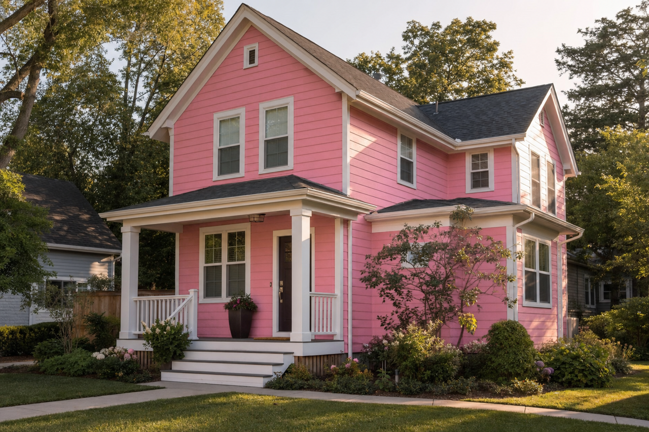
Benjamin Moore Precious (2084-40) is a captivating and vibrant jewel-toned pink that brings energy, sophistication, and a sense of luxury to any space. This eye-catching hue balances boldness with elegance, making it a perfect choice for those who want to make a statement in their interiors. Whether used as an accent or the main color, Precious exudes personality and charm while creating a warm and inviting atmosphere.
Undertones That Add Depth and Character
Precious is a rich and dynamic pink with subtle red and magenta undertones, giving it a warm and slightly dramatic edge. These undertones make the color versatile, allowing it to shift in tone depending on the lighting. In brighter, natural light, it appears as a lively and cheerful pink, while in dimmer, moody lighting, it takes on a deeper and more sophisticated look. This adaptability makes Precious an excellent choice for spaces where lighting changes throughout the day.
Coordinating Colors for a Cohesive Palette
To create a harmonious and balanced design, pair Benjamin Moore Precious with complementary and accent colors. Here are a few suggestions:
- Soft Neutrals: Pair Precious with soft, warm neutrals like Benjamin Moore Simply White (OC-117) or Edgecomb Gray (HC-173) to create a balanced and refined look. These neutrals help tone down the vibrancy of Precious while letting it shine as the focal point.
- Rich Jewel Tones: To enhance its dramatic appeal, combine Precious with other jewel tones like Newburyport Blue (HC-155) or Hunter Green (2041-10). This pairing creates a bold, luxurious palette perfect for eclectic or maximalist interiors.
- Playful Pastels: For a more whimsical and lighthearted vibe, consider softer pastels like Palladian Blue (HC-144) or Lemon Chiffon (2021-60). These colors bring out the playful side of Precious, making them great for children's rooms or creative spaces.
- Metallic Accents: Metallic finishes in gold, brass, or rose gold work beautifully with Precious, adding a touch of glamour and sophistication.
Ideal Uses and Applications
Benjamin Moore Precious is a bold and versatile color that can be used in a variety of ways to transform your home. Here are some ideas to inspire your next project:
Accent Walls
Use Precious on a feature wall to create a striking focal point in living rooms, bedrooms, or dining spaces. Its vibrant hue draws the eye and adds a sense of drama and depth to the room.
Statement Furniture
For a bold, modern look, consider painting furniture pieces like a console table, dresser, or bookshelf in Precious. This approach is perfect for adding a pop of color without fully committing to painting an entire wall.
Powder Rooms
Precious is a fantastic choice for a powder room or small bathroom, where its rich tone can create a jewel-box effect. Pair it with metallic fixtures and white accents for a luxurious, boutique-style space.
Creative Spaces
In art studios, craft rooms, or home offices, Precious fosters creativity and inspiration. Its vibrant energy energizes the space, making it a great backdrop for brainstorming or artistic endeavors.
Children's Rooms
For nurseries or kids’ bedrooms, Precious offers a playful and cheerful vibe. Pair it with soft pastels and whimsical decor to create a joyful and imaginative environment.
Dining Rooms
Bring drama and elegance to your dining room with Precious as the main wall color. When paired with dark wood furniture and metallic accents, it creates a sophisticated setting for entertaining.
Why Choose Benjamin Moore Precious?
Benjamin Moore Precious (2084-40) is more than just a color—it's a statement. Its jewel-tone vibrancy, warm undertones, and versatility make it a standout choice for those looking to imbue their spaces with personality and life. Whether used sparingly as an accent or generously throughout a room, Precious is sure to leave a lasting impression while adapting beautifully to your design style.