Benjamin Moore 50's (2086-70): A Nostalgic Hue with Timeless Appeal
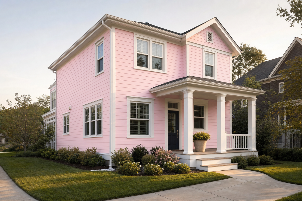
Benjamin Moore 50's (2086-70) is a truly unique shade that encapsulates the charm and sophistication of mid-century modern design. This soft, muted pink carries a vintage-inspired vibe that feels both playful and elegant, making it a versatile choice for interior spaces seeking a touch of nostalgic warmth. Its understated presence works beautifully in various design styles, from retro-chic to contemporary minimalism, proving that timelessness never goes out of style.
Undertones: Subtle and Sophisticated
The beauty of Benjamin Moore 50's lies in its delicate undertones. While its primary identity is a gentle pink, it carries subtle beige and peach undertones that lend it a slightly warm, natural quality. These undertones prevent the color from feeling overly sweet or saccharine, creating a balanced hue that works seamlessly in both modern and classic interiors. The warm undertones make it an approachable pink, avoiding an overly bold or dramatic appearance.
Coordinating Colors: Perfect Pairings
Benjamin Moore 50's (2086-70) pairs effortlessly with a variety of coordinating colors, allowing you to create harmonious palettes that suit your design goals:
- Soft Neutrals: For a calm and understated look, pair it with warm whites like Benjamin Moore White Dove (OC-17) or soft beiges such as Benjamin Moore Muslin (OC-12). These neutrals complement its warmth while maintaining a clean and airy feel.
- Earthy Greens: Add depth and balance by incorporating muted greens like Benjamin Moore Saybrook Sage (HC-114) or Benjamin Moore October Mist (1495). These earthy tones create a natural contrast that feels grounded and serene.
- Rich Grays: For a more dramatic effect, pair 50's with deep grays like Benjamin Moore Kendall Charcoal (HC-166) or Benjamin Moore Chelsea Gray (HC-168). These darker tones provide a sophisticated backdrop that highlights the vintage charm of the pink.
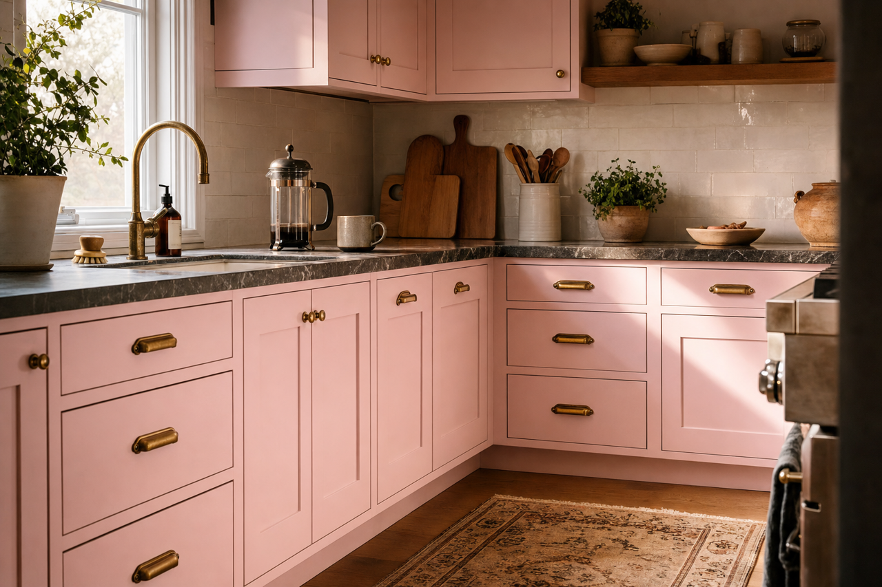
- Metallic Accents: Enhance the retro vibe by introducing accents in brass, gold, or copper. The warmth of metallics complements the peachy undertones while adding a touch of glamour.
Ideal Uses: Where 50's Shines
Benjamin Moore 50's (2086-70) is a versatile shade that can be used in various spaces to evoke different moods and aesthetics:
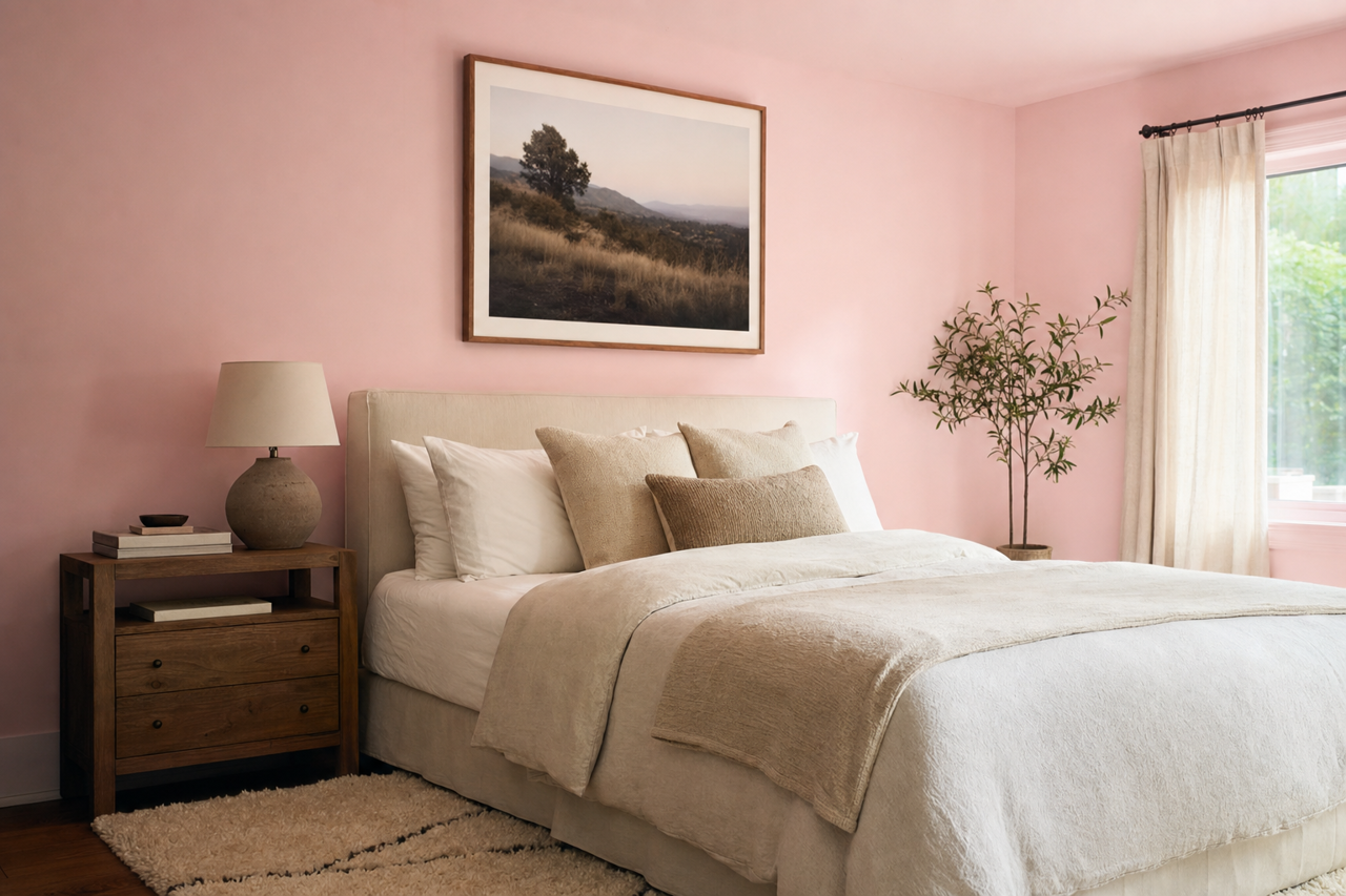
- Bedrooms: Create a cozy and romantic retreat by using 50's on bedroom walls. Pair it with crisp white linens and soft textures for an inviting and restful atmosphere.
- Living Rooms: For a mid-century modern-inspired living room, use 50's as an accent wall and pair it with retro furniture and geometric patterns. Its subtle warmth makes it a great backdrop for vintage décor.
- Bathrooms: Add a touch of elegance to bathrooms by using 50's on cabinetry or walls. Pair it with marble countertops and brass fixtures for a spa-like ambience.
- Nurseries: The soft pink tone is perfect for nurseries, offering a soothing and gender-neutral option that feels timeless and sophisticated.
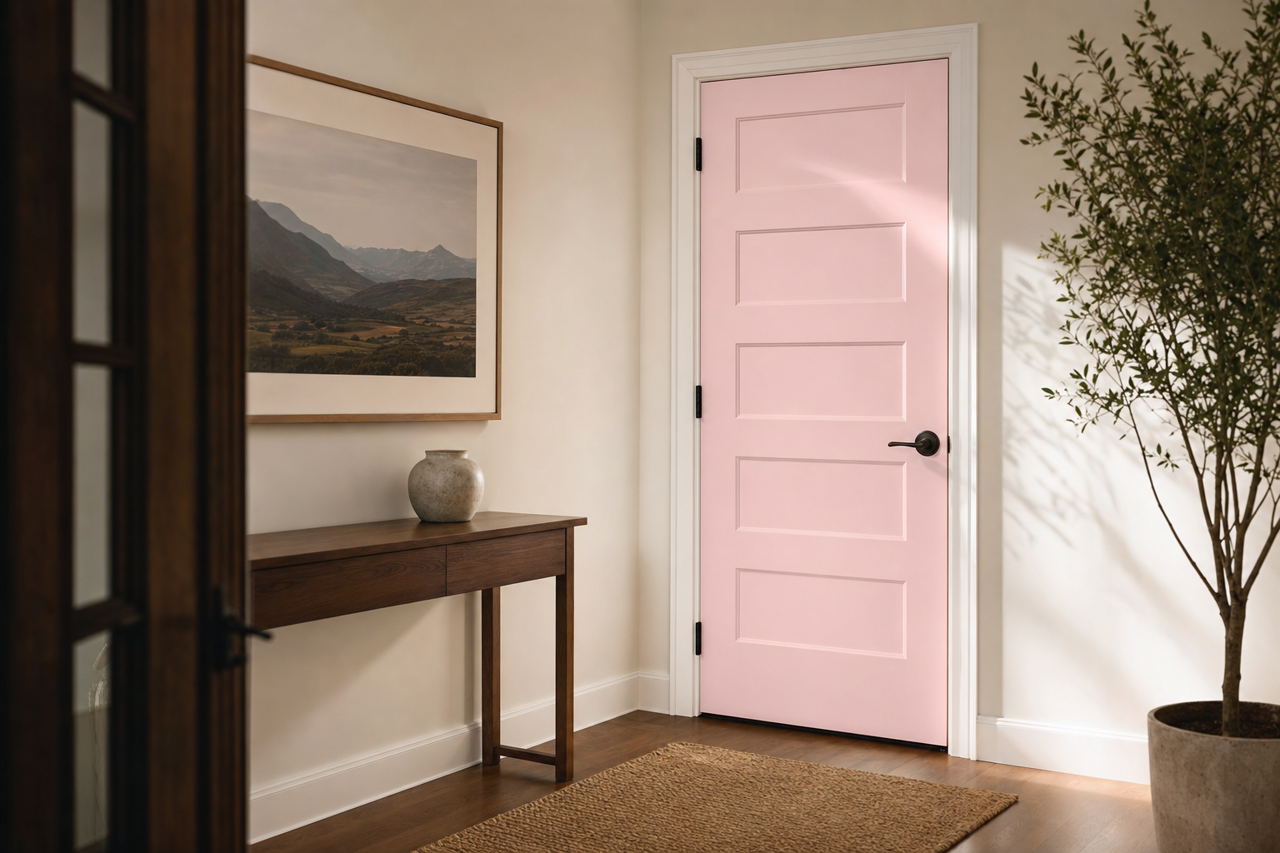
- Accent Furniture: If you’re hesitant to commit to pink walls, consider using 50's on accent furniture pieces like side tables, chairs, or shelving. Its muted tone ensures it won’t overwhelm the space.
Design Tips:
To make the most of Benjamin Moore 50's, consider these design strategies:
- Use it in rooms with ample natural light to bring out its warm undertones and enhance its inviting character.
- Layer textures like soft velvet, cozy knits, or sleek leather to add dimension and complement the color's vintage aesthetic.
- Combine it with mid-century-inspired patterns, such as geometric prints or starburst designs, for an authentic retro feel.
Benjamin Moore 50's (2086-70) is the ideal choice for anyone seeking a subtle pink with undeniable charm. Whether you’re revamping a modern space or channeling mid-century elegance, this hue delivers a perfect balance of warmth, sophistication, and versatility.