Benjamin Moore Wild (2090-40): A Bold Burst of Personality
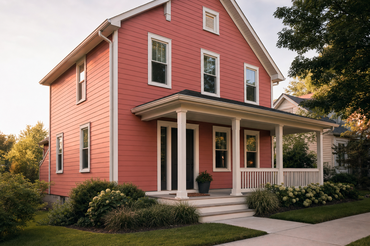
Benjamin Moore Wild (2090-40) is a striking, rich color that commands attention and brings unapologetic vibrancy to any space. This medium-to-dark pink hue is infused with a playful energy, making it an excellent choice for those looking to create a bold statement or elevate the mood of a room. Its distinctive personality can invigorate interiors, blending sophistication with an adventurous edge.
Undertones of Benjamin Moore Wild
Wild has warm red undertones that give it a fiery, dynamic feel. These undertones prevent the color from feeling overly sweet or juvenile, instead offering a sense of maturity and depth. Depending on the lighting and surrounding décor, the shade can lean toward a lively berry tone or a slightly softer rose-tinted hue. This adaptability makes Wild a versatile option for spaces that aim to balance fun with elegance.
Coordinating Colors for Benjamin Moore Wild
Pairing Benjamin Moore Wild with complementary colors can enhance its boldness while maintaining harmony in your design. Here are some coordinating options:
Neutrals:
- Chantilly Lace (OC-65): A crisp white that provides contrast and allows Wild to take center stage.
- Gray Owl (2137-60): A soft, cool gray that tempers Wild’s vibrancy for a more grounded palette.
Earthy Tones:
- Smokey Taupe (983): A muted taupe that adds sophistication without dulling the energy of Wild.
- Kingsport Gray (HC-86): A darker neutral that offers depth and pairs beautifully with Wild for a dramatic look.
Complementary Colors:
- Golden Straw (2152-50): A warm yellow that energizes the space while creating a cheerful balance.
- Blue Danube (2062-30): A rich blue that contrasts beautifully with Wild, resulting in a bold and modern pairing.
Soft Pastels:
- Windmill Wings (2067-60): A delicate lavender that complements Wild’s rosy undertones for a serene yet playful vibe.
Best Uses for Benjamin Moore Wild
Benjamin Moore Wild is not a shy color—it thrives in spaces where personality and creativity are celebrated. Here are some suggestions for incorporating this vibrant shade into your home or commercial interiors:
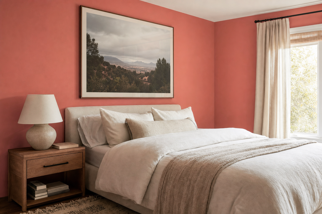
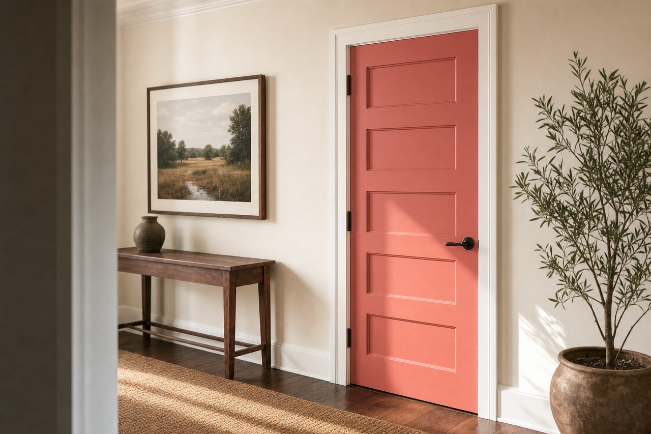
Accent Walls: Use Wild on a feature wall to create a focal point in living rooms, bedrooms, or creative studios. Pair it with neutral walls for contrast and balance.
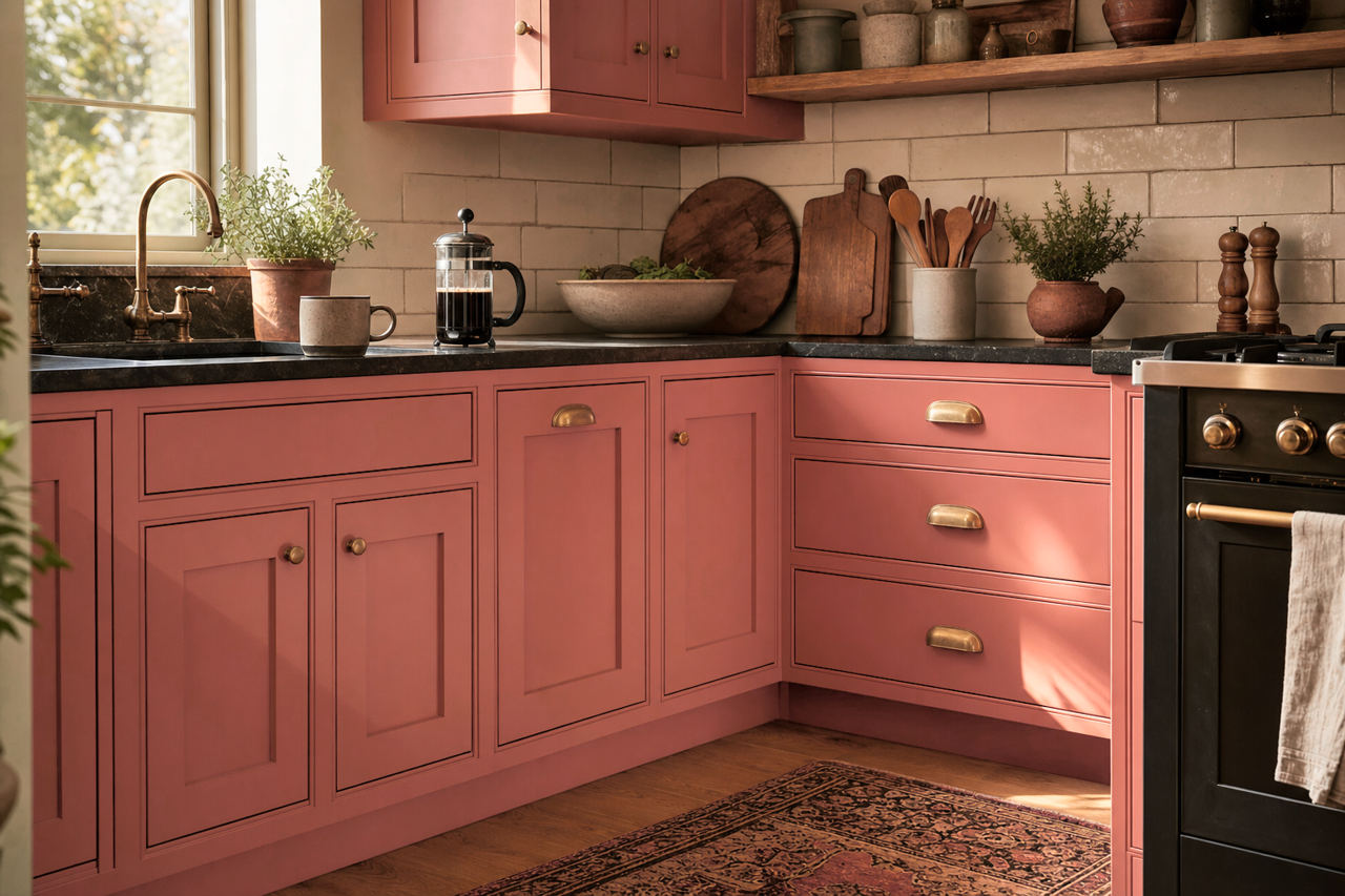
Furniture Makeovers: Revitalize old furniture with Wild to add a pop of color that feels fresh and contemporary. Picture a Wild-painted dresser or side table paired with brass accents and natural wood.
Dining Rooms: Create a lively dining area by using Wild on the walls or in décor elements such as upholstered chairs. Its energetic undertones can encourage conversation and warmth during gatherings.
Kids’ Rooms: Wild is a fantastic choice for children’s spaces where fun and playfulness are key. Pair it with lighter pastel shades for a whimsical yet cohesive look.
Creative Workspaces: Energize your office or studio with Wild to spark creativity and innovation. Combine it with clean whites and metallics for a modern aesthetic.
Bathrooms: Bring unexpected drama to a powder room or bathroom by using Wild on the walls or cabinetry. Pair it with gleaming tiles and chrome fixtures for a chic, jewel-box effect.
Lighting Considerations
The appearance of Benjamin Moore Wild can shift depending on the lighting in your space. In bright, natural light, it takes on a lively, almost fuchsia-like quality, while in dimmer settings, its warm undertones become more pronounced, lending a cozy and intimate feel. To maximize its potential, test Wild in various lighting conditions before committing to a large-scale application.
Styling Tips for Wild
- Textures: Pair Wild with textured elements like velvet or linen to add depth and tactile interest.
- Metallics: Gold or brass accents work beautifully with Wild, enhancing its warmth and sophistication.
- Natural Materials: Incorporate wood tones or greenery to strike a balance between the boldness of Wild and the organic feel of natural elements.
Benjamin Moore Wild (2090-40) is a captivating choice for those who want to make a bold design statement. Whether used sparingly as an accent or as the dominant color in a space, it injects energy, confidence, and character into interiors. With its versatile undertones and ability to coordinate with a wide range of colors, Wild is a brilliant addition to any designer’s palette.