Benjamin Moore Strawberry (2090-60): A Sweet and Playful Hue for Vibrant Spaces
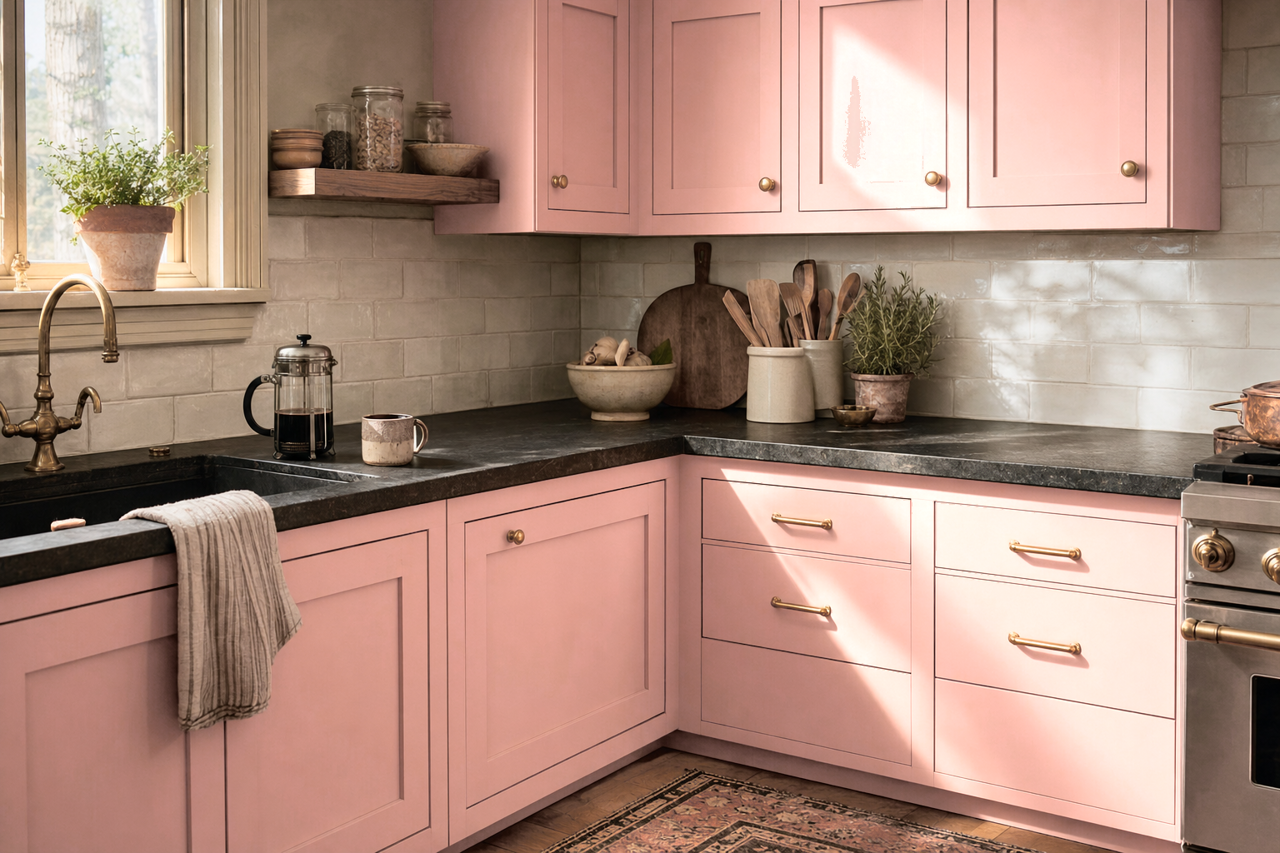
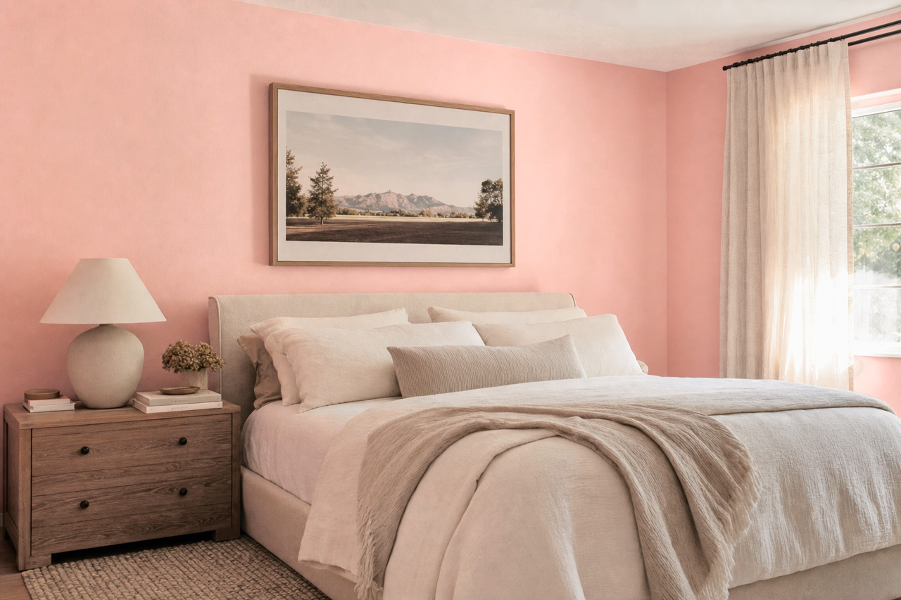
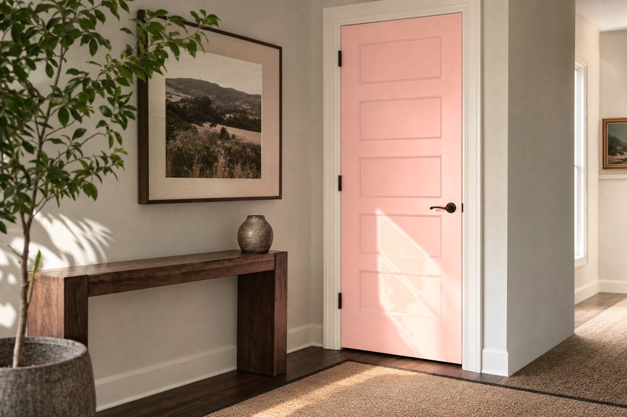
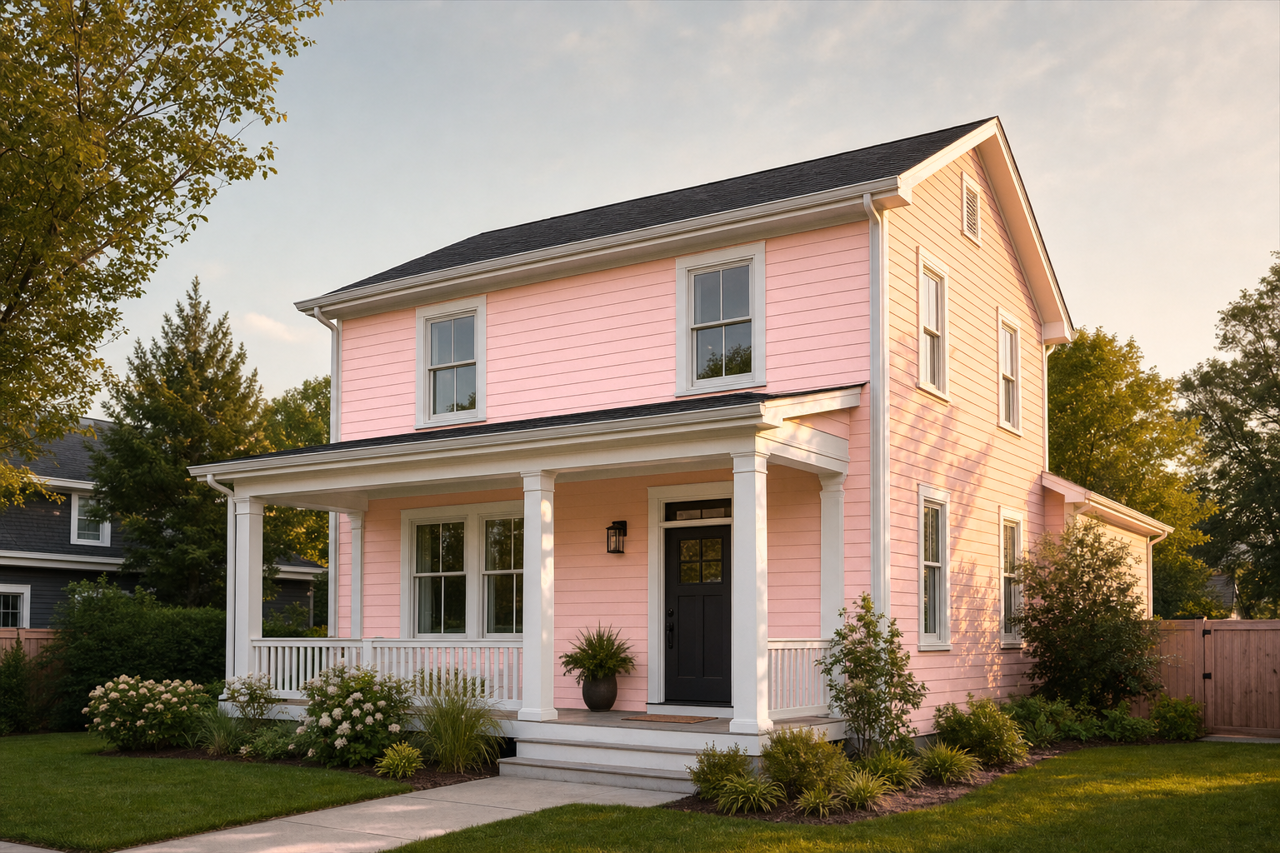
Benjamin Moore Strawberry (2090-60) is a cheerful and uplifting pink that brings a sense of charm and energy to any interior. This captivating hue is reminiscent of fresh strawberries ripened under the summer sun, making it a perfect choice for spaces that need a playful yet refined touch. Its medium intensity ensures it stands out, while its softness makes it versatile enough for a variety of design applications.
Undertones
Strawberry (2090-60) has warm red undertones infused with a delicate hint of coral. These undertones give the color depth and a slightly earthy richness, preventing it from feeling overly saccharine or juvenile. The warmth of the color ensures it complements other shades seamlessly, while the subtle coral notes add a modern flair.
Coordinating Colors
Benjamin Moore Strawberry pairs beautifully with a range of coordinating colors, allowing for both bold and subtle design schemes. Here are a few suggestions:
- Neutral Partners: To balance Strawberry’s vibrancy, pair it with soft neutrals like White Dove (OC-17) or Gray Owl (2137-60). These tones soften the pink and create a harmonious, calming palette.
- Complementary Colors: For a striking contrast, consider Hale Navy (HC-154) or Kendall Charcoal (HC-166). These deep hues provide grounding and sophistication, perfect for creating a dramatic yet balanced look.
- Analogous Pairings: Embrace its warm undertones by pairing it with other pinks and corals like Coral Gables (2010-40) or peachy tones such as Mango Punch (2175-40). This creates a vibrant and cohesive color story.
- Accent Colors: Incorporate cheerful accents like Sunshine (2022-40) or Spring Meadow (2030-50) to enhance the playful vibe Strawberry brings to a space.
Uses
Benjamin Moore Strawberry (2090-60) is versatile enough to fit into a variety of design styles, from whimsical and eclectic to modern and sophisticated. Here are some ways to incorporate this delightful hue:
- Children’s Rooms: Strawberry is an ideal choice for nurseries or kids’ bedrooms. Its playful energy fosters creativity and joy, making it a perfect backdrop for growth and imagination. Pair it with light neutrals and pops of bright colors for a fun, dynamic look.
- Accent Walls: Transform a space with a Strawberry accent wall. Whether in a living room, bedroom, or dining area, this bold hue adds personality and charm without overwhelming the entire room.
- Furniture and Décor: Use Strawberry for painted furniture pieces or accessories like throw pillows, curtains, or artwork. It can add a burst of color in neutral spaces or complement a room’s existing palette.
- Powder Rooms: Strawberry can make a powder room feel lively and inviting. Pair it with gold or brass fixtures for a glamorous touch, or opt for matte black accents for a contemporary vibe.
- Creative Spaces: Whether it’s a craft room, home office, or art studio, Strawberry’s vibrancy inspires creativity and energy, making it an excellent choice for spaces where ideas flourish.
Style Considerations
Strawberry (2090-60) works seamlessly across a variety of aesthetics:
- Modern and Minimalist: Pair Strawberry with crisp whites and sleek metallics for a clean, contemporary look.
- Bohemian and Eclectic: Mix Strawberry with warm tones, layered textures, and bold patterns to create a free-spirited vibe.
- Vintage-Inspired: Combine Strawberry with soft pastels and antique finishes for a nostalgic, romantic feel.
Benjamin Moore Strawberry (2090-60) is a unique color that strikes a perfect balance between boldness and elegance. Its warm undertones, versatile coordinating options, and broad range of uses make it a standout choice for any interior design project. Whether you’re looking to energize a space or create a cozy retreat, Strawberry is sure to deliver sweetness and charm.