
Benjamin Moore Sharkskin (2139-30): A Versatile and Sophisticated Neutral
Benjamin Moore Sharkskin (2139-30) is a striking and versatile mid-tone gray with an earthy, sophisticated edge. Offering a timeless appeal, this color is perfect for interior spaces that demand a grounded yet stylish ambiance. Whether you're designing a cozy living room, a modern kitchen, or a serene bedroom, Sharkskin stands out for its ability to balance depth and warmth, making it an excellent choice for a variety of design styles.
Undertones: The Subtle Nuances of Sharkskin
Sharkskin is more than just a standard gray; it carries subtle green and brown undertones that give it a rich, organic feel. These nuanced undertones make Sharkskin a unique neutral that can adapt to its surroundings. In cooler lighting conditions, the gray base takes center stage, offering a sleek and modern look. In warmer lighting, the earthy undertones emerge, creating a cozy and inviting atmosphere. This chameleon-like quality makes Sharkskin a versatile choice for any room in your home.
Coordinating Colors: Pairing Sharkskin with Complementary Hues
Sharkskin's balanced mix of gray, green, and brown undertones makes it an ideal companion to a wide range of colors. Here are some suggestions for coordinating hues:
- Off-Whites and Creams: Pair Sharkskin with warm whites like Benjamin Moore White Dove (OC-17) or creamy shades like Swiss Coffee (OC-45) for a classic and clean look.
- Earthy Greens: Complement Sharkskin’s subtle green undertones with muted greens like Benjamin Moore Sagebrush (2139-20) or Soft Fern (2144-40) for a harmonious, nature-inspired palette.
- Deep Blues: Create a bold contrast by pairing Sharkskin with rich navy tones like Hale Navy (HC-154) or Van Deusen Blue (HC-156) for a sophisticated vibe.
- Warm Metallics: Accentuate the earthy undertones of Sharkskin with brass, gold, or copper accents to add warmth and elegance.
- Wood Tones: Sharkskin pairs beautifully with natural wood tones, whether light oak or dark walnut, for a grounded and organic aesthetic.
Uses: Where Sharkskin Truly Shines
Sharkskin’s versatility makes it suitable for a wide range of applications throughout the home. Here are some of the best ways to incorporate this color into your interior design:
Living Rooms
Sharkskin’s calming yet elegant presence enhances living spaces, creating a cozy environment for relaxing or entertaining. Use it as a wall color paired with soft furnishings in cream or muted greens to strike the perfect balance between comfort and sophistication.
Kitchens
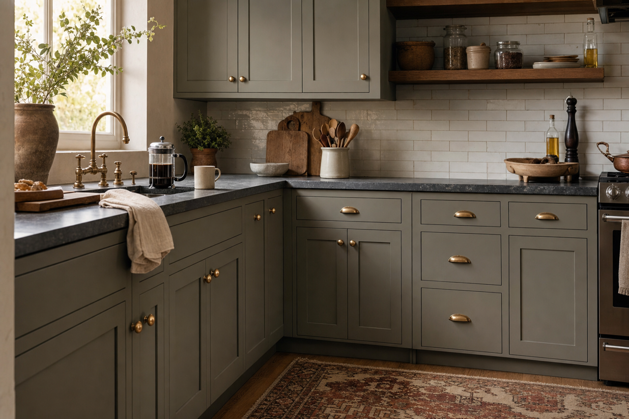
This mid-tone gray works beautifully in kitchens, particularly on cabinetry. Pair Sharkskin cabinets with white countertops and brass hardware for a modern farmhouse look, or opt for black accents and sleek surfaces for a contemporary vibe.
Bedrooms
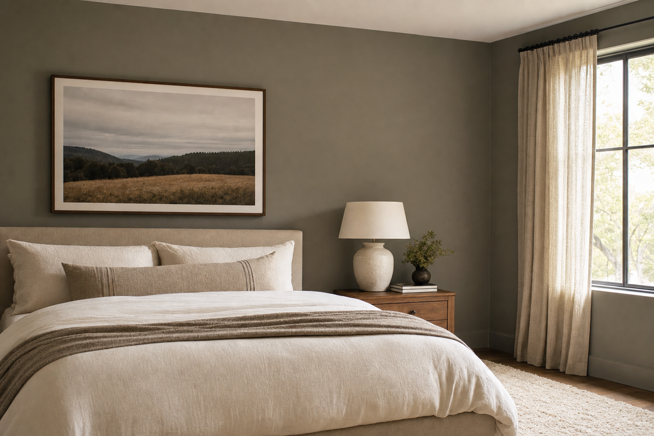
Sharkskin is an excellent choice for bedrooms, where its earthy undertones contribute to a tranquil and restful atmosphere. Layer it with soft textiles in off-white, sage green, or dusty blue for a serene retreat.
Bathrooms
For a spa-like bathroom, Sharkskin can be used on walls or vanity cabinets. Pair it with crisp white tiles and warm wood accents for a clean, refreshing design.
Accent Walls
If you’re looking to introduce depth to a room without overwhelming it, Sharkskin is perfect for an accent wall. Use it in spaces like dining rooms or home offices to create a focal point that feels grounded yet sophisticated.
Exterior Applications
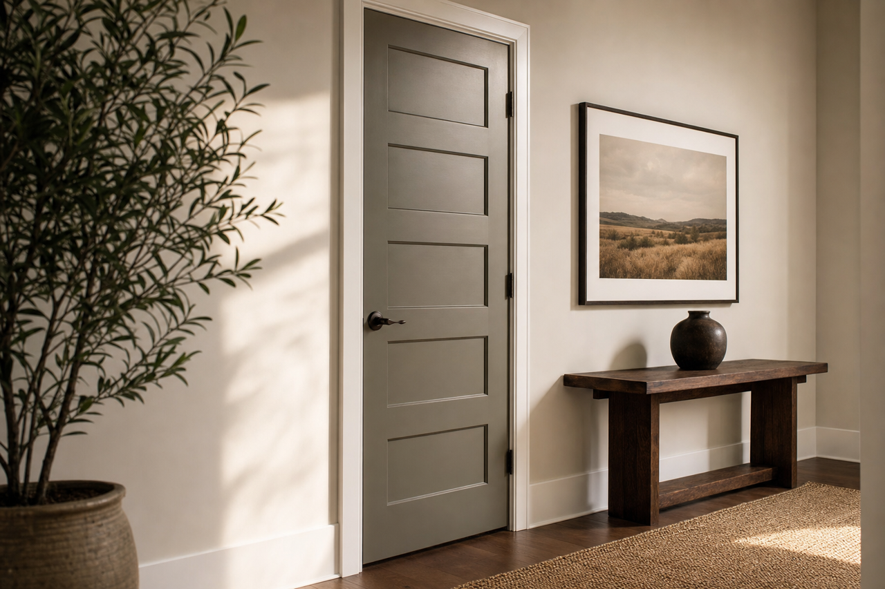
Sharkskin’s adaptability extends beyond interiors. It’s a fantastic choice for home exteriors, offering a neutral yet distinctive look. Pair it with white trim for a classic aesthetic or with black accents for a modern edge.
SEO-Friendly Keywords
For those searching for guidance on how to use Sharkskin in their spaces, consider incorporating these SEO-friendly keywords into your descriptions: “Benjamin Moore Sharkskin,” “earthy gray paint color,” “neutral paint with green undertones,” “gray paint for living rooms,” “modern gray paint,” and “paint colors for versatile design.”
Benjamin Moore Sharkskin (2139-30) is a refined yet approachable hue that embodies the perfect balance of sophistication and versatility. Whether used as a backdrop for vibrant accents or paired with complementary neutrals, this color promises to elevate interiors with its understated elegance.