Benjamin Moore Winter (2140-70) is a soft and sophisticated off-white that exudes calmness and serenity. Its subtle nature makes it an incredibly versatile choice for interiors, offering a neutral backdrop that complements a variety of design styles, from minimalist and Scandinavian to traditional and coastal-inspired spaces. Winter is ideal for creating a serene atmosphere that feels both timeless and inviting.
Benjamin Moore Winter carries delicate gray undertones, giving it a modern edge without feeling too stark or cold. These gray notes are balanced by a hint of warmth, which prevents the shade from appearing overly sterile. This equilibrium makes Winter a perfect choice for spaces where you want to achieve a soft, fresh look without veering too far into cool or warm territory. Its undertones adapt beautifully to different lighting conditions, making it a reliable choice for both well-lit rooms and those with limited natural light.
Winter’s versatility allows it to pair effortlessly with a variety of coordinating colors. Whether you’re looking to enhance its subtle sophistication or create dramatic accents, the following hues work beautifully with Winter:
These coordinating colors allow you to create a harmonious space that feels intentional and cohesive, whether you’re aiming for a monochromatic aesthetic or a dynamic mix of tones.
Benjamin Moore Winter is a chameleon-like color that adapts effortlessly to various spaces and design needs. Here are some of the best ways to incorporate this hue into your home:
Winter is an excellent choice for living rooms, especially if you want to create a serene and welcoming environment. Pair it with plush furniture in neutral tones, soft textiles, and natural materials like wood and linen to achieve a cozy yet sophisticated space.
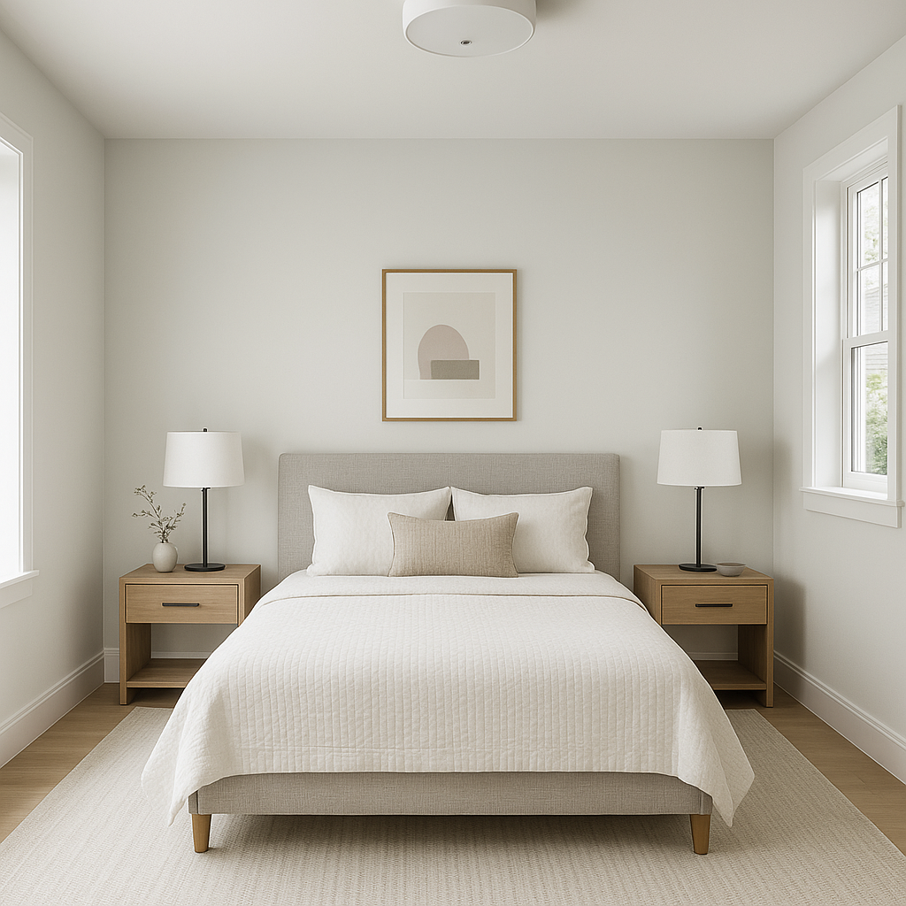
The calming undertones of Winter make it an ideal choice for bedrooms. Use it on walls to create a restful retreat, and complement it with soft blues, muted grays, or creamy whites for a soothing atmosphere.
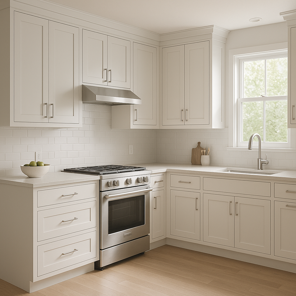
Winter is a superb option for kitchens, particularly if you're aiming for a clean and timeless look. It pairs beautifully with white cabinetry or light wood finishes, and accents in brushed nickel or matte black hardware can add a modern touch.
Bring a spa-like feel to your bathroom with Winter. Its soft gray undertones lend a tranquil vibe, and it pairs well with marble countertops, polished chrome fixtures, and natural stone tiles for an elevated design.
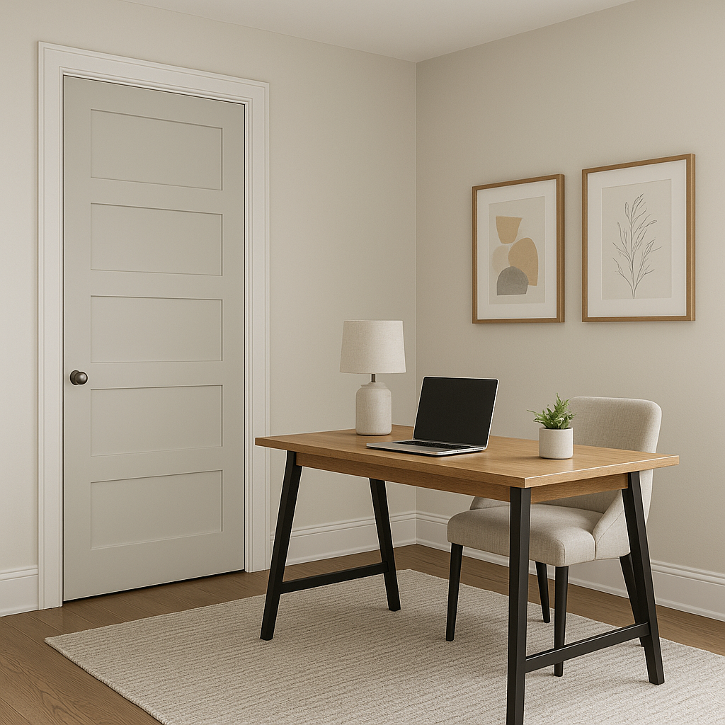
In transitional spaces like entryways or hallways, Winter provides an airy and welcoming feel. Use it to brighten up these areas, and consider pairing it with darker accents, such as charcoal or navy, to add depth.
Winter's subtle undertones make it a great choice for trim and molding, especially when paired with walls in slightly darker shades. It creates a seamless and understated contrast that enhances architectural details.
Benjamin Moore Winter’s adaptability means that it performs well in a range of lighting conditions. In rooms with abundant natural light, Winter will appear brighter and more luminous, while in dimmer spaces, its gray undertones become more pronounced, lending a cozy and grounded feel. To ensure the color works optimally in your space, test it in different lighting scenarios and observe how it interacts with surrounding elements.
Benjamin Moore Winter (2140-70) is more than just an off-white; it’s a color that embodies elegance, versatility, and tranquility. Its ability to adapt to various lighting conditions, pair seamlessly with coordinating hues, and enhance different spaces makes it a reliable choice for homeowners and designers alike. Whether you’re refreshing a single room or planning an entire home makeover, Winter is a shade that will stand the test of time while infusing your space with understated sophistication.
View Colors Only by Brand (No Imagery):
Sherwin-Williams
|
Benjamin-Moore
|
Behr
|
Valspar
Live on the Eastern Slope of Colorado and looking for a local painting professional, check out all our painting services and reach out for a free estimate.
Copyright © 2026 : Wild Fox Painting Inc. : 12435 Mead Way, Littleton, CO 80125


