Benjamin Moore Timid 2148-60: A Soft and Sophisticated Neutral
Benjamin Moore Timid 2148-60 is an elegant and understated soft neutral that effortlessly brings warmth and subtle charm to any space. Its delicate balance between beige and blush undertones makes it a versatile choice for creating serene, welcoming environments. Whether you’re designing a cozy living room, a tranquil bedroom retreat, or a sophisticated office, Timid 2148-60 offers timeless appeal.
Undertones of Benjamin Moore Timid 2148-60
The beauty of Timid lies in its unique undertones. At its core, this shade is a warm beige infused with gentle pink and peach undertones. These subtle hints of blush give it a fresh, airy feel without overpowering the space. The soft pink undertones make it a great alternative to stark whites or cool grays, adding a touch of warmth and personality to your interiors.
Timid 2148-60 shifts beautifully depending on the light. In spaces with ample natural light, it appears creamy and luminous, while in dimmer lighting, its warm blush undertones come forward, creating a cozy and inviting atmosphere. This chameleon-like quality makes it adaptable to a variety of lighting conditions and design styles.
Coordinating Colors for a Polished Look
Pairing Benjamin Moore Timid 2148-60 with complementary colors is key to achieving a cohesive and harmonious design. Here are some stunning options to consider:
1. Crisp Whites
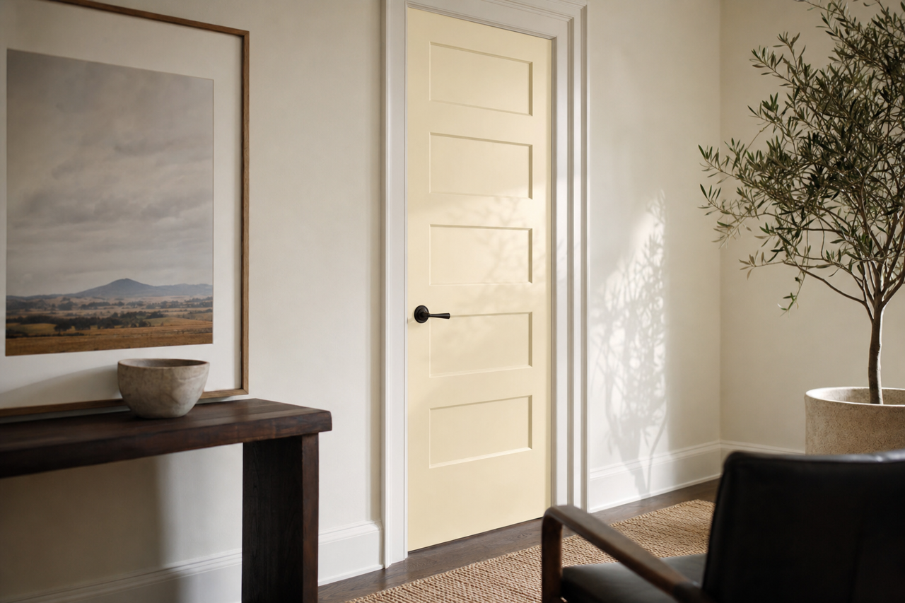
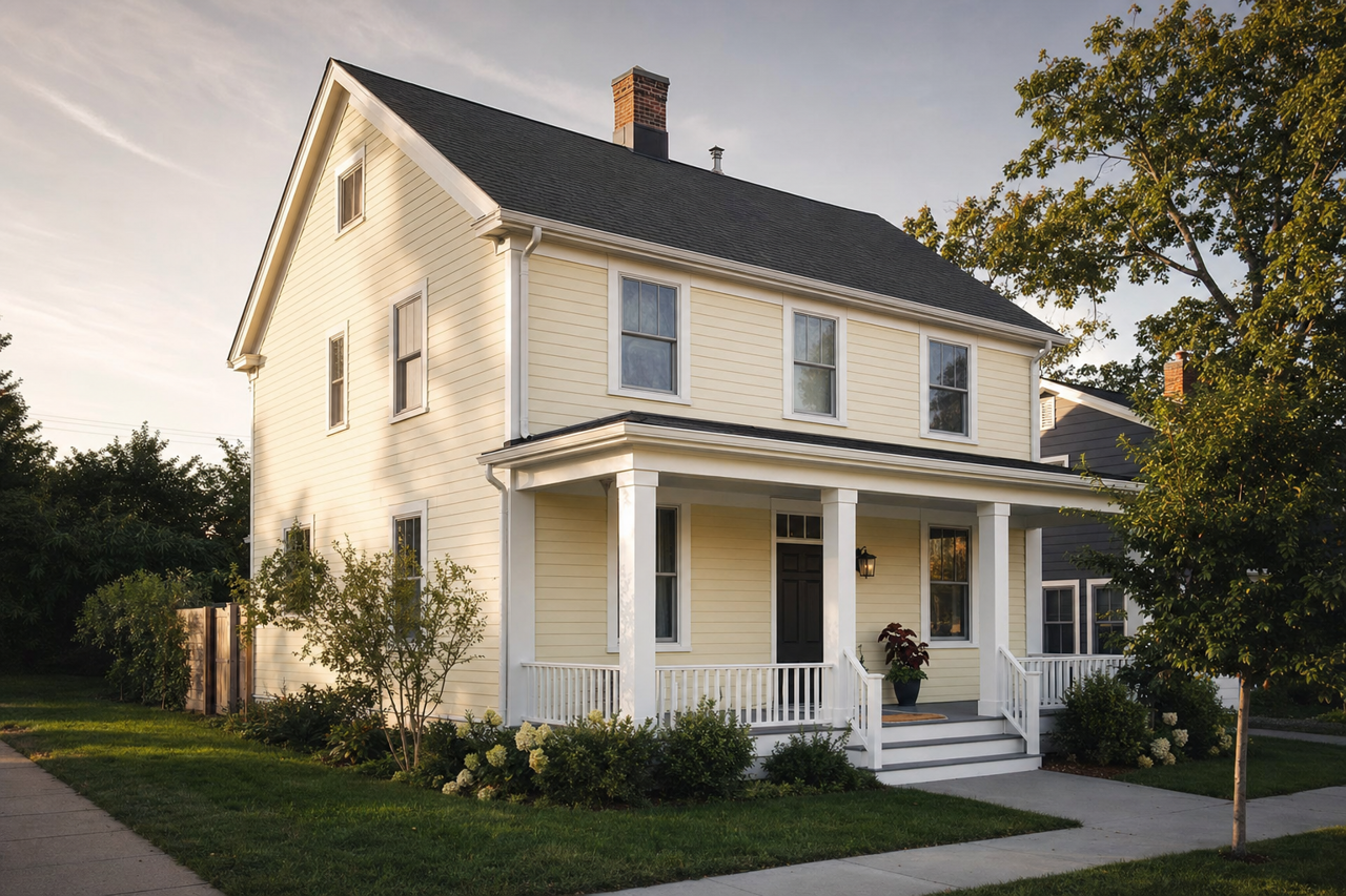
- Chantilly Lace OC-65 or Simply White OC-117: These clean, crisp whites create a striking contrast with Timid and enhance its warm undertones. Use them for trim, ceilings, or cabinetry for a fresh, modern look.
2. Deep Charcoals and Grays
- Chelsea Gray HC-168 or Kendall Charcoal HC-166: These darker shades provide a bold contrast, grounding the space while allowing Timid's softer tones to shine. Perfect for accent walls, furniture, or décor elements.
3. Earthy Greens
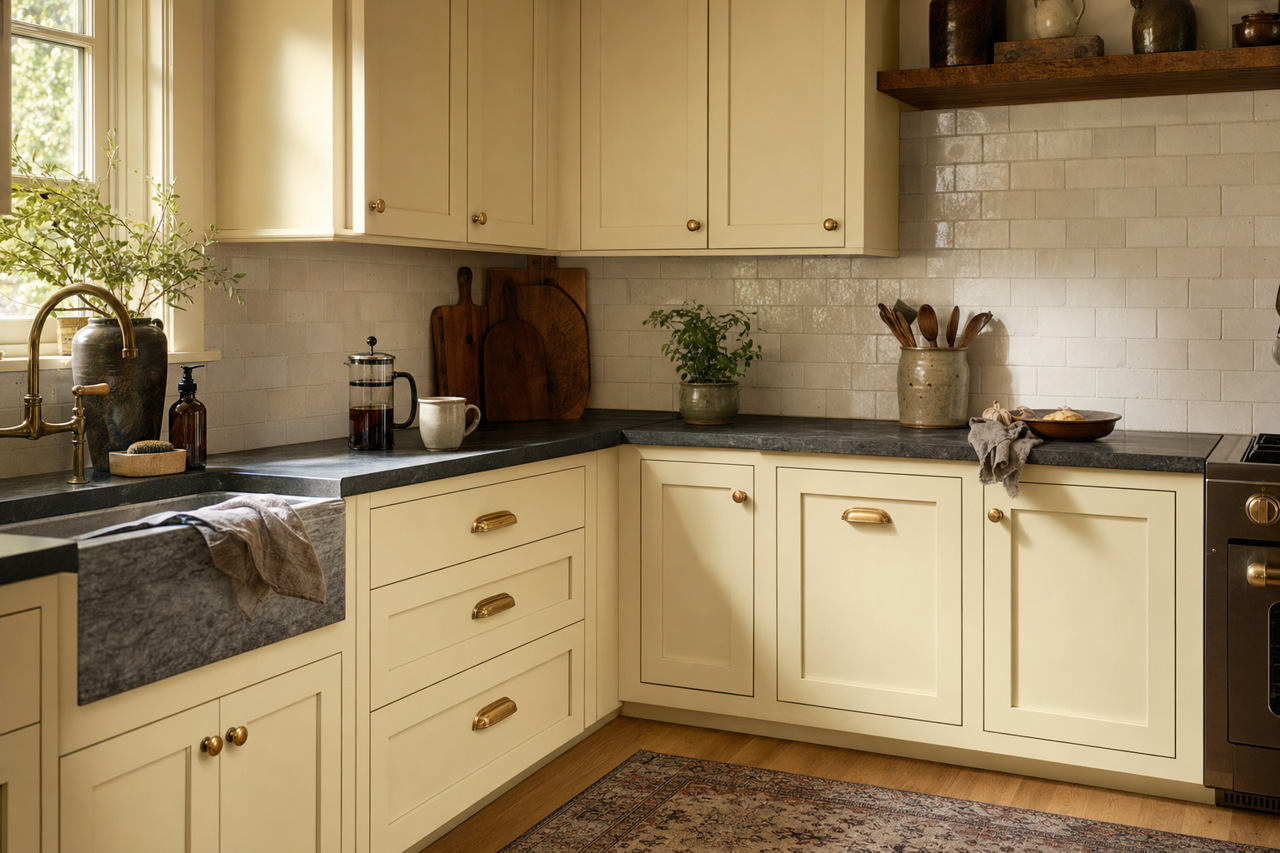
- October Mist 1495 or Sage Mountain 1488: Bring out Timid's natural, warm side with soft greens. This pairing works beautifully in bedrooms, living rooms, or even kitchens for a nature-inspired palette.
4. Muted Blues
- Boothbay Gray HC-165 or Van Courtland Blue HC-145: Cool, muted blues complement Timid’s warmth, offering a serene and balanced contrast. This combination is ideal for coastal-inspired interiors or spa-like bathrooms.
Best Uses for Benjamin Moore Timid 2148-60
Timid 2148-60’s versatility makes it a fantastic choice for a variety of spaces and applications:
1. Living Rooms
Create a cozy and inviting living room with Timid as your primary wall color. Its soft, warm undertones make it an excellent backdrop for light-toned furniture and natural textures like jute rugs and wooden accents. Pair it with pops of muted green or charcoal for added sophistication.
2. Bedrooms
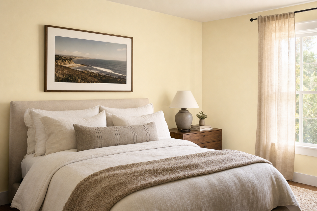
For a calming retreat, use Timid in the bedroom. Its subtle blush undertones exude warmth and relaxation, making it perfect for restful spaces. Pair with white bedding and soft pastel accents for a dreamy, serene look.
3. Nurseries and Kids' Rooms
Timid’s warmth and gentle pink undertones make it a delightful option for nurseries or children’s rooms. It offers a playful yet sophisticated alternative to traditional pinks or blues. Add whimsical décor and soft textiles to complete the design.
4. Bathrooms
In bathrooms, Timid creates a spa-like ambiance when paired with white tiles, chrome fixtures, and soft lighting. Its warm blush undertones ensure the space feels clean yet cozy.