Benjamin Moore Venetian (2158-20): A Timeless, Sophisticated Shade
Benjamin Moore Venetian (2158-20) is a striking and elegant paint color that instantly elevates the ambiance of any space. This rich, deep hue is a luxurious blend of earthy terra-cotta tones with a subtle hint of brick red, creating a warm and inviting atmosphere. Venetian is a bold yet balanced color that evokes timeless sophistication, making it an excellent choice for both modern and traditional interiors.
Undertones: Grounded Warmth and Subtle Elegance
Venetian carries distinct warm undertones of brown and orange, with a whisper of rust that adds depth and character. These undertones make it an ideal shade for spaces seeking a grounded and cozy vibe. The earthy nature of this color ensures it feels organic and natural rather than overly dramatic, allowing it to blend seamlessly with its surroundings. The subtle red undertone gives Venetian a refined edge, ensuring that it makes a statement without overpowering the room.
Coordinating Colors: Harmonious Pairings for a Cohesive Look
To create a harmonious palette with Venetian (2158-20), consider pairing it with complementary and neutral tones that enhance its richness. Some excellent coordinating colors include:
- Benjamin Moore White Dove (OC-17): A soft, creamy white that balances the warmth of Venetian while providing a crisp contrast.
- Benjamin Moore Lenox Tan (HC-44): A warm, sandy beige that complements the earthy undertones of Venetian.
- Benjamin Moore Wrought Iron (2124-10): A deep charcoal gray that adds drama and sophistication, perfect for accent elements.
- Benjamin Moore Golden Straw (2152-50): A muted yellow that echoes Venetian’s warmth, creating a sunny, cohesive pairing.
- Benjamin Moore Chelsea Gray (HC-168): A mid-tone gray that provides a modern balance to Venetian’s rustic charm.
These coordinating colors allow you to design spaces that feel polished, layered, and visually appealing, whether you’re working on a monochromatic scheme or adding pops of contrast.
Uses: Versatile Applications to Transform Your Space
Venetian (2158-20) is a versatile color that can be used in a variety of ways to transform your interiors. Its warm, earthy appeal makes it ideal for spaces where comfort and sophistication are paramount. Here are some creative uses for Venetian:
Accent Walls
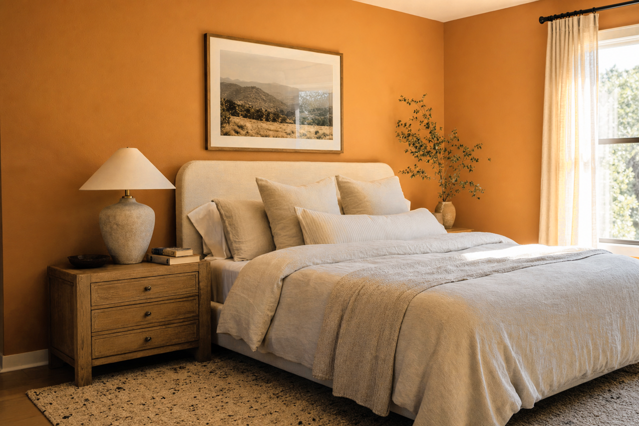
Venetian is perfect for creating a bold accent wall in living rooms, dining areas, or bedrooms. Pair it with lighter neutral walls to draw attention without overwhelming the space. Its earthy undertones ensure that it feels grounded while adding visual interest.
Dining Rooms and Kitchens
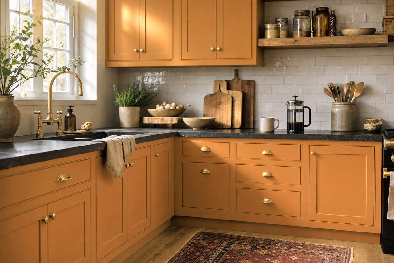
This color is a fantastic choice for dining rooms or kitchens, particularly when paired with natural wood finishes or metallic accents like brass or copper. Venetian’s warmth fosters a welcoming environment that’s perfect for entertaining and enjoying meals.
Office Spaces
In a home office or study, Venetian can inspire focus and creativity while maintaining a professional, polished look. Pair it with deep grays, creams, or leather textures for a space that feels elevated.
Furniture and Cabinetry
Venetian can also be used for painted furniture or cabinetry, adding a bold pop of color to kitchen islands, bathroom vanities, or built-ins. Its warmth pairs beautifully with natural stone countertops or tile backsplashes.
Exterior Applications
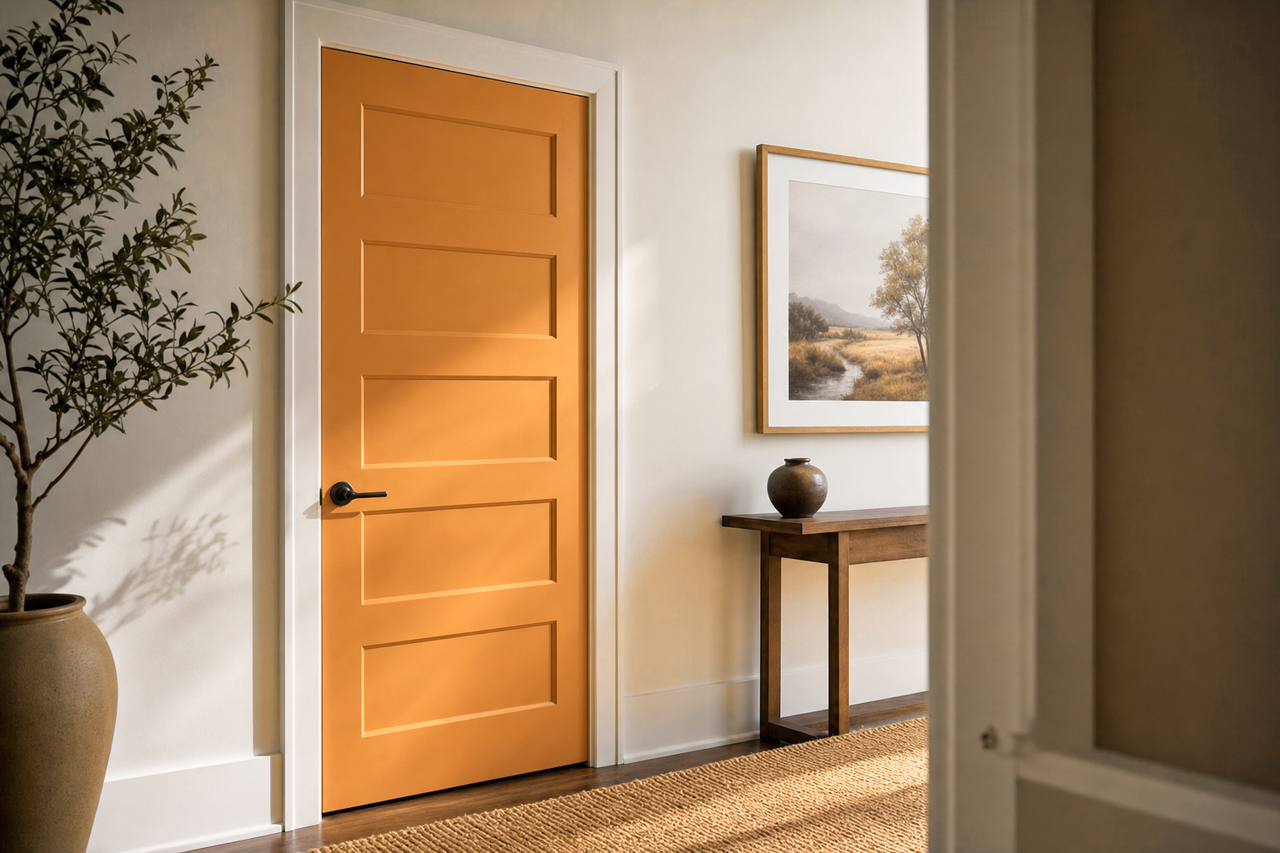
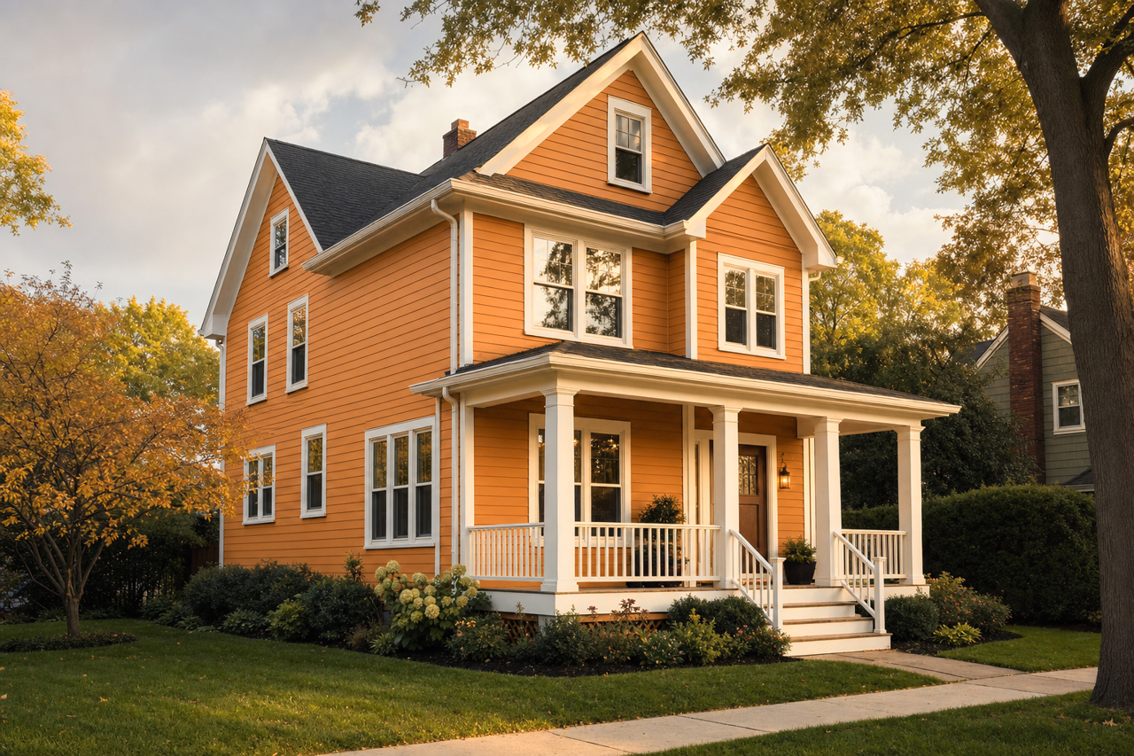
While Venetian is often used indoors, its earthy tone makes it a great option for exterior applications, such as front doors, shutters, or outdoor furniture. It adds a touch of rustic charm that complements brick, stone, or wood siding.
The Perfect Mood: Warm, Sophisticated, and Timeless
Venetian (2158-20) is a color that brings warmth, depth, and timeless sophistication to any interior or exterior space. Its earthy undertones, rich character, and versatility allow it to shine in a variety of design styles, from rustic to modern. Whether used as a bold focal point or a subtle accent, Venetian is a paint color that inspires creativity and transforms spaces into inviting havens.