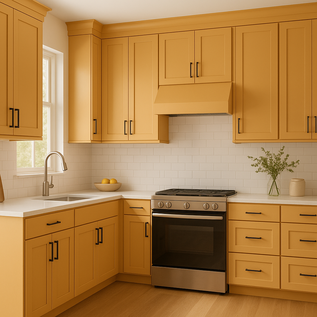
Benjamin Moore Amber (2159-40) is a rich, golden-brown hue that exudes warmth, elegance, and a timeless charm. Inspired by the earthy tones found in nature, this color creates a welcoming aura that works beautifully in both traditional and contemporary spaces. Its distinct amber glow makes it a versatile choice for homeowners seeking a balance between bold sophistication and understated comfort.
Amber is a warm color with subtle red and gold undertones that contribute to its richness and depth. These undertones allow the color to shift slightly depending on the lighting conditions, making it appear more golden and luminous in natural light, while leaning toward a cozy brown in dimmer, artificial lighting. This dynamic quality adds character to any room and ensures it remains visually interesting throughout the day.
Benjamin Moore Amber pairs beautifully with a range of complementary shades, making it an excellent choice for layering a cohesive color palette. Some coordinating colors include:
These pairings allow Amber to shine while maintaining harmony and balance within your overall design scheme.
Amber is a versatile color that can be used in various areas of your home to achieve different design goals. Here are some suggestions:
Amber is a fantastic choice for living rooms as its warm tone creates a cozy and inviting atmosphere. Pair it with plush furniture in neutral fabrics and metallic accents, such as gold or bronze, for a touch of glamour.
In dining areas, Amber sets the stage for intimate gatherings and elevates the mood with its golden glow. Combine it with dark wood furniture and soft lighting fixtures for a classic, elegant aesthetic.
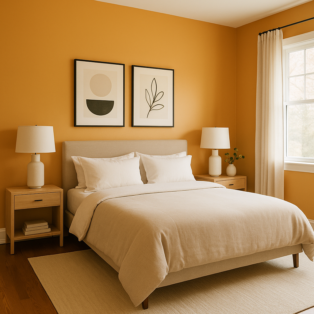
Amber can provide a soothing backdrop for bedrooms, especially when paired with soft textiles and muted colors. Its comforting hue encourages relaxation and helps create a serene retreat.
If you’re hesitant to go all in, consider using Amber as an accent wall. Its bold yet balanced tone adds depth and visual interest without overwhelming the space.
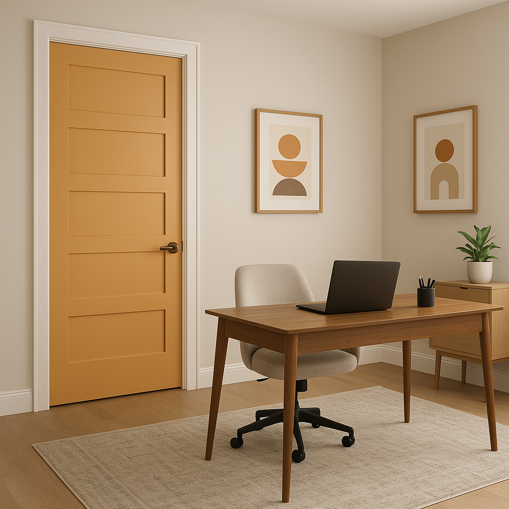
For a home office, Amber fosters creativity and focus. Pair it with natural wood finishes and earthy greens to build a productive yet calming environment.
Amber isn’t limited to interior spaces—it also makes a stunning choice for exterior siding or shutters. Its earthy warmth complements brick, stone, and natural landscaping beautifully.
Benjamin Moore Amber (2159-40) is more than just a warm, golden-brown paint color—it’s a versatile tool for transforming spaces into havens of comfort and style. Its rich undertones and ability to pair well with a variety of shades make it a go-to choice for interior designers and homeowners alike. Whether you’re looking to create a cozy living area, a sophisticated dining room, or a peaceful bedroom, Amber’s timeless appeal ensures it will enhance the beauty of your space for years to come.
View Colors Only by Brand (No Imagery):
Sherwin-Williams
|
Benjamin-Moore
|
Behr
|
Valspar
Live on the Eastern Slope of Colorado and looking for a local painting professional, check out all our painting services and reach out for a free estimate.
Copyright © 2026 : Wild Fox Painting Inc. : 12435 Mead Way, Littleton, CO 80125


