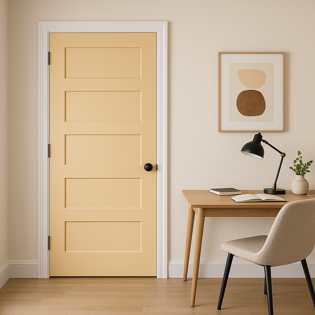
Benjamin Moore Wheatfield (2159-50) is a timeless, golden beige paint color that radiates warmth and comfort. With its soft, sunlit appearance, this shade is ideal for creating an inviting atmosphere in both residential and commercial spaces. Whether you're designing a cozy living room, a serene bedroom, or an elegant dining area, Wheatfield lends itself beautifully to a variety of styles and applications.
One of the standout features of Benjamin Moore Wheatfield is its subtle yellow and golden undertones. These undertones give the color its sunny, cheerful character without overwhelming the space. Unlike some beiges that lean too cool or too gray, Wheatfield has a natural warmth that feels grounded yet uplifting. The understated golden hue makes it a versatile choice, providing just enough color to feel distinctive while still acting as a neutral backdrop.
The yellow undertones also help Wheatfield pair beautifully with natural light, allowing the color to shift slightly based on the time of day. In bright sunlight, it takes on a soft golden glow, while in low light, it maintains a warm and cozy feel.
Benjamin Moore Wheatfield offers flexibility in coordinating with other colors, making it a fantastic choice for layered palettes. Here are some suggestions for creating harmonious designs:
By combining Wheatfield with complementary or contrasting colors, you can create looks ranging from minimalist elegance to bold sophistication.
Wheatfield’s versatility makes it suitable for a wide array of applications. Its warm, neutral base ensures it works well in any room while maintaining a welcoming and stylish aura.
Wheatfield is an excellent choice for living rooms, where its inviting tone creates a cozy yet polished ambiance. Pair it with soft furnishings in creamy whites and textured fabrics for a sophisticated look. Add pops of color like navy or rust to elevate the design.
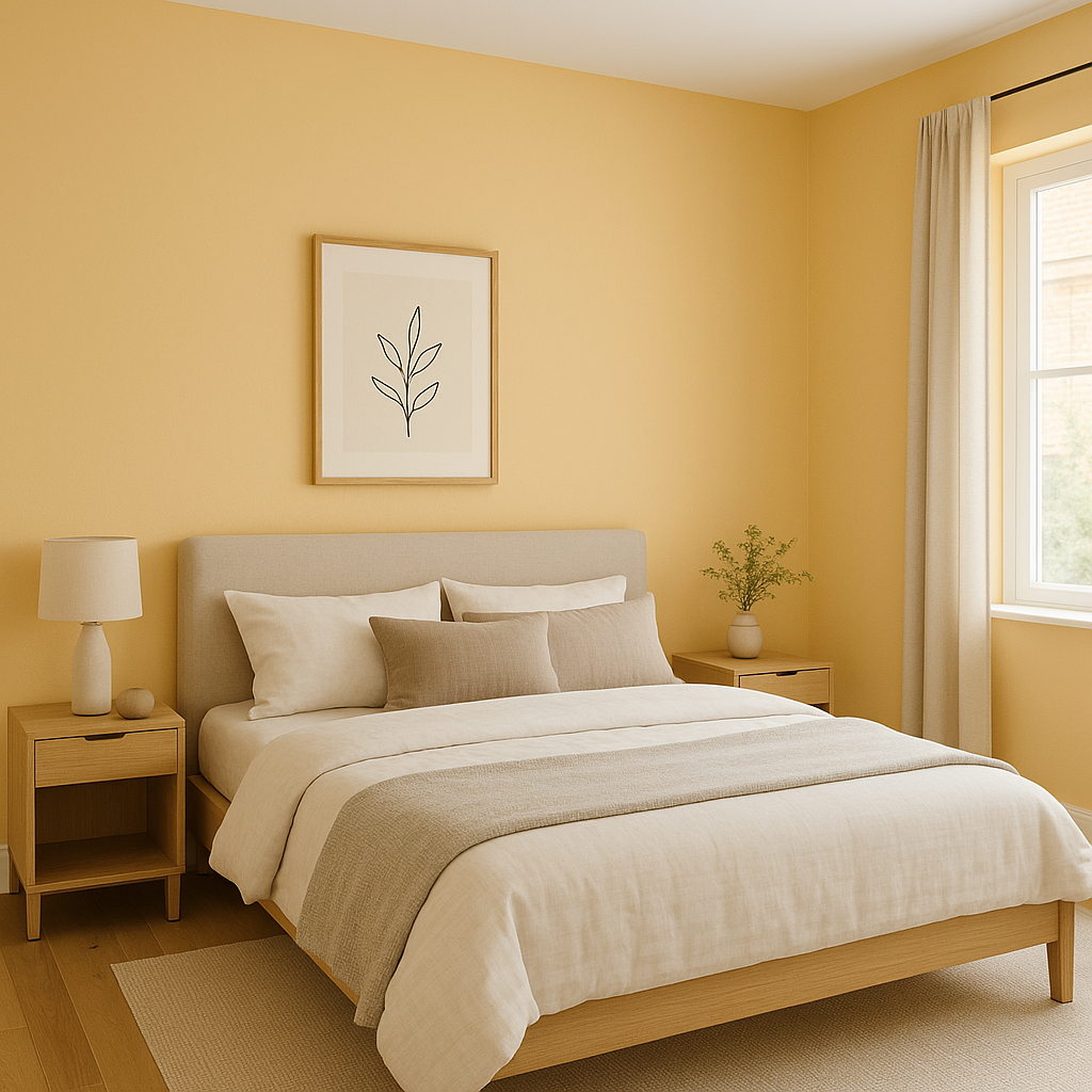
For bedrooms, Wheatfield delivers a serene and relaxing vibe. It pairs beautifully with natural wood furniture, soft linens, and muted accents like sage green or dusty pink. The color’s warmth fosters a tranquil environment perfect for unwinding.
In dining areas, Wheatfield brings an elegant and timeless quality. Combine it with darker wood finishes or metallics like brushed gold for a refined aesthetic. Use this shade as the backdrop for statement artwork or bold accent walls.
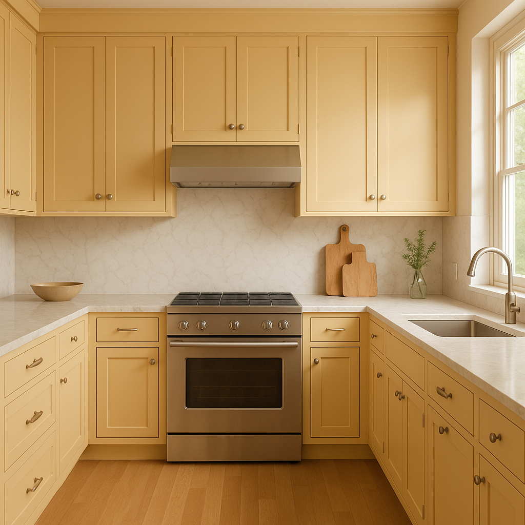
Wheatfield works wonderfully in kitchens, especially when paired with white cabinetry and warm wood tones. Its subtle golden undertones lend themselves to farmhouse, traditional, or transitional styles.
When used in hallways or entryways, Wheatfield creates a welcoming first impression. Its ability to reflect light makes these often-overlooked areas feel more spacious and inviting.
Benjamin Moore Wheatfield (2159-50) is the perfect choice for anyone seeking a paint color that blends warmth, versatility, and timeless appeal. Its golden beige hue with subtle yellow undertones ensures it enhances the character of a space without overwhelming it. Whether you’re designing a classic, rustic, or modern interior, Wheatfield’s adaptability allows it to shine in any setting.
Let Benjamin Moore Wheatfield transform your space into a haven of comfort, elegance, and style.
View Colors Only by Brand (No Imagery):
Sherwin-Williams
|
Benjamin-Moore
|
Behr
|
Valspar
Live on the Eastern Slope of Colorado and looking for a local painting professional, check out all our painting services and reach out for a free estimate.
Copyright © 2026 : Wild Fox Painting Inc. : 12435 Mead Way, Littleton, CO 80125


