Benjamin Moore Pink (2171-70): A Soft and Feminine Hue with Timeless Elegance
Benjamin Moore Pink (2171-70) is a delicate and understated shade of pink that exudes warmth, softness, and timeless sophistication. Its gentle hue brings a playful yet refined touch to any space, offering a versatile option that can complement a variety of interior styles. Whether you're creating a cozy bedroom retreat, a cheerful nursery, or a romantic dining room, this color provides the perfect backdrop for a serene and welcoming atmosphere.
Undertones
Benjamin Moore Pink (2171-70) is classified as a light pastel pink with subtle undertones of peach and beige. These soft undertones make it a more muted shade of pink, ensuring it doesn’t feel overly bright or overwhelming in a space. The peachy-beige undertones lend warmth to the color, making it a great choice for rooms that need a touch of femininity without being overtly bold or dramatic. This unique balance of warmth and softness allows the shade to evoke feelings of comfort and tranquility.
Coordinating Colors
One of the most appealing aspects of Benjamin Moore Pink (2171-70) is its versatility. It pairs beautifully with a range of complementary and contrasting tones, allowing you to create a harmonious palette for your interiors. Below are some coordinating color ideas:
Neutral Pairings:
Pair Benjamin Moore Pink with creamy whites like Chantilly Lace (OC-65) or soft grays like Gray Owl (2137-60) for a clean, airy look. These neutral tones allow the pink to shine without overpowering the space.Earthy Tones:
Shades like Revere Pewter (HC-172) or Edgecomb Gray (HC-173) work wonderfully with Pink (2171-70), adding depth and grounding the pastel hue with a touch of sophistication.Bold Contrasts:
For a more adventurous approach, consider pairing this pink with rich jewel tones like Newburg Green (HC-158) or Hale Navy (HC-154). The contrast creates a modern, dramatic effect that feels both chic and unexpected.Soft Pastels:
Complement this light pink with other gentle pastel hues like Palladian Blue (HC-144) or Spring Mint (2040-70) to create a whimsical, lighthearted palette that’s perfect for a nursery or playful living space.
Uses in Interior Design
Benjamin Moore Pink (2171-70) is incredibly versatile and can be used in a variety of spaces to evoke different moods and aesthetics. Here’s how you can incorporate this color into your home:
Bedrooms
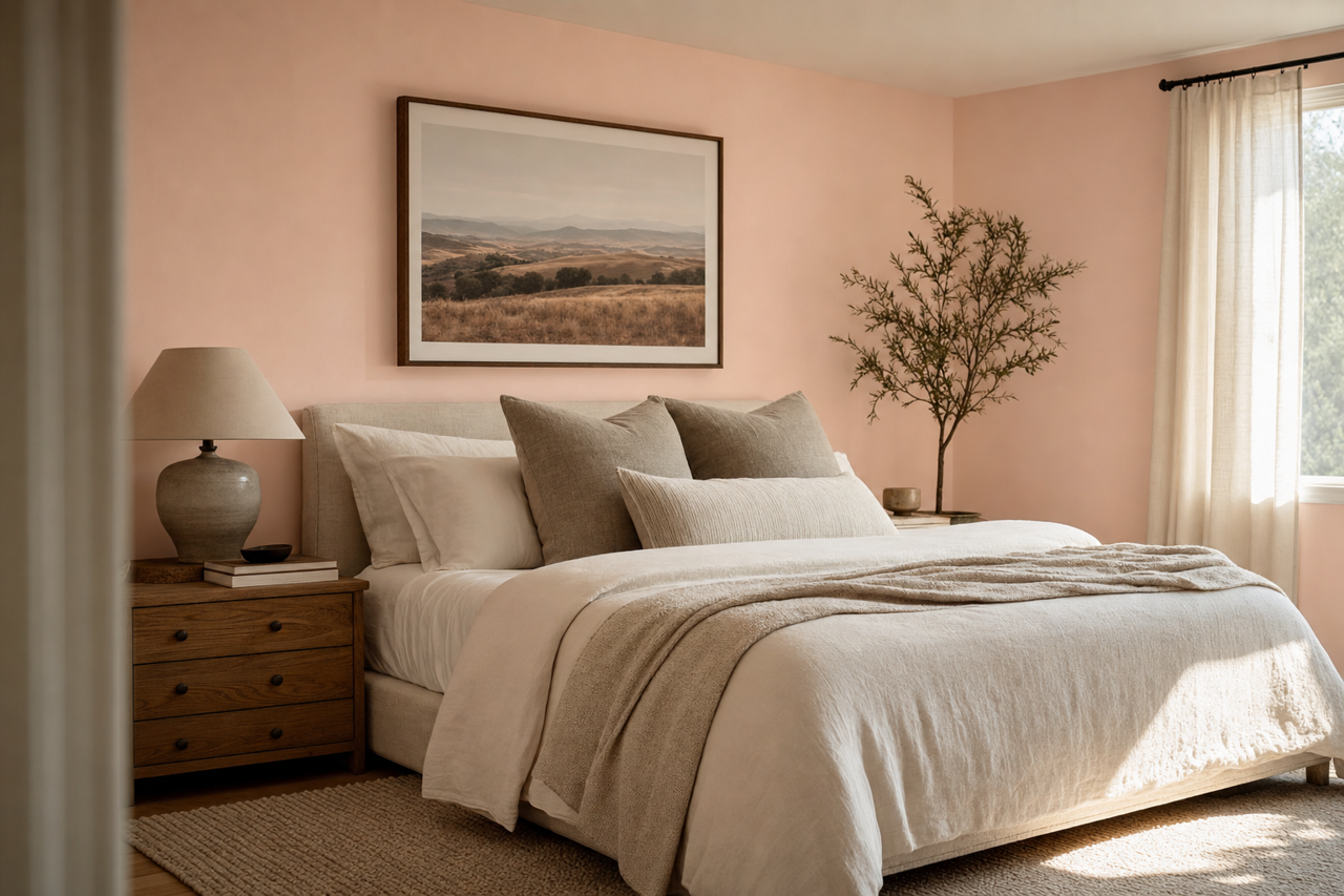
The soothing qualities of Pink (2171-70) make it a perfect choice for bedrooms. Its soft peach undertones create a calming environment conducive to relaxation. Pair it with plush bedding, soft textures, and warm metallics like gold or brass for a romantic and cozy ambiance.
Nurseries or Kids' Rooms
For a nursery or child’s bedroom, this pastel pink delivers a cheerful and youthful vibe without being overly saccharine. Combine it with playful patterns and complementary pastel tones to create a space that feels light and inviting.
Living Rooms
Add a subtle pop of color to your living room by incorporating Pink (2171-70) on an accent wall or using it in accessories like throw pillows and rugs. When paired with neutral furnishings and natural textures like wood or linen, the pink adds a touch of elegance without overwhelming the design.
Dining Rooms
Create a romantic and intimate dining space by using Pink (2171-70 on the walls or as part of the décor. Dark wood furniture and warm lighting can help balance the softness of the hue, creating a stylish and sophisticated atmosphere.
Bathrooms
Pink (2171-70) can transform a bathroom into a spa-like sanctuary. Pair it with crisp white tiles, marble countertops, and polished chrome fixtures for a clean yet inviting look.
Accent Pieces
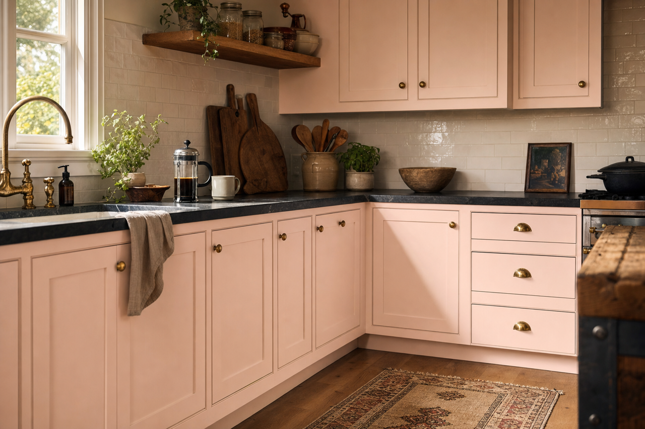
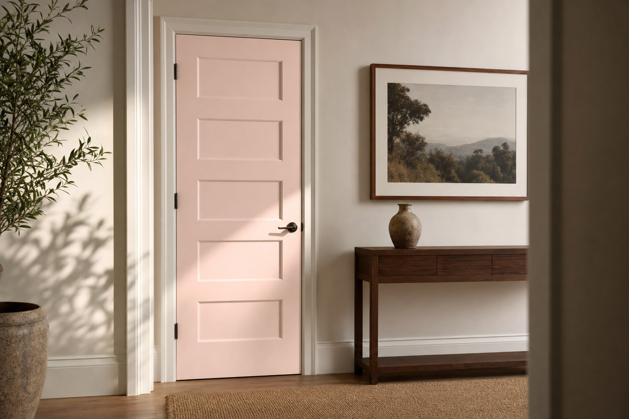
If painting walls feels like too much commitment, this color works beautifully on smaller elements like furniture, cabinetry, or trim. For example, a vintage dresser painted in Pink (2171-70) can serve as a charming statement piece in any room.
Why Choose Benjamin Moore Pink (2171-70)?
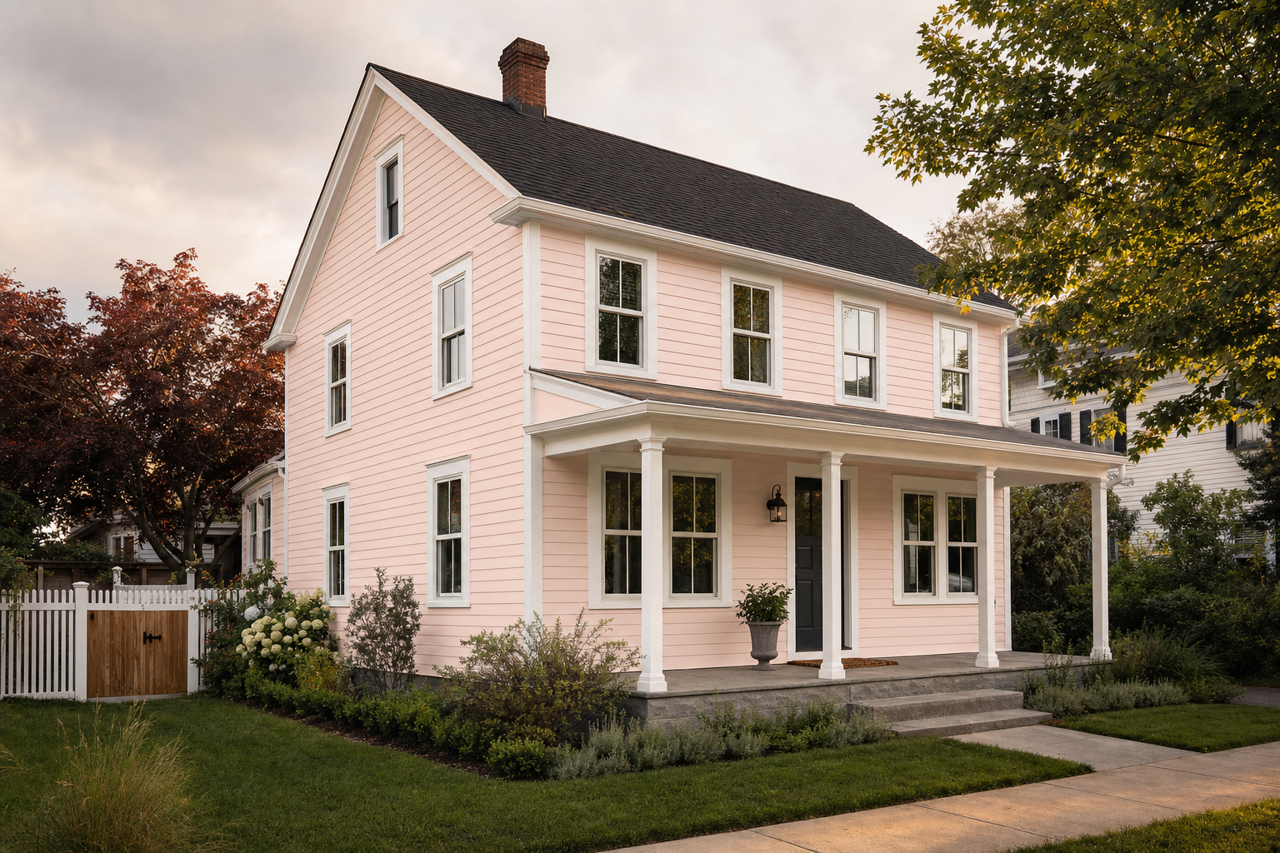
This shade is perfect for homeowners and designers looking to inject warmth and subtle femininity into a space. Its peach-beige undertones ensure it blends seamlessly into a variety of color schemes, while its soft pink hue creates a welcoming and serene atmosphere. Whether used as the main wall color, an accent, or on furniture, Benjamin Moore Pink (2171-70) is a versatile and timeless choice that elevates interiors with style and grace.