
Valspar Wheat Toast (3002-10B): A Warm, Versatile Neutral
Valspar Wheat Toast (3002-10B) is a beautifully balanced neutral paint color that radiates cozy warmth without overpowering a space. Perfectly blending rustic charm with modern sophistication, this shade is a timeless choice for both residential and commercial interiors. Its earthy, grounded hue creates a welcoming ambiance, making it an excellent option for a variety of design styles, from farmhouse chic to transitional elegance.
Undertones of Valspar Wheat Toast
Wheat Toast features subtle undertones of golden beige and soft taupe, giving it a gentle warmth that feels organic and inviting. These undertones allow it to adapt seamlessly to different lighting conditions, making it equally stunning in artificial light as it is in natural sunlight. Whether paired with cooler tones or warmer accents, Wheat Toast harmonizes beautifully with its surroundings, making it a versatile choice for any space.
Coordinating Colors
The flexibility of Wheat Toast is one of its standout qualities—it pairs effortlessly with a wide range of colors. Here are some coordinating shades that complement its warm undertones:
- Valspar Woodlawn Colonial Gray (6004-1A): A soft gray that adds a sophisticated contrast to Wheat Toast’s warmth. Perfect for creating depth and balance in contemporary spaces.
- Valspar Homestead Apricot (2007-8C): A peachy hue that enhances the golden undertones of Wheat Toast, ideal for accent walls or as a pop of color in furnishings.
- Valspar Simply White (7002-16): A crisp white that provides a clean, fresh backdrop for Wheat Toast, helping it shine in bright and airy spaces.
- Valspar Ocean Storm (5004-2C): A deep blue-gray that pairs beautifully for a more dramatic and moody aesthetic.
You can also incorporate natural materials like wood, rattan, or stone to further emphasize the earthy charm of Wheat Toast.
Best Uses for Wheat Toast
Wheat Toast’s versatility makes it suitable for a variety of interior applications. Here are some ideas to inspire your next design project:
Living Rooms
Use Wheat Toast as the primary wall color to create a cozy and inviting living room. Pair it with warm wooden furniture, plush textiles, and metallic accents like brushed gold or bronze for a polished look. Add coordinating colors like Ocean Storm in throw pillows or rugs to introduce subtle contrast.
Bedrooms
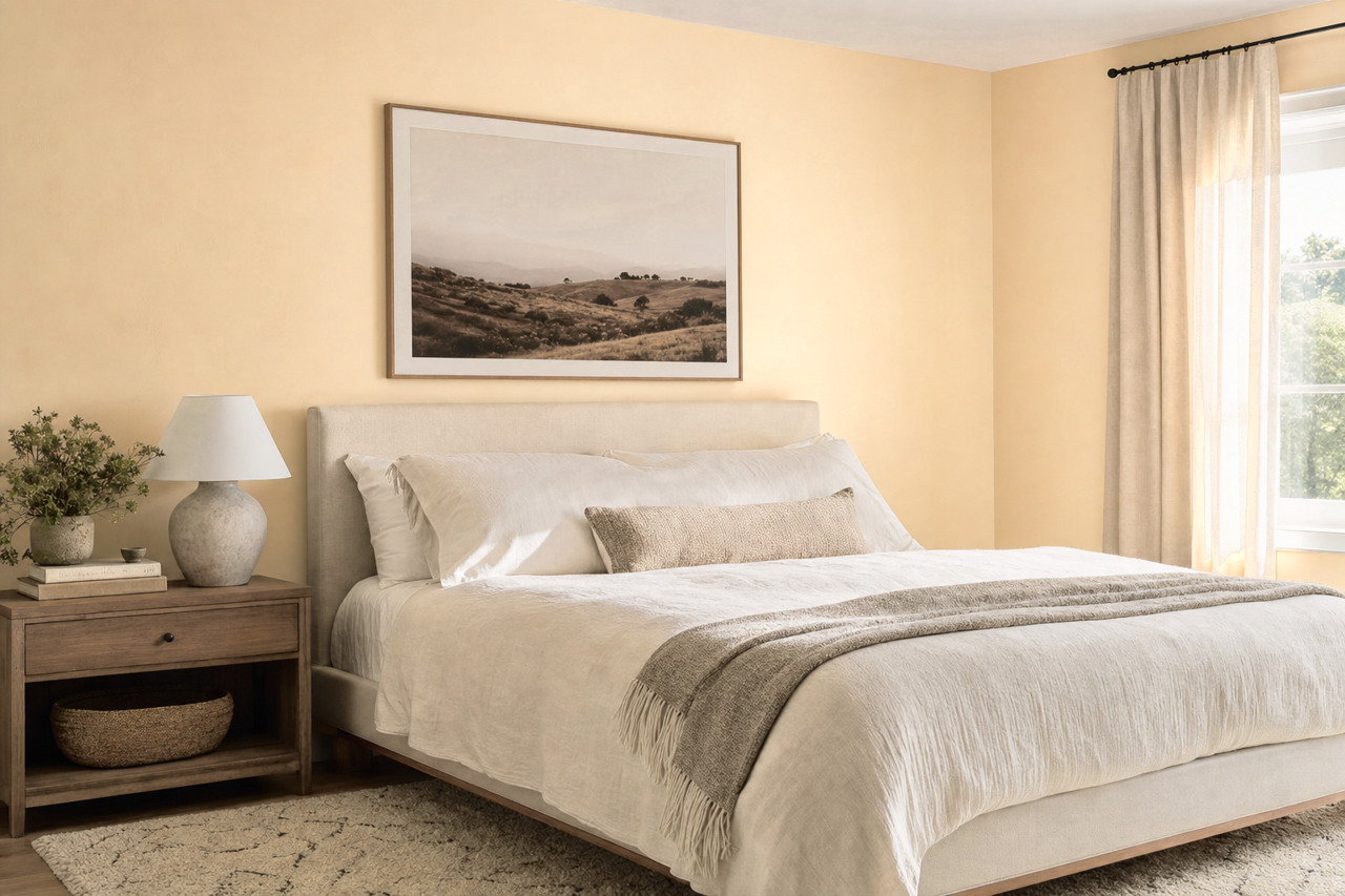
For a serene bedroom retreat, Wheat Toast works beautifully as the base color. Combine it with crisp white bedding and soft gray curtains to maintain a calming atmosphere. Accent with muted greens or blues for a nature-inspired palette.
Kitchens and Dining Areas
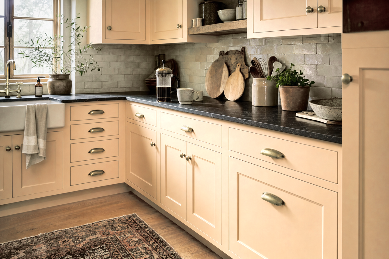
Wheat Toast is an excellent choice for kitchen walls or cabinetry. Its warm undertones pair wonderfully with stone countertops and stainless steel appliances. In dining areas, complement it with Homestead Apricot in table linens or wall art to enhance its welcoming vibe.
Home Offices
Bring focus and comfort to your home office with Wheat Toast. Use Simply White for trim and shelving to keep the space bright and organized. Add potted plants or greenery to tie in a natural element, creating an environment conducive to productivity.
Commercial Spaces
In commercial settings, Wheat Toast lends itself to a professional yet approachable atmosphere. It works well in offices, waiting rooms, or retail spaces, where its warmth can make clients and customers feel at ease.
Lighting Considerations
Lighting plays a crucial role when choosing Wheat Toast. In spaces with ample natural light, its golden undertones will appear brighter and more luminous, while in dimmer settings, it takes on a richer and more subdued tone. Consider testing it in your space at different times of the day to see how it interacts with your lighting and décor.
Valspar Wheat Toast (3002-10B) is more than just a paint color—it’s a design tool that brings warmth, versatility, and timeless elegance to any interior. Whether you’re creating a cozy home or a stylish commercial space, this neutral hue is sure to leave a lasting impression.