

Valspar Pumpkin Squash (3009-5): A Warm and Inviting Hue for Every Space
Valspar Pumpkin Squash (3009-5) is a rich, golden-orange shade that exudes warmth, character, and timeless charm. Perfect for creating cozy, welcoming interiors, this color features a balance of vibrant energy and earthy sophistication. Its mid-tone depth and natural undertones make it a versatile choice for a variety of design styles, from rustic chic to modern eclectic.
Undertones
Pumpkin Squash is grounded in warm, golden undertones with a subtle hint of brown, which gives it a natural, organic feel. These undertones prevent the color from feeling overly bright or brash, lending it a muted elegance that’s both comforting and approachable. The golden undertones enhance its ability to complement both neutral palettes and bolder accent colors, making it a standout choice for creating harmonious spaces.
Coordinating Colors
When paired thoughtfully, Valspar Pumpkin Squash can shine as either the focal point of your color scheme or a complementary player within a larger palette. Here are some coordinating color suggestions to bring out its full potential:
- Neutral Partners: Pair Pumpkin Squash with soft, earthy neutrals like Valspar Warm Oatmeal (3008-10C) or Ivory Dust (3006-8A) to create a serene and balanced look. These muted tones let the warmth of Pumpkin Squash take center stage without overwhelming the space.
- Bold Contrasts: For a more dynamic and playful atmosphere, consider pairing it with deep navy blues like Valspar Ocean Storm (5002-3C) or forest greens such as Valspar Pine Forest (5005-4C). These darker tones provide a dramatic contrast that highlights the golden-orange vibrancy of Pumpkin Squash.
- Complementary Accents: To enhance the autumnal quality of Pumpkin Squash, incorporate soft sage greens like Valspar Spring Meadow (6001-6A) or muted cranberry reds such as Valspar Redstone Canyon (1011-5). These complementary hues create a cohesive, nature-inspired palette.
Ideal Uses for Pumpkin Squash
The warmth and versatility of Valspar Pumpkin Squash make it an excellent choice for a variety of applications throughout your home. Whether you're designing a cozy living space, a statement wall, or bringing character to overlooked areas, this color adapts beautifully to your vision.
Living Rooms and Family Spaces
Pumpkin Squash is a natural fit for living rooms, where its golden undertones create a sense of comfort and intimacy. Use it on all four walls for a cocooning effect, or choose it as an accent color to enliven a neutral space. Pair it with warm wood tones and soft textiles for an inviting, layered look.
Kitchens and Dining Rooms
In kitchens and dining rooms, Pumpkin Squash evokes a sense of warmth and celebration, making it ideal for spaces where family and friends gather. Pair it with white cabinetry or rustic wood finishes for a farmhouse-inspired aesthetic, or combine it with black hardware and industrial accents for a more modern approach.
Bedrooms
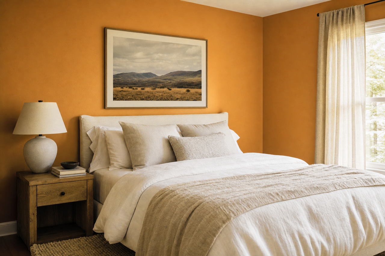
For a cozy bedroom retreat, Pumpkin Squash can create a warm and soothing ambiance. Use it as an accent wall behind the bed, paired with crisp white linens and textured throws, or go bold with all-over color for a truly enveloping space.
Entryways and Hallways
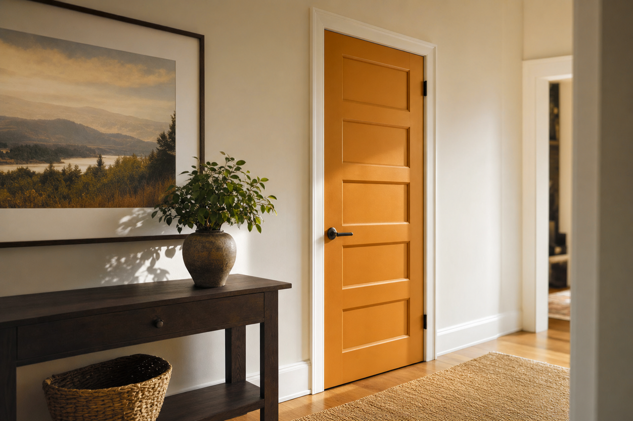
Make a lasting first impression by using Pumpkin Squash in your entryway. Its warm, inviting tone sets the stage for the rest of your home, creating a sense of openness. In hallways, it adds depth and character to what might otherwise be a purely functional space.
Seasonal Decor
Pumpkin Squash is the perfect choice for creating seasonal vignettes or highlighting decor elements throughout the year. Its autumnal quality makes it a natural fit for fall-inspired spaces, but its earthy sophistication ensures it remains relevant year-round.
Why Choose Valspar Pumpkin Squash?
Valspar Pumpkin Squash (3009-5) is more than just a color; it’s a statement of warmth, comfort, and style. Its ability to adapt to a variety of settings, coordinate with diverse palettes, and evoke a sense of home makes it a timeless choice for any interior design project. Whether you’re looking to revamp a single room or create a cohesive theme throughout your home, Pumpkin Squash is a hue that will inspire and delight.
Add this golden-orange gem to your color palette and transform your space into a haven of warmth and beauty.