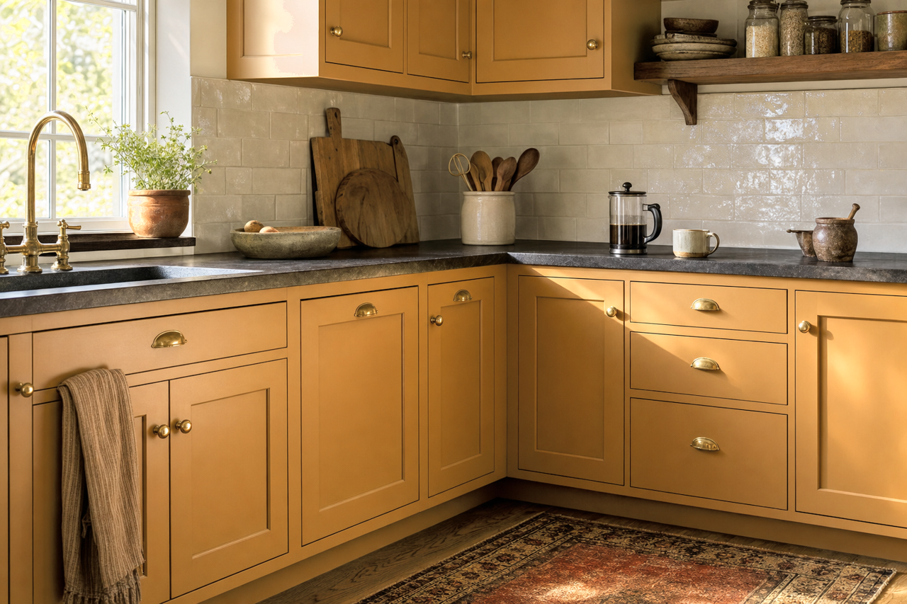
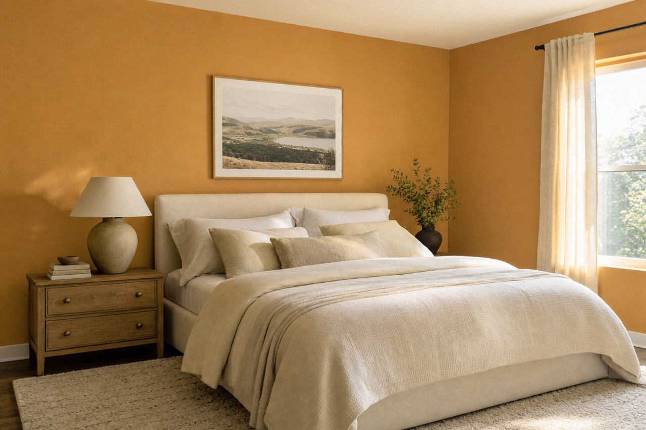
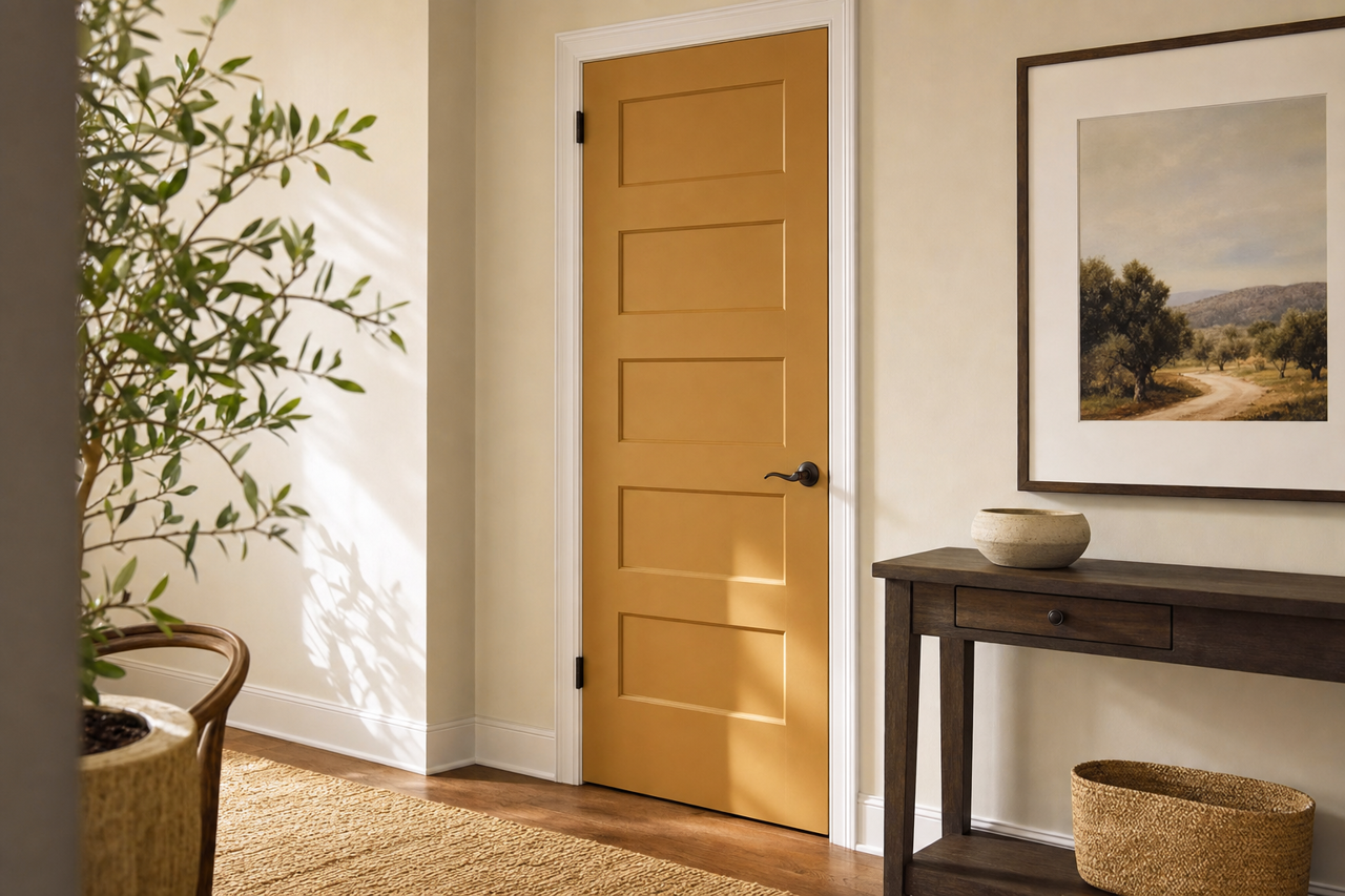

Valspar Mixed Potpourri (3010-4): A Sophisticated Blend of Soft Lavender and Gray
Valspar Mixed Potpourri (3010-4) is a tranquil and understated shade that combines the elegance of lavender with the versatility of soft gray. This unique hue exudes a sense of calm sophistication, making it a perfect choice for spaces that embrace both modern and classic design aesthetics. Its balanced tone is subtle yet impactful, providing a serene backdrop that enhances a variety of interior styles.
Undertones: Subtle Lavender with a Warm Gray Base
The standout feature of Mixed Potpourri is its delicate undertones. At its core, this hue leans into a soft lavender, offering a whisper of floral charm. However, its warm gray base tempers the purple, ensuring the color remains grounded and versatile. The muted lavender undertones give it a touch of personality without overwhelming the space, creating a refined look that feels both timeless and contemporary.
This duality of warm gray and lavender undertones makes Mixed Potpourri an excellent choice for creating a balanced atmosphere. It can feel cozy and inviting in the evening under warm light, while appearing fresh and airy in natural daylight.
Coordinating Colors: Harmonizing Your Palette
Mixed Potpourri’s versatility allows it to pair beautifully with a range of coordinating colors. Here are some recommendations to build a harmonious color palette:
- Soft Neutrals: Pair with creamy whites like Valspar’s "Swiss Coffee" or "Cream Delight" to maintain a light and airy feel. These shades will enhance the subtle elegance of Mixed Potpourri.
- Earthy Tones: Complement it with warm taupes or muted beiges like "Oatland Taupe" or "Woodlawn Colonial Gray" for a grounded, natural look.
- Deep Accents: Add depth with rich navy blues like "Indigo Streamer" or deep charcoals such as "Civic Steel." These darker shades will provide striking contrast while maintaining a sophisticated vibe.
- Soft Greens: For a refreshing and modern touch, consider pairing it with muted greens like "Secluded Garden" or "Green Grove."
These combinations allow you to tailor Mixed Potpourri to suit a variety of styles, from minimalist to eclectic, and everything in between.
Where to Use Valspar Mixed Potpourri
Mixed Potpourri’s soothing nature makes it an excellent choice for spaces where relaxation and comfort are a priority. Here are some inspiring ways to incorporate this color into your home:
- Bedrooms: Create a serene retreat by using Mixed Potpourri on the walls. Pair it with crisp white bedding and soft metallic accents like brushed gold or silver for a luxurious yet peaceful vibe.
- Living Rooms: Use it as a wall color to set a calming tone in your living space. Add layers of texture through plush throw pillows, soft rugs, and natural wood furniture to create a cozy atmosphere.
- Bathrooms: Bring a spa-like feel to your bathroom by pairing Mixed Potpourri with white marble or matte black fixtures. The subtle lavender undertones will add a hint of sophistication to your self-care sanctuary.
- Home Offices: Promote focus and creativity by using this color in your workspace. Pair it with neutral furniture and pops of greenery for an environment that feels both professional and inspiring.
- Entryways: Impress guests with a welcoming and elegant entryway by using Mixed Potpourri as a backdrop. Add a statement mirror or bold artwork to complete the look.
The Transformative Power of Mixed Potpourri
Valspar Mixed Potpourri (3010-4) is a stunningly adaptable shade that brings a sense of calm and refinement to any room. Its soft lavender undertones combined with a warm gray base make it a versatile choice for homeowners looking to create spaces that feel both stylish and soothing. Whether you’re designing a cozy bedroom, a chic living room, or a polished office, this color provides the perfect foundation for timeless elegance.