Benjamin Moore Citrus Burst (364): A Vibrant Burst of Energy for Your Space
Benjamin Moore Citrus Burst (364) is a lively and invigorating shade of yellow-green that instantly breathes life into any room. With its vibrant personality, this color sits at the intersection of zestful energy and natural tranquility. It’s the perfect hue for those who want to make a bold statement while maintaining a connection to nature. Whether used as a focal point or an accent, Citrus (364) has the versatility to inspire creativity and radiate positivity throughout your home.
Undertones of Benjamin Moore Citrus Burst (364)
Citrus (364) is a bright, yellow-green color with warm undertones that evoke the essence of freshly squeezed lime or a sunlit meadow. Its noticeable yellow base gives it a cheerful warmth, while the green undertones maintain a grounded, earthy feel. These undertones make it a dynamic color that shifts slightly depending on the lighting. In natural daylight, it leans more toward vibrant green, while under warm artificial light, its yellow undertones come forward, creating a sunnier, cozier vibe.
This duality of warm and cool undertones allows Citrus (364) to adapt beautifully to a variety of design styles, from modern and eclectic to farmhouse and tropical-inspired interiors.
Coordinating Colors for a Balanced Palette
Benjamin Moore Citrus Burst (364) pairs beautifully with a range of complementary and neutral shades, making it easy to create a cohesive and harmonious palette. Here are some coordinating colors to consider:
Neutrals:
- Cloud White (OC-130): A soft, creamy white that balances the vibrancy of Citrus and adds a clean, fresh backdrop.
- Gray Owl (OC-52): A light, cool gray that tempers the energy of Citrus, providing a calming contrast.
Accent Colors:
- Hale Navy (HC-154): A deep, rich navy blue that grounds the space and adds a sophisticated edge.
- Caliente (AF-290): A bold, fiery red that creates a striking contrast, perfect for adventurous designs.
Nature-Inspired Pairings:
- Tranquility (AF-490): A muted blue-green that complements the natural tones of Citrus.
- Fernwood Green (2145-40): A soft, leafy green that enhances the organic vibe of the color.
With these coordinating colors, you can build a palette that feels balanced and intentional, whether you’re designing a playful children’s room or a vibrant kitchen.
Best Uses for Benjamin Moore Citrus Burst (364)
Citrus (364) is a versatile hue that can be used to energize a variety of spaces. Here are some ideas to incorporate this striking color into your home:
1. Accent Walls
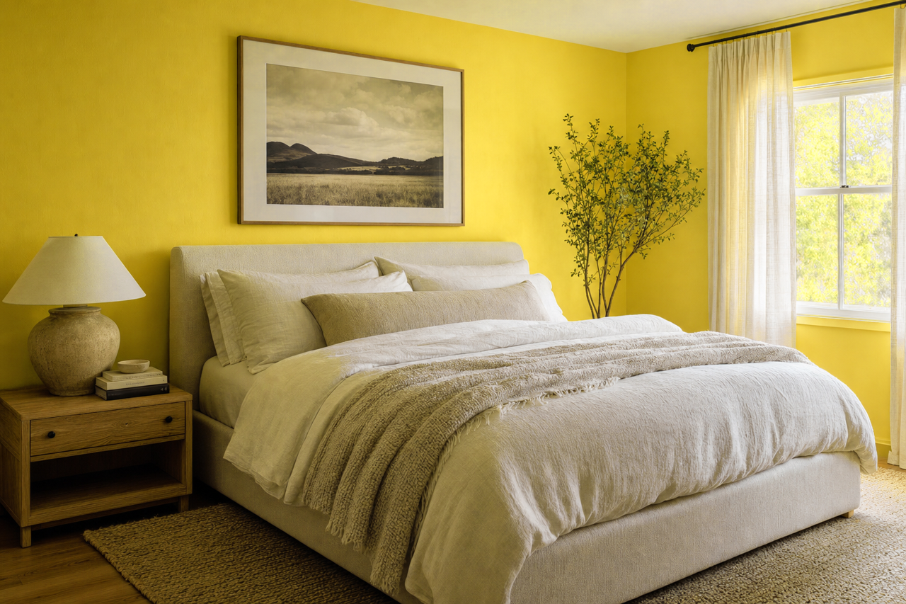
Make Citrus the star of the room by using it on an accent wall. In living rooms or home offices, it adds a burst of personality without overwhelming the space. Pair it with neutral walls and furnishings to let the color shine.
2. Kitchen and Dining Spaces
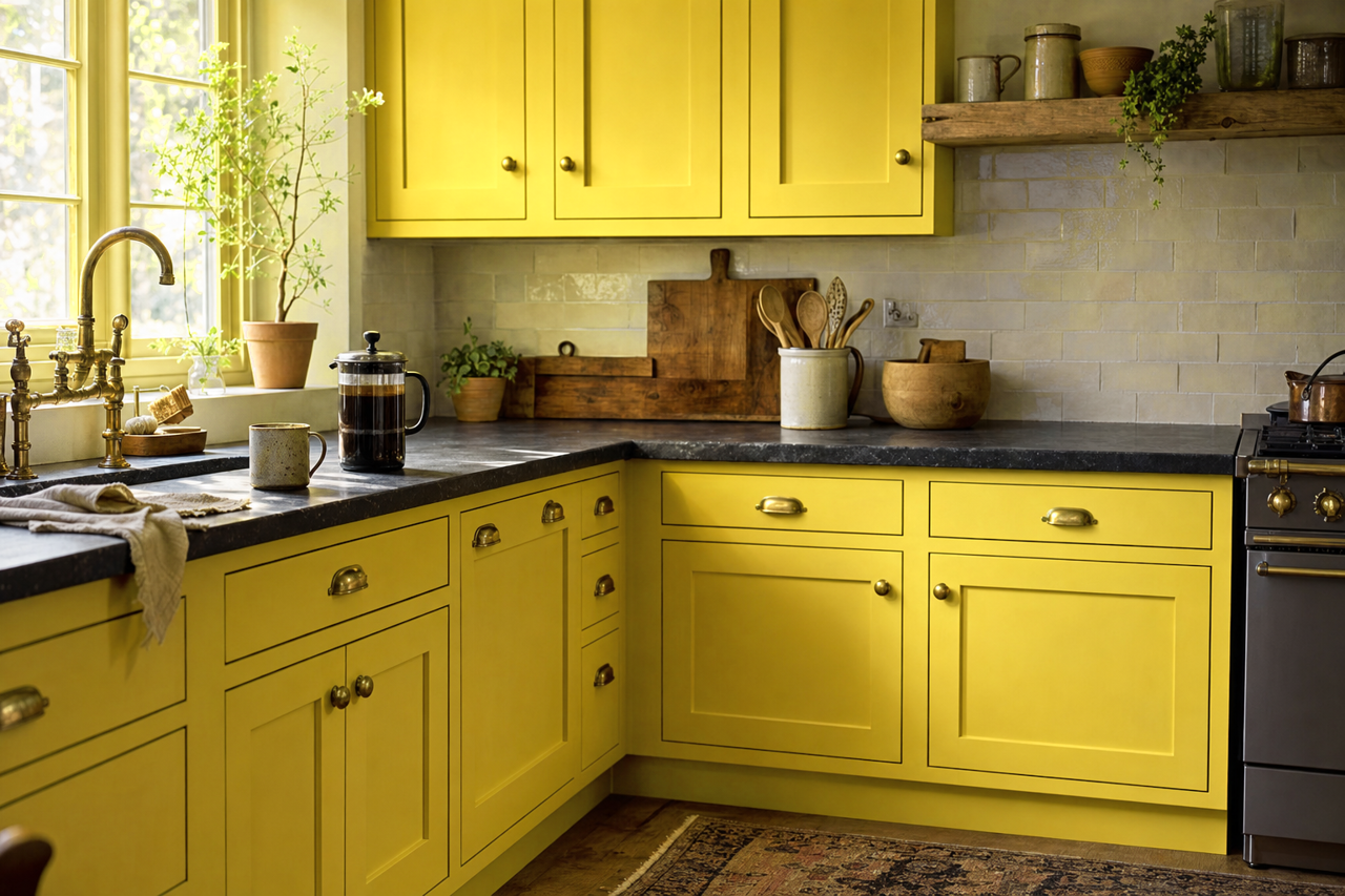
Citrus (364) is a natural choice for kitchens and dining areas, where its fresh, invigorating vibe can stimulate conversation and creativity. Try it on cabinetry, paired with white countertops and subway tiles for a modern twist.
3. Bathrooms
In smaller spaces like bathrooms or powder rooms, Citrus can create an unexpected pop of energy. Consider pairing it with crisp white fixtures and polished chrome accents for a clean, contemporary look.
4. Children’s Rooms and Play Areas
The playful nature of Citrus makes it a fantastic choice for kids’ spaces. Use it on walls, furniture, or decor to create a cheerful and imaginative atmosphere.
5. Outdoor Spaces
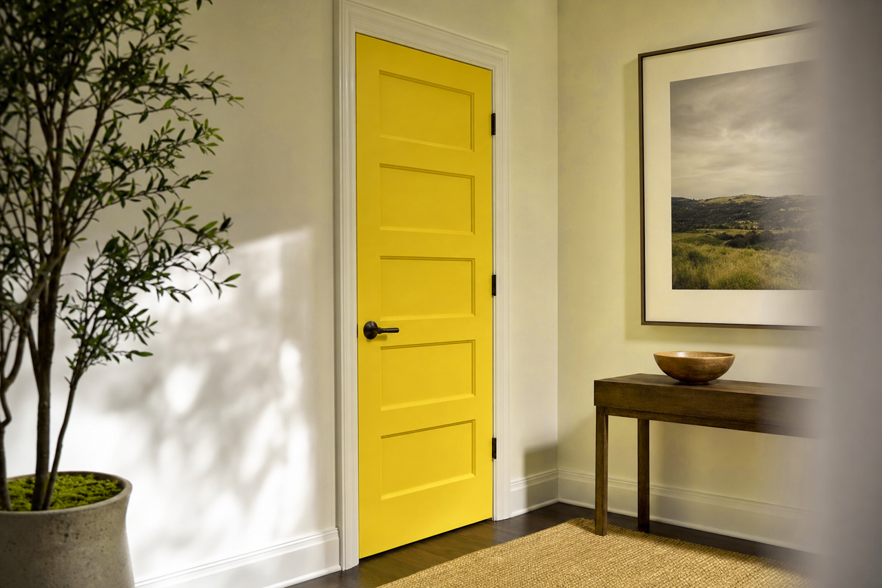
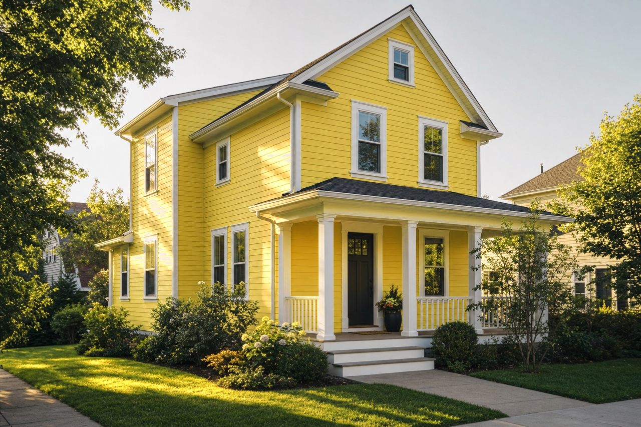
Bring the vibrancy of Citrus outdoors by using it on patio furniture, planters, or even a front door. Its natural undertones make it a seamless addition to gardens or greenery.
Lighting Considerations
Because of its dual undertones, Citrus (364) reacts differently in varying lighting conditions. To ensure it works well in your space:
- Test it with swatches on your walls at different times of day.
- Use natural lighting to emphasize its green tones for a fresh and airy feel.
- Pair it with warm artificial lighting to highlight its cozy, yellow undertones.
Benjamin Moore Citrus Burst (364) is not just a color; it’s an experience. Its lively energy and natural undertones make it a versatile option for spaces that need a splash of personality and warmth. Whether you’re designing a bold contemporary room or a serene, nature-inspired retreat, Citrus (364) offers endless possibilities to brighten and transform your home.