Valspar Timid Violet (4001-3A): A Soft, Sophisticated Hue for Serene Interiors
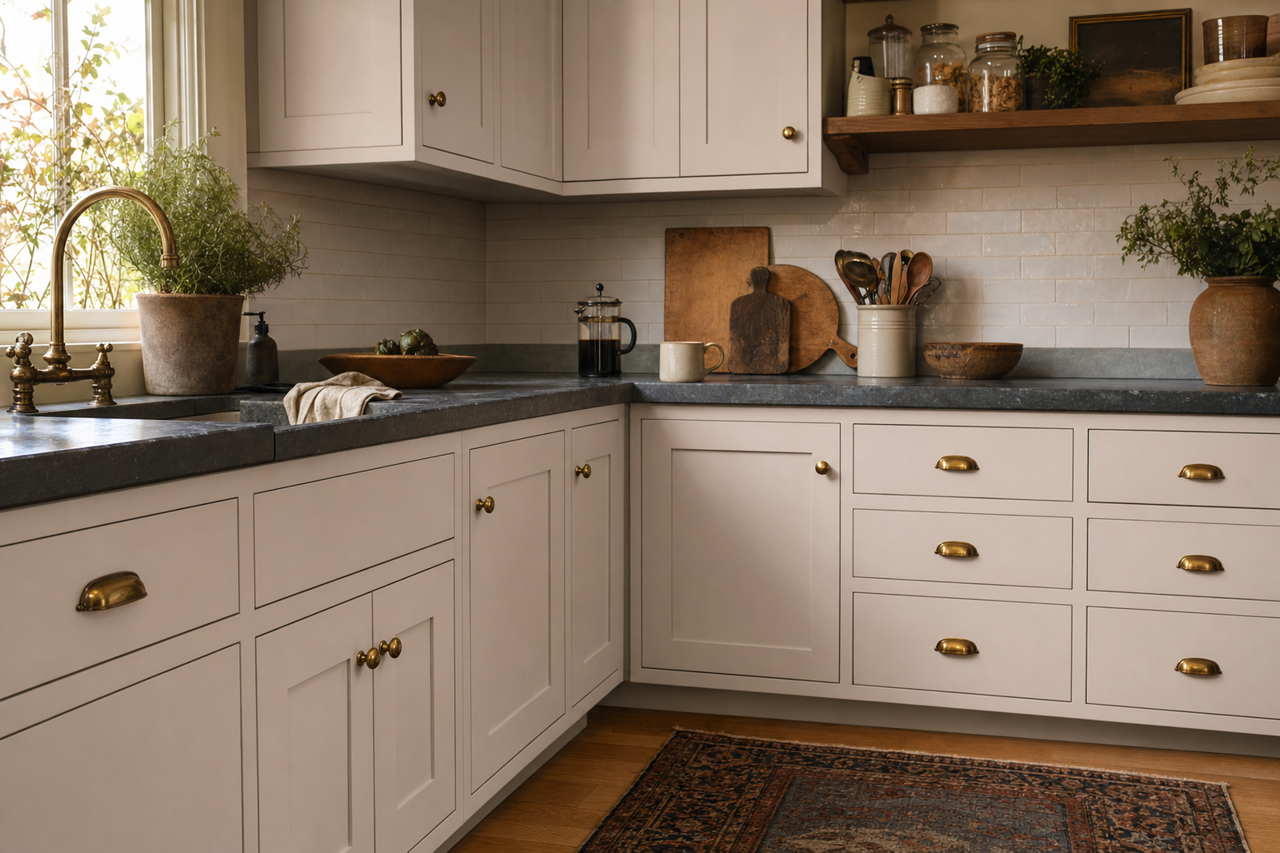
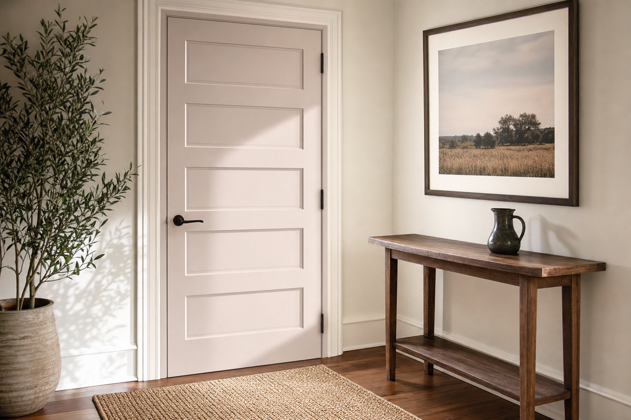
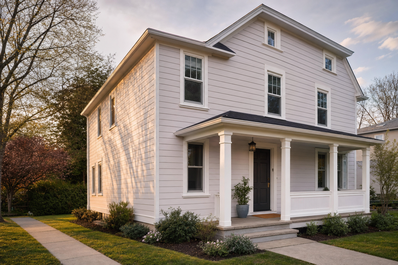
Valspar Timid Violet (4001-3A) is a delicate and sophisticated shade of light violet that lends a sense of tranquility and subtle elegance to any space. This versatile paint color seamlessly bridges the gap between cool and warm tones, making it an exceptional choice for a variety of interior design styles, from modern minimalism to classic traditional.
Undertones: A Perfect Blend of Warmth and Coolness
Timid Violet features a harmonious blend of subtle gray and lavender undertones, which give it a refined, muted appearance. Unlike bold or overly saturated purples, this hue leans soft and understated, creating a calming backdrop that is both approachable and refined. The gray undertones add a touch of neutrality, preventing the violet from feeling overpowering, while the lavender undertones infuse the color with a gentle warmth that feels inviting and serene. This balance makes Timid Violet a highly adaptable shade that can work beautifully in both north-facing and south-facing rooms.
Coordinating Colors: Crafting a Cohesive Palette
Timid Violet shines brightest when paired with complementary hues that enhance its subtle charm. Here are some coordinating colors to consider:
- Neutral Partners: Pair Timid Violet with crisp whites like Valspar’s "Du Jour" (7002-6) for a clean and airy feel, or with soft grays like "Silver Leaf" (4001-1B) to create a soothing monochromatic palette.
- Earthy Accents: For added depth and warmth, incorporate rich taupe tones such as "Smoked Oyster" (4004-2A) or muted beige shades like "Cozy White" (3005-10C). These colors ground the violet and bring an organic touch to the space.
- Bold Contrast: If you’re looking to add a pop of contrast, deep navy blues like "Indigo Streamer" (4007-8C) or charcoal tones such as "Iron Frost" (4008-1B) create a striking balance that feels both modern and sophisticated.
- Pastel Pairings: For a dreamy, feminine aesthetic, combine Timid Violet with blush tones like "Blushing Bride" (1006-8C) or soft mint greens like "Sea Sage" (5007-3A).
Where to Use Timid Violet: Versatility at Its Best
Timid Violet’s serene and versatile nature makes it a timeless choice for virtually any room in your home. Here are a few ideas to inspire you:
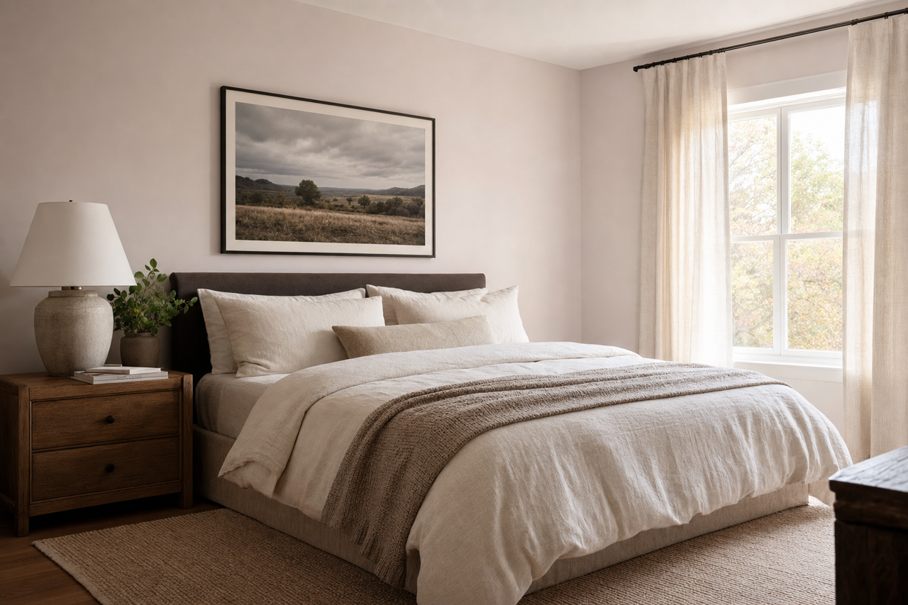
- Bedrooms: This color is a natural fit for bedrooms, where its calming undertones create a restful and peaceful environment. Pair it with plush textiles, soft lighting, and natural wood furniture for a cozy retreat.
- Living Rooms: In living areas, Timid Violet adds subtle sophistication without overwhelming the space. Use it on an accent wall to create a focal point or as the main wall color for a serene, cohesive look.
- Bathrooms: For a spa-like ambiance, Timid Violet works beautifully in bathrooms, especially when paired with crisp white tiles, chrome fixtures, and frosted glass accents.
- Home Offices: Its gentle tone promotes focus and creativity, making it an excellent choice for a home office. Pair it with minimalist furniture and clean lines for a modern workspace.
- Children’s Rooms: The playful yet understated quality of Timid Violet makes it a charming option for nurseries or kids’ rooms, especially when paired with other pastel tones.
Lighting and Mood: Enhancing Timid Violet’s Appeal
Lighting plays a crucial role in how Timid Violet is perceived. In natural light, it exudes a soft, cheerful lavender tone, while in dimmer artificial lighting, the gray undertones become more pronounced, giving it a cozier, more grounded feel. This dual personality allows you to create a mood that suits your space and lifestyle.
Why Choose Timid Violet?
Valspar Timid Violet (4001-3A) is more than just a paint color—it’s a statement of subtle elegance and serene style. Its balance of warm and cool undertones makes it a versatile choice for any design scheme, while its ability to pair effortlessly with a variety of colors ensures endless possibilities for creative expression. Whether you’re looking to create a tranquil retreat, a stylish living space, or a cozy corner, Timid Violet is a timeless hue that will elevate your interiors with its soft sophistication.