
Valspar Waterloo (4003-6C): A Timeless Blue with Depth and Elegance
Valspar Waterloo (4003-6C) is a rich and sophisticated blue that exudes timeless charm and versatility. This medium-dark hue strikes the perfect balance between boldness and restraint, making it a favorite for creating spaces that feel both grounded and calm. Whether used as a primary wall color, an accent, or a backdrop for statement pieces, Waterloo offers a sense of depth that draws the eye and sets a serene, confident tone.
Undertones: The Heart of Waterloo
Waterloo carries subtle gray undertones that soften its boldness and lend it a slightly moody character. These undertones make the color more versatile, allowing it to adapt beautifully to various lighting conditions and design styles. In natural light, the blue takes on a cooler, crisp appearance, while in softer, artificial light, the gray undertones add a cozy, muted effect. This duality ensures Waterloo is never overpowering, but always sophisticated.
Coordinating Colors: Perfect Pairings for a Cohesive Look
Valspar Waterloo pairs effortlessly with a variety of shades, making it a versatile choice for layering colors and textures in your space. Here are some ideal coordinating colors to consider:
- Neutrals: Pair Waterloo with warm neutrals like Valspar Warm Oatmeal (3003-10B) or cool whites such as Valspar Du Jour (7002-6) to create a balanced, airy palette.
- Earthy Tones: Complement its richness with earthy shades like Valspar Soft Suede (3006-10B) or Valspar Homestead Tea (2006-9C) for a grounded, nature-inspired look.
- Accent Colors: Add a pop of vibrancy with contrasting hues like Valspar Lemon Curd (3007-2A) or a deep green like Valspar Pine Forest (5005-3C) to create striking visual interest.
By combining these colors, you can craft a cohesive and layered design that highlights Waterloo’s depth and versatility.
Ideal Uses: Transform Your Space with Waterloo
Waterloo's sophisticated character makes it an excellent choice for a variety of uses throughout your home. Its mid-tone richness provides just enough drama without overwhelming the space. Consider the following applications:
1. Living Rooms and Common Areas
- Use Waterloo on feature walls to create a focal point that feels elegant and inviting. Pair it with light-colored furniture and metallic accents for a modern aesthetic, or layer it with warm woods for a more traditional vibe.
2. Bedrooms
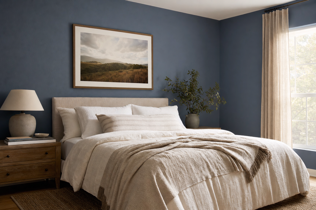
- The calming qualities of blue make Waterloo an ideal choice for bedrooms. Its gray undertones add a sense of tranquility, perfect for cultivating a restful retreat. Pair it with soft linens in neutral or pastel tones to enhance the serene atmosphere.
3. Home Offices
- Waterloo brings focus and depth to home offices, creating a sense of professionalism and calm. Use it on all four walls for a cocooning effect, or pair it with crisp white trim for a clean, structured look.
4. Kitchens and Dining Areas
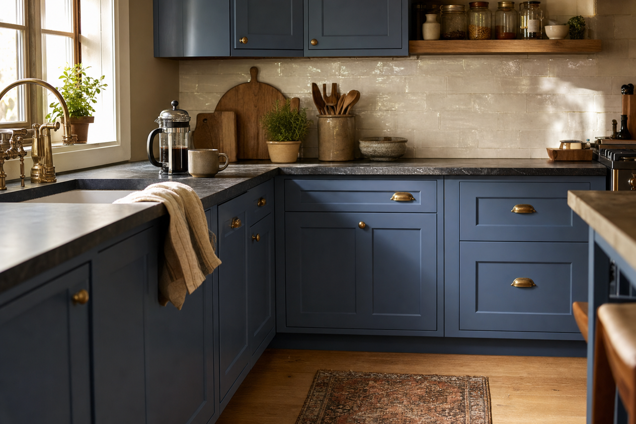
- For a bold yet sophisticated statement, use Waterloo on lower cabinets or a kitchen island. Pair it with brass hardware and white countertops for a timeless and upscale feel.
5. Exterior Applications
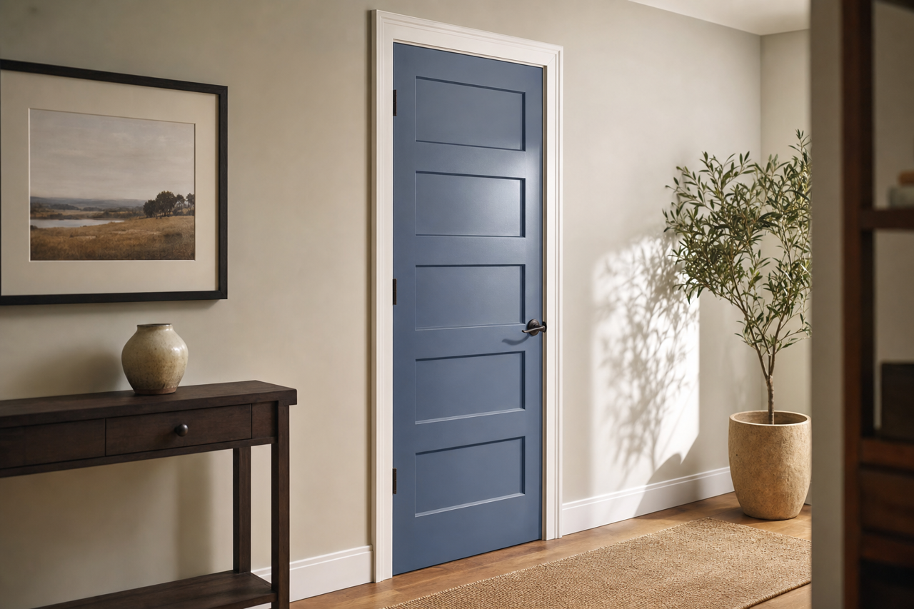
- Waterloo is also a fantastic choice for exteriors, where its moody richness can enhance curb appeal. Use it for shutters, doors, or even as the primary siding color, paired with white trim for a classic look.
Styling Tips: Accentuate Waterloo’s Beauty
- Textures: Incorporate textured elements like woven fabrics, natural woods, and metallic finishes to add depth and dimension.
- Lighting: Be mindful of lighting when using Waterloo. Warm lighting will enhance its gray undertones, while cool lighting will emphasize its blue richness.
- Artwork and Decor: Use artwork and decor in contrasting colors, such as gold, white, or even fiery reds, to create visual balance and excitement.
Valspar Waterloo (4003-6C) is a stunning choice for those who want to make a statement while maintaining a sense of sophistication and flexibility. Its timeless appeal and ability to adapt to a variety of settings make it a go-to color for homeowners and designers alike. Whether you're transforming a single room or an entire home, Waterloo delivers undeniable elegance and charm.