
Valspar Over the Moon (4003-7B): A Soft, Dreamy Gray with Timeless Charm
Valspar Over the Moon (4003-7B) is a versatile, understated shade of gray that exudes a calm and sophisticated energy. Its soft, muted tone makes it a perfect neutral for a wide range of interior design styles, from modern minimalism to classic traditional spaces. Whether you're aiming to create a serene sanctuary or a polished backdrop for colorful décor, Over the Moon offers the flexibility to bring your vision to life.
Undertones: A Subtle Warmth with a Touch of Cool
Over the Moon is a balanced gray with nuanced undertones that make it uniquely adaptable. It leans slightly warm, with hints of beige, giving it a taupe-like quality in certain lighting conditions. At the same time, it carries a whisper of cool blue undertones, which keep the shade fresh and modern. This duality allows it to complement both warm and cool color palettes seamlessly, making it a reliable choice for virtually any room.
Lighting plays a key role in how Over the Moon will appear. In spaces with natural light, the warmth becomes more apparent, creating a cozy and inviting atmosphere. In dimmer settings or under artificial light, the cool undertones may emerge, lending a more contemporary feel.
Coordinating Colors: Effortless Pairings for Any Design Style
The beauty of Valspar Over the Moon lies in its ability to harmonize effortlessly with other colors. Here are some coordinating shades to consider:
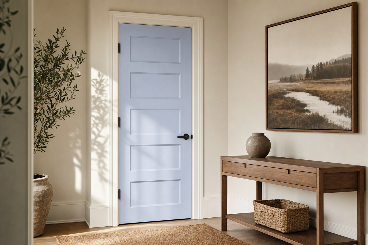
- Soft Whites: Pair it with a creamy white like Valspar Swiss Coffee (7002-16) or a crisp white like Valspar Ultra White (7006-24) for a clean, classic look. This combination is perfect for trim, ceilings, or cabinetry.
- Blush and Peach Tones: Add a touch of femininity with Valspar Sweet Pastel (2002-6B) or Peach Whisper (2006-8C). These colors work beautifully in bedrooms or nurseries for a cozy, romantic vibe.
- Deep Blues: Create a sophisticated contrast by pairing Over the Moon with rich navy tones like Valspar Night View (5005-2C) or Indigo Streamer (4008-4C). This pairing works especially well in living rooms or dining spaces.
- Earthy Greens: For a grounded, organic feel, complement Over the Moon with shades like Valspar Garden Flower (5006-3A) or Secluded Garden (5005-4B). This combination is ideal for home offices or kitchens.
- Charcoal Grays and Blacks: For a dramatic, monochromatic look, layer Over the Moon with darker grays like Valspar Chimney Smoke (4008-2B) or a true black like Valspar Noir (4009-2).
Uses: Where and How to Incorporate Over the Moon
The versatility of Over the Moon makes it suitable for a variety of spaces and purposes:
- Living Rooms: Use Over the Moon as the main wall color to create a neutral yet inviting space. Its soft tone allows furniture, artwork, and accent pieces to take center stage.
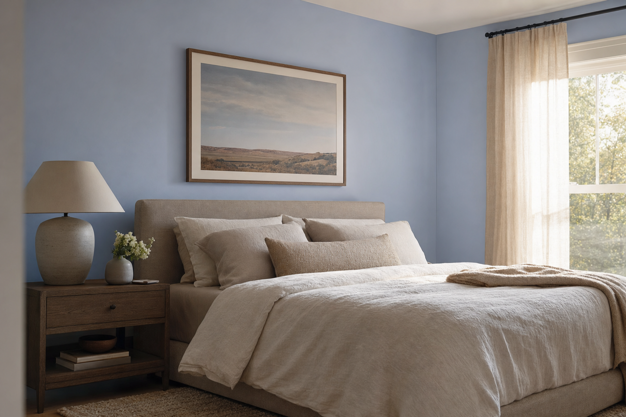
- Bedrooms: With its calming undertones, Over the Moon is an excellent choice for bedrooms. Pair it with plush bedding and soft lighting for a serene retreat.
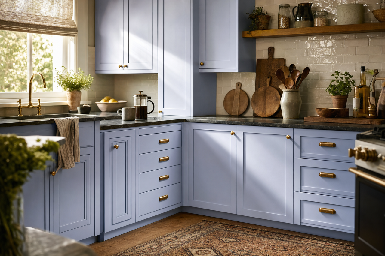
- Kitchens and Bathrooms: As a neutral gray, Over the Moon works beautifully on cabinetry or walls in kitchens and bathrooms. Pair it with white subway tiles or brushed nickel hardware for a timeless look.
- Home Offices: The balanced energy of Over the Moon creates a focused and calming environment, making it an excellent choice for a home office.
- Open Floor Plans: If you have an open-concept space, Over the Moon can serve as a unifying color that ties together various areas without feeling overwhelming.
Additionally, Over the Moon pairs well with a range of finishes and materials, from natural woods to sleek metals, further enhancing its adaptability.
Why Choose Valspar Over the Moon?
Valspar Over the Moon (4003-7B) is more than just a gray—it’s a canvas for your creativity. Its soft warmth, subtle coolness, and exceptional versatility make it a go-to color for designers and homeowners alike. Whether you're refreshing a single room or reimagining your whole home, Over the Moon delivers timeless elegance with a modern edge, ensuring your space feels effortlessly cohesive and inviting.