
Valspar Pulitzer Blue (4008-4A): A Timeless Hue for Sophisticated Interiors
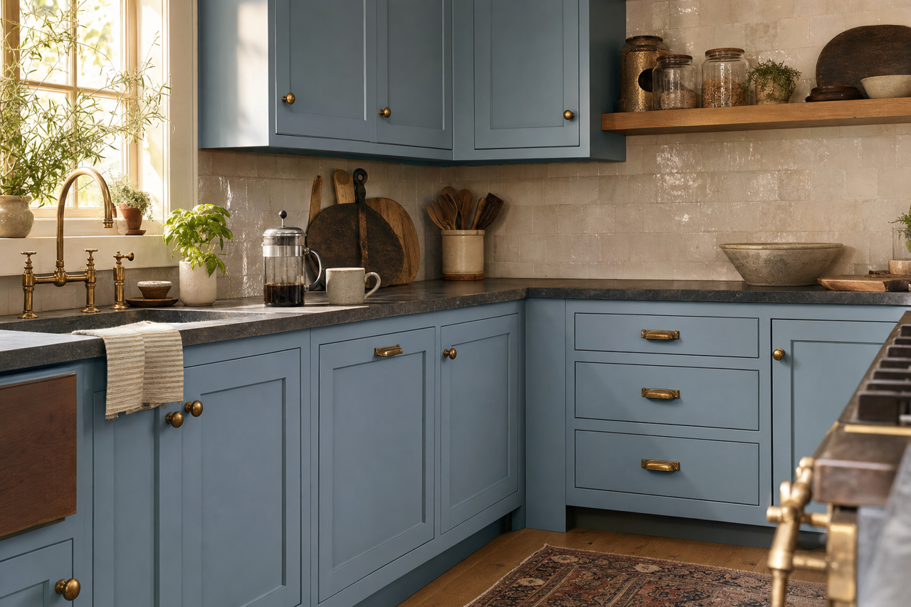
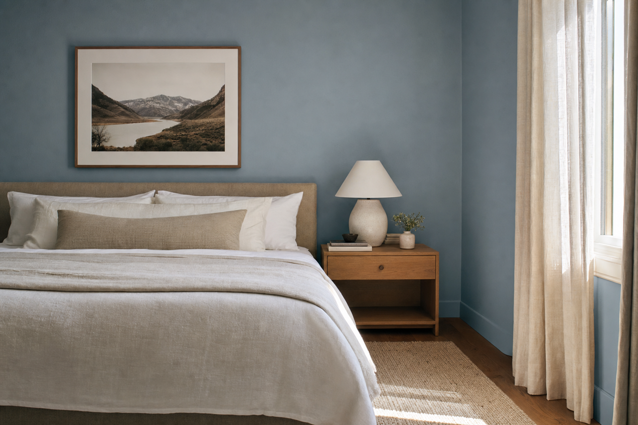
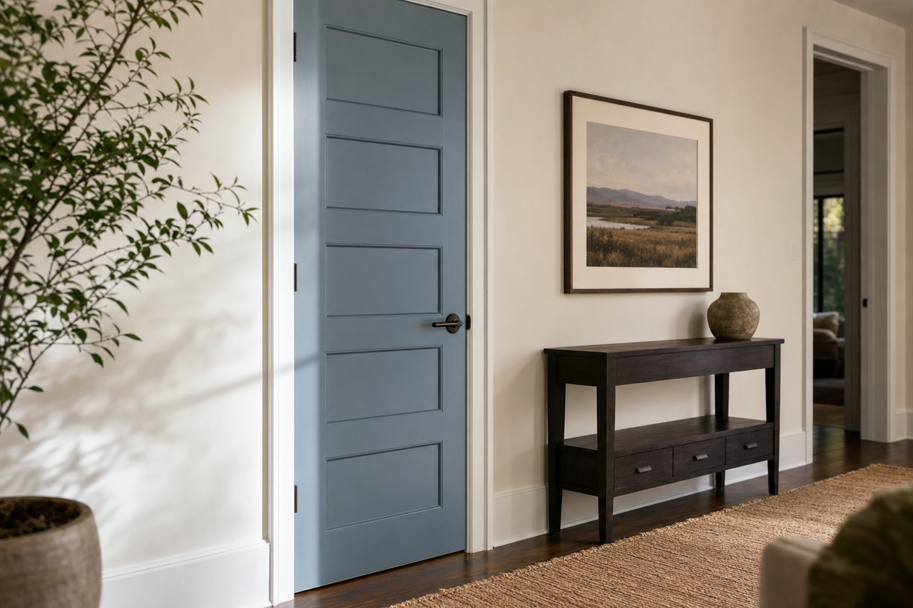
Valspar Pulitzer Blue (4008-4A) is an elegant and refined shade that effortlessly combines the richness of tradition with the vibrancy of modern style. This medium blue tone evokes a sense of serene sophistication, making it a versatile choice for spaces that demand timeless appeal. Whether you're designing a cozy retreat or a polished professional environment, Pulitzer Blue serves as a captivating backdrop that inspires creativity and calm.
Undertones of Valspar Pulitzer Blue
Pulitzer Blue carries subtle undertones of gray, which lend it a nuanced, muted quality. These undertones soften the vibrancy of the blue, giving the color a balanced and approachable feel. The gray undertones ensure Pulitzer Blue does not overwhelm a space, making it an excellent choice for both large areas and accent walls. This refined blend of blue and gray creates a calming effect, perfect for creating tranquil environments like bedrooms, reading nooks, or home offices.
Coordinating Colors for a Harmonious Palette
Valspar Pulitzer Blue pairs beautifully with a range of coordinating colors, allowing you to craft a cohesive and inspired design. Here are some suggestions to bring out the best in this versatile shade:
- Soft Neutrals: Pair Pulitzer Blue with creamy whites like Valspar's "Du Jour" (7002-6) or warm whites such as "Ivory Dust" (7003-18). These light tones amplify the soothing undertones of the blue while keeping the overall aesthetic fresh and airy.
- Earthy Grays: Complement the gray undertones of Pulitzer Blue with deeper grays, such as "Gravity" (4005-1B), for a monochromatic look that feels elegant and understated.
- Warm Accents: Introduce warmth to your palette with muted yellows or terracotta tones, like "Fossil Stone" (2008-10B), for a touch of contrast that feels inviting and balanced.
- Rich Contrast: Pair Pulitzer Blue with deeper hues like "Night Navy" (4006-8C) or "Rustic Red" (1011-7) to create a bold, dramatic effect.
Best Uses for Valspar Pulitzer Blue
Pulitzer Blue is adaptable to various interior design styles, from contemporary to traditional. Here are some creative ways to use this versatile shade:
Living Rooms
Create a cozy yet sophisticated atmosphere by using Pulitzer Blue as the primary wall color in your living room. Pair it with neutral furniture and metallic accents—such as brushed gold or matte black—to achieve an upscale aesthetic. For a modern twist, incorporate geometric patterns in rugs or throw pillows that feature complementary colors.
Bedrooms
Pulitzer Blue's calming qualities make it an ideal choice for bedrooms. Opt for this color on the walls to encourage relaxation and restful sleep. Combine it with soft linens in neutral tones or pastel shades for a serene retreat.
Home Offices
Enhance focus and creativity by using Pulitzer Blue in your workspace. The muted undertones provide a professional yet inspiring ambiance. Pair it with sleek furniture in grays or whites to maintain a clean, organized feel.
Bathrooms
Pulitzer Blue works beautifully in bathrooms, offering a spa-like vibe that feels fresh and rejuvenating. Use it on walls or cabinetry and pair it with crisp white tiles and chrome fixtures for a classic look.
Accent Walls
For those who love bold design elements, use Pulitzer Blue as an accent wall color. It pairs well with lighter hues across the rest of the space, drawing attention to specific architectural features or focal areas of the room.
Why Choose Valspar Pulitzer Blue?
Valspar Pulitzer Blue is more than just a color—it’s a design statement. Its balanced blend of calming blue and soft gray undertones makes it a versatile choice that can adapt to various aesthetics, from airy and minimalist to rich and dramatic. Whether you're revamping a single room or designing an entire home, Pulitzer Blue offers an enduring elegance that will stand the test of time.
Transform your space with Valspar Pulitzer Blue, and experience the serenity and sophistication it brings to your home.