Valspar Baritone Blues (4010-6): A Bold and Sophisticated Hue
Valspar Baritone Blues (4010-6) is a rich, deep blue that exudes confidence, sophistication, and modern elegance. This striking color is perfect for those who want to make a bold design statement while maintaining a sense of timeless refinement. Whether you're creating a cozy reading nook, a dramatic dining room, or a serene bedroom retreat, Baritone Blues delivers an impactful yet calming ambiance.
Undertones: A Hint of Depth and Warmth
Baritone Blues carries subtle undertones of gray, which lend a grounding and muted quality to its bold blue base. These gray undertones soften the intensity of the color, making it versatile and easy to integrate into a variety of design schemes. The gray influence also gives this hue a slightly warm edge, keeping it from feeling too cold or stark. This balance makes Baritone Blues an excellent choice for creating spaces that feel both dramatic and inviting.
Coordinating Colors: Harmonious Pairings for Every Style
To create a cohesive and polished look, consider pairing Baritone Blues with complementary and coordinating colors:
- Crisp Whites: Colors like pure white or off-white tones (e.g., Valspar’s Bistro White or Swiss Coffee) create a clean, high-contrast palette that allows Baritone Blues to take center stage.
- Soft Neutrals: Warm beige, taupe, or greige shades (e.g., Valspar’s Soft Pelican or Mushroom Bisque) balance Baritone Blues with a touch of warmth and subtlety.
- Earthy Greens: Olive or sage greens (e.g., Valspar’s Coastal Dusk or Forest Canopy) add a natural and organic feel, creating a serene and grounded atmosphere.
- Metallic Accents: Incorporate gold, brass, or copper elements to add a layer of sophistication and glamor to the space.
- Pops of Color: For a more playful or eclectic vibe, consider pairing Baritone Blues with coral, mustard yellow, or blush pink accents.
Uses: Versatility with a Dramatic Flair
Baritone Blues works beautifully across a variety of spaces and styles, offering endless possibilities for both modern and traditional interiors. Here are some ideas for incorporating this striking shade into your home:
- Living Rooms: Use Baritone Blues as an accent wall or to paint the entire room for a cozy, lounge-like feel. Pair it with plush furniture and metallic finishes for a luxurious vibe.
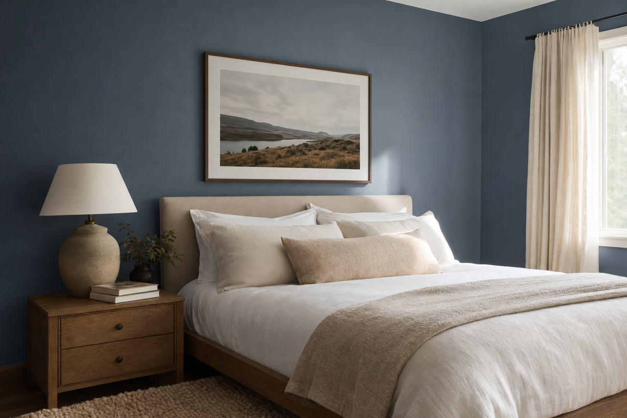
- Bedrooms: Create a serene retreat by using Baritone Blues as the primary wall color. Add crisp white bedding and soft gray linens for a tranquil and inviting space.
- Dining Rooms: Elevate your dining area with Baritone Blues on the walls, complemented by a statement chandelier and dark wood furniture for a dramatic and intimate setting.
- Home Offices: Boost focus and creativity by incorporating Baritone Blues into your office space. Pair it with minimalist furniture and clean lines for a modern workspace.
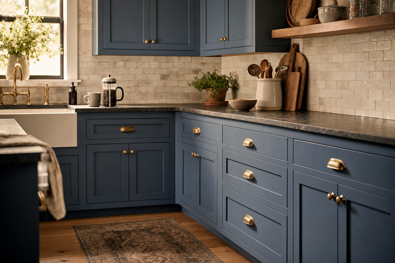
- Cabinetry and Millwork: Add depth and character to kitchens, bathrooms, or built-ins by painting cabinetry or millwork in Baritone Blues. This hue pairs beautifully with marble countertops and brushed gold hardware.
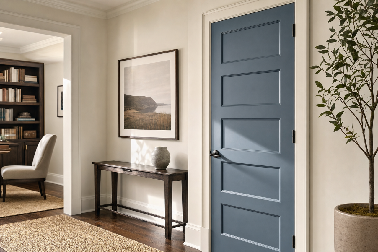
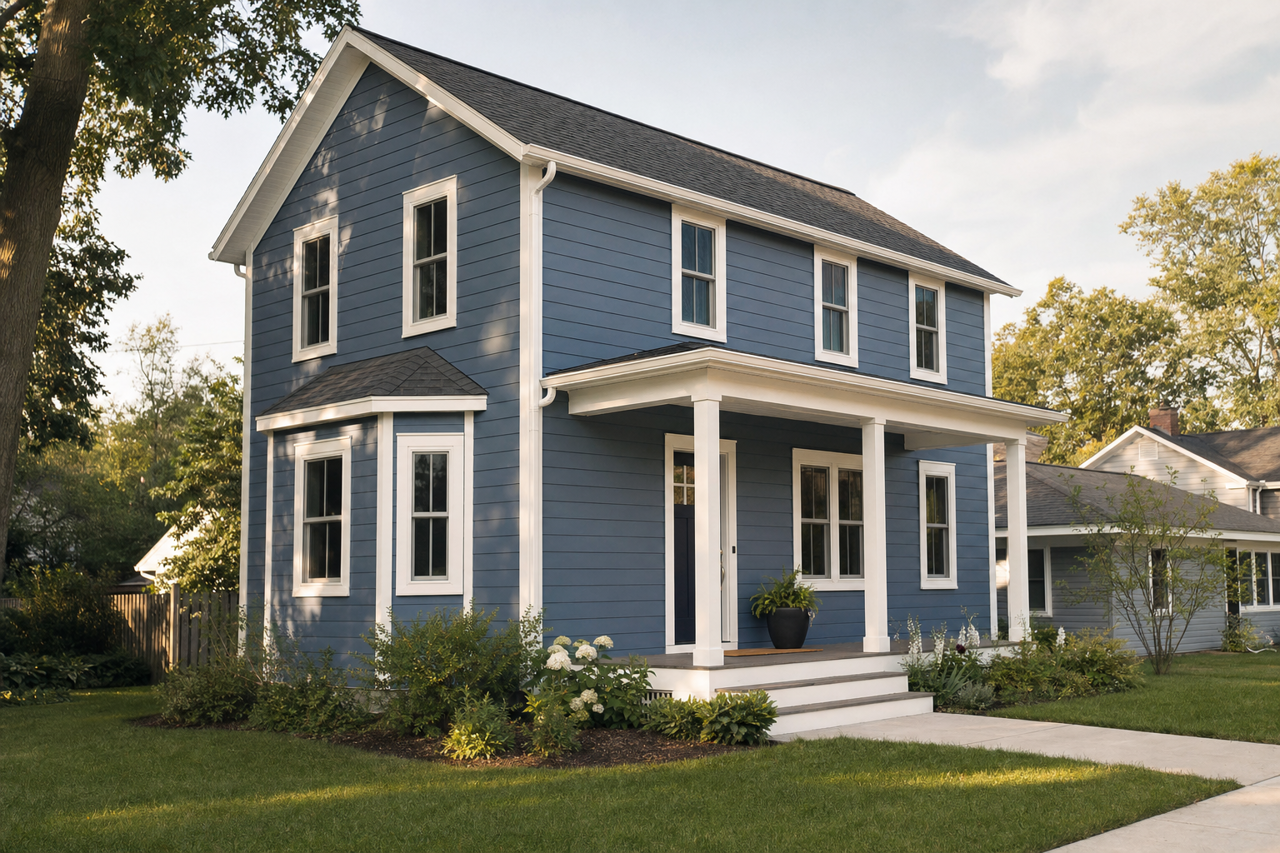
- Exteriors: Baritone Blues also works wonderfully as an exterior paint color, especially for front doors, shutters, or accent walls, providing a bold yet welcoming curb appeal.
Lighting Considerations
Lighting plays a crucial role in how Baritone Blues appears in your space. In natural light, its rich blue tones will shine, while artificial lighting can bring out the gray undertones, creating a more subdued effect. To ensure the color works well in your space, test it in different lighting conditions before committing to a full application.
Keywords for SEO Optimization
- Valspar Baritone Blues
- Deep blue paint colors
- Bold interior design hues
- Blue with gray undertones
- Coordinating colors for blue walls
- Sophisticated paint colors
- Best accent wall colors
- Dramatic dining room paint ideas
- Timeless blue paint shades
Valspar Baritone Blues is a design-forward choice that can transform any space into a sophisticated sanctuary with its bold, versatile charm. Its balanced undertones and compatibility with a variety of colors make it a true standout in home design.