Benjamin Moore Pine Barrens (437): A Timeless Green for Elegant Spaces
Benjamin Moore Pine Barrens (437) is a rich, sophisticated green with a timeless allure that effortlessly blends tradition with modernity. This shade is reminiscent of the verdant beauty of pine forests, making it a versatile choice for creating spaces that feel grounded, serene, and deeply connected to nature. Whether you're designing a cozy reading nook or refreshing a grand dining area, Pine (437) brings a sense of sophistication and warmth to any interior.
Undertones of Benjamin Moore Pine Barrens (437)
Pine (437) carries subtle yet impactful undertones that contribute to its versatility. Its primary undertone is a soft gray, which adds depth and refinement, preventing the green from feeling overly vibrant or saturated. Additionally, there’s a whisper of earthy brown that gives the color a rooted, natural quality. These undertones make Pine (437) adaptable to various lighting conditions, shifting from a deep, mossy green in dim light to a more muted and neutral shade in brighter spaces.
Coordinating Colors for Benjamin Moore Pine Barrens (437)
Benjamin Moore Pine Barrens (437) pairs beautifully with a wide range of colors, making it a smart choice for both monochromatic palettes and dynamic contrasts.
- Neutral Pairings: Complement Pine (437) with soft, warm neutrals like Benjamin Moore White Dove (OC-17) or Simply White (OC-117). These shades balance the richness of Pine, creating a clean and harmonious look.
- Earthy Tones: For a rustic, natural aesthetic, pair Pine with warm browns like Benjamin Moore Kingsport Gray (HC-86) or Alexandria Beige (HC-77).
- Accent Colors: Add vibrancy with jewel tones such as Benjamin Moore Hale Navy (HC-154) or a deep burgundy like Dinner Party (AF-300). These bold accents create a striking yet cohesive palette.
- Metallics: Pine (437) also works wonderfully with metallic finishes, particularly antique brass or brushed gold, for a touch of understated elegance.
Best Uses for Benjamin Moore Pine Barrens (437)
Thanks to its rich yet versatile nature, Benjamin Moore Pine Barrens (437) is an excellent choice for a variety of spaces and design styles.
- Living Rooms: Use Pine (437) on walls to create a cozy and inviting atmosphere. Pair it with neutral upholstery and natural wood furniture for a balanced, organic look.
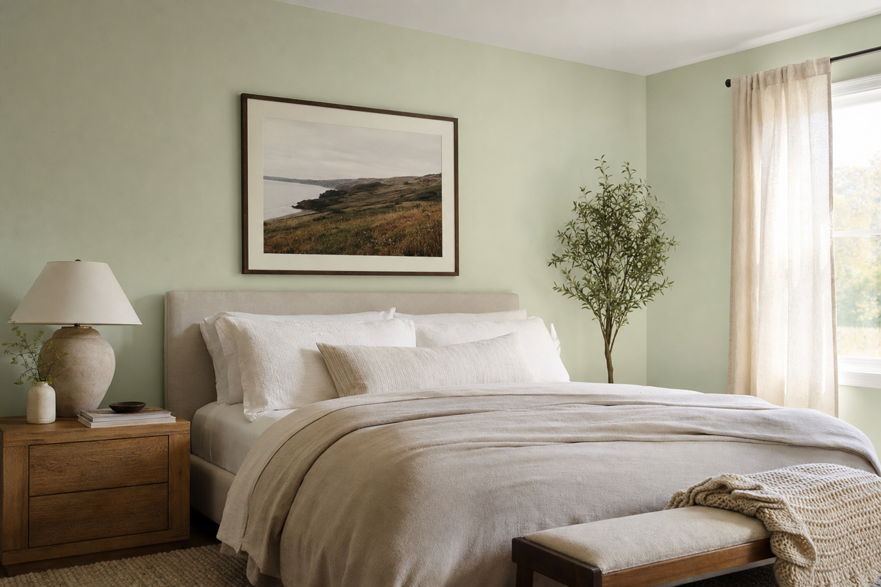
- Bedrooms: As a calming green, Pine is ideal for bedrooms. It fosters a restful environment, especially when paired with soft white linens and muted accent decor.
- Dining Rooms: Pine (437) adds depth and formality to dining spaces. Complement it with dark wood furniture and metallic accents for a refined, elegant setup.
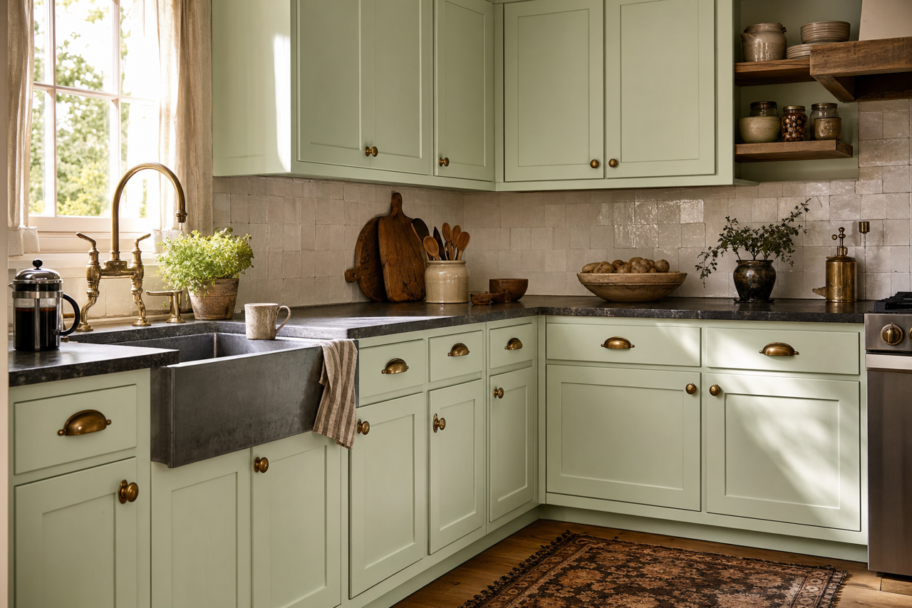
- Kitchens: Incorporate Pine on cabinetry or accent walls to bring an earthy sophistication to the kitchen. Pair with white subway tiles and brushed gold hardware for a timeless finish.
- Home Offices: With its grounding qualities, Pine (437) is a fantastic choice for home offices, encouraging focus and productivity.
Lighting Considerations
Lighting plays a crucial role in how Benjamin Moore Pine Barrens (437) appears. In spaces with ample natural light, Pine leans toward its muted green-gray tones, creating a soft and calming effect. In areas with less light, the color deepens, showcasing its earthy richness and adding dramatic sophistication. Be sure to test the color in your space under different lighting conditions to fully appreciate its versatility.
Why Choose Benjamin Moore Pine Barrens (437)
Benjamin Moore Pine Barrens (437) is a timeless green that brings balance, depth, and elegance to any interior. Its subtle undertones and adaptability make it a go-to choice for a variety of design styles, from rustic chic to modern sophistication. Whether you're looking to create a serene retreat or add a touch of understated drama, Pine (437) is a color that delivers enduring beauty and charm.