Benjamin Moore Grenada Villa (690): An Interior Designer's Perspective
Benjamin Moore Grenada Villa (690) is a captivating shade that effortlessly merges strength with elegance, making it a standout choice for both modern and traditional interiors. This color channels the essence of deep, rich teal, creating a sophisticated atmosphere that feels grounded yet intriguing. Whether you're designing a serene bedroom retreat or adding personality to a bold accent wall, Grenada proves to be versatile and transformative.
Undertones: The Depth Behind Grenada's Appeal
Grenada boasts deep blue-green undertones, giving it a luxurious richness. The subtle green infusion softens the strength of the blue base, resulting in a balanced hue that feels calming without being overly subdued. Depending on the lighting, Grenada can appear more teal in natural daylight or lean toward a moody blue-green in artificial light. This adaptability makes it a chameleon-like color that pairs well with various design styles.
Coordinating Colors: Building a Cohesive Palette
Grenada shines when paired with complementary colors that enhance its depth and beauty. Here are some ideas for coordinating hues:
- Neutral Pairings: For a timeless look, pair Grenada with soft, warm neutrals like Benjamin Moore White Dove (OC-17) or Revere Pewter (HC-172). These shades lighten the mood while maintaining a sophisticated balance.
- Accent Colors: To create a dramatic yet harmonious palette, consider pairing Grenada with rich, jewel-toned accents like Benjamin Moore Caliente (AF-290) or Black Bean Soup (2130-10). These tones amplify Grenada’s depth and richness.
- Bright Contrasts: For a lively and playful aesthetic, combine Grenada with crisp whites like Chantilly Lace (OC-65) or vibrant yellows such as Golden Straw (2152-50). These contrasts bring out Grenada’s energetic undertones.
- Earthy Complements: Incorporate natural hues like Kendall Charcoal (HC-166) or Amherst Gray (HC-167) for a grounded and organic look.
Uses: Where Grenada Can Shine
Grenada is a versatile color that can be used in various spaces and design scenarios. Below are some ideas for incorporating this stunning shade into your home or commercial interior:
1. Living Rooms
Grenada adds a touch of drama and sophistication to living spaces. Use it on a feature wall to anchor the room, and complement the look with natural wood furniture or metallic accents for an upscale vibe. Pair Grenada with soft neutral upholstery to balance its boldness.
2. Bedrooms
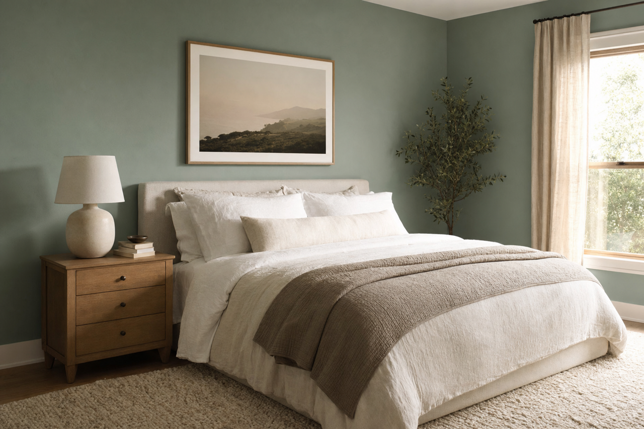
This deep teal shade evokes a sense of calm and serenity, making it an excellent choice for bedrooms. Use Grenada on all walls to create a cocoon-like retreat, or opt for an accent wall behind the bed to draw attention to your focal point. Pair it with plush textures like velvet or linen for added luxury.
3. Bathrooms
Grenada works beautifully in bathrooms, especially when paired with crisp white tiles and chrome or brass fixtures. Its moody undertones create a spa-like ambiance that feels both indulgent and refreshing.
4. Kitchens
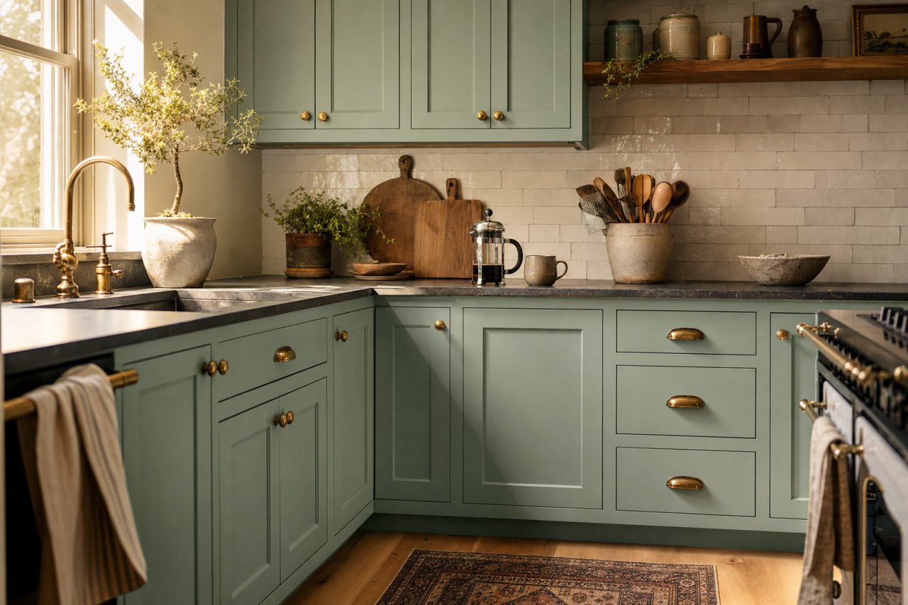
For a bold statement in the kitchen, consider Grenada for cabinetry or as a backdrop for open shelving. Pair it with marble countertops or natural wood finishes for a high-contrast yet harmonious look.
5. Offices
In an office space, Grenada can foster creativity and focus. Use it on walls or furniture pieces to add personality and depth to the room. Pair it with muted tones to maintain a professional atmosphere.
6. Accent Pieces
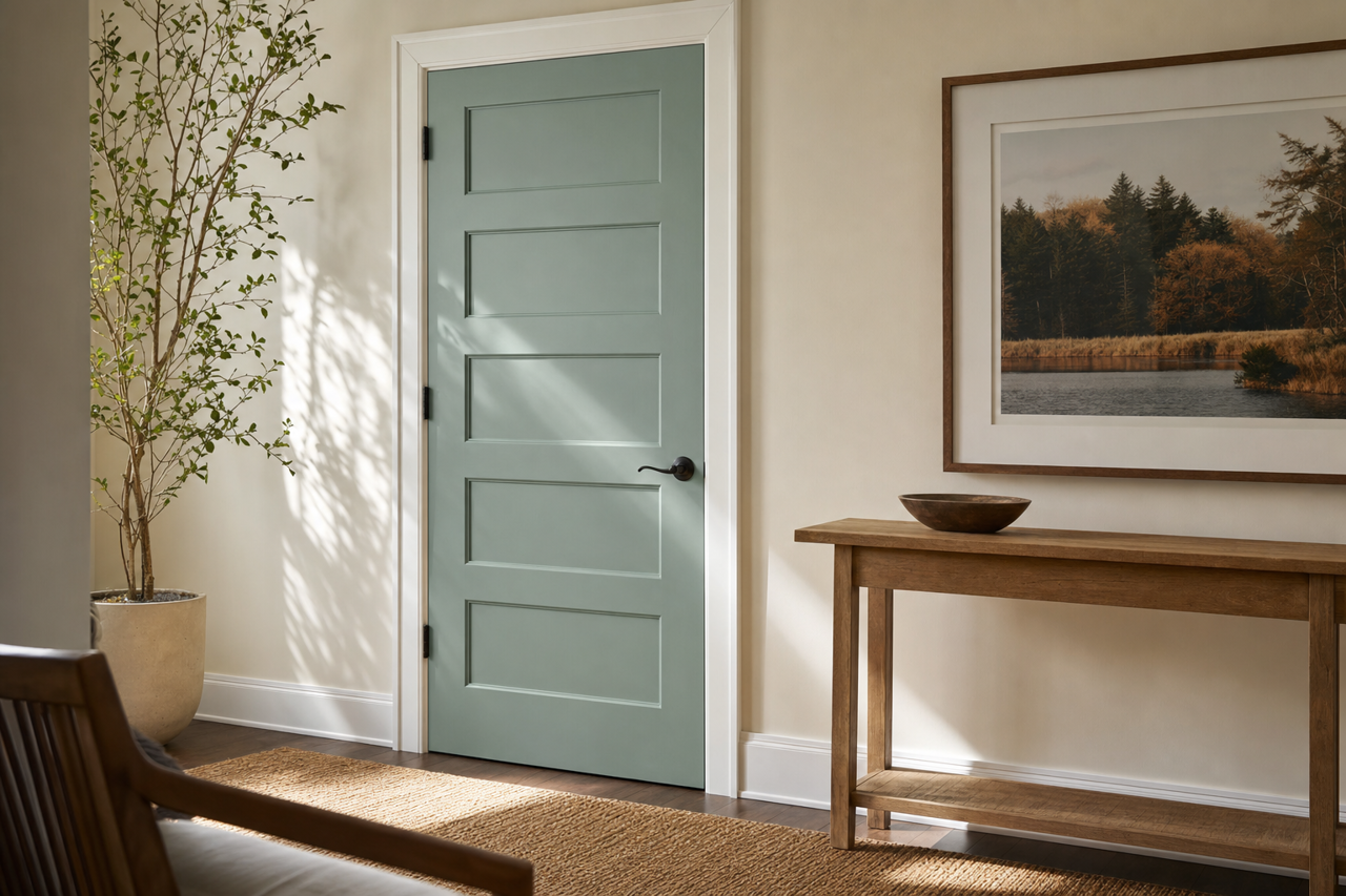
If you're not ready to commit to Grenada on your walls, consider incorporating it through accent pieces like furniture, area rugs, or decorative accessories. This allows you to enjoy its beauty without overwhelming your space.
Lighting Considerations
Grenada’s undertones are highly influenced by lighting conditions. In spaces with ample natural light, the color leans more teal, creating a bright and inviting vibe. In rooms with dim or artificial lighting, it shifts toward a darker, moodier blue-green. To optimize its effect, test Grenada in your space before committing fully, and consider using layered lighting to highlight its versatility.
SEO Optimization Tips for Grenada
When writing about Benjamin Moore Grenada Villa (690) for SEO purposes, include keywords like “deep teal paint color,” “blue-green Benjamin Moore shades,” “rich interior paint,” and “Grenada coordinating colors.” Highlight its uses in various rooms and emphasize its undertones to attract search traffic from homeowners, designers, and DIY enthusiasts looking for sophisticated paint options. Additionally, phrases like "Benjamin Moore jewel tones" and "calming yet dramatic paint colors" can help target niche audiences.
Benjamin Moore Grenada Villa (690) is more than just a paint color—it’s a design statement. Its rich undertones, versatility, and ability to adapt to diverse palettes make it an exceptional choice for any space. Whether you're crafting a serene oasis or a bold and dynamic interior, Grenada holds the power to elevate your design vision to new heights.