Valspar Statuesque (7002-5): A Timeless Neutral for Sophisticated Spaces
Valspar Statuesque (7002-5) is a refined shade that effortlessly balances elegance and versatility, making it a timeless choice for both modern and traditional interiors. This soft, muted taupe leans into warm gray undertones, creating a color that feels both grounded and serene. Whether you're looking to craft a cozy ambiance or establish a clean backdrop for bold design elements, Statuesque delivers understated sophistication.
Undertones
The beauty of Statuesque lies in its complex undertones. It features a delicate blend of warm gray and beige, giving it a greige-like quality that complements a variety of palettes. These warm undertones ensure the color doesn’t feel stark or cold, while the subtle gray grounding adds depth and richness. This balanced mix makes Statuesque a versatile neutral that adapts to changing light conditions throughout the day, from soft and warm in natural daylight to rich and cozy under artificial lighting.
Coordinating Colors
Valspar Statuesque pairs beautifully with a curated selection of coordinating colors. Its neutrality allows it to harmonize with a range of hues, from cool blues to earthy browns. Here are a few suggestions for complementary colors:
- Valspar Polar Star (7004-18): A crisp, cool gray that contrasts beautifully with Statuesque for a clean and modern vibe.
- Valspar Sweet Sand (7002-15): A soft beige that complements the warm undertones in Statuesque and creates a cohesive, inviting palette.
- Valspar Twilight Mist (4002-3A): A dusky lavender-gray that adds a subtle pop of color while maintaining a sophisticated feel.
- Valspar Blue Arrow (5001-3A): A muted blue that introduces a calming touch and works well in coastal or transitional designs.
For those looking to add drama and depth, Statuesque also pairs beautifully with darker accent colors like deep navy, charcoal, or forest green.
Uses and Applications
Valspar Statuesque is the ultimate neutral, making it a versatile choice for virtually any room in your home. Here are some ideas for incorporating this color into your interior design:
Living Rooms
Statuesque creates a warm and welcoming atmosphere, making it an ideal backdrop for living spaces. Pair it with soft beige furniture and textured throws for a cozy retreat, or layer in bold accent pieces like navy cushions or metallic decor for a polished look.
Bedrooms
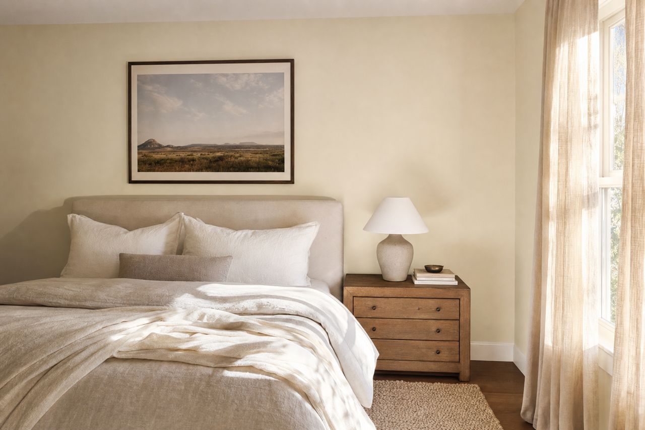
This color's soothing undertones lend themselves perfectly to restful spaces like bedrooms. Combine it with crisp white linens and touches of muted lavender or sage green for a calming, spa-like sanctuary.
Kitchens and Bathrooms
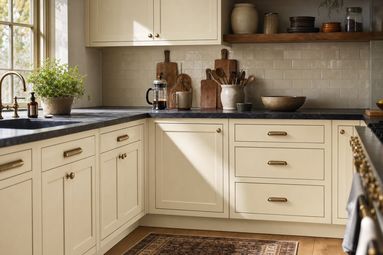
Statuesque brings understated elegance to kitchens and bathrooms. Use it on walls to complement white cabinetry and sleek marble countertops for a timeless, high-end feel. Add brushed gold or black fixtures to enhance its modern appeal.
Home Offices
For a productive yet serene workspace, coat your office walls in Statuesque. Pair it with dark wood furniture and pops of greenery for a grounded, inspiring environment.
Accent Walls
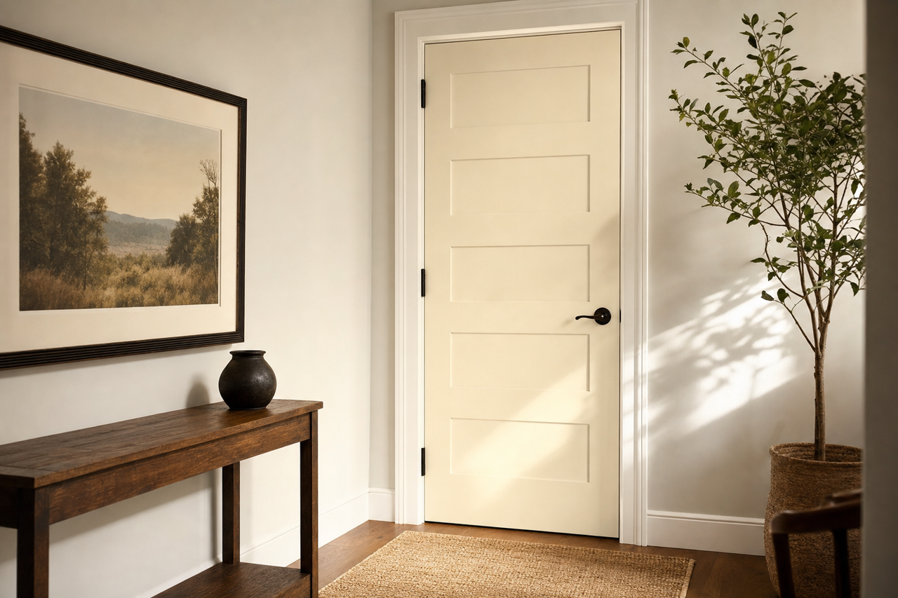
While Statuesque works beautifully as an all-over color, it also serves as a sophisticated choice for accent walls. Its warm gray undertones provide a subtle contrast against lighter neutrals like off-white or cream, creating depth and visual interest.
Why Choose Statuesque?
Valspar Statuesque is perfect for anyone seeking a neutral color that doesn’t fade into the background. Its warm undertones and adaptable nature make it a go-to for creating spaces that feel polished and inviting. Whether you're designing a cozy family room or a minimalist modern office, Statuesque has the versatility to bring your vision to life.
With its timeless appeal and ability to coordinate with a wide range of colors, Valspar Statuesque (7002-5) is a designer’s dream for transforming interiors into sophisticated, harmonious spaces.