
Benjamin Moore Bella Blue (720): A Timeless Neutral with Elegant Warmth
Benjamin Moore Bella Blue (720) is a sophisticated and inviting neutral that effortlessly balances a sense of refinement with approachable warmth. This versatile shade falls under the category of light beige, offering a soft and creamy hue that brings comfort and style to any space. Its understated elegance makes it a popular choice for homeowners and designers alike, whether you're revamping a living room, enhancing a bedroom, or creating a polished yet cozy ambiance in your dining area.
Undertones That Define Bella (720)
Bella’s nuanced undertones are what make it such a standout color. This shade carries subtle warm undertones of peach and tan, lending it a gentle glow without being overly yellow or orange. These undertones ensure that Bella creates a nurturing environment, making it ideal for spaces where tranquility and relaxation are prioritized. It’s a neutral that feels alive and dynamic, offering just the right amount of warmth without overpowering a room.
The versatile undertones also mean that Bella adapts exceptionally well to varied lighting conditions. In natural light, Bella appears luminous and creamy, while under artificial lighting, it gains a slightly cozier, richer feel. This adaptability makes it a dependable choice for spaces with fluctuating light throughout the day.
Coordinating Colors for a Cohesive Palette
Bella (720) harmonizes beautifully with a wide range of coordinating colors, making it easy to build a cohesive design palette. Here are some suggestions to inspire your design journey:
- Soft Whites: Pair Bella with Benjamin Moore White Dove (OC-17) or Simply White (OC-117) for a clean, crisp look. These whites enhance Bella’s softness and create a light, airy atmosphere.
- Earthy Greens: Complement Bella with muted greens like Benjamin Moore Sage Tint (458) or Saybrook Sage (HC-114) for a natural and calming vibe.
- Cool Grays: Add a modern edge by incorporating gray tones such as Gray Owl (OC-52) or Silver Chain (1472). These cooler shades create contrast and add depth to Bella’s warm undertones.
- Rich Browns: Deep browns like Kendall Charcoal (HC-166) or Alexandria Beige (HC-77) create a grounding effect, adding dimension and warmth to the overall palette.
- Dusty Blues: For a charming and balanced look, pair Bella with soft blues like Beach Glass (1564) or Van Deusen Blue (HC-156), adding a touch of sophistication.
These coordinating colors allow you to design spaces that feel layered and harmonious, whether you're aiming for a traditional, transitional, or contemporary aesthetic.
Ideal Uses for Bella (720)
Bella (720) is an exceptionally versatile color that can be used effectively in a variety of settings. Here are some ideas for incorporating this timeless neutral into your interior design projects:
Living Rooms
Bella’s warm beige tones create a welcoming atmosphere in living rooms, making it an ideal backdrop for gatherings and relaxation. Pair it with plush textiles, neutral furniture, and metallic accents to elevate the space while maintaining a cozy vibe.
Bedrooms
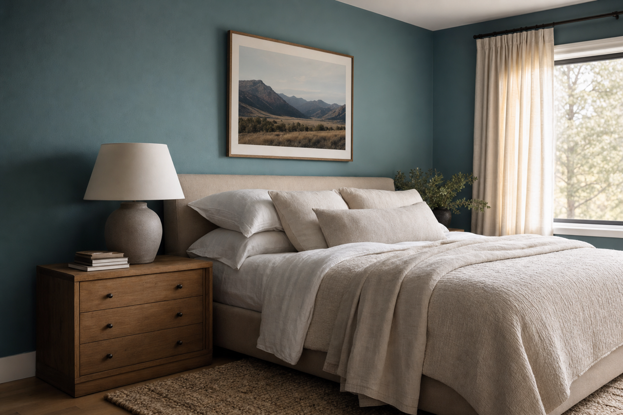
Bring serenity to your bedroom with Bella. Its calming undertones are perfect for creating a tranquil retreat. Use Bella on the walls and complement it with crisp white bedding, soft gray accents, and natural wooden furniture for a soothing sanctuary.
Dining Rooms
Bella adds sophistication to dining rooms without feeling too formal. Pair it with darker wood furniture and elegant lighting fixtures to create a space that feels both classic and contemporary.
Kitchens
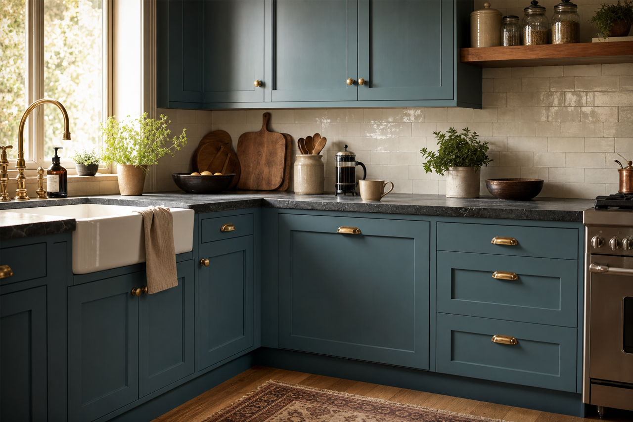
For a kitchen that exudes understated elegance, Bella works beautifully on walls or cabinetry. Pair it with marble countertops, brass finishes, and warm wood tones for a timeless yet modern look.
Entryways
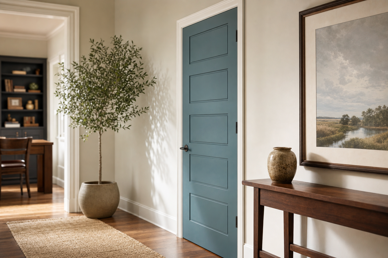
Set the tone for your home with Bella in your entryway. Its inviting hue makes guests feel welcome while providing a neutral backdrop for colorful or textured accents like rugs, art, or statement furniture.
Offices
If you’re looking to create a productive yet calming environment, Bella is an excellent choice for a home office. Its warm undertones promote focus and comfort while pairing seamlessly with natural wood desks and muted accessories.
Why Choose Bella (720)
Bella (720) is more than just a paint color—it’s a design tool that lends warmth, sophistication, and versatility to your home. Its ability to complement a wide array of colors and styles ensures it fits seamlessly into any design scheme, whether you’re refreshing one room or undertaking a full home makeover. With Bella, you can achieve spaces that feel timeless, inviting, and effortlessly stylish.
By choosing Benjamin Moore Bella Blue (720), you’re opting for a neutral shade that brings character and charm, setting the foundation for countless creative possibilities in your interior design projects.