Benjamin Moore Dolphin 722: A Sophisticated Neutral With Timeless Appeal
Benjamin Moore Dolphin 722 is a sophisticated, medium-toned neutral that exudes warmth and adaptability. This versatile shade is a beautiful balance between gray and taupe, making it a go-to color for creating elegant, serene spaces. Dolphin’s understated charm allows it to complement a wide variety of styles, from modern minimalism to traditional interiors. Whether you're designing a cozy living room, a polished office, or a tranquil bedroom, this hue offers a refined backdrop that enhances any environment.
Undertones of Benjamin Moore Dolphin 722
One of the defining characteristics of Dolphin 722 is its subtle undertones, which play a significant role in its versatility. This color has a warm taupe base with soft hints of brown and gray. Depending on the lighting, you may notice slight beige undertones that add depth and warmth, giving the color a welcoming, grounded feel. In spaces with cooler lighting, the gray undertones may become more prominent, creating a neutral and sophisticated ambiance.
The chameleon-like quality of Dolphin 722 allows it to adapt to different settings, making it an excellent choice for a variety of rooms and design styles.
Coordinating Colors for Dolphin 722
Benjamin Moore Dolphin 722 pairs beautifully with a wide range of coordinating colors, making it easy to incorporate into your design palette. Here are some suggestions to help you craft a cohesive and harmonious look:
Neutral Pairings: To maintain a soft and understated atmosphere, pair Dolphin 722 with light neutrals like Benjamin Moore White Dove OC-17 or Cloud White OC-130. These creamy whites provide a crisp contrast while keeping the overall mood light and airy.
Bold Accents: For a pop of color, consider pairing Dolphin 722 with dramatic shades like Benjamin Moore Hale Navy HC-154 or Caliente AF-290. These deep tones create a striking contrast, adding depth and energy to your space.
Earthy Tones: Dolphin 722 works seamlessly with warm earth tones such as Rustic Taupe 837 or Sparrow AF-720, which echo its taupe undertones and create a grounded, organic vibe.
Cool Blues and Greens: To infuse a sense of calm, complement Dolphin 722 with soft blues like Palladian Blue HC-144 or muted greens like Guilford Green HC-116. These shades bring a refreshing yet subdued balance to the warmth of Dolphin.
Recommended Uses for Dolphin 722
The versatility of Dolphin 722 makes it suitable for a variety of applications throughout your home or office. Its neutral tone allows it to function as a main wall color or as an accent shade to complement bolder hues.
Living Rooms: Use Dolphin 722 on the walls to create a cozy, welcoming atmosphere that works well with both modern and classic furnishings. Pair it with light neutral furniture and metallic accents for a polished, upscale look.
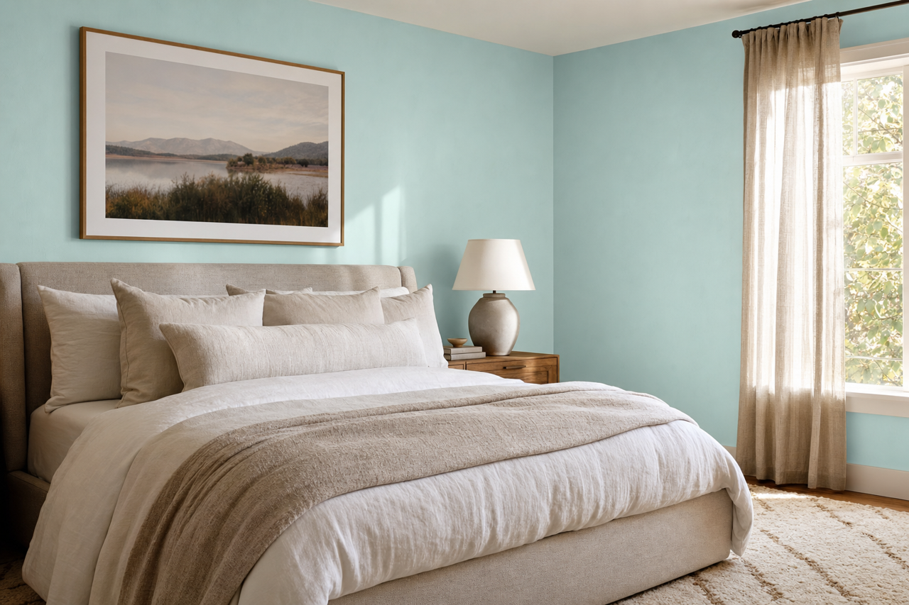
Bedrooms: Dolphin 722 is an excellent choice for bedrooms, as its calming undertones promote relaxation. Pair it with soft textiles in creams or pastels to achieve a tranquil retreat.
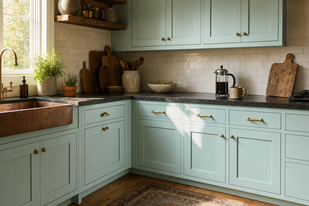
Kitchens: For a sophisticated kitchen, use Dolphin 722 on cabinetry or walls. It works beautifully with white marble countertops, stainless steel appliances, and warm wood floors.
Home Offices: This shade’s understated elegance makes it ideal for home offices. Combine it with darker wood furniture and pops of navy or olive for a professional yet stylish workspace.
Bathrooms: Dolphin 722 is a great choice for bathrooms when paired with crisp white trim and fixtures. Add accents in silver or brushed nickel for a spa-like atmosphere.
Lighting Considerations
As with any paint color, lighting plays a crucial role in how Dolphin 722 will appear in your space.