Benjamin Moore Bermuda Turquoise (728): A Captivating Coastal Hue
Benjamin Moore Bermuda Turquoise (728) is a refreshing and versatile paint color that evokes the serene beauty of a tropical escape. With its light, breezy quality and soft blue-green tone, Bermuda is perfect for creating tranquil, coastal-inspired interiors or uplifting spaces that feel connected to nature. Whether you're designing a beach-themed retreat or simply seeking a hue that exudes relaxation, Bermuda is a stunning choice.
Undertones of Benjamin Moore Bermuda Turquoise (728)
Bermuda is a delicate blend of blue and green, making it a quintessential coastal color. Its undertones lean slightly toward green, providing an earthy depth that grounds the hue while maintaining its airy and fresh appearance. These green undertones create a soothing balance, ensuring Bermuda doesn’t feel overly cool or sterile. You’ll notice that the color can shift slightly depending on the lighting—appearing more green in warm, natural light and leaning toward blue in cooler, artificial settings.
Coordinating Colors for Bermuda (728)
Bermuda pairs beautifully with a variety of complementary and contrasting shades, making it a versatile choice for both monochromatic and eclectic palettes. Consider the following coordinating colors to enhance its charm:
- White Dove (OC-17): A soft, creamy white that harmonizes beautifully with Bermuda’s light and airy vibe. Perfect for trim, ceilings, or cabinetry to create a crisp, clean contrast.
- Hale Navy (HC-154): A deep, dramatic navy that adds sophistication and richness when paired with Bermuda. This duo is ideal for accent walls or nautical-themed spaces.
- Simply White (OC-117): A bright, pure white that amplifies Bermuda’s freshness, making spaces feel larger and brighter.
- Gray Owl (2137-60): A silvery gray that complements Bermuda’s coastal tone while adding a subtle layer of depth and modernity.
- Sea Haze (2137-50): A muted green-gray that blends seamlessly with Bermuda, creating a harmonious and natural palette for tranquil spaces.
Best Uses for Benjamin Moore Bermuda Turquoise (728)
Thanks to its versatility, Bermuda can be used across various interior styles and spaces, from casual coastal cottages to modern urban apartments. Its light and airy quality makes it a favorite for creating uplifting, serene environments. Here are some suggestions for using Bermuda throughout your home:
Living Rooms
Bring a sense of calm and coastal charm to your living room with Bermuda. Pair it with natural textures like rattan furniture, woven accents, and driftwood for a laid-back beachy vibe. Add pops of coral, sandy beige, or soft gray for a well-rounded palette.
Bedrooms
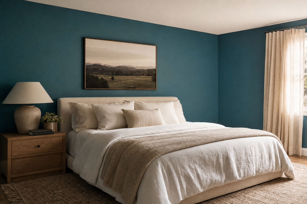
Bermuda’s soothing undertones make it an excellent choice for bedrooms. Use it on walls to create a peaceful retreat, and pair it with crisp white bedding and soft linen curtains for an effortlessly breezy feel. Consider dark navy or charcoal accents for added depth and sophistication.
Bathrooms
Transform your bathroom into a spa-like oasis with Bermuda. Its fresh, watery hue is perfect for evoking the feeling of ocean waves. Pair it with polished nickel fixtures, marble countertops, and white subway tile for a timeless look. Add natural wood accents for warmth and texture.
Kitchens
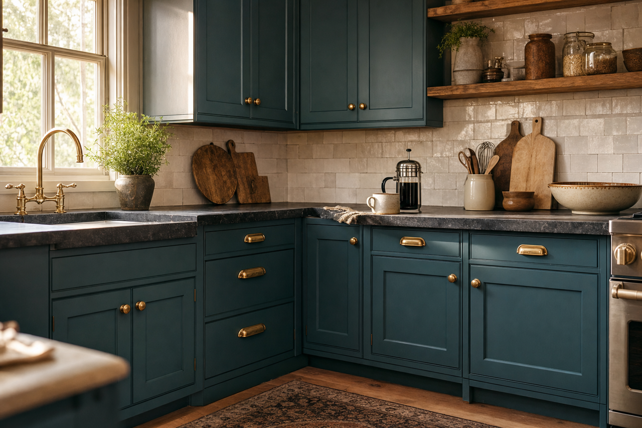
Bermuda can bring a refreshing burst of color to your kitchen. Use it for cabinetry or walls, and pair it with white quartz countertops and stainless steel appliances for a clean, contemporary vibe. Add open shelving with natural wood or glass elements to keep the space light and airy.
Accent Walls
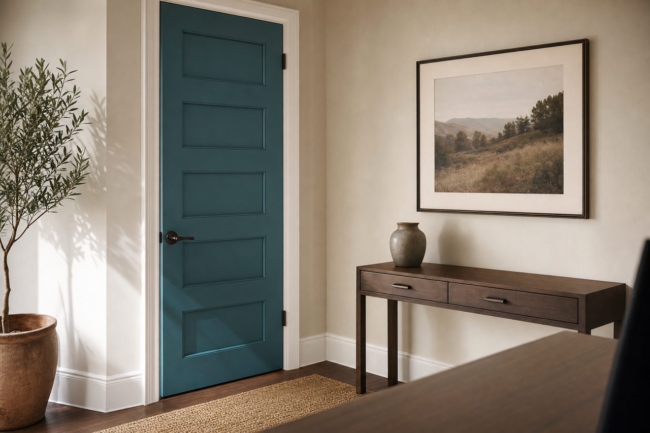
For a subtle yet impactful design statement, Bermuda works beautifully as an accent wall. Use it in living rooms, dining rooms, or home offices to add a pop of color without overwhelming the space. Pair it with neutral walls in gray or beige to create a layered and sophisticated look.
Lighting Considerations
As with any paint color, lighting plays a crucial role in how Bermuda appears in your space. In rooms with ample natural light, its green undertones will be more pronounced, giving the color a soft, organic feel. In spaces with cooler artificial light, Bermuda’s blue side may take center stage, offering a crisp and refreshing look. Be sure to test swatches in different lighting conditions to understand how the color will interact with your environment.
Benjamin Moore Bermuda Turquoise (728) is a timeless and adaptable hue that brings a sense of calm, freshness, and elegance to any interior. Whether you’re designing your dream coastal retreat or seeking a gentle pop of color for a modern aesthetic, Bermuda’s understated beauty is sure to shine. Pair it thoughtfully with coordinating colors and textures to elevate your space into a sanctuary of style and serenity.