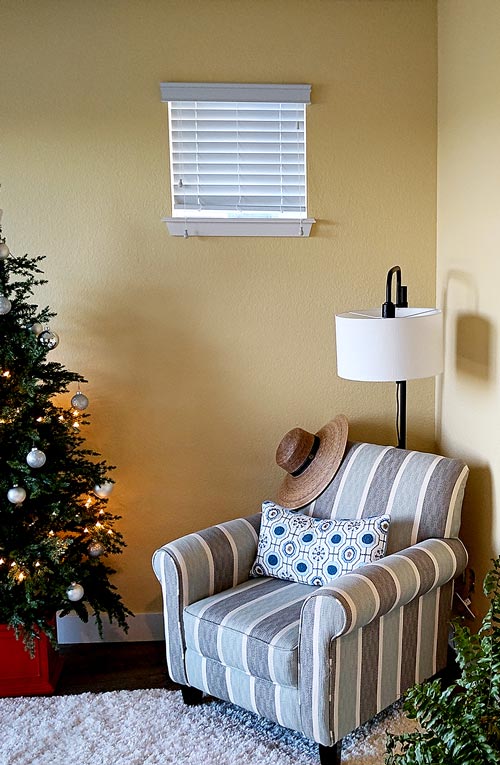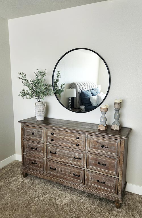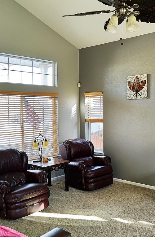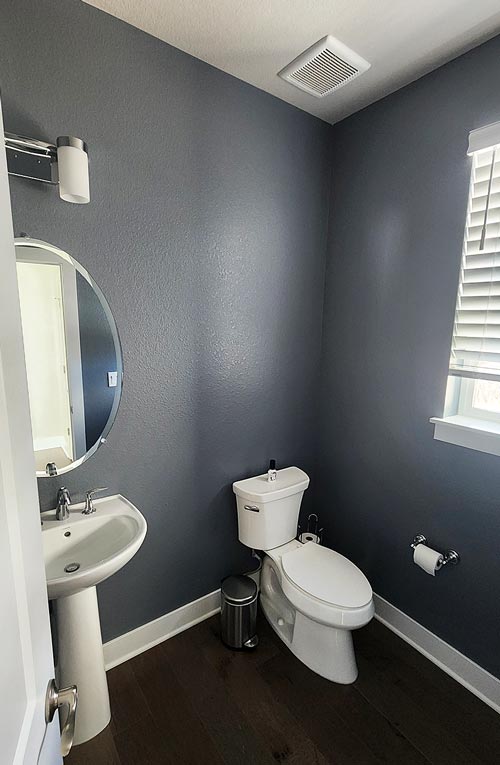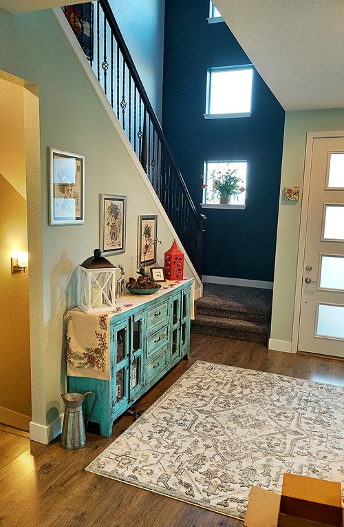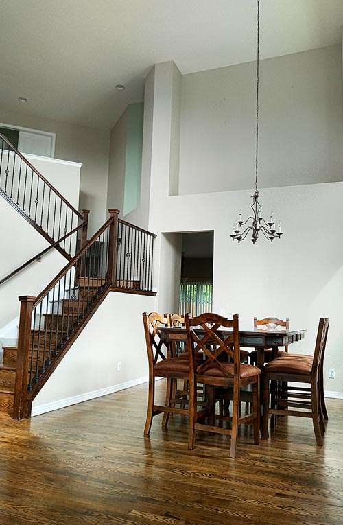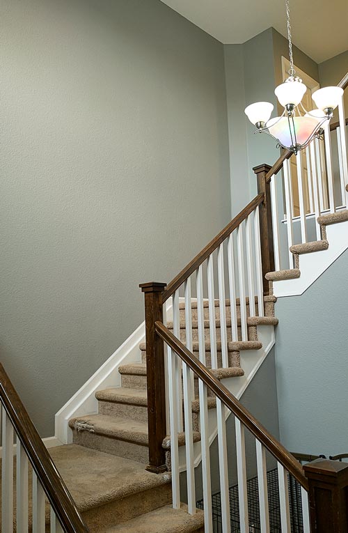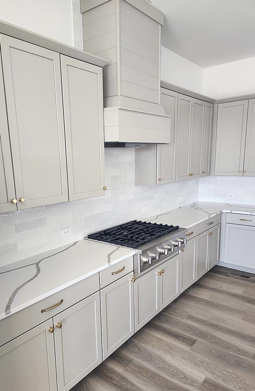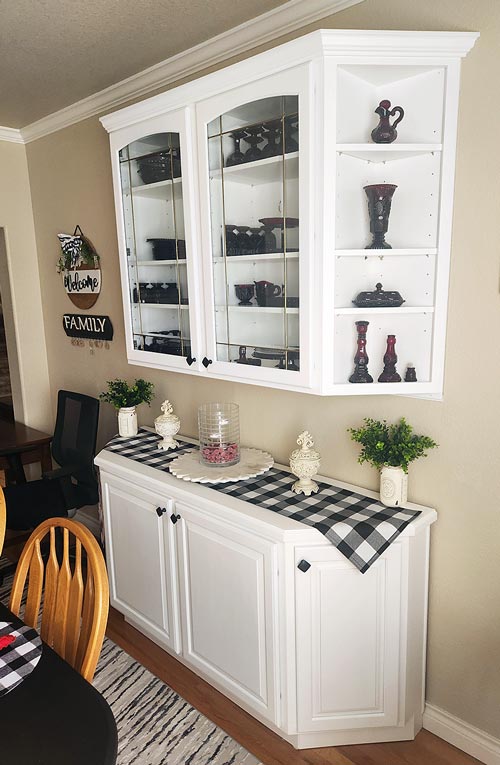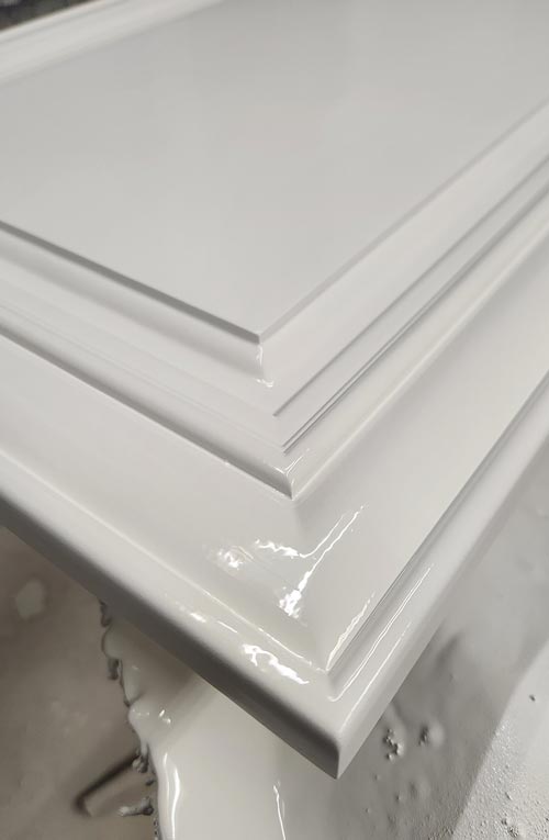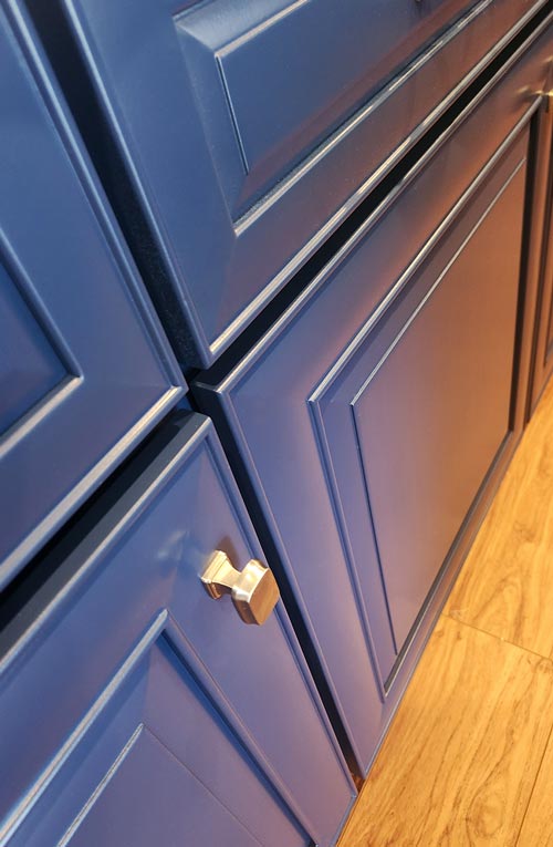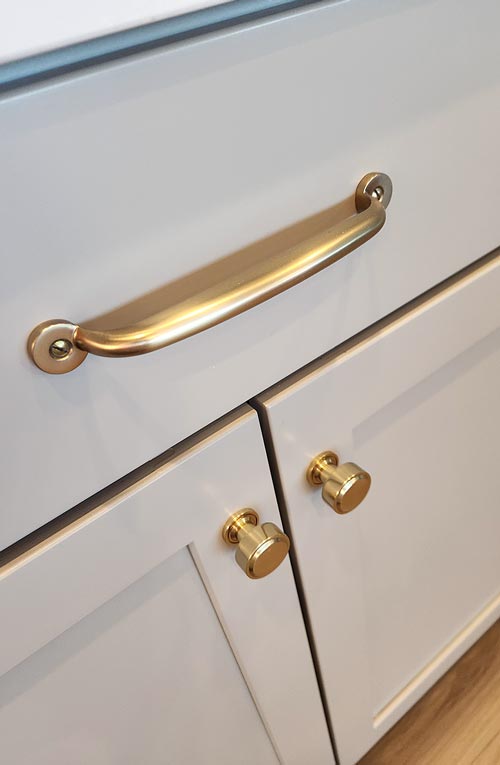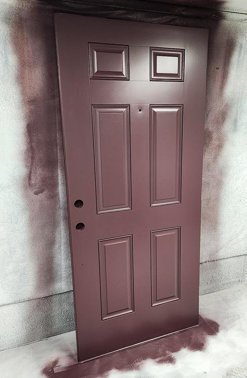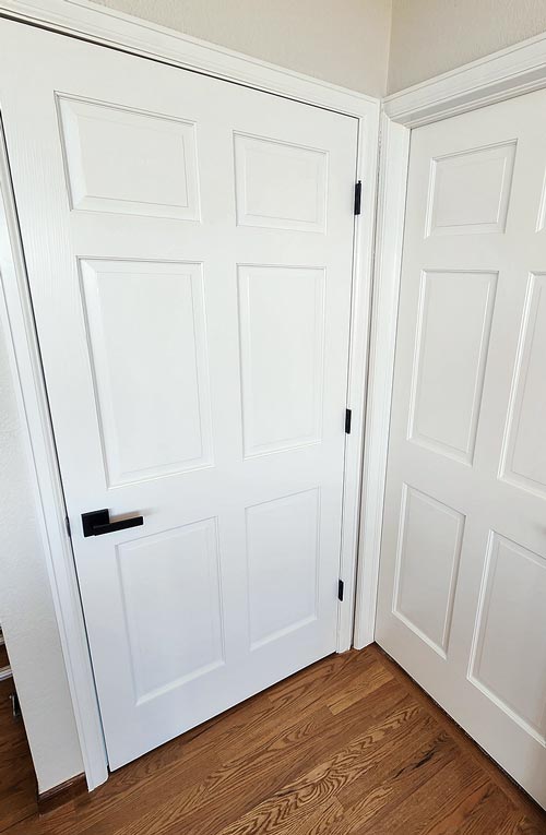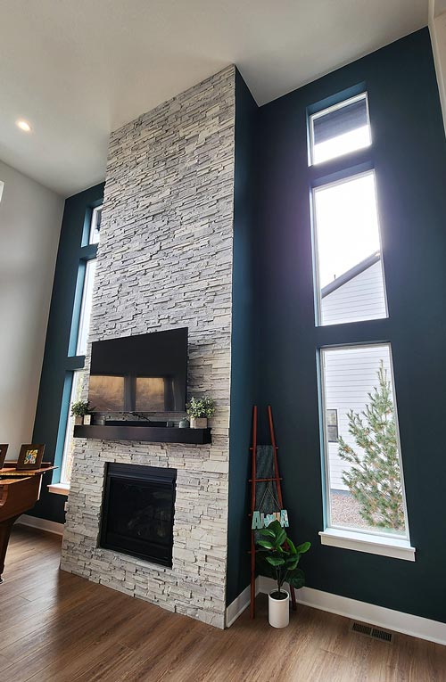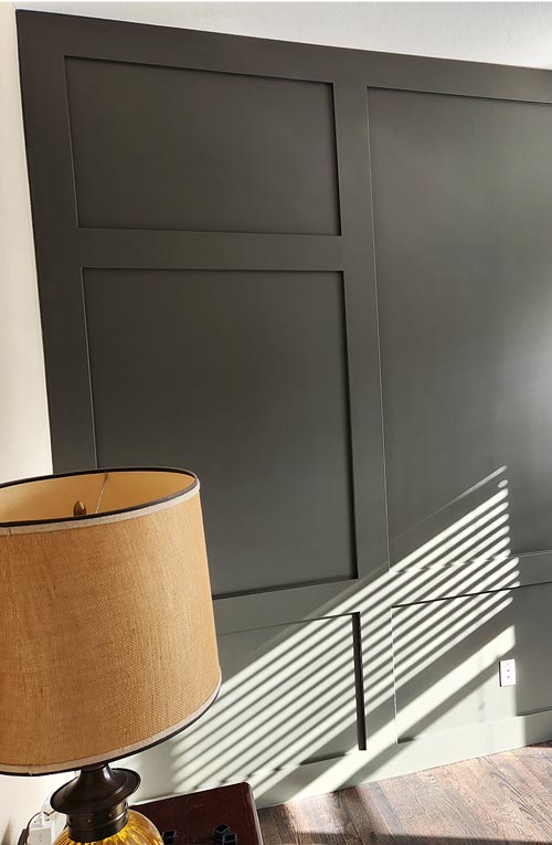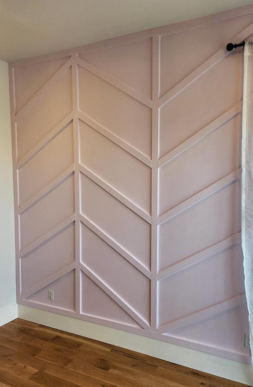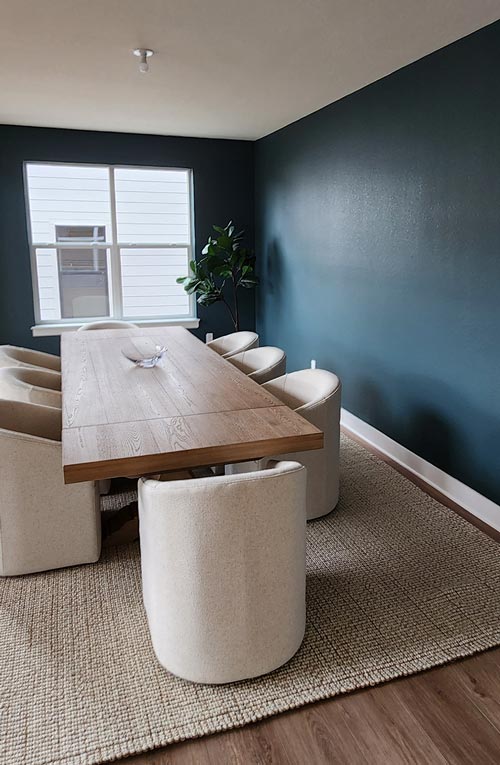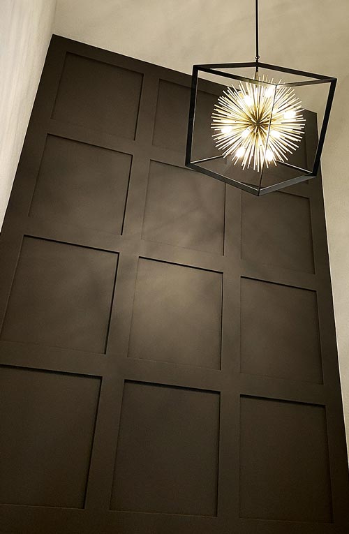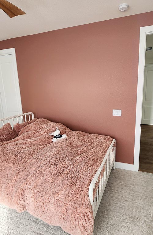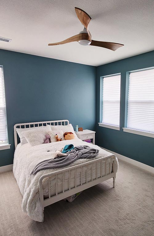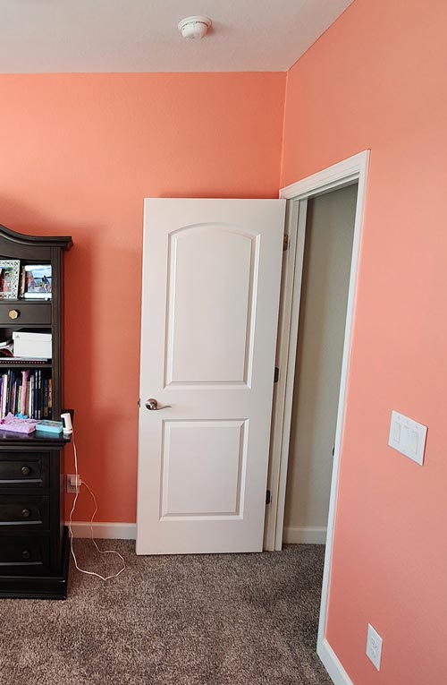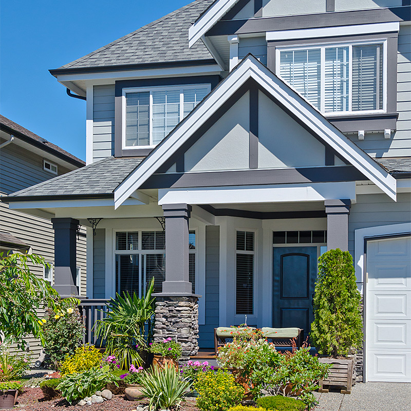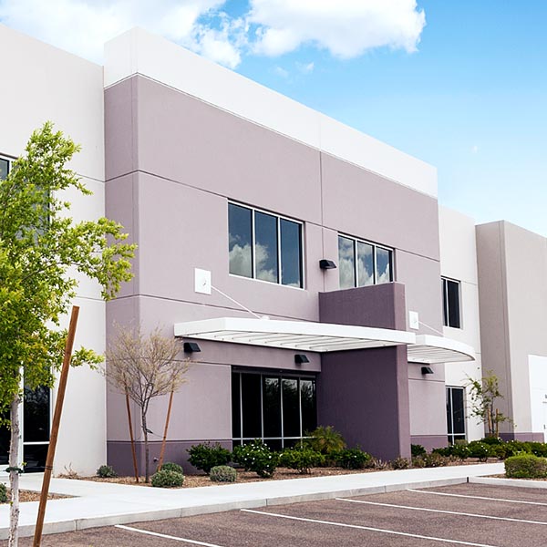
Benjamin Moore Paradise (794) is a stunning shade that effortlessly blends the calming essence of nature with a refined touch of sophistication. This medium-tone green carries an air of relaxation, making it an exceptional choice for both residential and commercial spaces. Its fresh yet subdued quality evokes the serenity of lush gardens and tropical retreats, offering a peaceful atmosphere wherever it's applied. Whether you're looking to make a bold statement or craft a subtle sanctuary, Paradise (794) provides the perfect balance.
Paradise (794) is a versatile green with soft blue undertones, giving it a cool, refreshing vibe. These blue undertones prevent it from feeling overly vibrant or yellow-toned, keeping the color grounded and refined. The gentle undertones also allow Paradise to shift slightly in mood depending on the lighting. Under bright natural light, it leans toward a crisp and airy green, while in dimmer settings, its deeper tones emerge, creating a cozy, cocoon-like ambiance. This chameleon characteristic makes it adaptable across various spaces and styles.
To complement the serene beauty of Paradise (794), consider pairing it with the following coordinating colors:
These coordinating hues allow you to tailor Paradise to suit a wide range of aesthetics, from coastal-inspired interiors to contemporary urban spaces.
Benjamin Moore Paradise (794) is a versatile choice that can transform any room into a calming retreat. Here are some of the best ways to incorporate this beautiful shade into your home or workspace:
Create a serene and inviting atmosphere by using Paradise on the walls. Pair it with neutral furniture and natural textures like rattan or wood to evoke a relaxed, earthy vibe. Add pops of coordinating colors, such as navy or charcoal, for a more contemporary feel.
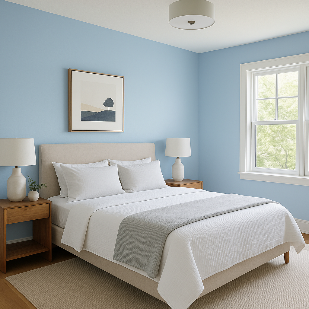
Paradise is perfect for crafting a soothing bedroom environment. Pair it with crisp white bedding and subtle metallic accents to achieve a clean yet cozy look. Its tranquil undertones foster restful sleep and relaxation.
Transform your bathroom into a spa-like escape by using Paradise on the walls or vanity cabinets. Pair it with white subway tile and brushed nickel fixtures for a timeless and refreshing design.
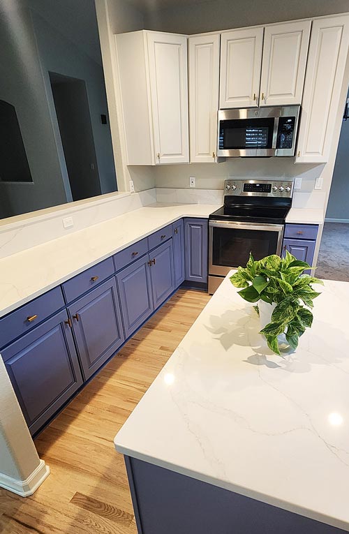
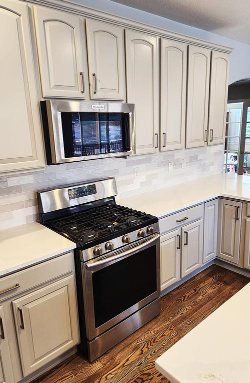
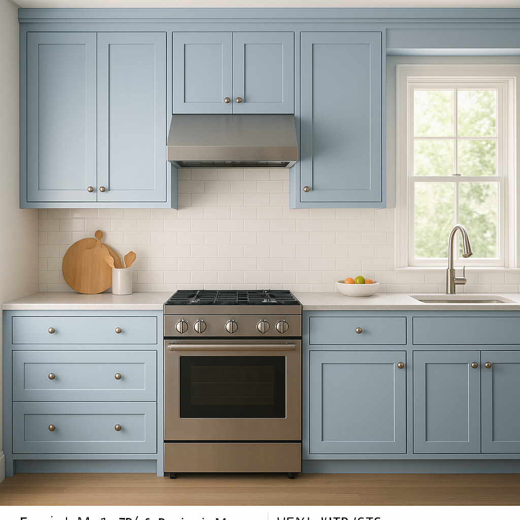
For a fresh, modern kitchen, consider Paradise for your cabinetry or an accent wall. Pair it with white quartz countertops and stainless-steel appliances to create a clean and polished look.
Make a memorable first impression by using Paradise in your entryway or foyer. Its inviting yet sophisticated hue sets the tone for the rest of your home.
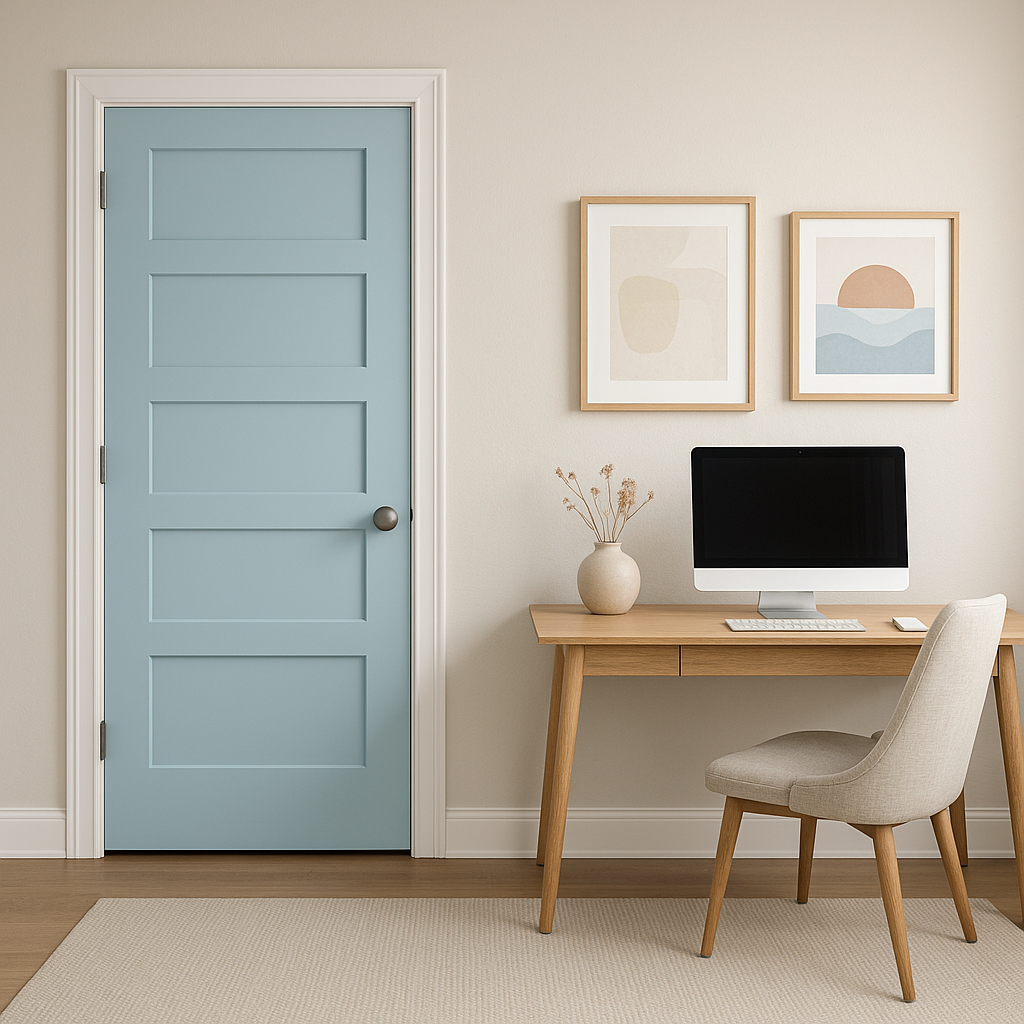
Incorporate Paradise into your home office or study to foster concentration and creativity. Its calming presence can help reduce stress and promote focus.
Like all paint colors, Paradise (794) shifts depending on the lighting conditions. In rooms with ample natural light, it feels airy and invigorating, while in spaces with limited light, its richness and depth come to life. To get the most accurate sense of how it will look in your space, test it on a small section of your wall and observe it throughout the day.
Benjamin Moore Paradise (794) is a versatile green that feels both timeless and fresh. With its tranquil undertones, flexible coordinating options, and suitability for a variety of spaces, it’s a shade that invites serenity and style into your home. Whether you’re designing a coastal retreat, a modern oasis, or a cozy nook, Paradise (794) is sure to deliver a sense of calm and sophistication.
View Colors Only by Brand (No Imagery):
Sherwin-Williams
|
Benjamin-Moore
|
Behr
|
Valspar
Live on the Eastern Slope of Colorado and looking for a local painting professional, check out all our painting services and reach out for a free estimate.
Copyright © 2026 : Wild Fox Painting Inc. : 12435 Mead Way, Littleton, CO 80125