Benjamin Moore Subtle AF-310: A Soft and Versatile Neutral
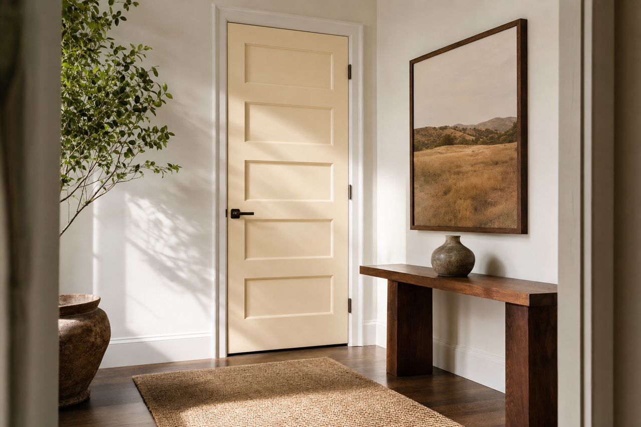
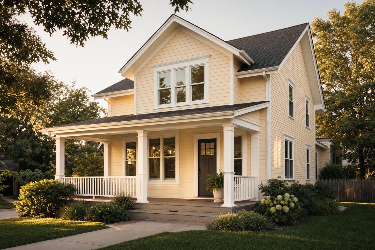
Benjamin Moore's Subtle AF-310 is a sophisticated and understated neutral that effortlessly bridges the gap between cool and warm tones. Its delicate balance makes it a versatile choice for a wide range of interior spaces, offering a serene backdrop that complements various design styles. Whether you're designing a cozy living room, a serene bedroom, or a welcoming entryway, Subtle AF-310 lends itself to creating a polished and cohesive look.
Undertones of Subtle AF-310
One of the defining features of Subtle AF-310 is its nuanced undertones. This color carries a gentle gray-beige base, often referred to as "greige," which shifts depending on lighting conditions. In spaces with ample natural light, Subtle AF-310 leans more toward a soft, warm beige, while in dimmer settings, its cooler gray undertones subtly emerge, giving it a chameleon-like quality. This adaptability makes it a favorite among designers looking for a paint color that works harmoniously in various environments.
Coordinating Colors for a Balanced Palette
Subtle AF-310 pairs beautifully with a range of complementary colors, making it easy to build a cohesive color scheme. Below are some recommended coordinating colors:
Neutrals:
- Simply White OC-117: A crisp, clean white that works well for trim, molding, or ceilings.
- Edgecomb Gray HC-173: A slightly deeper greige that adds dimension when used alongside Subtle AF-310.
Accent Colors:
- Hale Navy HC-154: A rich, deep navy that creates a striking contrast for cabinetry or feature walls.
- Revere Pewter HC-172: Another timeless greige that acts as a subtle companion in adjacent spaces.
Pops of Color:
- Caliente AF-290: A bold, warm red for a lively accent in accessories or furniture.
- Palladian Blue HC-144: A soft, airy blue-green that adds a refreshing touch to the palette.
When paired with these coordinating hues, Subtle AF-310 serves as a versatile foundation, enabling you to craft both monochromatic and high-contrast designs.
Best Uses for Subtle AF-310
Subtle AF-310 is a go-to choice for creating a calming and timeless aesthetic. Its flexibility makes it suitable for both residential and commercial settings. Here are some ideas for incorporating this color into your spaces:
Living Rooms and Family Rooms
The soft greige tones of Subtle AF-310 make it an ideal backdrop for communal spaces. It pairs well with natural textures like wood and linen, creating a cozy yet elegant atmosphere. Incorporate warm metallics like brass or gold in lighting fixtures and decor to enhance its warmth.
Bedrooms
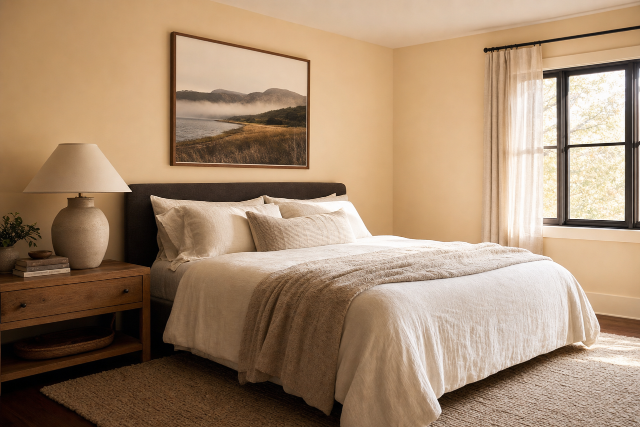
For a restful and tranquil bedroom, Subtle AF-310 provides the perfect neutral base. Pair it with plush textiles in soft blues, blush pinks, or creamy whites to elevate the space into a serene retreat.
Kitchens and Dining Areas
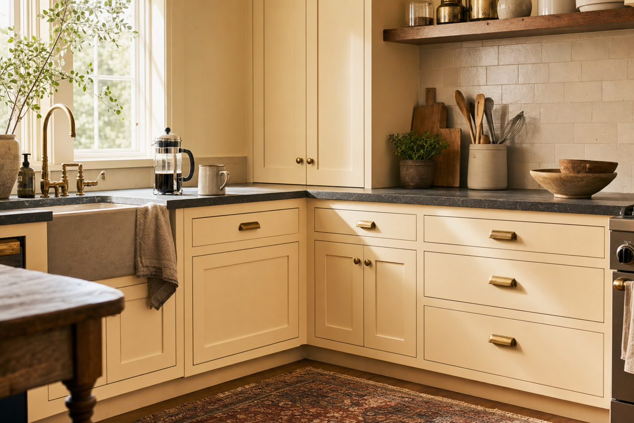
Subtle AF-310 works beautifully in kitchens when paired with white cabinets and marble countertops. For a more dramatic effect, consider using it on lower cabinets or kitchen islands, contrasted with a light, bright upper half.
Bathrooms
In a bathroom, Subtle AF-310 creates a spa-like ambiance. Complement it with white subway tiles, polished chrome fixtures, and fluffy white towels for a clean and timeless look.
Home Offices
If you’re designing a productive and stylish home office, Subtle AF-310 offers a focused yet calming environment. Incorporate darker accent colors like Hale Navy or deep charcoal to add depth and sophistication.
Lighting Considerations
It's essential to test Subtle AF-310 in your space, as its appearance can change depending on the lighting. In rooms with natural light, the warmth of the color becomes more apparent,