
Benjamin Moore Storm AF-700: A Sophisticated and Versatile Neutral
Benjamin Moore Storm AF-700 is a rich and refined gray that sits squarely in the "neutral" color family, offering a balanced and timeless appeal to any space. Part of Benjamin Moore's Affinity® Color Collection, this hue has been carefully curated for its versatility, making it an excellent choice for both modern and traditional designs. Its understated elegance creates a calming atmosphere while providing the perfect backdrop for a variety of colors, textures, and finishes.
Undertones of Storm AF-700
What sets Storm AF-700 apart from other grays is its subtle undertones. This shade leans toward a cool gray with soft blue undertones, giving it a serene and sophisticated feel. Depending on the lighting, the blue undertones may present more prominently, especially in spaces with natural light, creating a fresh and airy look. However, in dimmer environments or rooms with warmer lighting, Storm can take on a slightly warmer cast, which makes it incredibly adaptable to different settings.
Its balanced undertones ensure that it neither feels too cold nor too warm, making it a "go-to" neutral for homeowners and designers alike.
Coordinating Colors for Storm AF-700
One of the standout features of Storm AF-700 is its ability to pair beautifully with a wide range of colors. Whether you're aiming for a monochromatic palette or want to introduce pops of color, this shade provides endless opportunities for creativity. Here are some excellent coordinating options:
Complementary Neutrals:
- Benjamin Moore White Dove (OC-17): A creamy off-white that pairs beautifully with Storm AF-700 for trim and ceilings, creating a crisp and clean contrast.
- Benjamin Moore Revere Pewter (HC-172): A warm greige that complements Storm’s cooler undertones for a layered, sophisticated look.
- Benjamin Moore Edgecomb Gray (HC-173): A soft, light greige that provides a harmonious transition when used in adjacent rooms.
Bold Accent Colors:
- Benjamin Moore Hale Navy (HC-154): A deep navy blue that adds drama and richness when paired with Storm.
- Benjamin Moore Caliente (AF-290): A fiery red that brings an energizing pop of color to the cool gray background.
- Benjamin Moore Wrought Iron (2124-10): A deep charcoal with a hint of softness, perfect for creating striking contrast.
Earthy Tones:
- Benjamin Moore Saybrook Sage (HC-114): A muted green that enhances Storm’s timeless appeal with an organic and serene vibe.
- Benjamin Moore Kendall Charcoal (HC-166): A deeper gray that pairs seamlessly for a monochromatic, modern aesthetic.
Where to Use Benjamin Moore Storm AF-700
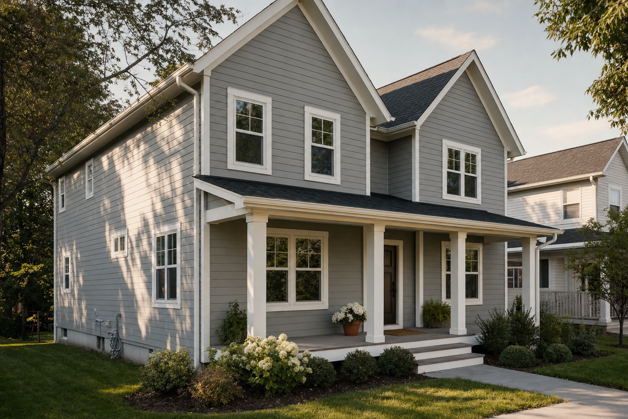
Thanks to its flexibility and timeless appeal, Storm AF-700 can be used in virtually any room of the house. It adapts effortlessly to a variety of design styles, from minimalist modern to classic traditional, and can even function as a transitional color in open-concept spaces.
Living Rooms:
Storm AF-700 creates a warm and inviting ambiance, especially when paired with soft textures like velvet or wool. Use it for walls and accentuate with crisp white trim for a polished look. It also serves as a perfect backdrop for gallery walls or statement furniture.
Bedrooms:
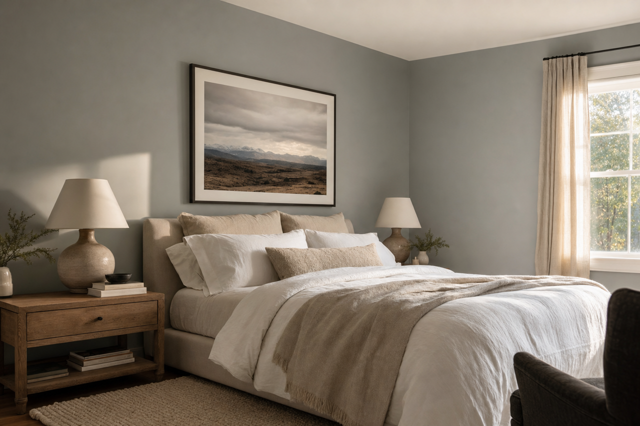
The calming blue undertones of Storm make it an excellent choice for bedrooms. Pair it with plush bedding in whites and creams for a serene retreat, or layer in deeper hues like navy and charcoal for a more dramatic, cocoon-like feel.
Kitchens:
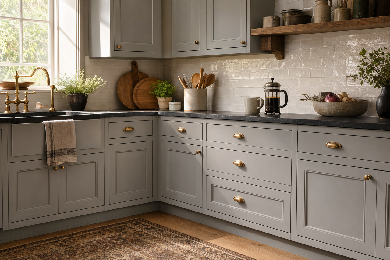
Storm AF-700 works beautifully on kitchen cabinets, especially when paired with white quartz countertops and brushed nickel hardware. It also provides a chic, contemporary look on walls, especially when paired with a backsplash in contrasting colors like white subway tile or deep navy.