
Benjamin Moore Pink (CC-158): The Perfect Blend of Softness and Sophistication
Benjamin Moore Pink (CC-158) is a timeless and versatile hue that exudes warmth, femininity, and elegance. This soft pink shade is neither overly saccharine nor too muted, making it an excellent choice for a variety of interior design styles. Whether you’re looking to create a soothing retreat or add a subtle touch of color to your space, Pink (CC-158) delivers a refined aesthetic that feels effortless and inviting.
Undertones: Subtle Warmth with a Hint of Sophistication
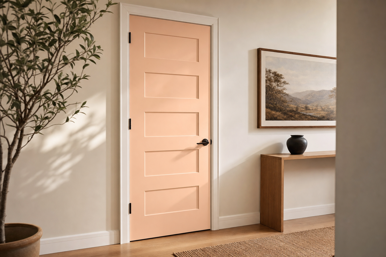
What sets Benjamin Moore Pink (CC-158) apart is its beautifully balanced undertones. With a soft warmth that leans toward peach, this pink shade stays grounded without veering into the cooler, bluish territory often found in other pinks. The subtle peach undertones make CC-158 feel more harmonious and versatile, complementing both warm and cool palettes. Additionally, its gentle vibrancy ensures it doesn’t feel washed out, making it suitable for spaces where natural light may vary throughout the day.
Coordinating Colors: Perfect Pairings for Every Design Style
Benjamin Moore Pink (CC-158) pairs beautifully with a wide range of coordinating colors, making it an ideal choice for both monochromatic and contrasting schemes.
Neutral Coordinating Colors
For a soft, serene look, pair Pink (CC-158) with warm neutrals like Benjamin Moore White Dove (OC-17) or Simply White (OC-117). These creamy whites enhance the pink’s elegance while maintaining a light and airy atmosphere. Beige tones such as Lenox Tan (HC-44) or Manchester Tan (HC-81) also complement Pink (CC-158) for a grounded, earthy palette.
Bold Contrasts
If you’re looking to make a statement, consider pairing Pink (CC-158) with deeper shades like Hale Navy (HC-154) or Black Satin (2131-10). The juxtaposition of soft pink against rich, dramatic hues creates a striking contrast that feels modern and sophisticated.
Colorful Accents
For playful or eclectic spaces, Pink (CC-158) works beautifully with cheerful accents like Pale Sea Mist (2137-50) or Clearlake (2058-40). These vibrant colors add energy while maintaining a cohesive and polished look.
Uses: Versatility Across Spaces
Benjamin Moore Pink (CC-158) is a highly adaptable shade that can be used in a variety of spaces, from bedrooms to living rooms, nurseries, and even kitchens.
Bedrooms
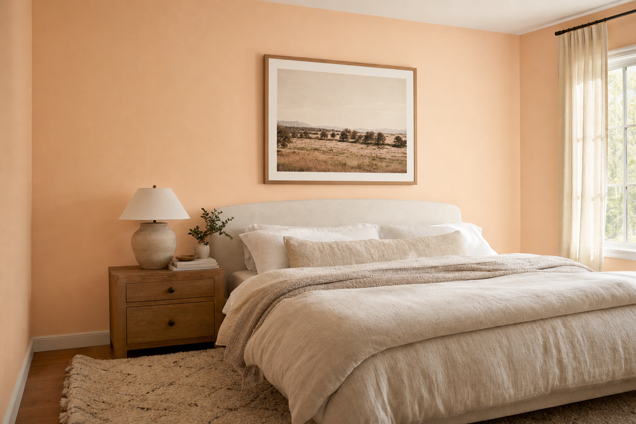
Pink (CC-158) is a natural choice for bedrooms, offering a soothing and romantic vibe. Pair it with crisp white linens and soft textures to create a relaxing retreat.
Living Rooms
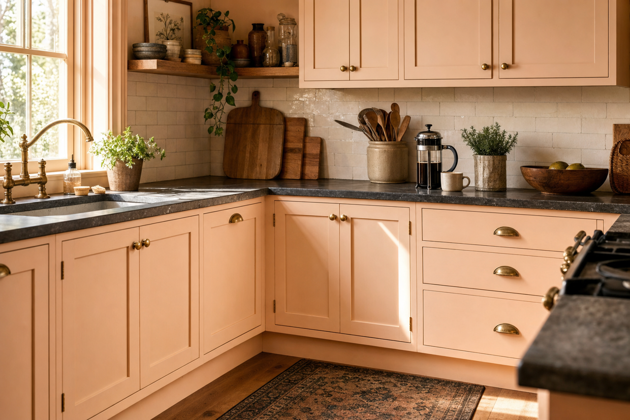
In living rooms, Pink (CC-158) can be used as an accent wall or throughout the space for a chic and inviting atmosphere. Pair it with metallic finishes like gold or brass for a glamorous touch.
Nurseries
For nurseries, the softness of Pink (CC-158) provides a nurturing and calming environment. Combine it with pastel blues, greens, or yellows for a whimsical and cheerful palette.
Kitchens and Bathrooms
Pink (CC-158) works surprisingly well in kitchens and bathrooms, especially when paired with sleek white cabinetry and subway tiles. It adds a fresh, unexpected charm to these utilitarian spaces.
Lighting Considerations
Like any paint color, the appearance of Benjamin Moore Pink (CC-158) can shift depending on lighting conditions. In spaces with ample natural light, the pink will appear brighter and more vibrant, while in dimly lit areas, its peachy undertones will come forward, creating a cozy feel.
Benjamin Moore Pink (CC-158) is a versatile and inviting color that’s perfect for adding warmth and sophistication to any room. Its balanced undertones, wide range of coordinating color options, and adaptability across design styles make it a standout choice for interior spaces. Whether you’re aiming for a soft and serene ambiance or a bold and dramatic statement, Pink (CC-158) is sure to elevate your home’s aesthetic.