
Benjamin Moore Baffin CC-270: A Timeless Neutral
Benjamin Moore Baffin CC-270 is a versatile and sophisticated neutral paint color that offers an understated elegance to any space. Part of Benjamin Moore's Classic Color Collection, this light greige (a blend of gray and beige) is a favorite among interior designers for its adaptability and subtle charm. Whether you're refreshing a single room or unifying your entire home’s palette, Baffin CC-270 delivers a seamless balance of warmth and modernity.
Undertones: A Perfect Blend of Warm and Cool
One of the most appealing aspects of Baffin CC-270 is its balanced undertone profile. The color leans slightly warm due to its beige base but is tempered by soft gray undertones. This harmonious mix makes it a true greige that avoids feeling too cold or overly warm. Depending on the lighting, it can take on different characteristics:
- In natural light: It appears soft and creamy with a hint of warmth.
- In artificial or cooler lighting: The gray undertones become more pronounced, offering a subtle, modern vibe.
This chameleon-like quality ensures Baffin CC-270 works beautifully in a variety of settings and lighting conditions.
Coordinating Colors: Harmonizing Your Space
Baffin CC-270 pairs effortlessly with a wide range of colors, making it an easy choice for both monochromatic and contrasting palettes. Here are some tried-and-true coordinating options:
Monochromatic Pairing
For a serene and cohesive look, pair Baffin CC-270 with other neutrals or soft tones:
- Edgecomb Gray HC-173: A slightly lighter greige that complements Baffin’s warmth.
- Revere Pewter HC-172: A classic, slightly darker greige that adds depth without overpowering.
Bold Contrasts
To create striking accents or focal points, consider these contrasting hues:
- Hale Navy HC-154: A rich, deep navy that adds drama and sophistication.
- Kendall Charcoal HC-166: A moody charcoal gray that works well in modern or transitional spaces.
Soft Accent Colors
For a subtle pop of color, try soft, muted tones:
- Wickham Gray HC-171: A cool, refreshing light gray with blue undertones.
- Soft Fern 2144-40: A gentle green that adds a touch of nature to your design.
Uses: A Neutral for Every Room
Baffin CC-270 is incredibly versatile, making it suitable for a wide range of interior applications:
Living Rooms and Family Spaces
Its neutral tone creates a warm and inviting atmosphere, making it ideal for both contemporary and traditional living areas. Pair it with textured fabrics and natural wood furniture for a cozy, layered look.
Kitchens and Dining Rooms
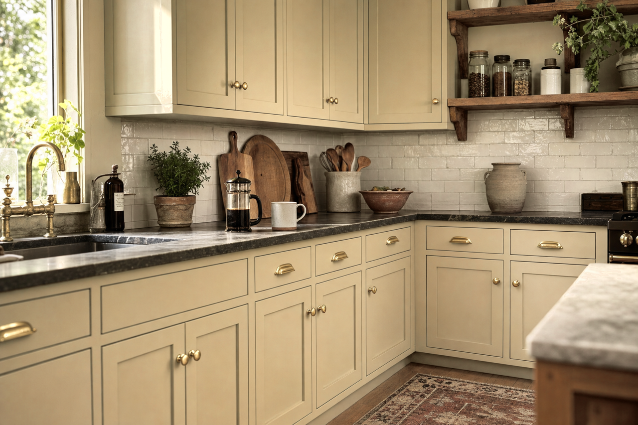
In kitchens, Baffin CC-270 works well with white or off-white cabinets, providing a subtle contrast that feels clean and timeless. Add brass or matte black hardware for a modern edge. In dining rooms, it sets the stage for elegant dinners, especially when paired with rich accent colors like navy or emerald green.
Bedrooms
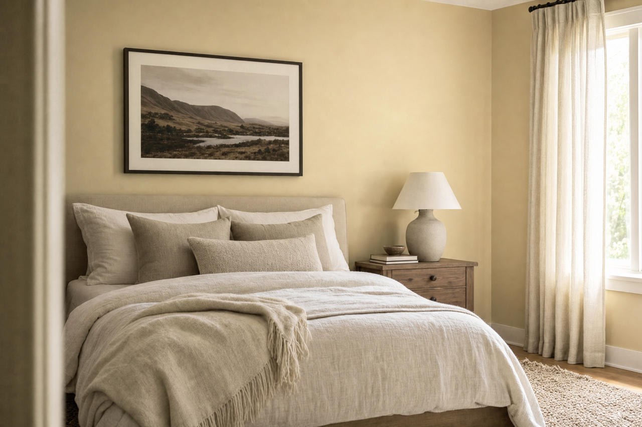
For a tranquil bedroom retreat, Baffin CC-270 offers a soothing backdrop. Pair it with soft linens and calming accent colors like blush pink or light blue for a relaxing sanctuary.
Bathrooms
Its clean and understated nature makes it a great choice for bathrooms, especially when complemented by crisp white trim and earthy accessories like woven baskets or greenery.
Hallways and Open Floor Plans
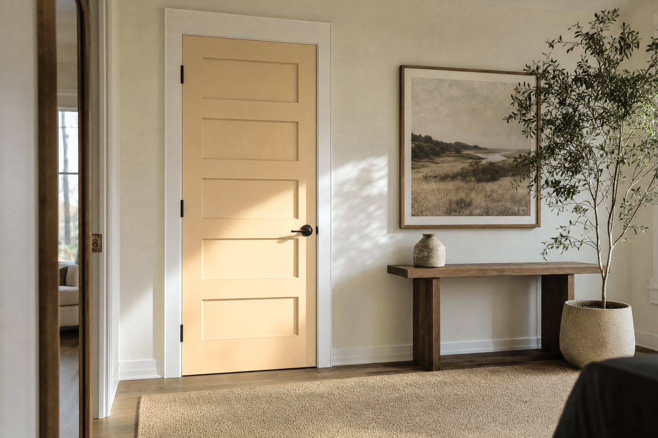
Baffin CC-270 excels in transitional spaces like hallways and open-concept layouts. Its neutral base ties different areas together seamlessly while allowing accent colors in adjoining rooms to shine.