Benjamin Moore Buckhorn (CC-510): A Timeless, Versatile Neutral
Benjamin Moore Buckhorn (CC-510) is a sophisticated neutral paint color that exudes warmth and depth, making it a go-to choice for creating inviting and timeless interiors. This hue sits comfortably in the taupe family, with a balance of beige and gray undertones that lend it exceptional versatility. Whether you're designing a cozy living room, a modern kitchen, or a tranquil bedroom, Buckhorn adapts effortlessly to a variety of spaces and styles.
Undertones of Buckhorn (CC-510)
Buckhorn features warm beige undertones subtly grounded by a hint of gray. This balanced blend of warmth and neutrality allows the color to feel cozy without appearing too yellow or overly cool. The gray undertones give it a contemporary edge, making it an excellent choice for spaces that need a neutral backdrop with personality. Depending on the lighting, Buckhorn can shift slightly, appearing warmer in natural sunlight and more muted under artificial light, giving it a dynamic quality.
Coordinating Colors for Harmonious Design
The adaptability of Buckhorn makes it easy to pair with a variety of complementary hues. Here are some recommended coordinating colors to enhance your space:
Off-Whites and Creams: Pair Buckhorn with soft whites like Benjamin Moore's White Dove (OC-17) or Simply White (OC-117) to create a crisp, clean contrast that feels fresh and timeless. This combination works beautifully for trim, ceilings, and cabinetry.
Earthy Greens: Add depth by incorporating muted greens such as Sage Mountain (2135-30) or Saybrook Sage (HC-114). These tones highlight Buckhorn’s natural warmth and create a grounded, organic palette.
Rich Browns and Chocolates: For a cozier, more dramatic look, try deeper tones like Kendall Charcoal (HC-166) or Bittersweet Chocolate (2114-10). These colors enhance Buckhorn's richness while maintaining an elegant aesthetic.
Soft Blues: For a subtle pop of color, pair Buckhorn with serene blues like Smoke (2122-40) or Van Courtland Blue (HC-145). This combination brings a calm and airy feel to any room.
Where to Use Buckhorn in Your Home
The beauty of Buckhorn lies in its versatility. Here are a few ideas for incorporating this elegant color into your home:
Living Room: Buckhorn is perfect for creating a warm and inviting living space. Use it as a wall color and pair it with plush, neutral furniture and natural textures like jute, rattan, or wood for a cozy yet refined look.
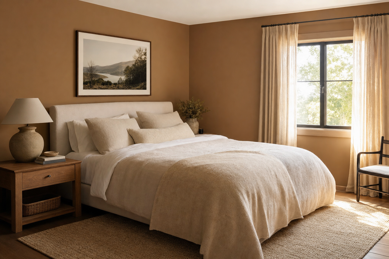
Bedroom: In a bedroom, Buckhorn's soothing tones set the stage for a restful retreat. Complement it with soft linens in cream or taupe and add metallic accents like brushed gold or bronze for a touch of luxury.
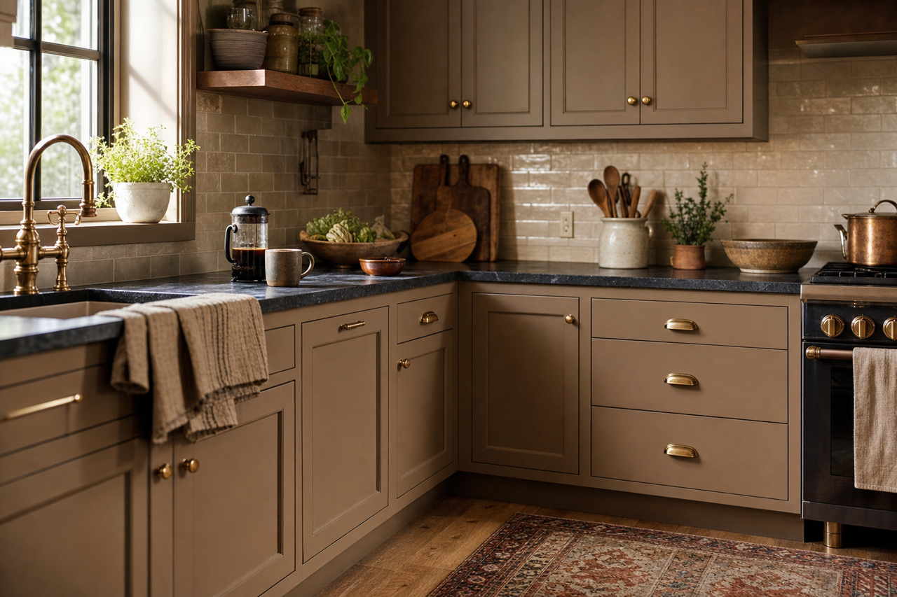
Kitchen or Dining Room: For a modern twist, use Buckhorn on cabinetry or as a wall color in the kitchen or dining room. Pair it with crisp white countertops, subway tile, and matte black hardware for a contemporary aesthetic.
Home Office: Buckhorn creates a calming yet focused atmosphere, making it an excellent choice for a home office. Pair it with minimalist furniture and pops of greenery for a serene workspace.
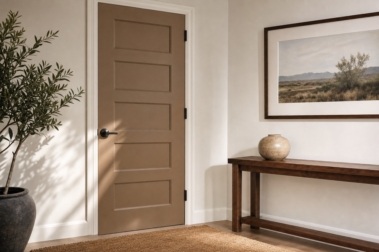
Hallways and Entryways: As a transitional color, Buckhorn works beautifully in hallways or entryways, offering a seamless flow between rooms. Add accent pieces in coordinating colors to tie the look together.
Lighting Considerations
Buckhorn (CC-510) is a chameleon color that reacts to lighting conditions. In spaces with ample natural light, its warm beige undertones come alive, making the room feel bright and welcoming. In lower-light environments, the gray undertones become more prominent, providing a moodier and more sophisticated vibe. Testing a sample in your space is highly recommended to observe how it interacts with your specific lighting.
Why Choose Buckhorn?
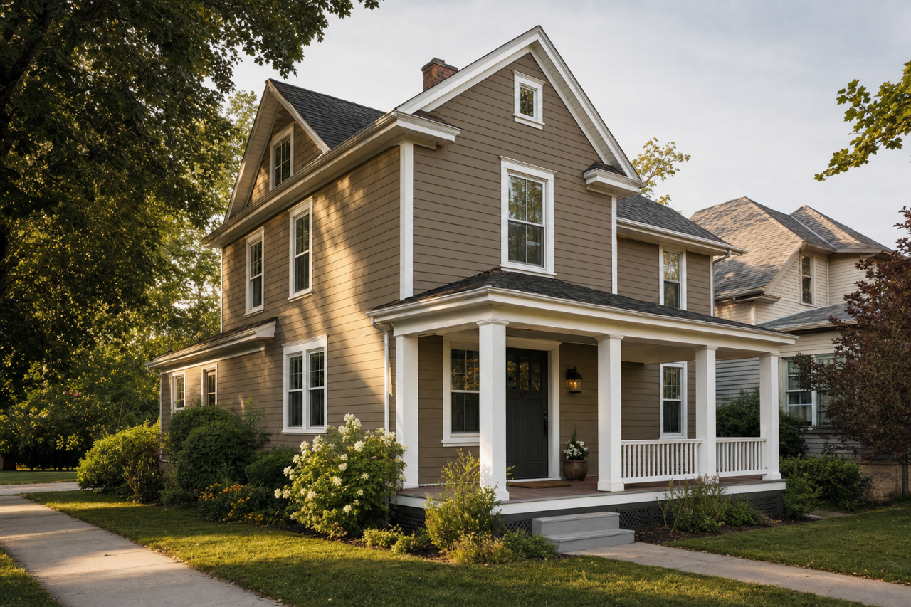
Benjamin Moore Buckhorn (CC-510) is more than just a neutral—it’s a versatile foundation for a myriad of design styles, from modern farmhouse to transitional and beyond. Its ability to adapt to different lighting conditions and its compatibility with a wide range of colors make it a reliable and stylish choice for any space. Whether you're looking to create a cozy retreat or a polished, modern interior, Buckhorn is a color that delivers timeless elegance and enduring appeal.