Benjamin Moore Nordic (CC-576): A Sophisticated Neutral with Cool Undertones
Benjamin Moore Nordic (CC-576) is a timeless, versatile neutral that effortlessly bridges the gap between modern sophistication and classic charm. This soft, airy shade of gray exudes a serene and polished aesthetic, making it a perfect choice for creating calm and balanced interiors. With its subtle cool undertones, Nordic offers a refined elegance that works beautifully in a variety of design styles, from minimalist and Scandinavian to transitional and contemporary spaces.
Undertones of Benjamin Moore Nordic (CC-576)
Nordic is a cool-toned gray with delicate blue undertones that give it a crisp, clean appearance. These undertones lend a soft iciness to the color, enhancing its ability to create a light and airy atmosphere. While it leans toward the cooler side of the spectrum, Nordic maintains a sense of warmth that prevents it from feeling stark or sterile. This nuanced balance makes it an adaptable choice for a wide range of lighting conditions, from natural daylight to soft, warm artificial light.
Coordinating Colors for Benjamin Moore Nordic
Nordic (CC-576) pairs beautifully with a curated selection of complementary colors, making it an ideal backdrop for layered palettes. Here are some suggestions for coordinating colors:
- Benjamin Moore White Dove (OC-17): A creamy, soft white that enhances Nordic’s subtle elegance. Ideal for trim, ceilings, or cabinetry.
- Benjamin Moore Hale Navy (HC-154): A bold, deep navy that creates a striking contrast while maintaining a cool undertone harmony.
- Benjamin Moore Revere Pewter (HC-172): A warmer greige that adds depth and dimension when paired with Nordic in adjacent spaces.
- Benjamin Moore Wrought Iron (2124-10): A rich, near-black shade that adds drama and sophistication to accent furniture or cabinetry.
- Benjamin Moore Nimbus Gray (2131-50): A slightly darker gray with blue undertones, perfect for creating a monochromatic palette with subtle variations.
When paired with crisp whites, Nordic exudes a fresh, contemporary vibe. Alternatively, combining it with darker, moody hues can create a more dramatic and cocooning effect. Adding in muted pastels or soft metallics, such as brushed gold or silver, can elevate the palette with a touch of understated glamour.
Where to Use Benjamin Moore Nordic (CC-576)
Nordic’s versatility ensures that it works seamlessly in various spaces throughout the home. Its neutral yet distinctive tone makes it a go-to choice for walls, cabinetry, and even furniture. Here are some ideas for incorporating Nordic into your spaces:
- Living Rooms: Use Nordic as the main wall color to create a serene foundation for your living space. Pair it with soft textiles and natural wood tones for a cozy, Scandinavian-inspired retreat.
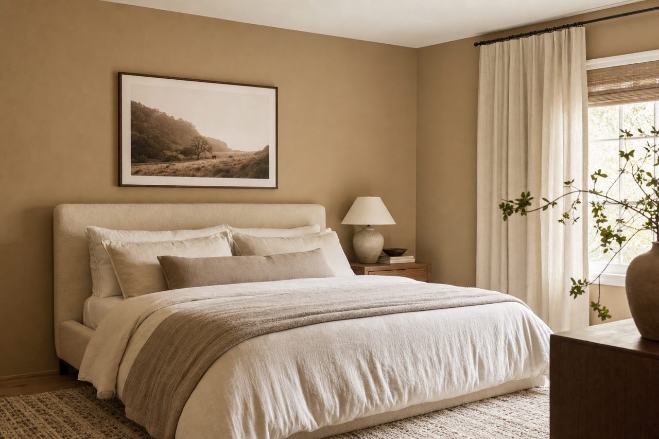
- Bedrooms: The cool undertones of Nordic make it a calming choice for bedrooms. Pair with crisp white bedding and navy accents for a fresh, tailored look.
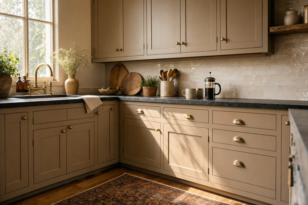
- Kitchens: Nordic shines when used on kitchen cabinets or islands, especially when paired with quartz or marble countertops and stainless steel appliances. For a modern farmhouse vibe, pair Nordic cabinetry with matte black hardware.
- Bathrooms: In bathrooms, Nordic’s soothing tone works beautifully as a wall color or on vanity cabinetry. Pair it with white subway tiles and chrome fixtures for a spa-like feel.
- Home Offices: Nordic’s subtle sophistication creates a professional yet relaxed atmosphere, ideal for productivity and focus. Add pops of color through artwork or accessories for visual interest.
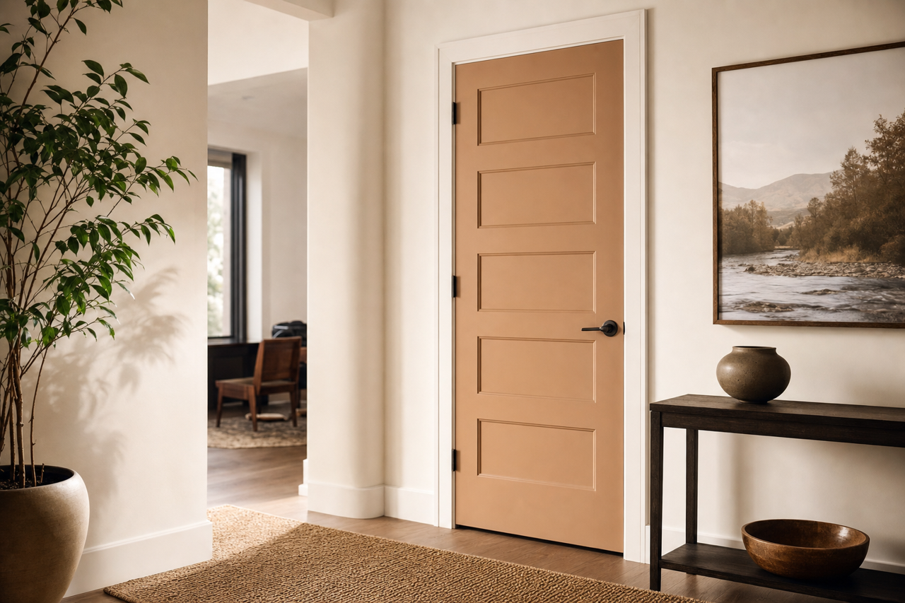
- Hallways and Entryways: Its ability to reflect light makes Nordic an excellent choice for hallways and entryways, helping to brighten these transitional spaces.
Lighting and Nordic’s Adaptability
Lighting plays a crucial role in how Nordic (CC-576) appears in your space. In rooms with ample natural light, Nordic will lean slightly cooler, emphasizing its blue undertones. In spaces with warm artificial lighting, the color softens, creating a subtle greige effect. This chameleon-like quality makes it essential to test the color in your specific lighting conditions before committing.
Why Choose Benjamin Moore Nordic (CC-576)
Benjamin Moore Nordic (CC-576) is the epitome of understated elegance. Its cool gray base, paired with subtle blue undertones, creates an adaptable and tranquil backdrop that complements a wide range of design aesthetics. Whether you’re designing a minimalist sanctuary or a richly layered space, Nordic delivers a sophisticated, polished look that stands the test of time. Its versatility, paired with an array of coordinating colors, ensures that your design vision will come to life with ease.
Nordic (CC-576) isn’t just a paint color; it’s a foundation for creating spaces that feel balanced, welcoming, and effortlessly stylish.